今天先來點不一樣的吧!
資料視覺化是將數據以圖形或圖像的形式呈現出來,其用意是透過視覺呈現數據,以便更容易理解、分析和傳遞。
以下是資料視覺化的優點:
-清楚明瞭的數據
-容易發現異常
-識別關聯性
-支援決策
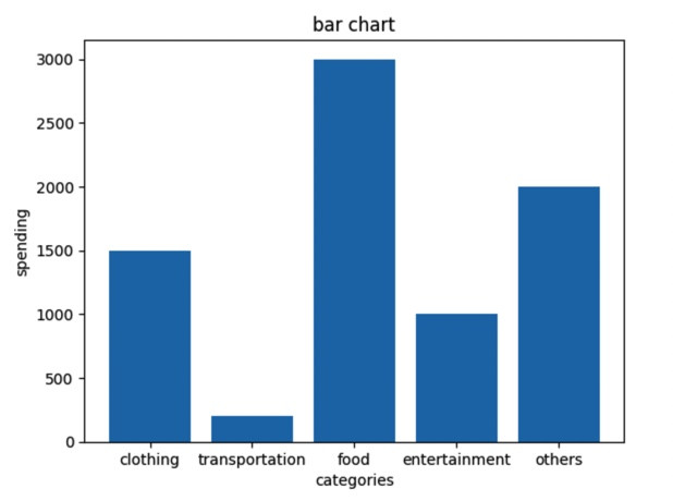
Matplotlib是一個常用的繪圖庫,如果想在Python繪製長條圖,則可以使用Matplotlib庫。
·簡單的長條圖
範例:
import matplotlib.pyplot as plt
#長條圖資料
categories = ['clothing', 'transportation', 'food','entertainment', 'others']
spending = [1500, 200, 3000, 1000, 2000]

#繪製長條圖
plt.bar(categories, spending)

#輸入標題和x,y標籤
plt.title('bar chart')
plt.xlabel('categories')
plt.ylabel('spending')

#顯示圖表
plt.show()
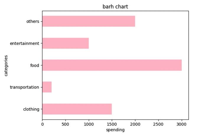
長條圖變橫條圖
只需要將plt.bar 改成plt.barh
(注意x,y軸有沒有顛倒)
·橫條圖
import matplotlib.pyplot as plt
#橫條圖資料
categories = ['clothing', 'transportation', 'food','entertainment',  'others']  # y軸上的類別
spending = [1500, 200, 3000, 1000, 2000]    # 橫條圖的值

#繪製橫條圖
plt.barh(categories, spending, color='pink', height=0.5)  #換顏色以及高度

#添加標題和x,y標籤
plt.title('barh chart')
plt.xlabel('spending')
plt.ylabel('categories')

#顯示圖表
plt.show()
今天就學到這邊,明天繼續加油!
目前進度:12/30···


 iThome鐵人賽