當我們第一次使用某網站時,有時候網站會跳出導覽指引(就是教你怎麼用?),這可稱作網頁導覽或者用戶導覽(User Tour)或者 Onboarding (是指使用者第一次使用產品時認識、熟悉產品的過程),有時候也稱為 FRUX (First Run User Experience)
根據公司專案情況,可以選擇有SaaS(Software as a Service)解決方案來實現用戶onboarding,像是Appcues: 這個平台允許你創建各種用戶導覽和onboarding流程,而不需要編碼...等,那如果要由前端製作的話,可以考慮Intro.js: 這是一個非常簡單且易於使用的JavaScript庫,當然不同框架也推出系列套件。
而今天我們要介紹的v-onboarding 是Vue 3的超薄的入門元件
官網:https://v-onboarding.fatihsolhan.com/
npm install v-onboarding
const steps = [
  { attachTo: { element: '#foo' }, content: { title: "Welcome!" } }
]
element是要在哪出現提示框的元素/content提示內容
這只是簡單的範例,還可以放其他參數
const wrapper = ref(null)
const { start, goToStep, finish } = useVOnboarding(wrapper)
onMounted(() => start())
這樣就完成拉!已經可以入門款的啟動
(單一組件內或APP.vue)
<template>
  <VOnboardingWrapper ref="wrapper" :steps="steps" />
  <div>
    <button id="foo">Welcome</button>
  </div>
</template>

<script>
import { ref,onMounted} from 'vue'
import { VOnboardingWrapper, useVOnboarding } from 'v-onboarding' // 引用
import 'v-onboarding/dist/style.css' // 引用
export default ({
  components: {
    VOnboardingWrapper
  },
  setup() {
    const wrapper = ref(null)
    const { start, goToStep, finish } = useVOnboarding(wrapper)
    const steps = [
      { attachTo: { element: '#foo' }, content: { title: "Welcome!" } }
    ]

     onMounted(() => start()) // 啟動

    return {
      wrapper,
      steps
    }
  }
})
</script>
在進階應用中,可以自行設定css以及插槽內容
前往 >> 官方進階應用範例
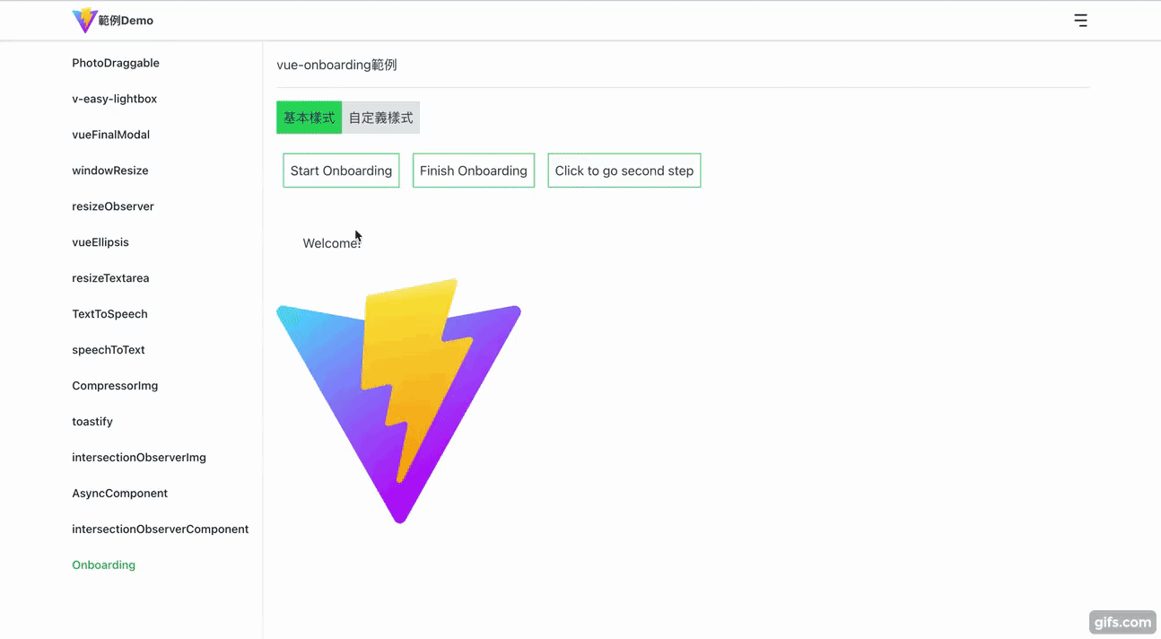
Demo網址:https://hahasister-ironman-project.netlify.app/#/onboarding
GitHub:https://github.com/hahaalin/ironman-project/blob/master/src/views/Onboarding.vue
功能大綱
程式碼
<template>
  <div>
    <VOnboardingWrapper ref="wrapper" :steps="steps" :options="options" />

    <div class="flex mb-4">
      <button @click="start" class="p-2">Start Onboarding</button>
      <button @click="finish" class="p-2">Finish Onboarding</button>
      <button @click="() => goToStep(1)" class="p-2">
        Click to go second step
      </button>
    </div>

    <div class="p-8">
      <p id="foo">Welcome!</p>
    </div>

    <div class="bar">
      <img src="/vite.svg" alt="" width="300" />
    </div>
  </div>
</template>
▼ options 中有特別修改預設的按鈕內容以及箭頭的偏移offset
另外,
<script setup>
import { ref } from 'vue';
import { VOnboardingWrapper, useVOnboarding } from 'v-onboarding';
import 'v-onboarding/dist/style.css';

const wrapper = ref(null);
const { start, goToStep, finish } = useVOnboarding(wrapper);
const steps = [
  {
    attachTo: { element: '#foo' },
    content: { title: 'welcome' }
  },
  {
    attachTo: { element: '.bar' },
    content: {
      title: 'Do it!',
      description: '測試'
    }
  },
  {
    attachTo: { element: '#demo' },
    content: { title: '回到首頁' }
  }
];

const options = {
  popper: {
    modifiers: [
      {
        name: 'offset',
        options: {
          offset: [0, 10]
        }
      }
    ]
  },
  labels: {
    previousButton: '上一步',
    nextButton: '下一步',
    finishButton: '完成'
  }
};
</script>
▼ 專案的class 我都是採用tailwindCSS,
<style lang="scss" scoped>
button {
  @apply border border-green-500 block m-2 bg-white;
}
</style>

<style lang="scss">
:root {
  --v-onboarding-overlay-fill: lightseagreen; // 修改預設覆蓋顏色
}
</style>
詳細可看官方文件
{
  attachTo: {
    element: "#foo"
    classList: ["attached", "bar"]
  },
  content: {
    title: "..."
    description: "..."
  },
  on: {
    beforeStep: function() {},
    afterStep: function() {}
  },
  options: {}
}
可用的屬性:
attachTo: 物件型態
content: 物件型態(選填)
on: 物件型態(選填)
options: 型態(選填)- 步驟的選項。這會覆蓋 VOnboardingWrapper 的選項。(詳細可看下面)
預設值為以下(若沒有在建立步驟steps時沒有特別寫,則就照下面)
{
  popper: {},
  overlay: {
    enabled: true,
    padding: 0,
    borderRadius: 0
  },
  scrollToStep: {
    enabled: true,
    options: {
      behavior: 'smooth',
      block: 'center',
      inline: 'center'
    }
  },
  autoFinishByExit: true,
  hideButtons: {
    previous: false,
    next: false,
    exit: false
  },
  labels: {
    previousButton: 'Previous',
    nextButton: 'Next',
    finishButton: 'Finish'
  }
}
可用的屬性:
popper: 參考PopperJS (預設為{})
overlay
scrollToStep
autoFinishByExit: 布林值(預設為 true)- 當點擊退出按鈕時關閉覆蓋層。
hideButtons
labels(按鈕的名稱)
不懂插槽是什麼意思可以看 VUE官方文件
可用的屬性和方法
| 屬性 | 用法 | 類型 | 描述 |
|---|---|---|---|
| step | 物件 | 當前的步驟物件 | |
| next | next() | 函數 | 移動到下一個步驟 |
| previous | previous() | 函數 | 移動到上一個步驟 |
| exit | exit() | 函數 | 退出新手引導 |
| isFirst | 布林值 | 判斷當前步驟是否是第一個步驟 | |
| isLast | 布林值 | 判斷當前步驟是否是最後一個步驟 | |
| index | 步驟的索引(開始為0) |
可以修改以下值
<style>
:root {
  --v-onboarding-step-arrow-background: #f5f5f5; // 預設為白色
  --v-onboarding-step-arrow-size: 14px; // 預設為10
}
</style>
<style>
:root {
  --v-onboarding-overlay-fill: lightseagreen; // 修改填滿顏色
  --v-onboarding-overlay-opacity: 0.9; //透明度
}
</style>
exit - 透過點擊退出按鈕或呼叫方法關閉引導時觸發
finish - 透過點擊完成按鈕或呼叫該finish方法完成入門時觸發
整體來說,整個是簡單好用拉!
那我們明天再見拉~


 看影片追技術