終於來到我們的正式切版畫面了,今天的目標是我們大概會切出一個這樣子的簡單版型,藉以熟悉tailwind CSS 的應用

在初期規劃版型上面,我們將預計分成三個區塊:
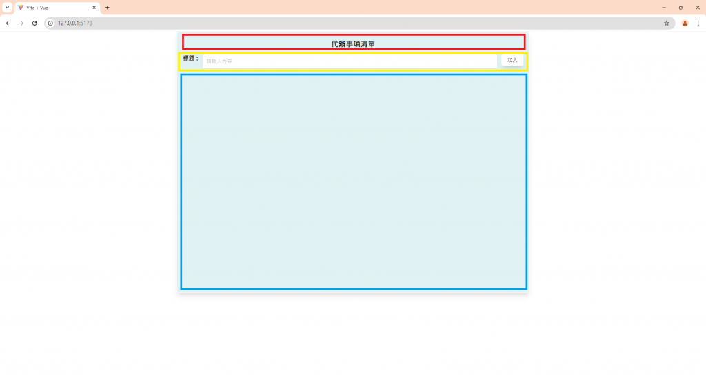
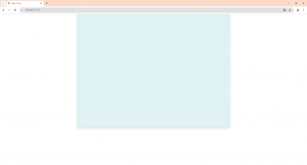
首先是上面的header title、中間的輸入區塊,以及下面的列表區塊,列表區塊的部分我們先保留,先來完成外圍的部分
<template>
		<div class="min-w-[300px] max-w-[50vw] h-[75vh] mx-auto flex flex-col gap-4 shadow-lg bg-tiffanyBlue rounded-lg">

		</div>
</template>
<script setup>
</script>
<style scoped>
</style>
我們可以先設定最小寬度和最大寬度為300px和50vw,高度先設定為75vh,左右的margin都是auto,按照上圖,外圍容器的內部將會是直向排列,所以我們用flex和flex-col來讓裡面的內容直排,並選用gap-4來當作間距,陰影部分可以用tailwind預設的shadow-lg做設定,背景色則是我自己自訂義的bg-tiffanyBlue,圓角選用lg的尺寸。
看起來會像這樣:
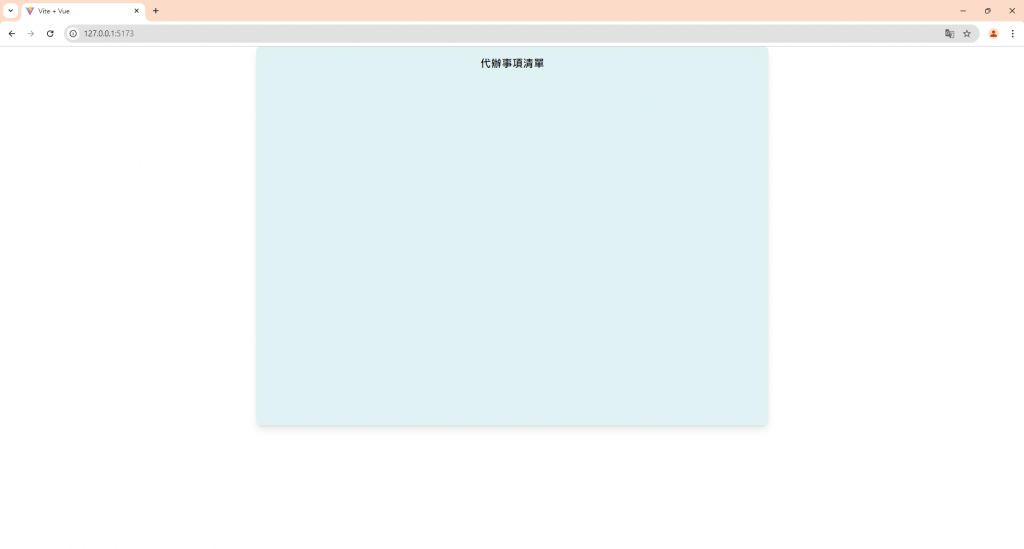
接下來加入header語句的部分:
<template>
		<div class="min-w-[300px] max-w-[50vw] h-[75vh] mx-auto flex flex-col gap-4 shadow-lg bg-tiffanyBlue rounded-lg">
			<header class="pt-5 text-center text-[20px] font-black">代辦事項清單</header>
		</div>
</template>
<script setup>
</script>
<style scoped>
</style>
我們在header標籤中使用了pt-5,讓padding-top多了1.25rem的高度,text-center 讓文字置中,text-[20px] 使字體大小在20px,font-black讓字體顏色為黑色:
會變成這樣:
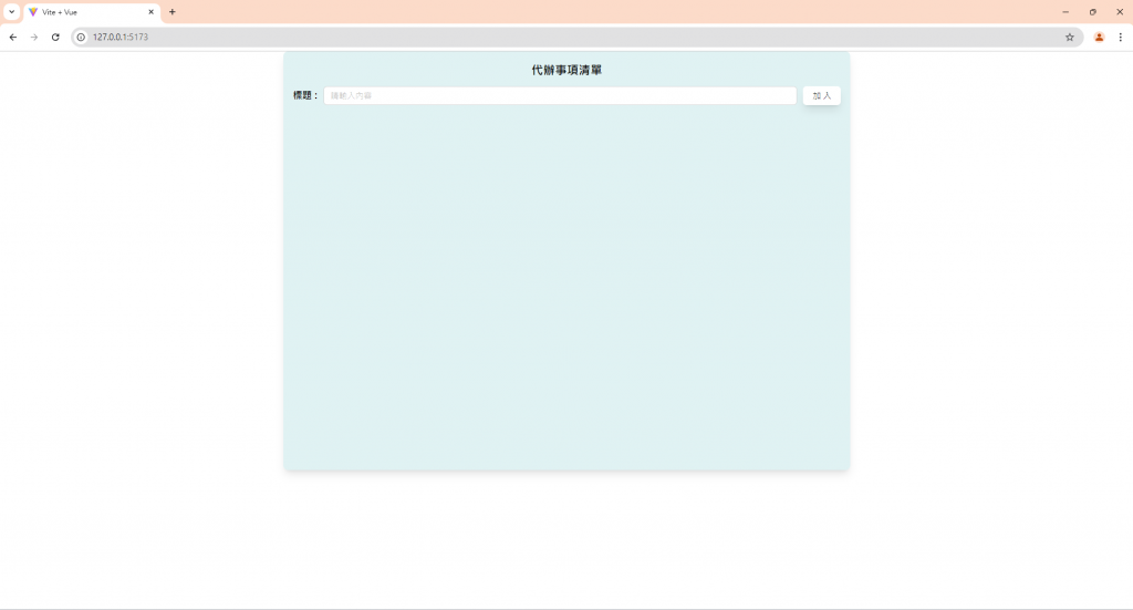
接下來來做黃色區塊,也就是輸入框的部分:
<template>
		<div class="min-w-[300px] max-w-[50vw] h-[75vh] mx-auto flex flex-col gap-4 shadow-lg bg-tiffanyBlue rounded-lg">
			<header class="pt-5 text-center gap-[10px] text-[20px] font-black">代辦事項清單</header>
			<div class="flex gap-[10px] mx-4">
				<p class="flex items-center whitespace-nowrap font-semibold mb-0">標題 :</p>
				<a-input  placeholder="請輸入內容" />
				<a-button class="shadow-lg border-transparent">加入</a-button>
			</div>
		</div>
</template>
<script setup>
</script>
<style scoped>
</style>
可以看到我們用一個div包裹住裡面的input框和button的部分,因為要讓裡面的內容橫向排列,所以我們對外框的div使用flex,標題我們選用p標籤,字體置中(items-center),不折行(whitespace-nowrap),字體大小semibold(font-semibold),因為選用p標籤有margin-bottom,所以使用mb-0消除掉margin-bottom。
選擇˙a-input當作搜尋框之後,可以給a-button加上一些陰影(shadow-lg),並且隱藏邊框線(border-transparent),基本上就大功告成啦!
整體看起來就會是這個樣子,明天我們繼續來做列表的部分!!


 iThome鐵人賽