display: flex 應用到容器上,該容器內的所有直接子元素將成為 flex 項目(Flex Items)。display: flex:設置元素為 Flex 容器,啟用 Flexbox。flex-direction:設置子元素排列方向:
row(默認):子元素橫向排列。row-reverse:子元素反向橫向排列。column:子元素縱向排列。column-reverse:子元素反向縱向排列。justify-content:控制子元素在主軸(flex-direction 設定的軸線)上的對齊方式:
flex-start:子元素靠主軸起點對齊。flex-end:子元素靠主軸終點對齊。center:子元素居中排列。space-between:子元素平均分佈,第一個在起點,最後一個在終點。space-around:子元素均勻分佈,且周圍留有相等的空間。align-items:控制子元素在交叉軸上的對齊方式:
stretch(默認):子元素填滿交叉軸。flex-start:子元素靠交叉軸起點對齊。flex-end:子元素靠交叉軸終點對齊。center:子元素在交叉軸上居中。flex-wrap:控制當子元素超出容器寬度時是否換行:
nowrap(默認):不換行,所有子元素在一行中。wrap:自動換行,子元素超過容器寬度時移到下一行。flex-grow:控制子元素在容器中剩餘空間的增長比例,默認為 0(不增長)。flex-shrink:控制子元素在空間不足時的縮小比例,默認為 1(允許縮小)。flex-basis:設置子元素的基礎尺寸,默認為 auto。align-self:允許單個子元素覆蓋 align-items 的設置,可設為 auto, flex-start, flex-end, center, baseline, stretch。HTML:
<!DOCTYPE html>
<html lang="en">
<head>
  <meta charset="UTF-8">
  <meta name="viewport" content="width=device-width, initial-scale=1.0">
  <title>Flexbox Example</title>
  <link rel="stylesheet" href="style.css"> <!-- 引用外部 CSS -->
</head>
<body>
  <div class="container">
    <div class="box box1">1</div>
    <div class="box box2">2</div>
    <div class="box">3</div>
  </div>
</body>
</html>
CSS:
.container {
  display: flex;
  flex-direction: row;
  justify-content: space-between;
  align-items: center;
  height: 200px;
  border: 2px solid #000;
}

.box {
  width: 100px;
  height: 100px;
  background-color: lightblue;
  text-align: center;
  line-height: 100px;
}

.box1 {
  background-color: coral;
}

.box2 {
  background-color: lightgreen;
}
網頁呈下圖: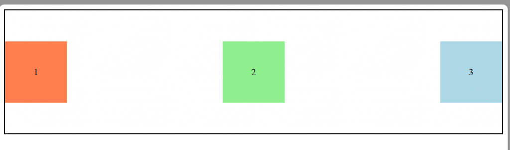

 iThome鐵人賽
 看影片追技術