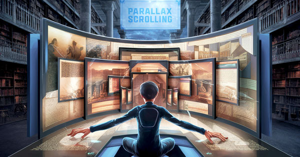
大家還記得周星馳「破壞之王」打敗斷水流的絕招嗎?當何金銀和大師兄在旋轉幸運輪裡滾動時,不知道他們眼中的畫面是怎樣,是不是和網頁的視差滾動一樣呢?所以我決定做個純 CSS 視差滾動來體驗無敵風火輪的威力~( 並不是這樣 )
這篇教學會運用 background-attachment 固定背景、sticky 黏貼定位以及 animation-timeline 控制動畫進度等方法,使用純粹的 CSS 製作視差滾動效果。
注意,這個效果目前僅支援 Chrome 和 Edge,其他部分瀏覽器或行動裝置瀏覽器可能不支援。
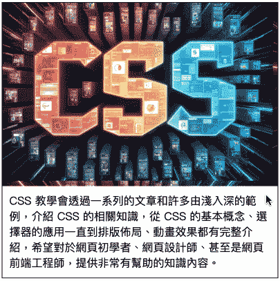
使用 background-attachment: fixed 可以「固定」背景,當其他元素因捲軸捲動覆蓋背景時,就會出現簡單的視差滾動效果,雖然這個做法很簡單,但因為 fixed 屬性質會以 body 為參考依據,所以只能處理單一張或少量圖片,如果要進行多張圖片不同位置的視差滾動,或要進行位置或尺寸修改,就必須撰寫額外的 CSS 或透過 animation-timeline 或 JavaScript 輔助才能實現。
下方範例會使用一個寬度為 400px 的 div 模擬有捲軸的網頁,展示固定背景的視差滾動效果。
<!-- HTML 程式碼 -->
<div class="main">
  <div class="banner"></div>
  <div class="contain">CSS 教學會透過一系列的文章和許多由淺入深的範例,介紹 CSS 的相關知識,從 CSS 的基本概念、選擇器的應用一直到排版佈局、動畫效果都有完整介紹,希望對於網頁初學者、網頁設計師、甚至是網頁前端工程師,提供非常有幫助的知識內容。</div>
</div>

<!-- CSS 程式碼 -->
<style>
  div {box-sizing: border-box;}
  .main {
    width: 400px;
    height: 400px;
    border: 1px solid #000;
    overflow: scroll;   /* 模擬視窗,超過範圍出現捲軸 */
  }
  .banner {
    width: 100%;
    aspect-ratio: 3/2;   /* 元素保持 3:2 比例 */
    background-image: url("https://steam.oxxostudio.tw/image/index-css.jpg");
    background-size: 400px;         /* 背景寬度 */
    background-attachment: fixed;   /* 背景固定 */
  }
  .contain{
    padding: 10px;
    width: 100%;
    height: 500px;
  }
</style>
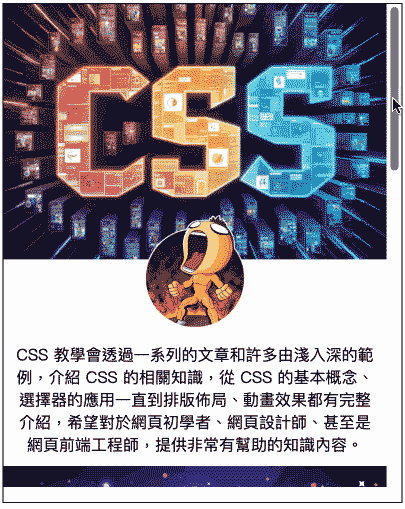
*position: sticky 黏貼定位是個很特別的排版樣式,同時具備了 relative 和 fixed 的效果,當黏貼定位的元素指定了 top 之類的位置距離樣式,就會在元素抵達顯示畫面的該位置時,觸發為類似 fixed 的樣式,當元素的父元素底部碰觸到元素時,又會回復 relative 的行為,對於使用「多種圖片」或「多層區塊」的單頁式網頁而言,是製作視差滾動相當方便的做法。
下方範例會使用一個寬度為 400px 的 div 模擬有捲軸的網頁,展示黏貼定位的視差滾動效果,當中運用 z-index 讓後方元素可以覆蓋前方。
<!-- HTML 程式碼 -->
<div class="main">
  <div class="parallax">
    <img class="img-a" src="https://steam.oxxostudio.tw/image/index-css.jpg">
    <img class="img-b" src="https://steam.oxxostudio.tw/download/css/function-filter-demo.png">
    <div class="note-1">CSS 教學會透過一系列的文章和許多由淺入深的範例,介紹 CSS 的相關知識,從 CSS 的基本概念、選擇器的應用一直到排版佈局、動畫效果都有完整介紹,希望對於網頁初學者、網頁設計師、甚至是網頁前端工程師,提供非常有幫助的知識內容。</div>
    <img class="img-c" src="https://steam.oxxostudio.tw/download/python/line-template-message-demo2.jpg">
    <div class="note-2">大家好,我是 OXXO,是個即將邁入中年的斜槓青年。如果大家有課程講師、研習授課、寫作、書籍出版、產品顧問、網站顧問...等需求,都可以與我聯繫,一起來做點又酷、又好玩、又有創意的東西吧!</div>
  </div>
  <div class="contain"></div>
</div>

<!-- CSS 程式碼 -->
<style>
  div {box-sizing: border-box;}
  .main {
    width: 400px;
    height: 500px;
    border: 1px solid #000;
    overflow: scroll;   /* 模擬視窗,超過範圍出現捲軸 */
  }
  .parallax {
    width: 100%;
    margin-bottom: 30px;
    text-align: center;
  }
  .parallax * {
    position: sticky;  /* 內容元素都是黏貼定位 */
    width: 100%;
  }
  .img-a {
    z-index: 1;
    top: 0;            /* 遇到 top 為 0 時黏貼 */
  }
  .img-b {
    width: 100px;
    z-index: 2;
    margin-top: -50px;
    top: 20px;         /* 遇到 top 為 20px 時黏貼 */
  }
  .note-1, .note-2{
    top: 0;            /* 遇到 top 為 0 時黏貼 */
    z-index: 3;
    padding: 10px;
    background: #fffc;
  }
  .img-c {
    z-index: 4;
    top: 0;           /* 遇到 top 為 0 時黏貼 */
  }
  .note-2{z-index: 5;}
  .contain{
    width: 100%;
    height: 500px;
  }
</style>
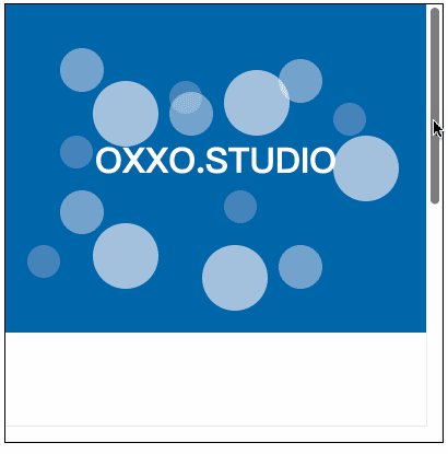
animation-timeline 是一個可以運用「元素在可視範圍中的位置」或「捲軸位置」控制「動畫進度」的樣式,隨著瀏覽器支援度的提升,逐漸取代了使用 JavaScript 獲取位置或捲軸資訊的能力,使用方式需要先定義動畫內容,設定將元素改變過程的位置或尺寸,接著根據需求使用 view() 或 scroll() 將動態的位置對應到元素的時間軸,就能產生非常漂亮的視差滾動效果,下方範例會定義三組動畫,並會根據捲軸下拉的程度,執行不同的動畫進度。
注意,目前除了 Chrome 與 Edge,其他瀏覽器可能不支援這個樣式屬性!
<!-- HTML 程式碼 -->
<div class="main">
  <div class="parallax">
    <div class="ball b1"><div></div><div></div><div></div><div></div><div></div></div>
    <div class="ball b2"><div></div><div></div><div></div><div></div><div></div></div>
    <div class="ball b3"><div></div><div></div><div></div><div></div><div></div></div>
    <h1>OXXO.STUDIO</h1>
  </div>
  <div class="contain"></div>
</div>

<!-- CSS 程式碼 -->
<style>
  div {position: relative;}
  .main {
    width: 400px;
    height: 400px;
    border: 1px solid #000;
    overflow: scroll;        /* 模擬視窗,超過範圍出現捲軸 */
  }
  .main > * {width: 100%;}
  .contain {height: 500px;}
  .parallax {
    height: 300px;
    background: #06a;
  }
  .parallax * {position: absolute;} /* 內容元素都是絕對定位 */

  .ball {
    top: 0;
    width: 100%;
    height: 100%;
  }
  .ball * {border-radius: 50%;}

  .b1 {
    animation: oxxo forwards;     /* 名稱 oxxo,動畫結束後保持在最後一格 */
    animation-range: 0 500px;     /* 捲軸下拉範圍 0~500px 對應動畫的 0%~100% */
    animation-timeline: scroll(); /* 捲軸控制動畫進度 */
  }
  .b1 * {
    width: 30px;
    height: 30px;
    background: #fff3;
  }
  .b1 div:nth-child(1){top:120px; left: 50px;}
  .b1 div:nth-child(2){top:70px; left: 150px;}
  .b1 div:nth-child(3){top:90px; left: 300px;}
  .b1 div:nth-child(4){top:170px; left: 200px;}
  .b1 div:nth-child(5){top:220px; left: 20px;}

  .b2 {
    animation: oxxo forwards;     /* 名稱 oxxo,動畫結束後保持在最後一格 */
    animation-range: 0 400px;     /* 捲軸下拉範圍 0~400px 對應動畫的 0%~100% */
    animation-timeline: scroll(); /* 捲軸控制動畫進度 */
  }
  .b2 * {
    width: 40px;
    height: 40px;
    background: #fff6;
  }
  .b2 div:nth-child(1){top:40px; left: 50px;}
  .b2 div:nth-child(2){top:80px; left: 150px;}
  .b2 div:nth-child(3){top:50px; left: 250px;}
  .b2 div:nth-child(4){top:220px; left: 250px;}
  .b2 div:nth-child(5){top:170px; left: 50px;}

  .b3 {
    animation: oxxo forwards;     /* 名稱 oxxo,動畫結束後保持在最後一格 */
    animation-range: 0 300px;     /* 捲軸下拉範圍 0~300px 對應動畫的 0%~100% */
    animation-timeline: scroll(); /* 捲軸控制動畫進度 */
  }
  .b3 * {
    width: 60px;
    height: 60px;
    background: #fff9;
  }
  .b3 div:nth-child(1){top:70px; left: 80px;}
  .b3 div:nth-child(2){top:60px; left: 200px;}
  .b3 div:nth-child(3){top:120px; left: 300px;}
  .b3 div:nth-child(4){top:220px; left: 180px;}
  .b3 div:nth-child(5){top:200px; left: 80px;}

  h1 {
    animation: oxxo forwards;     /* 名稱 oxxo,動畫結束後保持在最後一格 */
    animation-range: 0 500px;     /* 捲軸下拉範圍 0~500px 對應動畫的 0%~100% */
    animation-timeline: scroll(); /* 捲軸控制動畫進度 */
  }
  h1 {
    margin-top: 120px;
    width: 100%;
    color: white;
    text-align: center;
  }
  /* 動畫定義 */
  @keyframes oxxo {
    0% {top: 0;}
    100% {top: -200px;}
  }
</style>
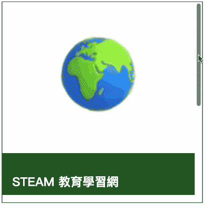
除了單純的控制元素位置,也可以搭配「sprite 圖片」,實作透過捲軸控制的動畫效果,下方範例會用一張 3D 地球的 sprite 圖片,搭配動畫速度 animation-timing-function: step-start;,就能在拖拉捲軸時,呈現地球轉動的動畫,此外在搭配上述的 position: sticky,就能做出更別致的視差滾動。
<!-- HTML 程式碼 -->
<div class="main">
  <div class="banner">
    <div class="earth"></div>
  </div>
  <div class="contain">
    <h2>STEAM 教育學習網</h2>
    STEAM 教育學習網秉持著 STEAM/STEM 的精神,透過一系列免費且高品質的教學與範例,讓所有人都能輕鬆跨入 STEAM 的學習領域。
    <h2>CSS 教學</h2>
    CSS 教學會透過一系列的文章和許多由淺入深的範例,介紹 CSS 的相關知識,從 CSS 的基本概念、選擇器的應用一直到排版佈局、動畫效果都有完整介紹,希望對於網頁初學者、網頁設計師、甚至是網頁前端工程師,提供非常有幫助的知識內容。
  </div>
</div>

<!-- CSS 程式碼 -->
<style>
  div {box-sizing: border-box;}
  .main {
    position: relative;
    width: 400px;
    height: 400px;
    border: 1px solid #000;
    overflow: scroll;        /* 模擬視窗,超過範圍出現捲軸 */
  }
  .banner {
    width: 100%;
    height: 300px;
    background: white;
  }
  .earth {
    position: sticky;        /* 黏貼定位,讓地球一開始固定不動 */
    margin: 0 auto;
    top: 100px;
    width: 87px;
    height: 87px;
    scale: 2;
    background: url("https://steam.oxxostudio.tw/download/css/animate-sprites.jpg");
    background-position: 0 0;
    animation: oxxo step-start;   /* 使用 step-start 讓進度一格格移動 */
    animation-timeline: scroll(); /* 根據捲軸滾動改變動畫進度 */
    animation-range: 0 300px;     /* 捲軸的 0~300px 對應動畫的 0~100% */
  }
  @keyframes oxxo {
    0.00% {background-position: 0 0;}
    3.34% {background-position: -100% 0;}
    6.67% {background-position: -200% 0;}
    10.01% {background-position: -300% 0;}
    13.35% {background-position: -400% 0;}
    16.68% {background-position: -500% 0;}
    20.02% {background-position: -600% 0;}
    23.36% {background-position: -700% 0;}
    26.69% {background-position: -800% 0;}
    30.03% {background-position: -900% 0;}
    33.37% {background-position: 0 -100%;}
    36.70% {background-position: -100% -100%;}
    40.04% {background-position: -200% -100%;}
    43.38% {background-position: -300% -100%;}
    46.71% {background-position: -400% -100%;}
    50.05% {background-position: -500% -100%;}
    53.39% {background-position: -600% -100%;}
    56.72% {background-position: -700% -100%;}
    60.06% {background-position: -800% -100%;}
    63.40% {background-position: -900% -100%;}
    66.73% {background-position: 0 -200%;}
    70.07% {background-position: -100% -200%;}
    73.41% {background-position: -200% -200%;}
    76.74% {background-position: -300% -200%;}
    80.08% {background-position: -400% -200%;}
    83.42% {background-position: -500% -200%;}
    86.75% {background-position: -600% -200%;}
    90.09% {background-position: -700% -200%;}
    93.43% {background-position: -800% -200%;}
    96.78% {background-position: -900% -200%;}
  }
  .contain {
    position: relative;
    z-index: 2;
    width: 100%;
    height: 400px;
    background: #252;
    padding: 20px;
    color: #fff;
  }
</style>
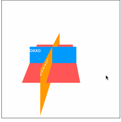
如果搭配 CSS「3D 轉換」效果,也能透過捲軸位置讓畫面中的元素進行類似 3D 的轉動效果。
<!-- HTML 程式碼 -->
<div class="main">
  <div class="camera">
    <div class="space">
      <div class="a">oxxo</div>
      <div class="b">oxxo</div>
      <div class="c">oxxo</div>
    </div>
  </div>
  <div class="contain"></div>
</div>

<!-- CSS 程式碼 -->
<style>
  div {position: relative;}
  .main {
    width: 400px;
    height: 400px;
    border: 1px solid #000;
    overflow: scroll;        /* 模擬視窗,超過範圍出現捲軸 */
  }
  .contain {
    width: 100%;
    height: 500px;
    background: #fff;
  }
  .camera {
    z-index: 2;
    position: sticky;        /* 黏貼定位,讓位置固定 */
    top: 0px;
    width: 100%;
    height: 350px;
    perspective: 200px;           /* 透視距離 */
    perspective-origin: 50% 0%;   /* 透視中心 */
    animation: oxxo;              /* 對應動畫 */
    animation-timeline: scroll(); /* 根據捲軸滾動改變動畫進度 */
    animation-range: 0 200px;     /* 捲軸的 0~200px 對應動畫的 0~100% */
  }
  .space {
    width: 100%;
    transform-style: preserve-3d; /* 所有子元素位於同一個 3D 空間,使用座標系統位置排列 */
  }
  .a, .b, .c{
    position: absolute;
    top: 150px;
    left: 100px;
    width: 150px;
    height: 100px;
    color: white;
  }
  .a {
    transform: translateZ(10px);
    background: #09f;
  }
  .b {
    transform: rotateX(75deg);
    background: #f55;
  }
  .c {
    transform: rotateY(75deg);
    background: #f90;
  }
  @keyframes oxxo {
    0% {perspective-origin: 50% 0%;}
    100% {perspective-origin: 50% 150%;}
  }
</style>
過去要製作精美的 CSS 視差滾動效果,不外乎都得依靠 JavaScript 來實現,但隨著瀏覽器的進步,純粹透過 CSS 也可以做出許多酷炫的視差滾動特效,如果有興趣不妨趕快試試看吧。
- 原文參考:純 CSS 視差滾動效果
- 延伸閱讀:CSS 教學大全


 iThome鐵人賽
 看影片追技術