夜深人靜,又聽了茄子蛋的「浪流連」,不知道他們什麼時候能再復出,MV 裡男主角被掏空的心何時才能平復,我已經決定,用純 CSS 做個「空心」的「波浪」,薰莫閣食,酒袂閣焦... 猶原會記得我少年時所偷偷烏白寫的願望,彼當陣我已經當做這世界我早著已經看破,後世人,袂閣為著 CSS 來浪流連!!!!!!
這篇教學會使用 CSS 的 paint-order 樣式屬性產生空心文字,並搭配 clip-path 和 background-clip 樣式屬性,產生水波的背景動畫,做出有趣的文字效果
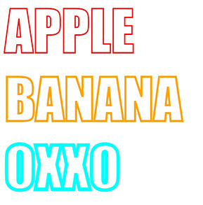
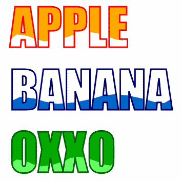
CSS 的 paint-order 是專門製作「外框文字」的樣式屬性,使用時需要搭配 -webkit-text-stroke 設定外框的顏色和粗細,下方範例會將文字顏色設為透明,產生三組不同粗細外框的外框文字。
<!-- HTML 程式碼 -->
<h1>APPLE</h1>
<h1>BANANA</h1>
<h1>OXXO</h1>

<!-- CSS 程式碼 -->
<style>
  h1 {
    color: #0000;  /* 顏色設為透明 */
    margin: 0;
    font-size: 80px;
    font-family: impact, arial-black;  /* 設定成比較粗的字體 */
    paint-order: stroke;
  }
  h1:nth-child(1) {-webkit-text-stroke: 2px red;}
  h1:nth-child(2) {-webkit-text-stroke: 3px orange;}
  h1:nth-child(3) {-webkit-text-stroke: 5px cyan;}
</style>
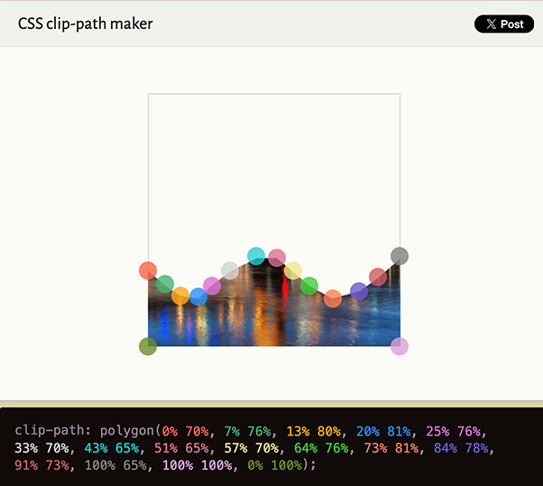
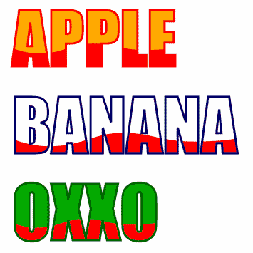
能夠製作外框字之後,只需要將外框字覆蓋在實心文字上方,並使用 clip-path 將實心文字裁切出水波的造型,就能產生水波背景文字,此處使用 polygon() 搭配「百分比」單位才能再裁切後自動適應文字寬度,不能使用 path() 路徑進行裁切,最後搭配 CSS 動畫就能做出水波的效果,可開啟「CSS clip path maker」網站自行標記出水波的座標點。
下方範例會展示三組不同顏色,但相同水波動畫的效果 ( 注意,水波動態的節點數量必須相同 )。
<!-- HTML 程式碼 -->
<h1 text="APPLE">APPLE</h1>
<h1 text="BANANA">BANANA</h1>
<h1 text="OXXO">OXXO</h1>

<!-- CSS 程式碼 -->
<style>
  h1 {
    position: relative;
    margin: 0;
    font-size: 100px;
    font-family: impact, arial-black;  /* 設定成比較粗的字體 */
    width: max-content;
  }
  h1:nth-child(1){color: #fa0;}                            /* 底色 */
  h1:nth-child(1)::before{-webkit-text-stroke: 3px red;}   /* 外框色 */
  h1:nth-child(1)::after{color: #fff;}                     /* 水波色 */
  h1:nth-child(2){color: #fff;}                            /* 底色 */
  h1:nth-child(2)::before{-webkit-text-stroke: 3px #006;}  /* 外框色 */
  h1:nth-child(2)::after{color: #06c;}                     /* 水波色 */
  h1:nth-child(3){color: #0a0;}                            /* 底色 */
  h1:nth-child(3)::before{-webkit-text-stroke: 3px #060;}  /* 外框色 */
  h1:nth-child(3)::after{color: #6f6;}                     /* 水波色 */

  h1::before, h1::after {
    position: absolute;  /* 絕對定位讓兩者可以重疊 */
    top: 0;
    left: 0;
    content: attr(text); /* 讀取元素屬性 */
  }
  h1::before {
    z-index: 2;
    color: #0000;
    paint-order: stroke; /* 外框文字 */
  }
  h1::after {
    z-index: 1;
    animation: oxxo 1s infinite alternate linear; /* 套用動畫 */
  }
  /* 注意節點數量都要一致 */
  @keyframes oxxo {
    0% {clip-path: polygon(0% 70%,
      6% 60%,
      15% 62%,
      22% 68%,
      30% 73%,
      42% 71%,
      51% 66%,
      59% 59%,
      66% 56%,
      74% 57%,
      83% 62%,
      90% 69%,
      96% 72%,
      100% 65%,
      100% 100%,
      0% 100%);
    }
    100% {clip-path: polygon(0% 70%,
      7% 76%,
      13% 80%,
      20% 81%,
      25% 76%,
      33% 70%,
      43% 65%,
      51% 65%,
      57% 70%,
      64% 76%,
      73% 81%,
      84% 78%,
      91% 73%,
      100% 65%,
      100% 100%,
      0% 100%);
    }
  }
</style>
使用 clip-path:polygon() 的方式會產生「直線邊緣」的水波,效果仍然沒有辦法實現「平滑」的水波邊緣,如果要實現平滑邊緣,就必須使用 SVG 的水波動畫作為背景,搭配 background-clip 裁切出文字的樣式,下方是 SVG 動畫的程式碼。
<?xml version="1.0" encoding="utf-8"?>
<svg version="1.1" id="wave" xmlns="http://www.w3.org/2000/svg" xmlns:xlink="http://www.w3.org/1999/xlink" x="0px" y="0px"
  viewBox="0 0 667 124" style="enable-background:new 0 0 667 124;" xml:space="preserve">
<path fill="red">
  <animate
attributeName="d"
dur="2s"
repeatCount="indefinite"
restart="always"
values="M0,43v81h667V43c0,0-44.9-43-131.5-43C438.5,0,411,76,325,77S208.5,20,110.5,20C46.5,20,0,43,0,43z;
M0,43v81h667V43c0,0-44.9,35.5-131.5,35.5c-97,0-124.5-79-210.5-78s-116.5,89-214.5,89C46.5,89.5,0,43,0,43z;
M0,43v81h667V43c0,0-44.9-43-131.5-43C438.5,0,411,76,325,77S208.5,20,110.5,20C46.5,20,0,43,0,43z"
/>
</path>
</svg>
下方範例會將背景圖設定為 SVG 動畫,搭配外框文字和背景位置,就能呈現漂亮的水波動畫背景,但如果要修改水波顏色就必須修改 SVG 檔案。
<!-- HTML 程式碼 -->
<h1 text="APPLE">APPLE</h1>
<h1 text="BANANA">BANANA</h1>
<h1 text="OXXO">OXXO</h1>

<!-- CSS 程式碼 -->
<style>
  h1 {
    position: relative;
    margin: 0 20px;
    font-size: 100px;
    font-family: impact, arial-black;  /* 設定成比較粗的字體 */
    width: max-content;
  }
  h1:nth-child(1){color: #fa0;}                           /* 底色 */
  h1:nth-child(1)::before{-webkit-text-stroke: 3px red;}  /* 外框 */
  h1:nth-child(1)::after{background-position: 0 60px;}    /* 背景位置 */
  h1:nth-child(2){color: #fff;}                           /* 底色 */
  h1:nth-child(2)::before{-webkit-text-stroke: 3px #006;} /* 外框 */
  h1:nth-child(2)::after{background-position: 0 60px;}    /* 背景位置 */
  h1:nth-child(3){color: #0a0;}                           /* 底色 */
  h1:nth-child(3)::before{-webkit-text-stroke: 3px #060;} /* 外框 */
  h1:nth-child(3)::after{background-position: 0 63px;}    /* 背景位置 */

  h1::before, h1::after {
    position: absolute;
    top: 0;
    left: 0;
    content: attr(text);
  }
  h1::before {
    z-index: 2;
    color: #0000;
    paint-order: stroke;
  }
  h1::after {
    color: #0000;
    z-index: 1;
    background-image: url('https://steam.oxxostudio.tw/download/css/wave-bg.svg'); /* 背景為 SVG */
    background-repeat: no-repeat;
    background-clip: text;
  }
</style>
雖然這個文字效果很有趣,但因為 -webkit-text-stroke 樣式屬性只支援 -webkit- 瀏覽器,在部分瀏覽器就無法看到這種文字空心效果,不過如果只是要單純展示一些有趣的效果,倒是可以試試看這篇教學的做法。
- 原文參考:CSS 空心文字、文字水波背景動畫
- 延伸閱讀:CSS 教學大全


 iThome鐵人賽
 看影片追技術