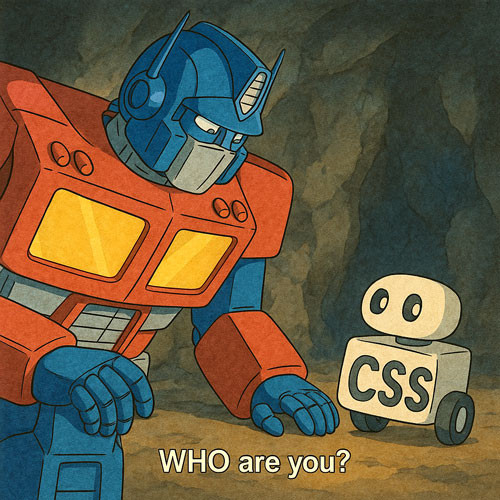
雖然變形金剛演了好幾部曲,但我只看到第二部曲 ( 還我梅根福克斯 ),看到變形金剛劈哩啪啦的變形,心想不如用純 CSS 做個 ICON 的變形好了!凡事起頭難,雖然離變形金剛還很遙遠,但總有一天 CSS 一定做得到!為了柯博文!
這篇教學會使用虛擬元素和 clip-path 這兩種方式,製作六種不同的 ICON 圖示形狀,並搭配 CSS 動畫讓這些圖示形狀互相變換。

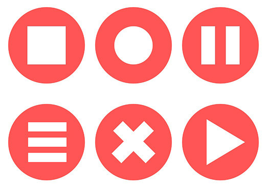
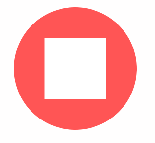
使用虛擬元素 before 和 after 是製作 ICON 圖示最簡單的方式,只要運用背景色、寬度高度、定位,甚至在搭配一些邊框、transform 旋轉或陰影,就能產生更多圖示形狀,下方範例會展示六種圖示形狀。
html >>>>
<!-- HTML 程式碼 -->
<div class="icon"></div>
<div class="icon a"></div>
<div class="icon b"></div>
<div class="icon c"></div>
<div class="icon d"></div>
<div class="icon e"></div>


<!-- CSS 程式碼 -->
<style>
  .icon {
    --w: 150px;            /* 使用變數方便後續計算 */
    position: relative;
    width: var(--w);
    height: var(--w);
    background: #f55;
    border-radius: 50%;   /* 使用圓角讓底圖變成圓形 */
    margin: 20px 10px;
    float: left;
  }
  /* 虛擬元素共用樣式 */
  .icon::before, .icon:after {
    position: absolute;
    content: "";
    z-index: 2;
    background: #fff;
  }
  /* 第一組正方形圖案,由兩個虛擬元素組成,目的在於之後要變化時更有彈性 */
  .icon::before {
    width: 25%;
    height: 50%;
    top: 25%;
    left: 25%;
  }
  .icon::after {
    width: 25%;
    height: 50%;
    top: 25%;
    right: 25%;
  }
  /* 第二組圓形圖案,由左右兩個半圓組成,寬高和第一組都相同,只是運用了不同半徑的圓角樣式 */
  .icon.a::before {
    border-radius: 200% 0 0 200%/ 100% 0 0 100%;
  }
  .icon.a::after {
    border-radius: 0 200% 200% 0/ 0 100% 100% 0;
  }
  /* 第三組圓形圖案,和第一組類似,差別在於左右兩半長方形的寬度不同 */
  .icon.b::before {
    width: 18%;
    height: 50%;
  }
  .icon.b::after {
    width: 18%;
    height: 50%;
  }
  /* 第四組三條槓圖案,運用旋轉 90 度和改變位置,加上陰影的方式產生第三條槓 */
  .icon.c::before {
    width: 12%;
    height: 50%;
    top: 5%;
    left: 45%;
    transform: rotateZ(90deg);
    box-shadow: #fff calc(var(--w)*0.2) 0 0;
  }
  .icon.c::after {
    width: 12%;
    height: 50%;
    top: 45%;
    right: 43%;
    transform: rotateZ(90deg);
  }
  /* 第五組叉叉圖案,透過旋轉和定位,產生叉叉圖案 */
  .icon.d::before {
    top: 20%;
    left: 40%;
    width: 18%;
    height: 60%;
    transform: rotateZ(45deg);
  }
  .icon.d::after {
    top: 20%;
    right: 40%;
    width: 18%;
    height: 60%;
    transform: rotateZ(-45deg);
  }

  /* 第六組三角形圖案,透過旋轉和定位,並搭配邊框製作三角形,組合後就會是完整的三角形 */
  .icon.e::before {
    top: 10%;
    left: 42%;
    width: 0;
    height: 0;
    background: #fff0;
    border-style: solid;
    border-width: calc(var(--w)*0.25) calc(var(--w)*0.15);
    border-color: #fff0 #fff #ffff #fff0;
    transform: rotateZ(90deg);
  }
  .icon.e::after {
    top: 40%;
    right: 28%;
    width: 0;
    height: 0;
    background: #fff0;
    border-style: solid;
    border-width: calc(var(--w)*0.25) calc(var(--w)*0.15);
    border-color: #fff0 #fff0 #ffff #fff;
    transform: rotateZ(90deg);
  }
</style>
如果要使用虛擬元素製作「動畫效果」會稍微麻煩一點,必須要特別注意動畫影格進度中「固定」與「改變」的樣式,下方範例會將上述的靜態圖示,改成動態變化的效果。
html >>>>
<!-- HTML 程式碼 -->
<div class="icon"></div>


<!-- CSS 程式碼 -->
<style>
  .icon {
    --w: 250px;
    position: relative;
    width: var(--w);
    height: var(--w);
    background: #f55;
    border-radius: 50%;
    margin: 50px;
  }
  .icon::before, .icon:after {
    position: absolute;
    content: "";
    z-index: 2;
    background: #fff;
    border-style: solid;
    border-width: 0;
    border-color: #fff;
  }
  .icon::before {animation: oxxo-b 12s infinite;}
  .icon::after {animation: oxxo-a 12s infinite;}

  @keyframes oxxo-b {
    /* 第一組,正方形 */
    0%, 100% {
      width: 25%;
      height: 50%;
      top: 25%;
      left: 25%;
      background: #fff;
      box-shadow: #fff 0 0 0;
      border-width: 0;
      border-color: #fff0;
      transform: rotateZ(0);
    }
    13% {
      border-radius: 0;
    }
    /* 第二組,圓形 */
    16.5% {
      border-radius: 200% 0 0 200%/ 100% 0 0 100%;
    }
    29.5% {
      width: 25%;
      height: 50%;
      top: 25%;
      left: 25%;
      border-radius: 200% 0 0 200%/ 100% 0 0 100%;
    }
    /* 第三組,兩條槓 */
    33% {
      width: 18%;
      height: 50%;
      top: 25%;
      left: 25%;
      border-radius: 0;
    }
    46% {
      width: 18%;
      height: 50%;
      top: 25%;
      left: 25%;
      transform: rotateZ(0);
      box-shadow: #fff 0 0 0;
    }
    /* 第四組,三條槓 */
    49.5% {
      width: 12%;
      height: 50%;
      top: 5%;
      left: 45%;
      transform: rotateZ(90deg);
      box-shadow: #fff calc(var(--w)*0.2) 0 0;
    }
    62.5% {
      width: 12%;
      height: 50%;
      top: 5%;
      left: 45%;
      transform: rotateZ(90deg);
      box-shadow: #fff calc(var(--w)*0.2) 0 0;
    }
    /* 第五組,叉叉 */
    66% {
      top: 20%;
      left: 40%;
      width: 18%;
      height: 60%;
      box-shadow: #fff 0 0 0;
      transform: rotateZ(45deg);
    }
    79% {
      top: 20%;
      left: 40%;
      width: 18%;
      height: 60%;
      background: #fff;
      box-shadow: #fff 0 0 0;
      border-width: 0;
      border-color: #fff0;
      transform: rotateZ(45deg);
    }
    /* 第六組,三角形 */
    82.5% {
      top: 10%;
      left: 42%;
      width: 0;
      height: 0;
      background: #fff0;
      border-width: calc(var(--w)*0.25) calc(var(--w)*0.15);
      border-color: #fff0 #fff #ffff #fff0;
      transform: rotateZ(90deg);
    }
    95.5% {
      top: 10%;
      left: 42%;
      width: 0;
      height: 0;
      background: #fff0;
      border-width: calc(var(--w)*0.25) calc(var(--w)*0.15);
      border-color: #fff0 #fff #ffff #fff0;
      transform: rotateZ(90deg);
    }

  }
  @keyframes oxxo-a {
    /* 第一組,正方形 */
    0%, 100% {
      width: 25%;
      height: 50%;
      top: 25%;
      right: 25%;
      background: #fff;
      box-shadow: #fff 0 0 0;
      border-width: 0;
      border-color: #fff0;
    }
    13% {
      border-radius: 0;
    }
    /* 第二組,圓形 */
    16.5% {
      border-radius: 0 200% 200% 0/ 0 100% 100% 0;
    }
    29.5% {
      width: 25%;
      height: 50%;
      top: 25%;
      right: 25%;
      border-radius: 0 200% 200% 0/ 0 100% 100% 0;
    }
    /* 第三組,兩條槓 */
    33% {
      width: 18%;
      height: 50%;
      top: 25%;
      right: 25%;
      border-radius: 0;
    }
    46% {
      width: 18%;
      height: 50%;
      top: 25%;
      right: 25%;
      transform: rotateZ(0);
    }
    /* 第四組,三條槓 */
    49.5% {
      width: 12%;
      height: 50%;
      top: 45%;
      right: 43%;
      transform: rotateZ(90deg);
    }
    62.5% {
      width: 12%;
      height: 50%;
      top: 45%;
      right: 43%;
      transform: rotateZ(90deg);
    }
    /* 第五組,叉叉 */
    66% {
      top: 20%;
      right: 40%;
      width: 18%;
      height: 60%;
      transform: rotateZ(-45deg);
    }
    79% {
      top: 20%;
      right: 40%;
      width: 18%;
      height: 60%;
      background: #fff;
      box-shadow: #fff 0 0 0;
      border-width: 0;
      border-color: #fff0;
      transform: rotateZ(-45deg);
    }
    /* 第六組,三角形 */
    82.5% {
      top: 40%;
      right: 28%;
      width: 0;
      height: 0;
      background: #fff0;
      border-width: calc(var(--w)*0.25) calc(var(--w)*0.15);
      border-color: #fff0 #fff0 #ffff #fff;
      transform: rotateZ(90deg);
    }
    95.5% {
      top: 40%;
      right: 28%;
      width: 0;
      height: 0;
      background: #fff0;
      border-width: calc(var(--w)*0.25) calc(var(--w)*0.15);
      border-color: #fff0 #fff0 #ffff #fff;
      transform: rotateZ(90deg);
    }
  }
</style>
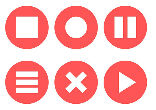
相較於虛擬元素需要不斷計算位置尺寸才能組合出特定形狀,使用 clip-path 就能快速產生不同的圖示形狀,程式碼也會減少非常多,下方範例會運用 polygon 的做法,搭配圓角半徑,實作六種不同的圖示形狀。
html >>>>
<!-- HTML 程式碼 -->
<div class="icon a"></div>
<div class="icon b"></div>
<div class="icon c"></div>
<div class="icon d"></div>
<div class="icon e"></div>
<div class="icon f"></div>

<!-- CSS 程式碼 -->
<style>
  .icon {
    --w: 150px;
    position: relative;
    width: var(--w);
    height: var(--w);
    background: #f55;
    border-radius: 50%;
    margin: 20px 10px;
    float: left;
  }
  /* 預設全部都是正方形 */
  .icon::before {
    position: absolute;
    content: "";
    z-index: 2;
    background: #fff;
    width: 50%;
    height: 50%;
    top: 25%;
    left: 25%;
  }
  /* 圓形 */
  .b::before {
    border-radius: 50%;
  }
  /* 兩條槓 */
  .c::before {
    border-radius: 0;
    clip-path: polygon(0 0, 40% 0, 40% 50%, 60% 50%, 60% 0, 100% 0,
                100% 100%, 60% 100%, 60% 50%, 40% 50%, 40% 100%,0 100%);
  }
  /* 三條槓 */
  .d::before {
    border-radius: 0;
    clip-path: polygon(0 0, 100% 0, 100% 25%, 0% 25%,
                      0 37.5%, 100% 37.5%, 100% 62.5%, 0 62.5%,
                      0 75%, 100% 75%, 100% 100%, 0 100%);
  }
  /* 叉叉 */
  .e::before {
    border-radius: 0;
    clip-path: polygon(20% 0%, 50% 30%, 80% 0%, 100% 20%, 70% 50%,
      100% 80%, 80% 100%, 50% 70%,20% 100%, 0% 80%, 30% 50%, 0% 20%);
  }
  /* 三角形 */
  .f::before {
    border-radius: 0;
    clip-path: polygon(20% 0, 20% 0, 20% 0, 20% 0,
                      100% 50%, 100% 50%, 100% 50%, 100% 50%,
                      20% 100%,20% 100%,20% 100%,20% 100%);
  }
</style>
能夠運用 clip-path 產生形狀後,就能將這些形狀組合成動畫效果,但需要自行調整不同節點的位置,使其更符合動畫的過程,下方範例會讓六種形狀互相變換。
html >>>>
<!-- HTML 程式碼 -->
<div class="icon"></div>

<!-- CSS 程式碼 -->
<style>
  .icon {
    --w: 300px;
    position: relative;
    width: var(--w);
    height: var(--w);
    background: #f55;
    border-radius: 50%;
    margin: 50px;
  }
  .icon::before {
    position: absolute;
    content: "";
    z-index: 2;
    background: #fff;
    width: 50%;
    height: 50%;
    top: 25%;
    left: 25%;
    animation: oxxo 12s infinite linear;
  }

  @keyframes oxxo {
    0%, 100% {
      border-radius: 0;
      clip-path: polygon(0 0, 0 0, 0 0,
                        100% 0, 100% 0, 100% 0,
                        100% 0100%, 100% 100%, 100% 100%,
                        0 100%, 0 100%, 0 100%);
    }
    13% {
      border-radius: 0;
      clip-path: polygon(0 0, 0 0, 0 0,
                        100% 0, 100% 0, 100% 0,
                        100% 0100%, 100% 100%, 100% 100%,
                        0 100%, 0 100%, 0 100%);
    }

    16.5% {
      border-radius: 50%;
      clip-path: polygon(0 0, 0 0, 0 0,
                        100% 0, 100% 0, 100% 0,
                        100% 0100%, 100% 100%, 100% 100%,
                        0 100%, 0 100%, 0 100%);
    }
    29.5% {
      border-radius: 50%;
      clip-path: polygon(0 0, 0 0, 0 0,
                        100% 0, 100% 0, 100% 0,
                        100% 0100%, 100% 100%, 100% 100%,
                        0 100%, 0 100%, 0 100%);
    }

    33% {
      border-radius: 0;
      clip-path: polygon(0 0, 40% 0, 40% 50%, 60% 50%, 60% 0, 100% 0,
                  100% 100%, 60% 100%, 60% 50%, 40% 50%, 40% 100%,0 100%);
    }
    46% {
      border-radius: 0;
      clip-path: polygon(0 0, 40% 0, 40% 50%, 60% 50%, 60% 0, 100% 0,
                  100% 100%, 60% 100%, 60% 50%, 40% 50%, 40% 100%,0 100%);
    }

    49.5% {
      border-radius: 0;
      clip-path: polygon(0 0, 100% 0, 100% 25%, 0% 25%,
                        0 37.5%, 100% 37.5%, 100% 62.5%, 0 62.5%,
                        0 75%, 100% 75%, 100% 100%, 0 100%);
    }
    62.5% {
      border-radius: 0;
      clip-path: polygon(0 0, 100% 0, 100% 25%, 0% 25%,
                        0 37.5%, 100% 37.5%, 100% 62.5%, 0 62.5%,
                        0 75%, 100% 75%, 100% 100%, 0 100%);
    }

    66% {
      border-radius: 0;
      clip-path: polygon(20% 0%, 50% 30%, 80% 0%, 100% 20%, 70% 50%,
        100% 80%, 80% 100%, 50% 70%,20% 100%, 0% 80%, 30% 50%, 0% 20%);
    }
    79% {
      border-radius: 0;
      clip-path: polygon(20% 0%, 50% 30%, 80% 0%, 100% 20%, 70% 50%,
        100% 80%, 80% 100%, 50% 70%,20% 100%, 0% 80%, 30% 50%, 0% 20%);
    }

    82.5% {
      border-radius: 0;
      clip-path: polygon(20% 0, 20% 0, 20% 0, 20% 0,
                        100% 50%, 100% 50%, 100% 50%, 100% 50%,
                        20% 100%,20% 100%,20% 100%,20% 100%);
    }
    95.5% {
      border-radius: 0;
      clip-path: polygon(20% 0, 20% 0, 20% 0, 20% 0,
                        100% 50%, 100% 50%, 100% 50%, 100% 50%,
                        20% 100%,20% 100%,20% 100%,20% 100%);
    }
  }
</style>
透過 CSS 製作圖示形狀其實不困難,通常都是花費許多時間在「繪製形狀」,只要知道形狀的節點或位置,就可以輕鬆地透過 CSS 控制形狀變換囉。
- 原文參考:CSS ICON 圖示形狀變換
- 延伸閱讀:CSS 教學大全


 iThome鐵人賽
 看影片追技術