上一篇我們替登入頁加入了基本的驗證功能,但隨著功能增多,程式碼也開始變得雜亂,閱讀與維護的成本逐漸升高🫠。
在本篇中,我們會透過 組件化 ( Componentization ) 的方式,將重複或龐雜的程式碼拆分整理,實踐 DRY (Don't Repeat Yourself) 原則,讓登入頁的架構更清晰、維護更輕鬆,也為後續測試與功能擴充打下良好基礎👍。
本篇重點整理:
我們先上一段我撰寫的程式碼,我們來看一下兩者之間的差異
這是上一篇做好表單的 username Input:
{/* 使用者名稱 */}
<div className="relative w-full">
  <label htmlFor="username">
    <span className="sr-only">使用者名稱</span>
    <FontAwesomeIcon
      icon="user"
      className="absolute mt-4.5 ml-3.5 text-xl text-gray-500"
    />
  </label>
  <input
    id="username"
    {...register("username")}
    type="text"
    placeholder="使用者名稱"
    className={cn(
      "w-full py-3 pl-12 rounded-xl text-lg bg-white shadow-md focus:outline-none focus:ring-2 focus:ring-primary transition duration-200",
      errors.username &&
        "ring-1 ring-red-500 focus:ring-2 focus:ring-red-500"
      )}
  />
  {errors.username && (
    <p className="absolute mt-1 ml-2 text-xs text-red-600">
      {errors.username.message}
    </p>
  )}
</div>
而這是現在的 username Input:
{/* 使用者名稱 */}
<InputField
  id="username"
  label="使用者名稱"
  icon="user"
  type="text"
  autoComplete="username"
  register={register}
  errors={errors}
/>
你可以很清楚地看到,程式碼變得簡潔易讀。若要修改內容,就不用在海量的程式碼中翻找,只需要在這個接口中修改就行了,這就是所謂的 組件 Components。
拆分 Components 是每位工程師的必備技能,但拆得好、拆得妙,又是另一門學問 😌。這裡就會帶到一個重要的原則 — DRY。
重複出現的程式碼
如果某段 UI / 邏輯出現了兩次以上,就應該考慮抽成一個 Component。
單一責任 (Single Responsibility)
一個 Component 最好只負責一個明確的功能或區塊。例如 InputField 處理輸入框的樣式與驗證,不應同時負責整個表單提交邏輯。
程式碼過長/可讀性差
當一個檔案開始超過 100~200 行,或是你在捲動時需要一直上下找,就該考慮把重複邏輯抽出來。
需要重用
一個 UI 元素可能會在登入頁、註冊頁、忘記密碼頁都出現,那麼它就很適合獨立成 Component。
需要獨立測試
如果一個功能很重要(例如表單輸入驗證、按鈕互動),抽出成 Component 能更容易進行單元測試與維護。
上面我們一直提到的"重複",其實正是 DRY (Don’t Repeat Yourself) 原則的核心理念。
DRY 的重點在於:減少重複程式碼,讓邏輯集中管理。
這麼一來,修改時就能一次到位,不會出現「這裡改了、那裡忘了」的窘境。
這時你會問,像本次的登入頁的兩個 Input 欄位,仍有些微差異,這該怎麼辦🤔?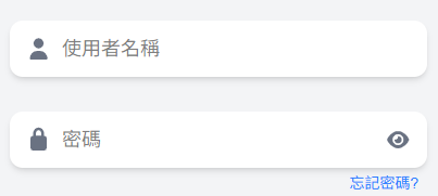
很簡單!這是可以在 Component 控制的。介紹幾種不同的方式:
<InputField
  /*.....*/
  showPwdBtn={true}
  showForgotPwdLink={true}
/>
👉 優點:靈活控制,語意清楚,簡單直觀。
👉 缺點:如果功能越加越多,props 可能變成十幾個,維護會變累。
type InputFieldVariant = "default" | "password" | "email";

<InputField
  /*.....*/
  variant="password"
/>
👉 優點:結構更清楚,避免 props 爆炸。
👉 缺點:彈性稍微比布林 props 小(但更好維護)。
<InputField
  /*.....*/
>
  <PasswordToggle />
  <ForgotPwdLink />
</InputField>
👉 彈性高,「基礎框架」不動,外部可以決定附加什麼內容。
👉 類似於 UI library( MUI、Ant Design )的設計哲學。
提供以上差異控制方式,能更有效控制程式碼重複、提高可維護性,真正落實 DRY 原則。
既然我們已經完成了 Components 拆分,接下來在歸檔時,也能依照 重複使用的組件 (components) 與 功能性組件 (feature) 來做分類,讓專案更加清晰易維護。
以下是我目前的專案目錄:
src
├── components                # 可重複使用的通用組件
│   ├── layout                # 版面配置相關
│   │   └── AuthLayout.tsx    # 登入/註冊頁專用的版型
│   └── ui                    # 基礎 UI 元件
│       └── InputField.tsx    # 輸入框元件

├── feature                   # 功能模組 (Feature-based)
│   ├── login                  # 登入功能
│   │   ├── index.tsx          # 登入頁面進入點
│   │   └── LoginForm.tsx      # 登入表單組件
│   └── register               # 註冊功能
│       ├── index.tsx          # 註冊頁面進入點
│       └── RegisterForm.tsx   # 註冊表單組件

├── lib                       # 第三方工具設定
│   └── fontawesome.ts         # FontAwesome 設定

├── utils                     # 輔助工具/函式
│   ├── cn.ts                  # Tailwind className 合併工具
│   └── validSchema.ts         # yup 驗證規則

├── App.tsx                   # React 主要應用程式入口 (路由設定)
├── index.css                 # 全域樣式
└── main.tsx                  # 專案進入點 (React DOM 綁定)
AuthLayout.tsx
import { Link } from "react-router-dom";
import type { ReactNode } from "react";

interface AuthLayoutProps {
  title: string;
  children: ReactNode;
  linkText: string;
  linkActionText: string;
  linkTo: string;
}

export default function AuthLayout({
  title,
  children,
  linkText,
  linkActionText,
  linkTo,
}: AuthLayoutProps) {
  return (
    <div className="h-screen flex flex-col items-center justify-center space-y-4 bg-gradient-to-bl from-primary-light to-slate-950">
      <p className="text-6xl text-white font-extrabold font-en-title drop-shadow-lg">
        {title}
      </p>
      {/* 表單頁面 */}
      <div className="w-md p-8 rounded-2xl bg-gray-100 shadow-xl">
        {children}
      </div>
      {/* 註冊頁引導 */}
      <p className="font-bold text-white">
        {linkText}
        <Link to={linkTo} className="text-blue-300 hover:underline ml-3">
          {linkActionText}
        </Link>
      </p>
    </div>
  );
}
InputField.tsx
import { useState } from "react";
import type {
  FieldErrors,
  FieldPath,
  FieldValues,
  UseFormRegister,
} from "react-hook-form";
import type { IconProp } from "@fortawesome/fontawesome-svg-core";

import { FontAwesomeIcon } from "@fortawesome/react-fontawesome";
import { cn } from "@utils/cn";

interface InputFieldProps<TFieldValues extends FieldValues> {
  readonly id: FieldPath<TFieldValues>;
  label: string;
  icon: IconProp;
  type: string;
  autoComplete?: string;

  register: UseFormRegister<TFieldValues>;
  errors: FieldErrors<TFieldValues>;
  showPwdBtn?: boolean;
  showForgotPwdLink?: boolean;
}

export default function InputField<
  TFieldValues extends FieldValues = FieldValues
>({
  id,
  label,
  icon,
  type = "text",
  autoComplete,
  register,
  errors,
  showPwdBtn = false,
  showForgotPwdLink = false,
}: InputFieldProps<TFieldValues>) {
  const [showPwd, setShowPwd] = useState(false);

  // 密碼顯示邏輯
  const isPasswordField = type === "password" || type === "confirmPassword";
  const inputType = isPasswordField
    ? showPwdBtn
      ? showPwd
        ? "text"
        : "password"
      : "text"
    : type;

  const handleForgetPwdClick = (e: React.MouseEvent<HTMLAnchorElement>) => {
    e.preventDefault();
    console.log("忘記密碼連結被點擊");
  };

  return (
    <div className="relative w-full">
      <label htmlFor={id} className="absolute">
        <span className="sr-only">{label}</span>
        <FontAwesomeIcon
          icon={icon}
          className="mt-4 ml-3.5 text-xl text-gray-500"
        />
      </label>

      <input
        id={id}
        {...register(id as FieldPath<TFieldValues>)}
        type={inputType}
        placeholder={label}
        autoComplete={autoComplete}
        className={cn(
          "w-full py-3 pl-12 rounded-xl text-lg bg-white shadow-md focus:outline-none focus:ring-2 focus:ring-primary transition duration-200",
          showPwdBtn && "pr-12",
          errors[id as FieldPath<TFieldValues>] &&
            "ring-1 ring-red-500 focus:ring-2 focus:ring-red-500"
        )}
      />

      {/* 密碼顯示/隱藏按鈕 */}
      {showPwdBtn && (
        <button
          type="button"
          onClick={() => setShowPwd((prev) => !prev)}
          className={cn(
            "absolute top-1/2 -translate-y-1/2 right-0 flex items-center pr-4 focus:outline-none"
          )}
          aria-label={showPwd ? "隱藏密碼" : "顯示密碼"}
        >
          <FontAwesomeIcon
            icon={showPwd ? "eye-slash" : "eye"}
            className="text-lg text-gray-500 hover:text-gray-500 cursor-pointer"
          />
        </button>
      )}

      {/* 錯誤訊息 */}
      {errors[id as FieldPath<TFieldValues>] && (
        <p className="absolute mt-1 ml-2 text-xs text-red-600">
          {errors[id as FieldPath<TFieldValues>]?.message}
        </p>
      )}

      {/* 忘記密碼連結 */}
      {showForgotPwdLink && (
        <div className="absolute mt-1 right-0 text-sm pr-2">
          <a
            href="#"
            onClick={handleForgetPwdClick}
            className="text-blue-500 hover:text-blue-500"
          >
            忘記密碼?
          </a>
        </div>
      )}
    </div>
  );
}
LoginPage.tsx
import AuthLayout from "@components/layout/AuthLayout.tsx";
import LoginForm from "./LoginForm.tsx";

export default function LoginPage() {
  return (
    <AuthLayout
      title="Sign In"
      linkText="沒有帳戶嗎?"
      linkActionText="建立一個吧!"
      linkTo="/register"
    >
      <LoginForm />
    </AuthLayout>
  );
}
LoginForm.tsx
import { useForm } from "react-hook-form";
import { yupResolver } from "@hookform/resolvers/yup";
import { loginSchema, type LoginInputs } from "../../utils/validSchema";

import InputField from "@components/ui/InputField";

export default function LoginForm() {
  const {
    register,
    handleSubmit,
    formState: { errors },
  } = useForm<LoginInputs>({
    resolver: yupResolver(loginSchema),
    mode: "onBlur",
  });

  const onSubmit = (data: LoginInputs) => {
    console.log("表單提交資料:", data);
  };

  return (
    <form onSubmit={handleSubmit(onSubmit)} className="flex flex-col space-y-8">
      {/* 使用者名稱 */}
      <InputField
        id="username"
        label="使用者名稱"
        icon="user"
        type="text"
        autoComplete="username"
        register={register}
        errors={errors}
      />

      {/* 密碼 */}
      <InputField
        id="password"
        label="密碼"
        icon="lock"
        type="password"
        autoComplete="current-password"
        register={register}
        errors={errors}
        showPwdBtn={true}
        showForgotPwdLink={true}
      />

      {/* 登入按鈕 */}
      <div className="flex justify-center">
        <button
          type="submit"
          className="w-3xs py-3 rounded-xl bg-primary-dark text-white text-xl font-bold hover:bg-primary focus:outline-none focus:ring-2 focus:ring-primary focus:ring-opacity-50 shadow-md transition duration-200"
        >
          登入
        </button>
      </div>
    </form>
  );
}


 iThome鐵人賽
 看影片追技術