導覽列範例
css
/* 導航列 */
.navbar {
  background-color: #2c3e50;/* 導覽列背景色(深藍灰色) */
  padding: 15px 0; /* 上下內距 15px,左右 0 */
  margin-bottom: 30px;/* 與下面元素間距 30px */
  border-bottom: 3px solid #34495e;/*底部 3px 實線邊框*/
}

.navbar ul{
  list-style: none;/* 移除清單前面的圓點符號 */
  margin: 0;/* 移除預設外距 */
  padding: 0 20px;/* 左右內距 20px,讓內容不會緊貼邊界 */
  display: flex;/* 使用 Flexbox 排版 */
  justify-content: center;/* 水平置中排列 */
}

.navbar li {
  margin: 0 15px;/* 每個選單項目左右間距 15px */
}

.navbar a {
  color: white;/* 文字顏色白色 */
  text-decoration: none;/* 移除超連結底線 */
  padding: 10px 15px;/* 內距(讓按鈕有點空間) */
  border-radius: 4px;/* 四角圓角化 4px */
  transition: background-color 0.3s;/* 背景色在 0.3 秒內平滑過渡 */
}

.navbar a:hover {/*當滑鼠移到 <a> 超連結上時,套用這段樣式*/
  background-color: #34495e;
}
結果展示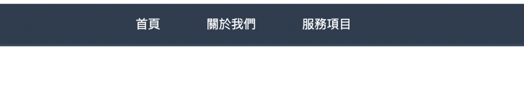
內容容器
css
/* 內容容器 */
.container {
  max-width: 900px;/* 最大寬度限制為 900px,避免內容太寬 */
  margin: 0 auto;/* 上下外距 0,左右 auto → 讓容器水平置中 */
  padding: 0 20px;/* 左右內距 20px,避免內容緊貼邊框 */
}
html
<div class="container">
  <p>內容會在容器中置中,最大寬度900px</p>
</div>
成果顯示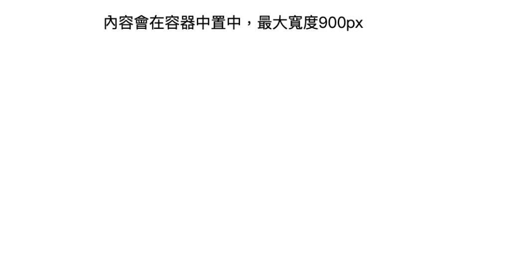
文章卡片陰影
ccs
.article-card {
  width: 500px;
  background: white;
  margin: 20px 0;
  padding: 25px;
  border: 1px solid #e1e8ed;
  border-radius: 12px;
  box-shadow: 0 2px 8px rgba(0,0,0.08);
  transition: box-shadow 0.3s ease;
}

.article-card:hover {
  box-shadow: 0 4px 16px rgba(0,0,0,0.12);
}
html
<div class="article-card">
  <h3>文章標題</h3>
  <p>文章內容,滑鼠移過看陰影變化效果</p>
</div>
顯示成果
滑鼠移入前: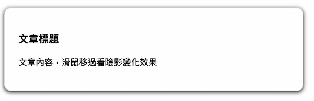
滑鼠移入後: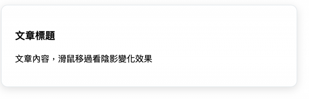


 iThome鐵人賽
 看影片追技術