css
.no-wrap {
 display: flex;
 flex-wrap: nowrap;
}
html
<div class="no-wrap">
 <div>很長的項目1</div>
 <div>很長的項目2</div>
 <div>很長的項目3</div>
 <div>很長的項目4</div>
</div>
顯示成果
css
.wrap {
 dispaly: flex;
 flex-wrap: wrap;
}
html
<div class="wrap">
 <div>項目1</div>
 <div>項目2</div>
 <div>項目3</div>
 <div>項目4</div>
 <div>項目5</div>
</div>
顯示成果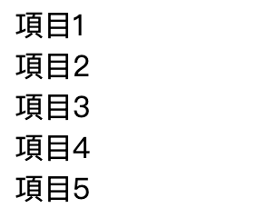
css
.wrap-reverse {
 width:  50px;
 display: flex;
 flex-wrap: wrap-reverse;
}
html
<div class="wrap-reverse">
 <div>項目1</div>
 <div>項目2</div>
 <div>項目3</div>
 <div>項目4</div>
 <div>項目5</div>
</div>
顯示成果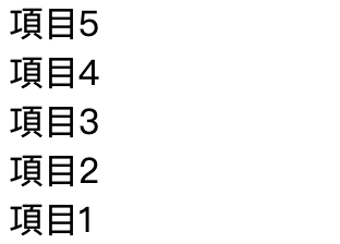
flex-flow: <flex-direction> <flex-wrap>;
範例:css
.flex-flow-example {
  width: 50px;
  display: flex;
  flex-flow: row wrap;
}
html
<div class="flex-flow-example">
  <div>項目1</div>
  <div>項目2</div>
  <div>項目3</div>
</div>
顯示成果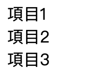
範例:css
.container {
  margin: 20px 0;
  padding: 15px;
  background-color: #fdf6e3;
  border-radius: 8px;
}

.flex-container {
  display: flex;
  width: 250px;
  gap: 10px;
  background-color: white;
  padding: 15px;
  border-radius: 5px;
}

.flex-item {
  background-color: #e67e22;
  color: white;
  paddinf: 15px;
  border-radius: 5px;
  width: 80px;
  text-align: center;
}

.flow1 {
  flex-flow: row wrap;
}/* 水平排列 (row),但空間不足時會換行 */

.flow2 {
  flex-direction: column;
/*   flex-flow: column nowrap; */
  width: 120px
}
/* 垂直排列 (column),而且不允許換行,所以會一直往下排 */

.flow3 {
  flex-flow: row-reverse wrap-reverse;
}/* 從右往左排列 (row-reverse),必要時會換行,而且換行方向也反轉 */
html
<div class="container">
    <h3>⚡ flex-flow: row wrap</h3>
    <div class="flex-container flow1">
      <div class="flex-item">1</div>
      <div class="flex-item">2</div>
      <div class="flex-item">3</div>
      <div class="flex-item">4</div>
    </div>
  </div>

  <div class="container">
    <h3>⚡ flex-flow: column nowrap</h3>
    <div class="flex-container flow2">
      <div class="flex-item">1</div>
      <div class="flex-item">2</div>
      <div class="flex-item">3</div>
    </div>
  </div>

  <div class="container">
    <h3>⚡ flex-flow: row-reverse wrap-reverse</h3>
    <div class="flex-container flow3">
      <div class="flex-item">1</div>
      <div class="flex-item">2</div>
      <div class="flex-item">3</div>
      <div class="flex-item">4</div>
    </div>
  </div>
顯示成果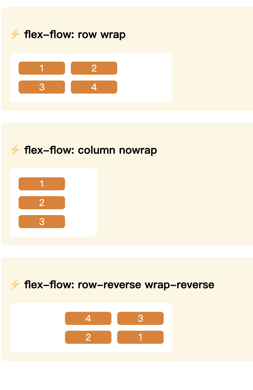


 iThome鐵人賽
 看影片追技術