flex這個屬性用在網頁排版,透過display:flex來使用,以下效果都需要display:flex才能運作
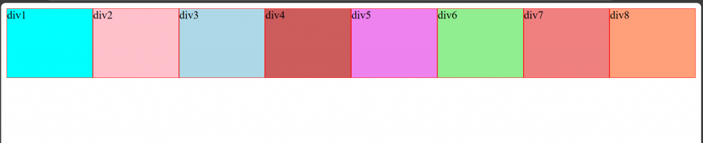
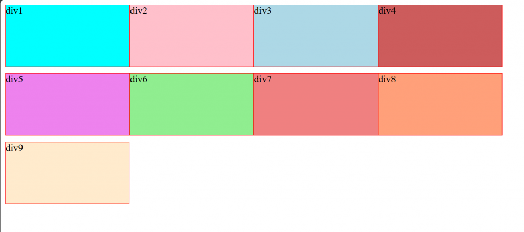
原本的div分布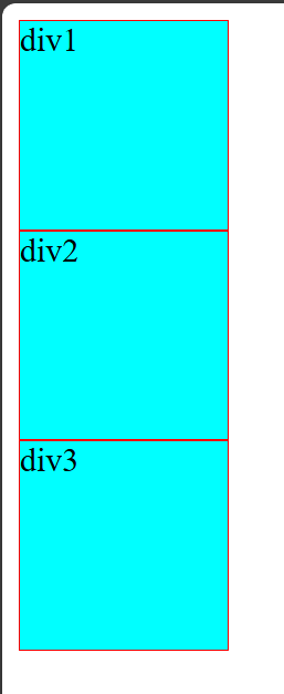
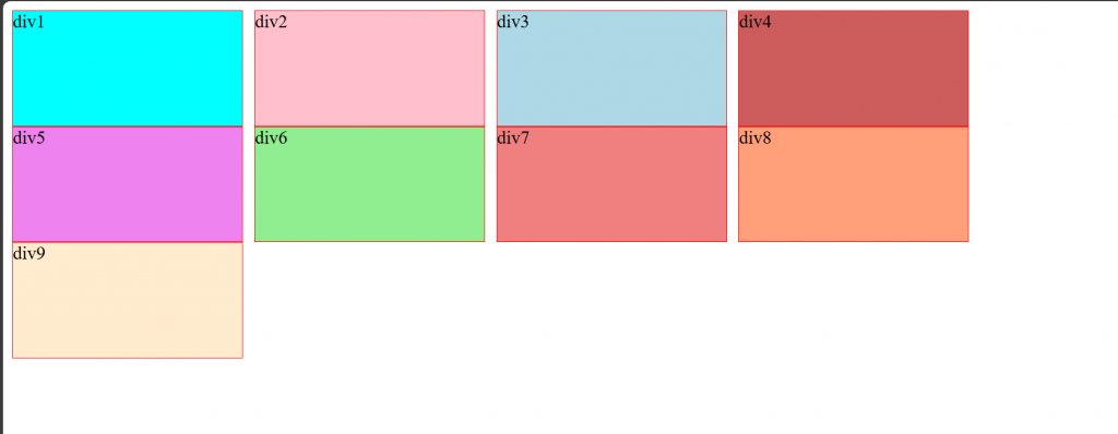
給body加上display:flex
body{display: flex;}
flex要用在容器上,將裡面的元素都變成彈性元素,不能用在被包裹的物件上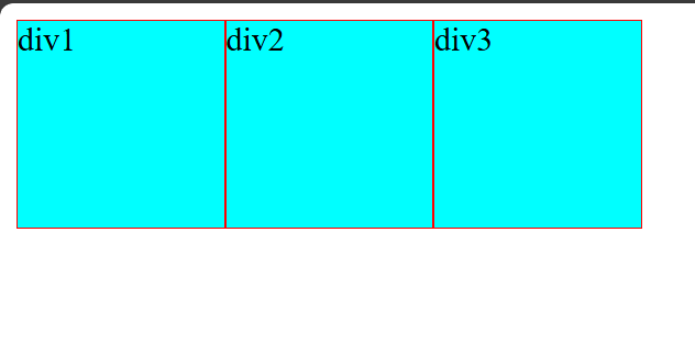
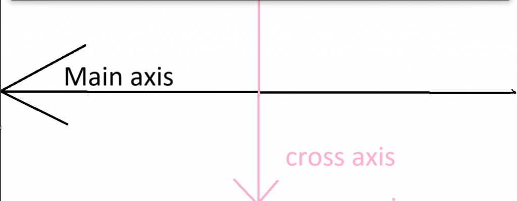
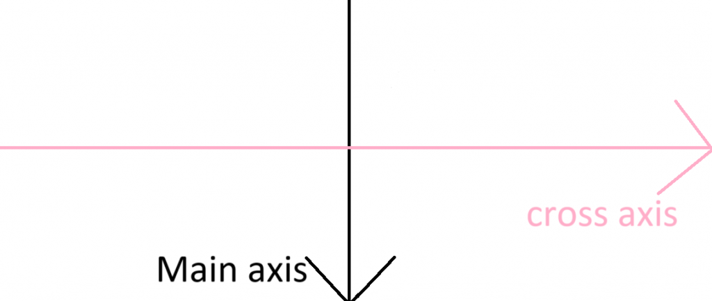
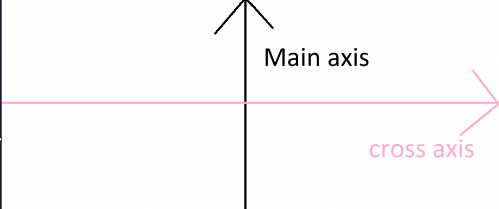
flex由Main axis與Cross axis為排版依據,雖然畫面上看不到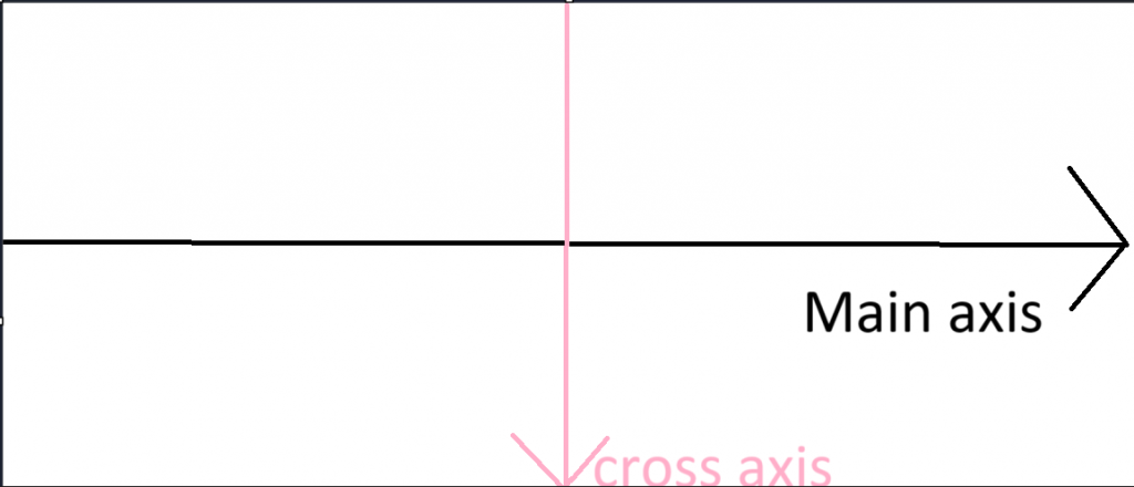
flex-directin會改變Main axis的方向,排序方向就會跟著變動
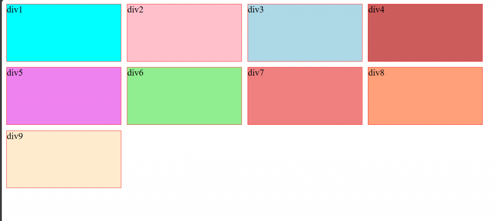
flex-direction:row橫向排序(默認)
flex-direction:row-reverse反向橫向排序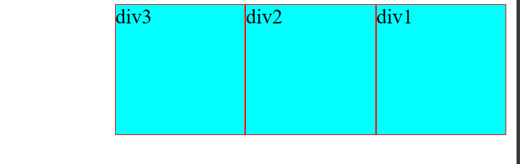
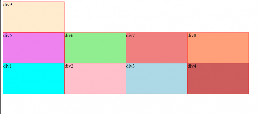
flex-direction:column縱向排序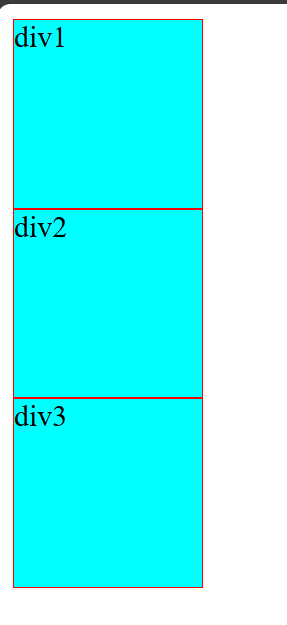
flex-direction:column-reverse反向縱向排序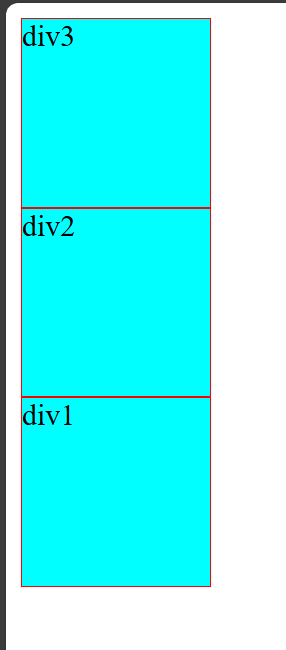
flex預設為不換行,當物件超過其容器寬度後flex會將全部物件壓縮至,容器能完全塞下物件的程度
目前已經被壓縮了
div{background-color: cyan;border: 1px solid red;width:150px;height: 100px;}
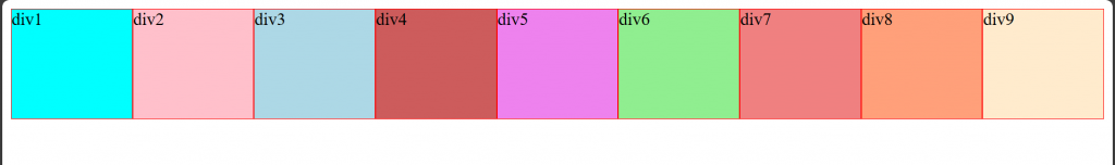
在塞一個div會再壓縮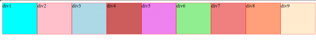
即便將寬度改大也不會有影響
div{background-color: cyan;border: 1px solid red;width:300px;height: 100px;}
需要換行的話就需要用flex-warp
flex-warp:nowarp不換行(默認)
flex-warp:warp會換行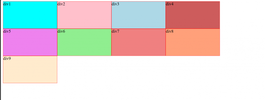
flex-warp:warp-reverse反向換行,超過的物件會把先前的往下擠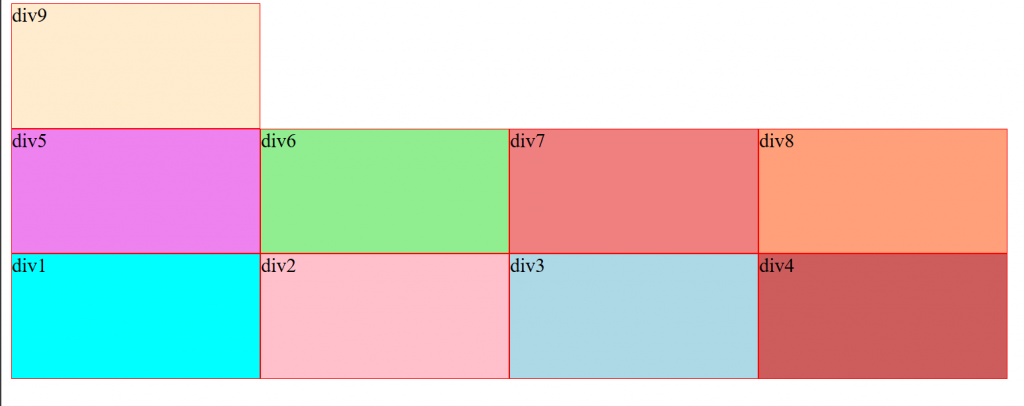
flex-flow:flex-warp與flex-direction的結合,可以一次設定兩者,未被設定的會用原默認設定
body{display: flex;flex-flow:wrap-reverse;}
gap:間距,設定容器中物間之間的距離
body{display: flex;flex-flow:wrap; gap:10px}
row-gap:只設定橫向間距
body{display: flex;flex-flow:wrap; row-gap:10px}
column-gap:只設定縱向間距
body{display: flex;flex-flow:wrap; column-gap:10px}


 看影片追技術