花了三天時間,一起初淺的學習了如何將 Web Component 使用在前端的三大框架中。
今天我們再一起將主角拉回建立 Web Component 的軌道上。
前端開發上有許許多多的框架,而建立 Web Component 其實也有一套框架(這時是不是想說那句經典台詞:老子學不動了啊~~~)。
別擔心,相信學會各大框架的你,這一定是輕而易舉,舉一就能反三的框架。
那麼今天要介紹關於開發 Web Component 的框架就是 Lit。
Lit is a simple library for building fast, lightweight web components.
At Lit's core is a boilerplate-killing component base class that provides reactive state, scoped styles, and a declarative template system that's tiny, fast and expressive.
-- from lit.dev
Lit 是由 Google 開發用來建立 Web Components 的輕量級框架。是基於原生的 Web Component 標準(Custom Elements + Shadow DOM + Template literals)的一層封裝。
使用 Lit 開發的元件其實都是標準的 Web Component。從我們這系列文章最初的介紹,到前三篇的解說之下,你應該可以了解到 Web Component 是具有非常好的互通性。
因為瀏覽器原生支持,所以 Web Component 可以用在任何 HTML 的環境中,可以跟任何框架配合使用,也可以不需要框架。
就跟我們平時在開發網頁一樣,其實也是為了讓開發更有效率,降低程式碼的複雜度,能用更簡潔的語法來開發 Web Component(前面寫的那麼多篇文章,相信你可能也被複雜大量的程式碼給嚇到了)。
extends HTMLElement 來繼承 HTMLElement 的屬性及方法?Lit 時,我們需要繼承 LitElement。ReactiveElement,讓元件可以有屬性到畫面的反應更新。export class CounterBtn extends LitElement {}
customElements.define(),@customElement 直接定義元件。export class CounterBtn extends HTMLElement { // 略... }
customElements.define('counter-btn', CounterBtn);
@customElement:注意: @customElement 是裝飾器語法,需要經過編譯,像是
TypeScript或Babel才能運行。
@customElement('counter-btn')
export class CounterBtn extends LitElement {  // 略... }
元件的 Shadow DOM:
由於我們已經繼承了 LitElement 所以不需要再像原生的寫法一樣使用 shadowRoot = this.attachShadow({ mode: 'open' }),Lit 會自動啟用 Shadow DOM。
模板的寫入:
你是否還記得,之前都是使用 const template = document.createElement('template') 之後寫入 innerHTML。
而在 Lit 中,你會需要建立一個 render() 的方法,並使用 html 寫入 template。
render() {
  const template = document.createElement('template');
  template.innerHTML = `<p>Hello Custom Element</p>`;
}
render(){
  return html`<p>Hello Custom Element</p>`;
}
template.innerHTML 中,而 Lit 提供了 static styles = css 方法,定義在 class 中寫入樣式。static styles = css`
button {
padding: 0.5rem;
border-bottom: 1px solid #ccc;
display: flex;
justify-content: space-between;
align-items: center;
}
`;
在這篇文章,我希望實作一個 counter 的元件作為範例。
vite 建立一個前端專案,選擇 TypeScriptnpm create vite@latest lit-demo
npm install lit
tsconfig.json 加上規則,讓我們可以使用 lit 裝飾器"compilerOptions": {
//...略
"experimentalDecorators": true,
}
src/counter.ts 中引入 Lit 相關方法及屬性import { LitElement, html, css } from 'lit';
import { customElement } from 'lit/decorators.js';
@customElement('counter-btn')
export class CounterBtn extends LitElement {
  // 定義樣式
  static styles = css`
    .counter-wrapper {
      display: flex;
      flex-direction: column;
      align-items: center;
      gap: 16px;
      padding: 32px;
    }

    .counter {
      display: flex;
      align-items: center;
      gap: 8px;
    }

    button {
      padding: 0.5rem 1rem;
      font-size: 1rem;
      border: none;
      border-radius: 4px;
      cursor: pointer;
    }

    button.increment {
      background-color: #e1d9d9;
    }

    button.decrement {
      background-color: #c9b7b7;
    }

    button.reset {
      background-color: #0d2b44;
      color: white;
    }
  `

  // 寫入模板相關內容
  render() {
    return html`
      <div class="counter-wrapper">
        <div class="counter">
          <button class="decrement">-</button>
          <span>Count:</span>
          <button class="increment">+</button>
        </div>
        <button class="reset">Reset</button>
      </div>
    `
  }
}
main.ts 中引入元件import './counter.ts'
const app = document.querySelector('#app')!;
// 建立一個 counter 元件
const counter = document.createElement('counter-btn');
app.appendChild(counter);
index.html 中引入 main.ts
<body>
  <div id="app"></div>
  <script type="module" src="/src/main.js"></script>
</body>
npm run dev 跑起來看看元件是否有出現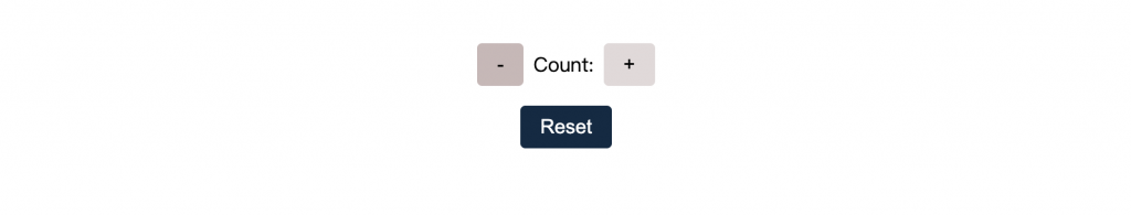
恭喜!使用 Lit 初步建立的元件就定義好囉~
那麼明天,我們再來說說關於屬性還有事件的傳遞吧 d(`・∀・)b !


 iThome鐵人賽
 看影片追技術