在前面兩篇文章,介紹了 Lit 的元件初始化與屬性。
完成靜態元件後,接下來要介紹 Lit 的生命週期(Life cycle)與事件(Event),讓元件可以動起來!
你是否還記得在 Day 6: Web Component 的生命週期 Life cycle 中有介紹過原生 Web Component 的生命週期呢?
原生的生命週期包含以下:
Lit 除了繼承原生的自訂元素生命週期方法之外,還引入了 reactive update cycle(響應式更新周期),當響應式屬性改變時,它會渲染 DOM 的變化。
注意:在 Lit 中使用 connectedCallback 時,記得加入
super.connectedCallback()。
update(changedProperties):當屬性或狀態變化即將導致畫面更新時觸發,通常用來初始化屬性或綁定方法(這時候還沒有建立起 Shadow DOM)。render():Lit 會負責輸出 HTML Template,回傳 html 樣板(這階段 Shadow DOM 已建立完成)。updated(changedProperties):畫面更新完畢後觸發(每次屬性變化都會觸發)firstUpdated(changedProperties):僅在第一次渲染完成後觸發一次,通常用來抓 DOM 的節點。constructor() {
super();
this.count = 10;
this.disabled = false;
this.title = 'WC-Lit Counter';
console.log('constructor')
}
connectedCallback() {
super.connectedCallback();
console.log('connectedCallback');
}
update(changedProps: Map<PropertyKey, any>) {
console.log('update');
super.update(changedProps);
}
render() {
console.log('render');
return html`<button>Count: ${this.count}</button>`;
}
updated(changedProps: Map<PropertyKey, any>) {
console.log('updated');
}
firstUpdated(changedProps: Map<string, any>) {
console.log('firstUpdated');
}
這是初次掛載時 consloe 會看見的:
constructor -> connectedCallback -> update -> render -> firstUpdated -> updated
那接下來我們來看看後續屬性更新時會觸發的幾個生命週期,我們先在 firstUpdated 的週期中綁定按鈕事件:
firstUpdated(changedProps: Map<string, any>) {
  console.log('firstUpdated');

  // 模板第一次完成 render,此時已經可以操作 DOM 元素。
  this.shadowRoot!.querySelector('button')!
    .addEventListener('click', () => {
      this.count++
    });
}
當我們按下畫面上的按鈕,屬性變化時,會觸發以下生命週期:
update -> render -> updated
以上大致是 Lit 生命週期的粗粗粗淺介紹,因為內容真的太多了,有興趣的讀者可以去看看 Lit-Lifecycle。
另外補充:
Lit 其實還提供了 requestUpdate(name?, oldValue?),可以讓使用者手動觸發更新,而不是等屬性改變才更新。
適合使用在當屬性沒有透過 @property 控制,需要手動觸發更新時使用。
接下來我們來說說 Event 吧!
在上一篇文章中我們有提到了兩個 Lit 的模板表達式 expressions,分別是 ${}, ?。
那這一篇我們就來說說 @event。
在剛剛我們在 firstUpdated 的響應式更新生命週期中加入了事件綁定,而現在要使用 @event,直接在模板中綁定事件,像是 @click。
<button @click=${this.handleClick}>Click me</button>
注意:其中
${this.handleClick}不用加(),否則會立即執行。
import { LitElement, html, css } from 'lit';
import { customElement, property } from 'lit/decorators.js';

@customElement('counter-btn')
export class CounterBtn extends LitElement {
  @property({ type: Number, reflect: true }) count!: number;
  @property({ type: Boolean, reflect: true }) disabled!: boolean;
  @property({ type: String,  reflect: true }) title!: string;

  // 建構函數:初始化組件屬性
  constructor() {
    super();
    this.count = 10;
    this.disabled = false;
    this.title = 'WC-Lit Counter';
  }

  // 定義樣式
  static styles = css`
    // ...略
  `

  // 增加按鈕
  increment() {
    this.count++;
    this._dispatchCountChanged();
  }

  // 減少按鈕
  decrement() {
    this.count--;
    this._dispatchCountChanged();
  }

  // 重置
  reset() {
    this.count = 10;
    this._dispatchCountChanged();
  }

  // 發送自訂事件給外部
  private _dispatchCountChanged() {
    this.dispatchEvent(
      new CustomEvent('count-changed', {
        detail: { count: this.count },
        bubbles: true,
        composed: true,
      })
    );
  }

  // render
  render() {
    return html`
      <div class="counter-wrapper">
        <h3>${this.title}</h3>
        <div class="counter">
          <button class="decrement" @click=${this.decrement}>-</button>
          <span>Count: ${this.count}</span>
          <button class="increment" @click=${this.increment}>+</button>
        </div>
        <button class="reset" ?disabled=${this.disabled} @click=${this.reset}>
          Reset
        </button>
      </div>
    `;
  }
}
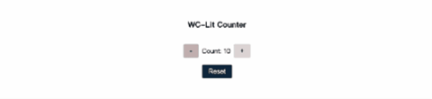
透過這三天的文章,我們使用 Lit 完成了基本的 counter-btn。
其實關於 Lit 這個框架,還是有許多要學習的地方,也再請大家一起深入研究囉!


 看影片追技術