在現代前端開發中,資料視覺化已成為不可或缺的核心技能。無論是產品經理需要洞察用戶行為,還是管理者要掌握營運全貌,都需要透過圖表來「看見」數據背後的真相。
今天我們將在「飲料魔法之旅」中,召喚占星水晶球——一個能將複雜數據轉化為清晰圖像的魔法工具。透過 Vue.js 的響應式魔法與 Chart.js 的繪圖咒語,我們將為飲料店打造一個強大的資料分析儀表板,讓管理者一眼看透顧客偏好、年齡分布、消費趨勢等關鍵資訊。
在飲料店的日常營運中,管理者面臨著諸多挑戰:
為了達成這個目的資料視覺化就是一個幫助顧客或是分析師整理的好方法,除了可以把一覽無遺的raw data轉換為精美有趣得圖表外~我們也可以看清楚趨勢跟變化
畢竟人類還是視覺動物咩~~ 圖還是比文字還親切
| 角色 | 需求 | 獲得的好處 | 成功條件 |
|---|---|---|---|
| 店長 roni | 了解飲品銷售占比 | 優化庫存配置,提升利潤 | 清楚看到各飲料銷售比例 |
| 行銷專員 | 掌握客群年齡分布 | 制定精準行銷策略 | 年齡分層數據一目了然 |
| 營運經理 | 追蹤每日銷售趨勢 | 預測需求高峰時段 | 時間序列圖表清晰呈現 |
| 數據分析師 | 分析年齡與消費關聯 | 發現潛在商機 | 散點圖揭示隱藏模式 |
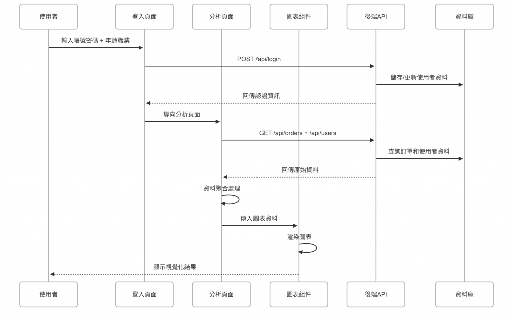
今天我們先思考一下
使用者的操作流程~
接者
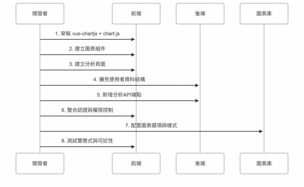
就輪到我們魔法師今天要執行的步驟了
請按照這個步驟去定義跟修改程式碼吧
後端的部分我不會著墨太多
但是該要用到的資料還是需要提醒大家~
畢竟前端要怎麼跟後端溝通,資料的型別跟call的api路徑還是要雙方有共識跟定義好!!
user.json){
"username": "string", // 使用者名稱
"password": "string", // 密碼
"role": "admin|user", // 角色權限
"token": "string", // 認證令牌
"preferredLocale": "string", // 偏好語系
"age": "number", // 年齡 (12-100) - 新增
"job": "string", // 職業 - 新增
"createdAt": "ISOString" // 建立時間 - 新增
}
為什麼需要這些欄位?
age: 用於年齡分布分析,了解客群結構job: 職業分析,發現不同職業的消費偏好createdAt: 追蹤使用者成長趨勢order.json){
"id": "string", // 訂單ID
"name": "string", // 使用者名稱
"drink": "string", // 飲料類型
"sweetness": "string", // 甜度選擇
"ice": "string", // 冰量選擇
"note": "string", // 備註
"createdAt": "ISOString", // 建立時間
"updatedAt": "ISOString" // 更新時間
}
GET /api/analytics/summary (僅 admin)
{
  "drinkShare": {
    "labels": ["紅茶", "綠茶", "抹茶拿鐵", "巧克力"],
    "data": [15, 12, 8, 5]
  },
  "ageDistribution": {
    "labels": ["18-24", "25-34", "35-44", "45+"],
    "data": [8, 12, 6, 4]
  },
  "timeSeries": {
    "labels": ["2025-10-01", "2025-10-02", "2025-10-03"],
    "data": [5, 8, 12]
  },
  "scatter": [
    {"x": 22, "y": 3},
    {"x": 28, "y": 5}
  ]
}
為什麼需要這些API?
DrinkShareChart.vue)<script setup>
import { computed } from 'vue'
import { Pie } from 'vue-chartjs'
import {
Chart as ChartJS,
ArcElement,
Tooltip,
Legend
} from 'chart.js'
ChartJS.register(ArcElement, Tooltip, Legend)
const props = defineProps({
labels: { type: Array, required: true }, // 飲料名稱陣列
data: { type: Array, required: true } // 對應數量陣列
})
const chartData = computed(() => ({
labels: props.labels,
datasets: [{
data: props.data,
backgroundColor: [
'#FF6384', '#36A2EB', '#FFCE56', '#4BC0C0',
'#9966FF', '#FF9F40'
],
borderColor: [
'#FF6384', '#36A2EB', '#FFCE56', '#4BC0C0',
'#9966FF', '#FF9F40'
],
borderWidth: 2
}]
}))
const chartOptions = computed(() => {
const prefersReducedMotion = window.matchMedia('(prefers-reduced-motion: reduce)').matches
return {
responsive: true,
maintainAspectRatio: false,
plugins: {
legend: {
position: 'bottom',
labels: {
padding: 20,
usePointStyle: true
}
},
tooltip: {
callbacks: {
label: function(context) {
const label = context.label || ''
const value = context.parsed
const total = context.dataset.data.reduce((a, b) => a + b, 0)
const percentage = ((value / total) * 100).toFixed(1)
return `${label}: ${value} 杯 (${percentage}%)`
}
}
}
},
animation: {
duration: prefersReducedMotion ? 0 : 800
}
}
})
</script>
<template>
<figure role="img" :aria-label="`飲品佔比圖表,顯示 ${labels.join('、')} 等飲料的銷售比例`">
<div class="chart-container">
<Pie :data="chartData" :options="chartOptions" />
</div>
<figcaption class="chart-caption">
飲品佔比分析 - 總計 {{ data.reduce((a, b) => a + b, 0) }} 杯
</figcaption>
</figure>
</template>
<style scoped>
.chart-container {
height: 300px;
position: relative;
}
.chart-caption {
text-align: center;
margin-top: 12px;
font-size: 14px;
color: #666;
font-weight: 500;
}
</style>
使用方式:
<DrinkShareChart
  :labels="['紅茶', '綠茶', '抹茶拿鐵']"
  :data="[15, 12, 8]"
/>
AgeDistributionChart.vue)<script setup>
import { computed } from 'vue'
import { Bar } from 'vue-chartjs'
import {
Chart as ChartJS,
CategoryScale,
LinearScale,
BarElement,
Title,
Tooltip,
Legend
} from 'chart.js'
ChartJS.register(
CategoryScale,
LinearScale,
BarElement,
Title,
Tooltip,
Legend
)
const props = defineProps({
labels: { type: Array, required: true }, // 年齡區間標籤
data: { type: Array, required: true } // 對應人數
})
const chartData = computed(() => ({
labels: props.labels,
datasets: [{
label: '使用者數量',
data: props.data,
backgroundColor: 'rgba(54, 162, 235, 0.6)',
borderColor: 'rgba(54, 162, 235, 1)',
borderWidth: 2,
borderRadius: 4,
borderSkipped: false
}]
}))
const chartOptions = computed(() => {
const prefersReducedMotion = window.matchMedia('(prefers-reduced-motion: reduce)').matches
return {
responsive: true,
maintainAspectRatio: false,
plugins: {
legend: { display: false },
tooltip: {
callbacks: {
label: function(context) {
return `${context.label}: ${context.parsed.y} 人`
}
}
}
},
scales: {
y: {
beginAtZero: true,
ticks: { stepSize: 1 },
title: { display: true, text: '使用者數量' }
},
x: {
title: { display: true, text: '年齡區間' }
}
},
animation: {
duration: prefersReducedMotion ? 0 : 800
}
}
})
</script>
<template>
<figure role="img" :aria-label="`年齡分布圖表,顯示 ${labels.join('、')} 等年齡區間的使用者分布`">
<div class="chart-container">
<Bar :data="chartData" :options="chartOptions" />
</div>
<figcaption class="chart-caption">
年齡分布分析 - 總計 {{ data.reduce((a, b) => a + b, 0) }} 人
</figcaption>
</figure>
</template>
<style scoped>
.chart-container {
height: 300px;
position: relative;
}
.chart-caption {
text-align: center;
margin-top: 12px;
font-size: 14px;
color: #666;
font-weight: 500;
}
</style>
TimeSeriesChart.vue)<script setup>
import { computed } from 'vue'
import { Line } from 'vue-chartjs'
import {
Chart as ChartJS,
CategoryScale,
LinearScale,
PointElement,
LineElement,
Title,
Tooltip,
Legend
} from 'chart.js'
ChartJS.register(
CategoryScale,
LinearScale,
PointElement,
LineElement,
Title,
Tooltip,
Legend
)
const props = defineProps({
labels: { type: Array, required: true }, // 日期標籤
data: { type: Array, required: true }, // 對應訂單數
title: { type: String, default: '時間趨勢' }
})
const chartData = computed(() => ({
labels: props.labels,
datasets: [{
label: '訂單數量',
data: props.data,
backgroundColor: 'rgba(75, 192, 192, 0.4)',
borderColor: 'rgba(75, 192, 192, 1)',
fill: true,
tension: 0.3
}]
}))
const chartOptions = computed(() => {
const prefersReducedMotion = window.matchMedia('(prefers-reduced-motion: reduce)').matches
return {
responsive: true,
maintainAspectRatio: false,
plugins: {
legend: { display: false },
title: {
display: true,
text: props.title
},
tooltip: {
mode: 'index',
intersect: false
}
},
scales: {
y: {
beginAtZero: true,
ticks: { stepSize: 1 },
title: { display: true, text: '訂單數量' }
},
x: {
title: { display: true, text: '日期' }
}
},
animation: {
duration: prefersReducedMotion ? 0 : 800
}
}
})
</script>
<template>
<figure role="img" :aria-label="`時間趨勢圖表,顯示每日訂單數量變化`">
<div class="chart-container">
<Line :data="chartData" :options="chartOptions" />
</div>
<figcaption class="chart-caption">
{{ title }} - 總計 {{ data.reduce((a, b) => a + b, 0) }} 筆訂單
</figcaption>
</figure>
</template>
<style scoped>
.chart-container {
height: 300px;
position: relative;
}
.chart-caption {
text-align: center;
margin-top: 12px;
font-size: 14px;
color: #666;
font-weight: 500;
}
</style>
AgeVsCupsScatter.vue)<script setup>
import { computed } from 'vue'
import { Scatter } from 'vue-chartjs'
import {
Chart as ChartJS,
LinearScale,
PointElement,
Tooltip,
Legend
} from 'chart.js'
ChartJS.register(LinearScale, PointElement, Tooltip, Legend)
const props = defineProps({
data: { type: Array, required: true } // [{ x: age, y: totalCups }]
})
const chartData = computed(() => ({
datasets: [{
label: '年齡 vs. 消費杯數',
data: props.data,
backgroundColor: 'rgba(153, 102, 255, 0.6)',
borderColor: 'rgba(153, 102, 255, 1)',
pointRadius: 6,
pointHoverRadius: 8
}]
}))
const chartOptions = computed(() => {
const prefersReducedMotion = window.matchMedia('(prefers-reduced-motion: reduce)').matches
return {
responsive: true,
maintainAspectRatio: false,
plugins: {
legend: { display: false },
tooltip: {
callbacks: {
label: function(context) {
const point = context.raw
return `年齡: ${point.x} 歲, 消費: ${point.y} 杯`
}
}
}
},
scales: {
x: {
type: 'linear',
position: 'bottom',
title: { display: true, text: '年齡' }
},
y: {
beginAtZero: true,
title: { display: true, text: '總杯數' }
}
},
animation: {
duration: prefersReducedMotion ? 0 : 800
}
}
})
</script>
<template>
<figure role="img" :aria-label="`年齡與消費量關聯圖表,顯示使用者年齡與總消費杯數的關係`">
<div class="chart-container">
<Scatter :data="chartData" :options="chartOptions" />
</div>
<figcaption class="chart-caption">
年齡與消費量關聯分析
</figcaption>
</figure>
</template>
<style scoped>
.chart-container {
height: 300px;
position: relative;
}
.chart-caption {
text-align: center;
margin-top: 12px;
font-size: 14px;
color: #666;
font-weight: 500;
}
</style>
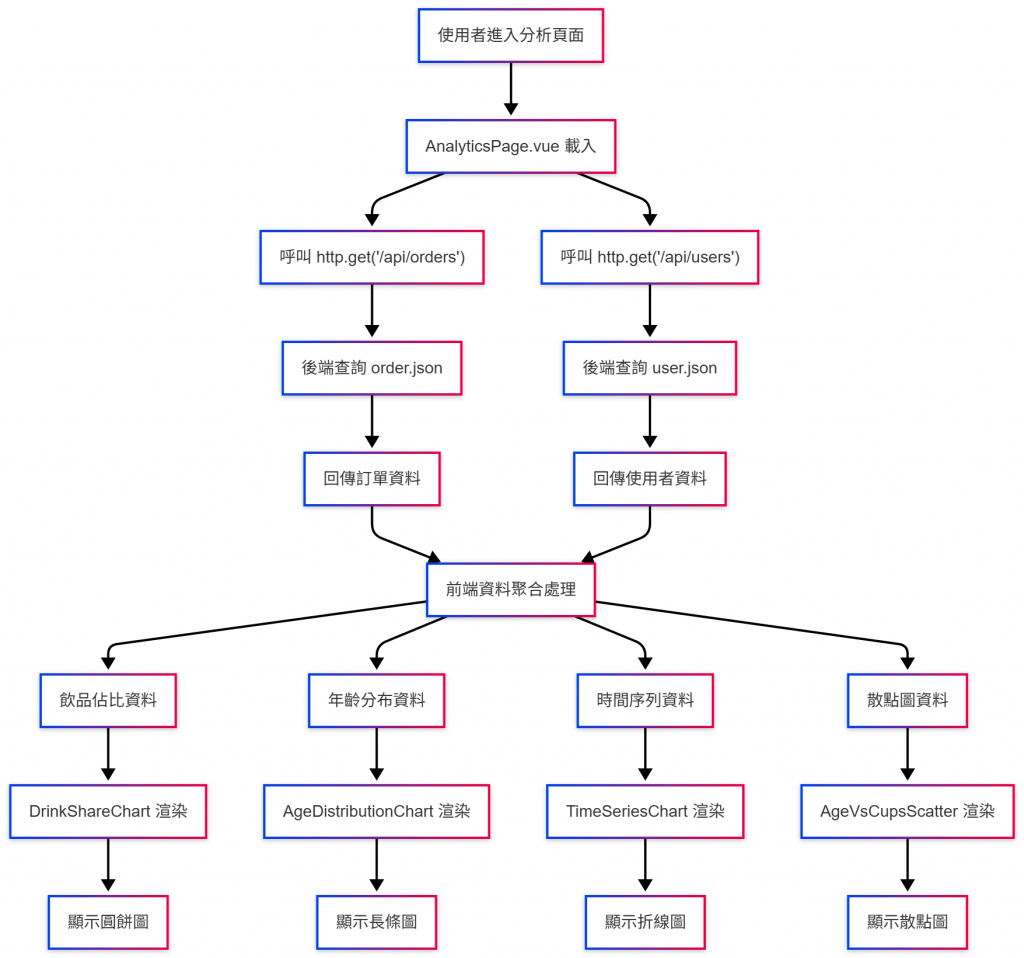
AnalyticsPage.vue)前面我們有講過一些概念
pages: 主要是用來呈現的頁面
components:用來放會重複利用的組件
這邊雖然各分析圖表也可以當作pages來呈現,不過我們可以想像如果設計的好意點的話
連標籤或是title這些字眼都可以透過後端傳資料,也就是動態的形式
比如說圓餅圖需要的label跟data只要設計夠好,我們就可以把這個圓餅分析表用在其他的地方上比如說我今天不做飲料改作時裝設計!? 或是衣服店的銷售狀況!!
這種時候就很適合做compoent的概念!!
<script setup>
import { ref, onMounted } from 'vue'
import { useI18n } from 'vue-i18n'
import { useToastStore } from '../stores/toastStore'
import { http } from '../services/http'
import DrinkShareChart from '../components/charts/DrinkShareChart.vue'
import AgeDistributionChart from '../components/charts/AgeDistributionChart.vue'
import TimeSeriesChart from '../components/charts/TimeSeriesChart.vue'
import AgeVsCupsScatter from '../components/charts/AgeVsCupsScatter.vue'

const { t } = useI18n()
const toast = useToastStore()

// 狀態管理
const loading = ref(true)
const error = ref('')

// 圖表資料
const drinkShareData = ref({ labels: [], data: [] })
const ageDistributionData = ref({ labels: [], data: [] })
const timeSeriesData = ref({ labels: [], data: [] })
const scatterData = ref([])

// 載入分析資料
async function loadAnalyticsData() {
  try {
    loading.value = true
    error.value = ''

    // 載入訂單和使用者資料
    const [ordersResponse, usersResponse] = await Promise.all([
      http.get('/api/orders'),
      http.get('/api/users')
    ])

    const orders = ordersResponse.data
    const users = usersResponse.data

    // 處理飲品佔比資料
    processDrinkShareData(orders)

    // 處理年齡分布資料
    processAgeDistributionData(users)

    // 處理時間序列資料
    processTimeSeriesData(orders)

    // 處理散點圖資料
    processScatterData(orders, users)

  } catch (err) {
    error.value = '載入分析資料失敗'
    toast.error('載入分析資料失敗')
    console.error('Analytics error:', err)
  } finally {
    loading.value = false
  }
}

// 處理飲品佔比資料
function processDrinkShareData(orders) {
  const drinkCounts = {}

  orders.forEach(order => {
    const drink = order.drink
    drinkCounts[drink] = (drinkCounts[drink] || 0) + 1
  })

  drinkShareData.value = {
    labels: Object.keys(drinkCounts),
    data: Object.values(drinkCounts)
  }
}

// 處理年齡分布資料
function processAgeDistributionData(users) {
  const ageBuckets = {
    '18-24': 0,
    '25-34': 0,
    '35-44': 0,
    '45+': 0
  }

  users.forEach(user => {
    if (user.age) {
      if (user.age >= 18 && user.age <= 24) {
        ageBuckets['18-24']++
      } else if (user.age >= 25 && user.age <= 34) {
        ageBuckets['25-34']++
      } else if (user.age >= 35 && user.age <= 44) {
        ageBuckets['35-44']++
      } else if (user.age >= 45) {
        ageBuckets['45+']++
      }
    }
  })

  ageDistributionData.value = {
    labels: Object.keys(ageBuckets),
    data: Object.values(ageBuckets)
  }
}

// 處理時間序列資料
function processTimeSeriesData(orders) {
  const dailyCounts = {}

  orders.forEach(order => {
    const date = new Date(order.createdAt).toISOString().split('T')[0]
    dailyCounts[date] = (dailyCounts[date] || 0) + 1
  })

  // 按日期排序
  const sortedDates = Object.keys(dailyCounts).sort()

  timeSeriesData.value = {
    labels: sortedDates,
    data: sortedDates.map(date => dailyCounts[date])
  }
}

// 處理散點圖資料
function processScatterData(orders, users) {
  const userCupCounts = {}

  // 計算每個使用者的總杯數
  orders.forEach(order => {
    const username = order.name
    userCupCounts[username] = (userCupCounts[username] || 0) + 1
  })

  // 建立散點圖資料
  const scatterPoints = []

  users.forEach(user => {
    if (user.age && userCupCounts[user.username]) {
      scatterPoints.push({
        x: user.age,
        y: userCupCounts[user.username]
      })
    }
  })

  scatterData.value = scatterPoints
}

onMounted(() => {
  loadAnalyticsData()
})
</script>

<template>
  <section class="analytics-page">
    <h2>{{ t('pages.analytics') }}</h2>

    <div v-if="loading" class="loading-message">
      🔄 {{ t('common.loading') }}
    </div>

    <div v-else-if="error" class="error-message">
      ⚠️ {{ error }}
      <button @click="loadAnalyticsData" class="btn btn-sm">{{ t('actions.reload') }}</button>
    </div>

    <div v-else class="analytics-grid">
      <!-- 飲品佔比圖表 -->
      <div class="chart-card">
        <h3>飲品佔比分析</h3>
        <DrinkShareChart
          :labels="drinkShareData.labels"
          :data="drinkShareData.data"
        />
      </div>

      <!-- 年齡分布圖表 -->
      <div class="chart-card">
        <h3>年齡分布分析</h3>
        <AgeDistributionChart
          :labels="ageDistributionData.labels"
          :data="ageDistributionData.data"
        />
      </div>

      <!-- 時間趨勢圖表 -->
      <div class="chart-card">
        <h3>時間趨勢分析</h3>
        <TimeSeriesChart
          :labels="timeSeriesData.labels"
          :data="timeSeriesData.data"
          title="每日訂單趨勢"
        />
      </div>

      <!-- 年齡 vs 消費量散點圖 -->
      <div class="chart-card">
        <h3>年齡與消費量關聯</h3>
        <AgeVsCupsScatter :data="scatterData" />
      </div>
    </div>

    <div class="analytics-actions" style="margin-top: 24px;">
      <button @click="loadAnalyticsData" class="btn primary">
        {{ t('actions.refreshData') }}
      </button>
      <router-link to="/order" class="btn">
        {{ t('actions.backToOrder') }}
      </router-link>
    </div>
  </section>
</template>

<style scoped>
.analytics-page {
  padding: 20px;
  max-width: 1200px;
  margin: 0 auto;
}

.analytics-grid {
  display: grid;
  grid-template-columns: repeat(auto-fit, minmax(500px, 1fr));
  gap: 24px;
  margin-top: 20px;
}

.chart-card {
  background: #fff;
  border: 1px solid #e5e7eb;
  border-radius: 12px;
  padding: 20px;
  box-shadow: 0 2px 8px rgba(0, 0, 0, 0.1);
}

.chart-card h3 {
  margin: 0 0 16px 0;
  font-size: 18px;
  font-weight: 600;
  color: #1f2937;
  text-align: center;
}

.analytics-actions {
  display: flex;
  gap: 12px;
  justify-content: center;
}

.loading-message, .error-message {
  text-align: center;
  padding: 40px;
  font-size: 16px;
}

.error-message {
  color: #dc2626;
  background: #fef2f2;
  border: 1px solid #fecaca;
  border-radius: 8px;
}

@media (max-width: 768px) {
  .analytics-grid {
    grid-template-columns: 1fr;
    gap: 16px;
  }

  .chart-card {
    padding: 16px;
  }
}
</style>
今天的程式碼在這
後端可以直接從github下載來玩
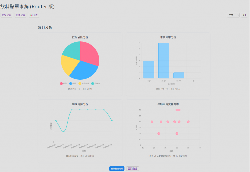
今天整理完大概會長這樣
是不是感覺非常複雜~
其實一點也不
我們今天用到的套件其實也只是踩在別人造好的輪子上~~
千萬別想不開去客製化這些圖表XDD => 當然有特殊需求的還是要做拉!!!
驗收
我們成功召喚了占星水晶球,為飲料點單系統注入了強大的資料視覺化魔法:
透過今天的魔法實作,我們掌握了:
今天的「占星水晶球」實作,不僅讓我們學會了資料視覺化的核心技能,更重要的是培養了數據思維。在現代前端開發中,能夠將複雜的數據轉化為直觀的視覺呈現,是每個開發者都應該具備的能力。
透過 Vue.js 的響應式魔法與 Chart.js 的繪圖咒語,我們成功打造了一個功能完整、易於擴展的資料分析系統。這不僅是技術的實現,更是對使用者需求的深度理解和解決方案的優雅呈現。
讓我們繼續在 Vue 魔法的道路上探索,用代碼創造更多令人驚艷的魔法體驗!