各位大大您好:
我想作響應式網頁
當銀幕較大時會顯示這樣,先是一排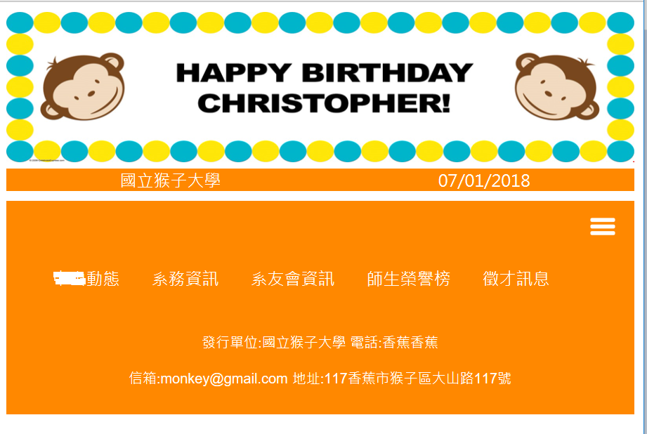
銀幕較小時會顯示這樣,會顯示很多排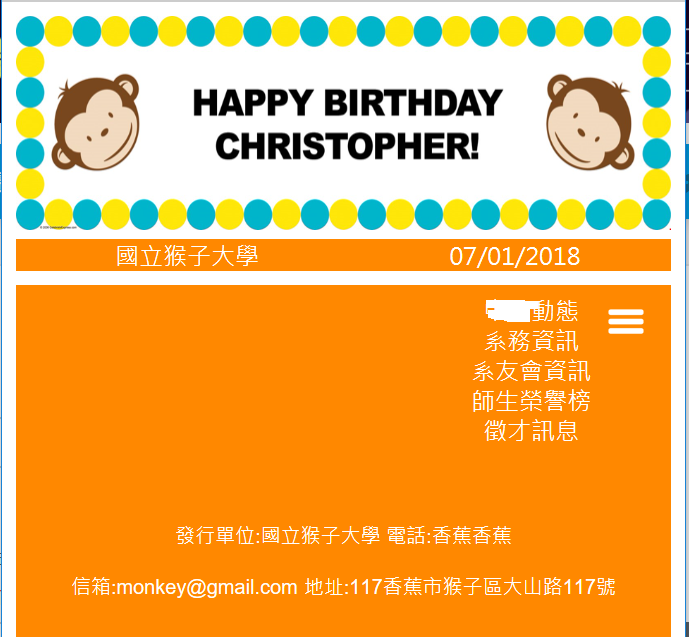
銀幕中間會有過渡期,會變兩排(如下圖),但若我只想要變一排請問要怎麼修改呢? 謝謝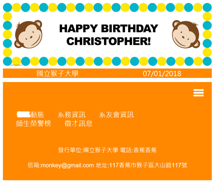
css and jquery
<style type="text/css">

a{
text-decoration:none;
	}
.intro p{
     text-align:justify;
     text-justify: distribute;
   }
.fixed {
  position: fixed;
  bottom: 0;
  right: 0;
  width: 200px;
   }
.alumni{
max-width:636.2px;
}
.scholar tr td{
border-style:solid;
border-width:0.5px;
text-align:center;
width:200px;
}
#menuicon{
display:none;
background-color:#FF8800 !important;
}
ul{
display:block;
float:right;
padding:0px 80px 0px 0px;
}
ul li{
display:block;
float:left;
margin-left:30px;
}
@media screen and (max-width:768px){
#navbar ul{
display:none;
}
#menuicon{
display:block;
float:right;
background-color:#FF8800 !important;
cursor:pointer;
padding:10px 10px 3px 10px;
}

.rwd-table
{
width:100%!important;
}

.photo img
{
width:100%!important;
}
}

@media screen and (max-width:481px){
#navbar ul{
padding:0px;
}
#navbar ul li{
	display:block;
	width:100%;
	float:none;
	line-height:2.5px;
	margin:0px;
	padding-left:6%
	}
.rwd-table
{
width:100%!important;
}

.photo img
{
width:100%!important;
}


ul li{
margin-left:3px!important;
}
}
</style>
<script src="http://ee.nsysu.edu.tw/key/bootstrap/js/jquery.min.js"></script>
<script>
$(window).resize(function(){
if(!$("#navbar ul").is(":visible")){
   $('#navbar ul').attr('style',function(i,style){
       return style.replace(/display[^;]+;?/g, '');
});

};

});

$(document).ready(function(){
$("#menuicon,#navbar ul li").click(function(){
if ($("#menuicon").is(":visible")){
$("#navbar ul").toggle(400);
};
});
});
</script>
html
<head>
<meta content="text/html; charset=big5" http-equiv="Content-Type"/>
<meta name="viewport" content="width=device-width, initial-scale=1.0,minimum-scale=0.2,maximum-scale=0.55">
<title>國立中山大學電機系電子報第16期</title>
</head>
<body>
<center>
<table class="rwd-table" style="width:636px;margin:0 auto;border-collapse:collapse;">
<tr>
<td >
<img class="rwd-table" style="width:636px;height:143px;border:none;" src="http://images.birthdayexpress.com/mgen/mod-monkey-personalized-vinyl-banner-bx-43902.jpg?zm=1600,1600,1,0,0"/>
</td>
</tr>
<td align="center" valign="top">
<table width="100%" border="0" cellspacing="0" cellpadding="0">
<tr >
<td colspan="3" align="center" valign="middle" bgcolor="#FF8800" style="height:20px" font color="#FFFFFF">
<font color="#FFFFFF">國立猴子大學</font></td>
<td colspan="2" align="center" valign="middle" bgcolor="#FF8800" style="height:20px" font color="#FFFFFF">
<font color="FFFFFF">07/01/2018</font></td>
</tr>
<tr>
<td style="line-height:9px;" colspan="5"> </td>
</tr>
</table>
<table width="100%" border="0" cellspacing="0" cellpadding="0">
<div id="navbar"style="background-color: #FF8800;overflow:hidden;">
<div id="menuicon"style="background-color: #FF8800;overflow:hidden;"><img src="http://www.ee.nsysu.edu.tw/alumni/info/201807/photo/menuicon.png"style="height:30px;width:40px;"></div>
<ul>
<li align="center" valign="middle" bgcolor="#FF8800" style="height:20px">
<a href="http://www.ee.nsysu.edu.tw/alumni/info/201807/html/#one">
<font color="#FFFFFF">中山動態</font></a></li>
<li align="center" valign="middle" bgcolor="#FF8800" style="height:20px">
<a href="http://www.ee.nsysu.edu.tw/alumni/info/201807/html/#two">
<font color="#FFFFFF">系務資訊</font></a></li>
<li align="center" valign="middle" bgcolor="#FF8800" style="height:20px">
<a href="http://www.ee.nsysu.edu.tw/alumni/info/201807/html/#three">
<font color="#FFFFFF">系友會資訊</font></a></li>
<li align="center" valign="middle" bgcolor="#FF8800" style="height:20px">
<a href="http://www.ee.nsysu.edu.tw/alumni/info/201807/html/#four">
<font color="#FFFFFF">師生榮譽榜</font></a></li>
<li align="center" valign="middle" bgcolor="#FF8800" style="height:20px">
<a href="http://www.ee.nsysu.edu.tw/alumni/info/201807/html/#five">
<font color="#FFFFFF">徵才訊息</font></a></li>
</ul>
</div>
</table>
<table class="rwd-table" border="0" cellpadding="0" cellspacing="0" style="width:636px;margin:0 auto;">
<tr>
<td class="rwd-table" align="center" valign="top" bgcolor="#FF8800"style="padding:10px" width="636px" colspan="2">
<p style="line-height: 100%">
<font size="2" color="#FFFFFF" face="Arial">發行單位:國立猴子大學 電話:香蕉香蕉 </font></p>
<p style="line-height: 100%">
<font size="2" color="#FFFFFF" face="Arial"><span style="font-weight: 400; text-decoration: none">信箱:monkey@gmail.com</span></font>
<font size="2" color="#FFFFFF" face="Arial">地址:117香蕉市猴子區大山路117號 </font></p>
</td>
</tr>
</table>
</table>
</center>
</body>
已邀請的邦友 {{ invite_list.length }}/5
個人是使用FlexBox 方便簡單好用。
缺點是IE9以下需要裝套件才相容。
大部分沒動,如果有興趣建議你試著改改架構。
P.s.如果是自己從頭寫的站 !important 用太多了
CSS
@media screen and (max-width:768px){
    #navbar ul{
        display:none;
        align-items: center;
        justify-content: space-between;
        padding: 0 0 0 20px;
        box-sizing: border-box;
        width: calc(100% - 60px);
        list-style: none;
    }
    ul li{
        margin: 0;
        float: unset;
    }
 }

 @media screen and (max-width:481px){
    #navbar ul{
        flex-direction: column;
        width: auto;
        padding:0px;
    }
 }

 看影片追技術