各位大大你好,請問網站程式是使用kendo UI,在android畫面,點選有很多字的textarea時,keyboard顯示出來,textarea的顯示位置會錯誤的跑回開頭,但是textarea的焦點仍然正確的留在結尾,
請問如何讓textarea得顯示位置正確的留在結尾。目前iphone跟電腦看網站是沒問題的:
我目前寫的是MVC C#的程式。
錯誤畫面如下:
目前在ios phone 跟電腦裝置顯示是可以的,但是在安卓是失敗的,以下為ios phone的成功範例:
圖1:點選網站事件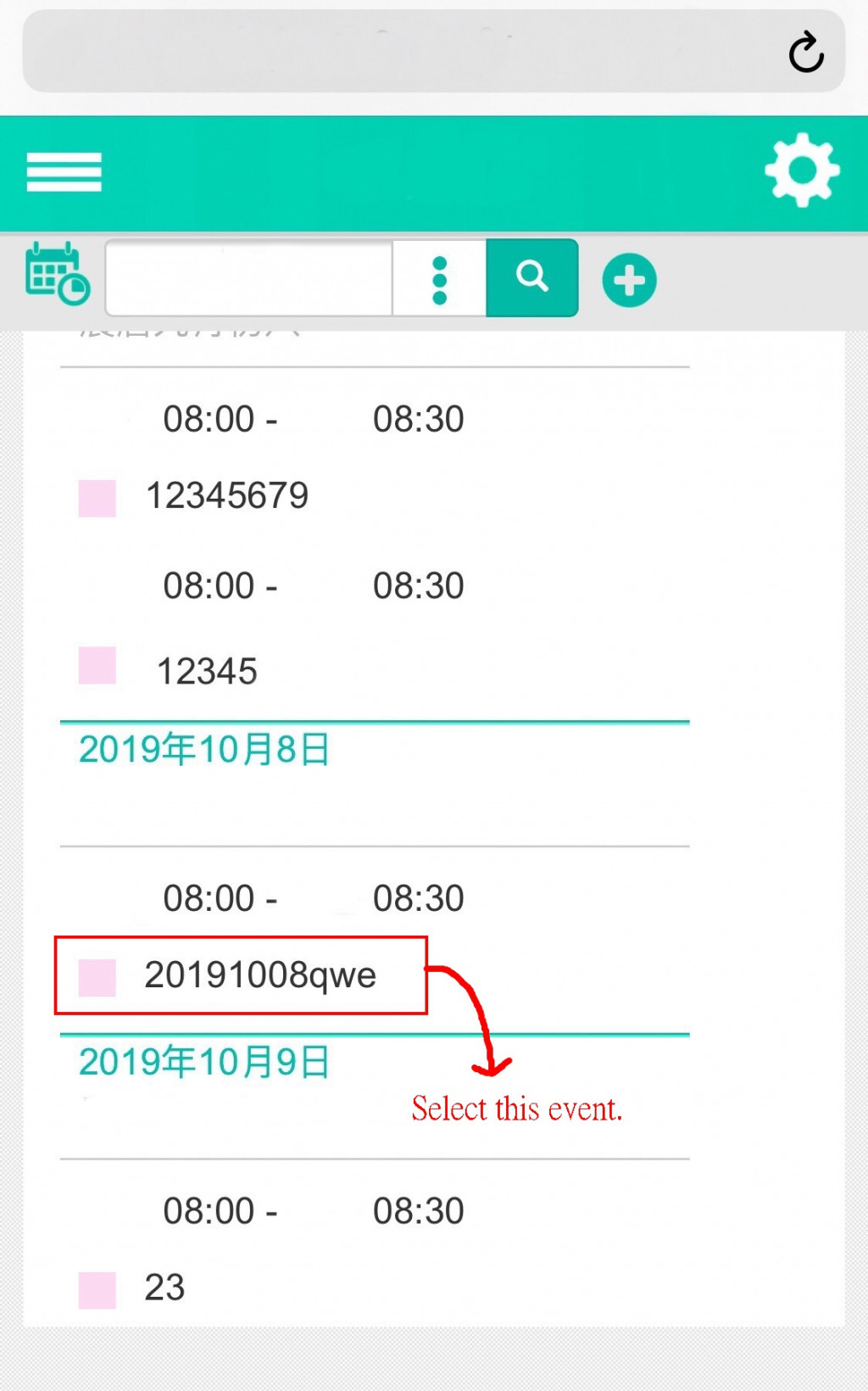
圖2:事件視窗顯示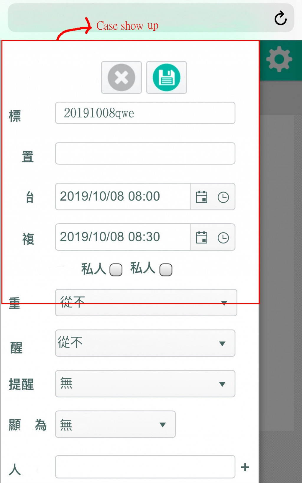
圖3:向下移動到事件視窗的textbox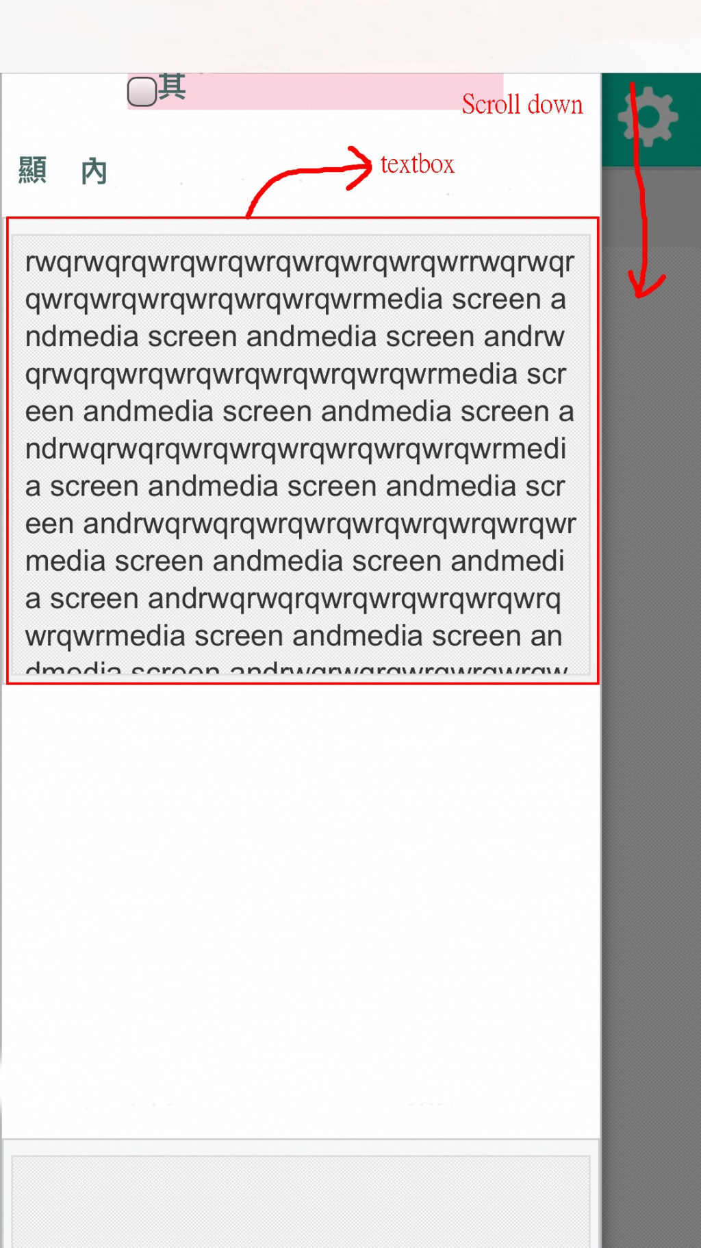
圖4:在textbox中向下滑動到textbox長段文字的結尾部分進行點選,keyboard顯示,在圖中iphone是沒有跑掉的,不過安卓的畫面會跑掉。不過目前部分安卓手機利用本串文章首篇的css是可以修正的,但是其他安卓手機畫面還是跑掉。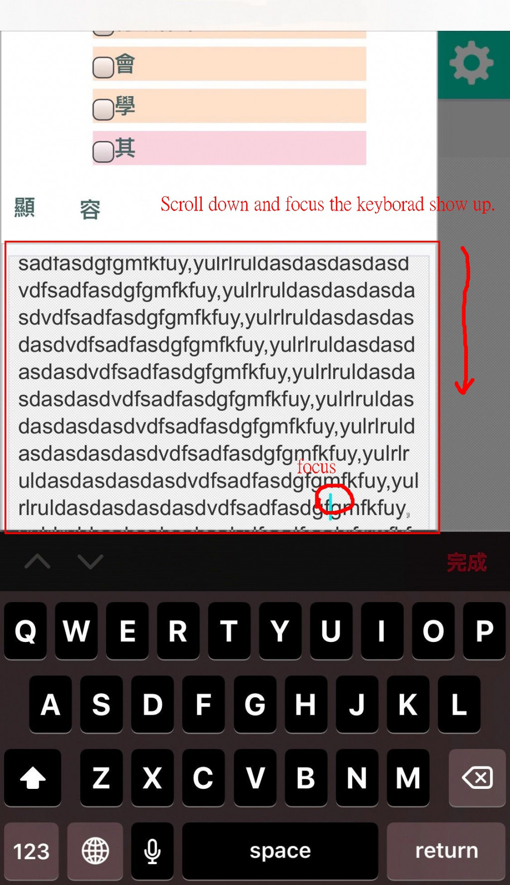
以下為textarea的cshtml檔案程式碼段落:
但是文字真正被輸入的位置是在#document的body裡面 輸入文字後,原始碼textarea並沒有增加文字
<td class="k-editable-area">
<iframe title="Editable area. Press F10 for toolbar." frameborder="0" class="k-content" tabindex="0" src="javascript:""">
#document
<!doctype html>
<html>
<head>
<meta charset="utf-8">
<style>html,body{padding:0;margin:0;height:100%;min-height:100%;}body{box-sizing:border-box;font-size:12px;font-family:Verdana,Geneva,sans-serif;margin-top:-1px;padding:5px .4em 0;word-wrap: break-word;-webkit-nbsp-mode: space;-webkit-line-break: after-white-space;}h1{font-size:2em;margin:.67em 0}h2{font-size:1.5em}h3{font-size:1.16em}h4{font-size:1em}h5{font-size:.83em}h6{font-size:.7em}p{margin:0 0 1em;}.k-marker{display:none;}.k-paste-container,.Apple-style-span{position:absolute;left:-10000px;width:1px;height:1px;overflow:hidden}ul,ol{padding-left:2.5em}span{-ms-high-contrast-adjust:none;}a{color:#00a}code{font-size:1.23em}telerik\3Ascript{display: none;}.k-table{width:100%;border-spacing:0;margin: 0 0 1em;}.k-table td{min-width:1px;padding:.2em .3em;}.k-table,.k-table td{outline:0;border: 1px dotted #ccc;}.k-table p{margin:0;padding:0;}.k-column-resize-handle-wrapper {position: absolute; height: 10px; width:10px; cursor: col-resize; z-index: 2;}.k-column-resize-handle {width: 100%; height: 100%;}.k-column-resize-handle > .k-column-resize-marker {width:2px; height:100%; margin:0 auto; background-color:#00b0ff; display:none; opacity:0.8;}.k-row-resize-handle-wrapper {position: absolute; cursor: row-resize; z-index:2; width: 10px; height: 10px;}.k-row-resize-handle {display: table; width: 100%; height: 100%;}.k-row-resize-marker-wrapper{display: table-cell; height:100%; width:100%; margin:0; padding:0; vertical-align: middle;}.k-row-resize-marker{margin: 0; padding:0; width:100%; height:2px; background-color: #00b0ff; opacity:0.8; display:none;}.k-table-resize-handle-wrapper {position: absolute; background-color: #fff; border: 1px solid #000; z-index: 100; width: 5px; height: 5px;}.k-table-resize-handle {width: 100%; height: 100%;}.k-table-resize-handle.k-resize-east{cursor:e-resize;}.k-table-resize-handle.k-resize-north{cursor:n-resize;}.k-table-resize-handle.k-resize-northeast{cursor:ne-resize;}.k-table-resize-handle.k-resize-northwest{cursor:nw-resize;}.k-table-resize-handle.k-resize-south{cursor:s-resize;}.k-table-resize-handle.k-resize-southeast{cursor:se-resize;}.k-table-resize-handle.k-resize-southwest{cursor:sw-resize;}.k-table-resize-handle.k-resize-west{cursor:w-resize;}.k-table.k-table-resizing{opacity:0.6;}k\:script{display:none;}
</style>
<script>
(function(d,c){d[c]('header'),d[c]('article'),d[c]('nav'),d[c]('section'),d[c]('footer');})(document, 'createElement');
</script>
<link rel="stylesheet" href="../../Content/master.css">
<link rel="stylesheet" href="../../Content/Editor.css">
</head>
<body autocorrect="off" contenteditable="true">
☆☆☆☆☆☆☆☆☆☆☆☆☆☆☆☆☆☆☆☆☆☆☆☆☆☆☆☆☆☆☆☆☆☆☆☆☆☆☆☆☆☆☆☆☆☆☆☆
☆☆☆☆☆☆☆☆☆☆☆☆☆☆☆☆textarea文字輸入文字在此☆☆☆☆☆☆☆☆☆☆☆☆☆☆☆☆
☆☆☆☆☆☆☆☆☆☆☆☆☆☆☆☆☆☆☆☆☆☆☆☆☆☆☆☆☆☆☆☆☆☆☆☆☆☆☆☆☆☆☆☆☆☆☆☆
</body>
</html>
</iframe>
<textarea class="k-textbox k-content k-raw-content" id="interview" name="Interview" rows="2" cols="20" alt="ch" style="overflow: scroll !important; display: none; font-family: Alertie, consolas, "courier new", monospace;" data-role="editor" autocomplete="off"></textarea>
</td>
目前在部分安卓平台是OK的,使用的CSS如下:
@media screen and  (max-width: 580px) and (max-height: 350px)and (min-height: 200px){
   html {
      display:block!important;
      overflow:hidden!important;
    }
}
不過在其他安卓平台還是失敗,請問各位大大如何讓網站的安卓手機畫面可以跟IPHONE、電腦一樣,不要跑掉,謝謝!
已邀請的邦友 {{ invite_list.length }}/5
簡單的問題,但要回答是不簡單的。
首先可以很明白,你不了解所謂RWD的配置方法。也不知道該從何處理。
然後丟個一大串的css來問這樣的問題。
這其實也不是說不教你,只是你的問題太過籠統。
等同要我來幫你配置整體頁面的css配置。
這太為難人了。
我只能說,你目前的css配置可以說完全沒有RWD的模式。
簡單說明一些東西好了。
height:100%;min-height:100%
這樣子的東西不該出現的
然後你有說過只有部份安卓手機才會出問題,其實你該要注意的不是手機,而是瀏覽器是哪一種。
因為你部份的多重應用,你只有宣告使用 「-webkit」這個確實是大多數來說是通用的。
但有部份的瀏覽器並不認識。一般來說,我會將「-webkit」「-moz」「-ms」統統一起宣告處理。來防止不同瀏覽器造成的問題。
大多數來說用「-webkit」「-moz」這兩個大多數都通用了。且「-ms」其實是給ie用的。可有可無。
其它來說你還需要學會針對了解為何跑板的問題,從中去了解後才來調整。善用f12大法。
當然,現在要叫你一口氣學會RWD的相關配置還是有很大的問題。我自已其實也懶的去規劃配置。所以都用框架來幫我處理。
為您推薦:
有基礎才能繼續往下學
不然你的挫折感會非常重
然後....我還是不知道該從何回答起

 看影片追技術