請問各位大大
圖片顯示根據圖片父元素的div比例和圖原始比例
自動resize填滿div高度或是寬度然後不能變形 + 水平垂直置中
有辦法純粹只靠css控制嗎?有比較general的方法嗎?
實際結構
    <style>
  #imageContainer {
    width: 100vw;
    height: 100vh;
  }

  #imageDiv {
    aspect-ratio: 4/3;
    width: auto;
    height: auto;
    max-width: 100%;
    max-height: 100%;
    background-color: beige;
    margin: auto;
    position: relative;
    top: 50%;
    transform: translateY(-50%);
    overflow: hidden;
    display: flex;
    align-items: center;
  }

  #imageDiv img {
    max-height: 100%;
    max-width: 100%;
    margin: auto;
  }
    </style>
    <body style="margin: 0;">

      <div id="imageContainer">
        <div id="imageDiv">
          <img src="image1.jpg" alt="">

        </div>
      </div>

    </body>
有兩種不同的圖
第一張圖寬比高大(1170x780)
第二張圖高比寬大(687x1030)
第一張的狀況,左右並沒有填滿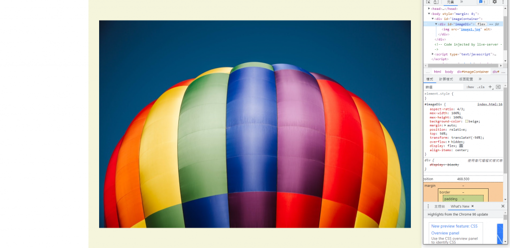
我如果加上
width: 100%;
height: auto;
就能把左右填滿
但是當我換成另一種比例的圖,第二張的狀況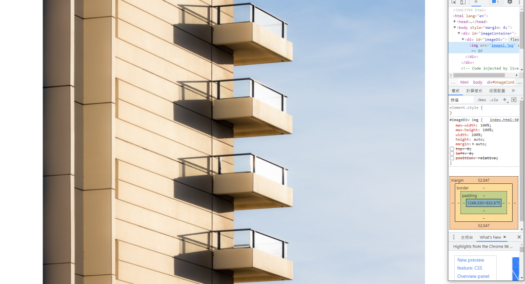
就會變形因為寬高比不一樣
必須反過來變成
width: auto;
height: 100%;
但第一張的狀況又無法適用會變形
已邀請的邦友 {{ invite_list.length }}/5

 iThome鐵人賽
 看影片追技術