我有一個資料如下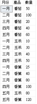
想要做出下面這種線圖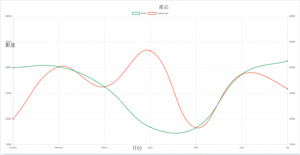
請問該如何做呢,目前是用ajax抓資料回來,但抓完資料後也不知如何下手
public class trafficSourceData
    {
        public string label { get; set; }
        public string count { get; set; }
        public string mount { get; set; }
        public string color { get; set; }
    }

    [WebMethod]
        public List<trafficSourceData> getTrafficSourceData()
        {
            List<trafficSourceData> t = new List<trafficSourceData>();
            string[] arrColor = new string[] { "#231F20", "#FFC200", "#F44937", "#16F27E", "#FC9775", "#5A69A6" };

            string conn = WebConfigurationManager.ConnectionStrings["HRPConnectionString"].ConnectionString;

            using (SqlConnection cn = new SqlConnection(conn))
            {
                string myQuery = "select * from TEST1";
                SqlCommand cmd = new SqlCommand();
                cmd.CommandText = myQuery;
                cmd.CommandType = CommandType.Text;
                cmd.Connection = cn;
                cn.Open();
                SqlDataReader dr = cmd.ExecuteReader();
                if (dr.HasRows)
                {
                    int counter = 0;
                    while (dr.Read())
                    {
                        trafficSourceData tsData = new trafficSourceData();
                        tsData.count = dr["數量"].ToString();
                        tsData.label = dr["產品"].ToString();
                        tsData.mount = dr["月份"].ToString();
                        tsData.color = arrColor[counter];
                        t.Add(tsData);
                        counter++;
                    }
                }
            }
            return t;
        }
    }
$(document).ready(function () {
            $.ajax({
                type: "POST",
                url: "WebService1.asmx/getTrafficSourceData",
                contentType: "application/json; charset=utf-8",
                dataType: "json",
                success: function (response) {
                    var aData = response.d;
                    var arr = [];
                    $.each(aData, function (inx, val) {
                        var obj = {};
                        obj.color = val.color;
                        obj.count = val.count;
                        obj.label = val.label;
                        obj.mount = val.mount;
                        arr.push(obj);
                    });
                    var ctx = $("#myChart").get(0).getContext("2d");

                },
                error: function () {

                }
            });

        });
請各位大神指導一下謝謝
已邀請的邦友 {{ invite_list.length }}/5
簡單範例(補充)
需要處理的是 你要在API回傳是產生data的格式,data.labels是你的月份資料,datasets這是array,你的產品可以放這用foreach產生出對應格式,最後在new chart元件,如果你比較熟後端,也可以用後端產生類似的結構再到前端處理
var canvas = document.getElementById("multiLineChart");
var ctx = canvas.getContext('2d');

var data = {
  labels: ["一月", "二月", "三月", "四月", "五月"],
  datasets: [{
    label: "蘋果",
    data: [23, 32, 24, 4, 43, ],
    borderColor: "rgba(100,100,100,0.8)",
    backgroundColor: "rgba(120,120,120,0.5)"
  },
  {
    label: "香蕉",
    data: [100, 20, 30, 5, 60, ],
    borderColor: "rgba(10,10,10,0.8)",
    backgroundColor: "rgba(110,110,110,0.5)"
  }]
};

var options = {
  scales: {
    yAxes: [{
      display: true,
      position: 'right',
      ticks: {
        beginAtZero: true
      }
    }, {
      display: true,
      position: 'left',
      ticks: {
        beginAtZero: true,
        max: 45,
        min: 0,
        stepSize: 5
      }
    }]
  },
  tooltips: {
    enabled: true,
    mode: 'label'
  },
  legend: {
    display: true,
  }
};

// Chart declaration:
var multiLineChart = new Chart(ctx, {
  type: 'line',
  data: data,
  options: options
});
恩我知道這裡有
但
datasets: [
    {
      label: 'Dataset 1',
      data: Utils.numbers(NUMBER_CFG),
      borderColor: Utils.CHART_COLORS.red,
      backgroundColor: Utils.transparentize(Utils.CHART_COLORS.red, 0.5),
    },
    {
      label: 'Dataset 2',
      data: Utils.numbers(NUMBER_CFG),
      borderColor: Utils.CHART_COLORS.blue,
      backgroundColor: Utils.transparentize(Utils.CHART_COLORS.blue, 0.5),
    }
  ]
datasets要多少資料只能寫死嗎
還是可以根據我查詢出來有多少產品動態產生呢
小山丘
直接對dataset修改內容就行
我以前是這樣寫的
https://ithelp.ithome.com.tw/articles/10207554
小山丘
我有更新內文了
感謝,我就是卡在後端到前端不知道要如何組array哈哈,讓我想想,謝謝兩位
