在網頁上有一個不規則區塊,
但是一直無法將其羽化...TAT
各位大大們,這是否有解~
請幫小的解解人森疑惑(跪拜+磕頭+舔腳趾)
目標: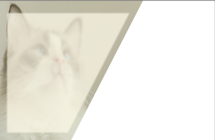
目前(差別在於最上層白色遮罩無法將其邊緣羽化):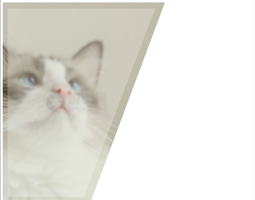
目前,code參考:
<div class="container">
  <div class="left">
    <div class="base">
      <div class="Image"></div>
      <div class="mask"></div>
    </div>
    <div class="content"></div>
  </div>
</div>
.container{
  position: relative;
  width: 100%;
  height: 100vh
}

.left{
  position: absolute;
  height: 100%;
  width: 65%;
  left: 0
}

.left .base{
  clip-path: polygon(0 0, 100% 0, 54% 100%, 0% 100%);
  height: 100%;
  width: 100%;
}

.left .base .Image{
  background-image:url('https://img95.699pic.com/photo/50135/8221.jpg_wh860.jpg');
  left: -35%;
  background-repeat: no-repeat;
  background-size: cover;
  background-position: center;
  width: 100vw;
  height: 100%;
  position: absolute;
}

.left .base .mask{
  height: 100%;
  width: 100%;
  display: block;
  opacity: 0.5;
  position: absolute;
  background: #71660055;
}

.left .content{
  clip-path: polygon(3% 3%, 94% 3%, 50% 97%, 3% 97%);
  height: 100%;
  width: 100%;
  position: absolute;
  top: 0;
  background: rgba(255, 255, 255, 0.239);
  backdrop-filter: blur(3px)
}
------------------------------>>>詳解,code如下:
<div class="container">
  <div class="left">
    <div class="base">
      <div class="Image"></div>
      <div class="mask"></div>
      <div class="tag-content">
        <div class="content"></div>
      </div>
    </div>
    <div class="content"></div>
  </div>
</div>
.container{
  position: relative;
  width: 100%;
  height: 100vh
}

.left{
  position: absolute;
  height: 100%;
  width: 65%;
  left: 0
}

.left .base{
  clip-path: polygon(0 0, 100% 0, 54% 100%, 0% 100%);
  height: 100%;
  width: 100%;
}

.left .base .Image{
  background-image:url('https://img95.699pic.com/photo/50135/8221.jpg_wh860.jpg');
  left: -35%;
  background-repeat: no-repeat;
  background-size: cover;
  background-position: center;
  width: 100vw;
  height: 100%;
  position: absolute;
}

.left .base .mask{
  height: 100%;
  width: 100%;
  display: block;
  opacity: 0.5;
  position: absolute;
  background: #71660055;
}
.left .tag-content{
  height: 100%;
  width: 100%;
  position: absolute;
  top: 0;
  filter: blur(5px);
}
.left .tag-content .content{
  clip-path: polygon(3% 3%, 94% 3%, 50% 97%, 3% 97%);
  height: 100%;
  width: 100%;
  position: absolute;
  top: 0;
  background: rgba(255, 255, 255, 0.5);
}
.left .content{
  clip-path: polygon(3% 3%, 94% 3%, 50% 97%, 3% 97%);
  height: 100%;
  width: 100%;
  position: absolute;
  top: 0;
  background: rgba(255, 255, 255, 0);
  backdrop-filter: blur(5px);
}
已邀請的邦友 {{ invite_list.length }}/5

 看影片追技術