Compass Vertical Rhythm - 網頁上的字型大小與行距的統一調整
在以往我們在設計網頁時,
通常在設定一些文字排版上的元素設定line-height(行距)、fon-size(字型大小),
而Compass也提供了一些mixin讓網頁設計師更加便利地統一調整行距與字型大小。
我們就一一瀏覽程式碼吧:
$base-font-size: 16px //網頁預設文字大小
$base-line-height: 24px // 行距
@include establish-baseline()
前三行語法是如果你要用Compass Vertical Rhythm時,
所必須要載入的設定語法,
譬如說你設定了
$base-font-size:16px,
$base-line-height:24px,
他就會先在HTML的TAG上,編譯出如下的CSS:
html{
font-size:100%;
line-height:1.5em
}
為什麼他會產生此程式碼的原因是,
網頁預設的字型大小為16px,
所以你如果在$base-font-size設定16px的話,
他就會以百分比來進行設定,
另外如果我調整為$base-font-size:20px的話,
自然就會變成:
html{
font-size: 125%;
line-height: 1.2em
}
而$base-line-height(統一行距)也就會隨著$base-font-size的設定來調整他的行距。
$base-font-size: 16px //網頁預設文字大小
$base-line-height: 24px // 行距
@include establish-baseline()
html
	font-size: 150%;
	line-height: 1.5em

h1
	+adjust-font-size-to(28px) //設定h1的字型大小與行距,將px轉為em
	+leader(1)  // 以$base-line-height來調整margin-top,1的話就是100%
	+trailer(3/4) //以$base-line-height來調整margin-bottom,1.5em的四分之三 = 1.125em
//編譯出來的CSS則會變成如下:
h1 {
  font-size: 1.75em;  //adjust-font-size-to編譯出來的字型大小
  line-height: 1.71429em; //adjust-font-size-to編譯出來的行距,
  margin-top: 1.5em;
  margin-bottom: 1.125em;
}
從上面就可以看出,
所有的設定,都會以$base-font-size與$base-line-height的全域設定來進行,
較常用的設定如下,運算方式可瀏覽上方程式碼的註解
+leader() = 設定margin-top
+padding-leader() = 設定padding-top
+trailer() = 設定margin-bottom
+padding-trailer() = 設定padding-bottom
你可能會想說,只是單純間距的設定,
設個margin-bottom:10~20px自己看順眼就好了,
幹嘛要搞得這麼複雜?
因為Compass Vertical Rhythm他是以字型的方式來設定間距,
像譬如說1em等於1個文字大小,
不論是在推margin、padding時,就看是要推1em還是2em的大小,
設定上也相對直覺多了,就不用像傳統的方式亂調10~20px來調整間距。
如果針對這部分你有興趣深入研究的話,
也可以再瀏覽下面延伸閱讀文章:
http://compass-style.org/reference/compass/typography/vertical_rhythm/#mixin-leading-border
http://www.mukispace.com/css-line-height/
聊完Compass Vertical Rhythm,接著再討論susy可以結合的部分,
你可以看得出來Compass Vertical Rhythm,都是在調上下的間距,
而susy也有不少可以調整margin與padding左右的設定,
像margin的話有:
pre(1) //margin-left,向左推一個columns
post() //margin-right
squish(2,3) //margin-left,margin-right
push() //有點像是pre()
pull() // 負值margin-left
width: +space(5) // 5個cloumns+1個間距(gutter)
padding:
+prefix(2) //pading-left
+suffix(0.5) //padding-right
+pad(3,2) //padding-left padding-right
如果你不希望padding把你的columns拉大距離,
也可以寫compass的+box-sizing(border-box)來設定。
--
透過Compass Vertical Rhythm來設定上下的間距,
再藉由susy padding、margin來調整左右的間距,
這樣子就能很完美的控管網頁間距與文字內容的排版,
接下來就是利用專案來培養自己的經驗了^_^
最後再提出一些地雷點:
(1)請不要輕易修改html的預設文字大小,susy是以html的預設font-size:16px來去設grid的,除非你很了解susy的設定,否則建議還是以html預設16px為主,文字的設定就使用+adjust-font-size-to()來設地區塊文字大小即可。
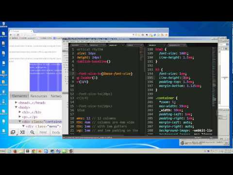
另也附上影片流程提供參考與學習:


 iThome鐵人賽
 看影片追技術