今天筆記了幾個在 grid 上的基礎屬性,分別為:
display
允許的值: grid / inline-grid / subgrid
設定了這三個的任一個後,( 有支援的 ) 瀏覽器就會知道他的子元素們 ( 也就是 grid items ) 的位置、大小,會在這裡設定。
grid - 本身的屬性類似 display: block
inline-grid - 本身的屬性類似 display: inline-block
subgrid - 如果這個元素本身也是個 grid item 時,我們就需要設定成設個值,來告訴瀏覽器 "這個元素的尺寸,請參考上一層的 grid container 的設定"
grid-template-columns
grid-template-rows
兩個屬性的使用方式相同,都是用來定義 grid track 的。( 只是一個是用來定義欄、一個是用來定義列 )
這兩個屬性可以做到兩件事:
定義 grid track 的尺寸的方式是 依序寫下 grid track 的 size,不同的 track 之間以空白分開
.grid-container {
    grid-template-columns: <track-size> ...;
    grid-template-rows: <track-size> ...;
}
而 size 可以是寫死的長度、百分比、"auto",或是一個 剩餘空間的分數的分子 ( fraction of the free space,以 fr 作為單位 )。
剩餘空間的分數的分子這個之後會在前一篇文章補上說明
今天要趕不完了 _(°ཀ°」 ∠)_
例如:
.grid-container {
    grid-template-columns: 40px 50px auto 50px 40px;
    grid-template-rows: 25% 100px auto;
}
接著,也可以在定義 track size 的同時,幫 track 之間的 grid line 取名字。
定義 grid line 名字的方式,就是在 grid line 的位置上寫上我們想要的名字,並以 [] ( 中括號 ) 包覆。
( grid line 的位置... 就是在 track 的兩邊啦 XD )
.grid-container {
    grid-template-columns: <line-name> <track-size> ...;
    grid-template-rows: <line-name> <track-size> ...;
}
例如:
.grid-container {
    grid-template-columns: [first] 40px [line2] 50px [line3] auto [col4-start] 50px [five] 40px [end];
    [row1-start] 25% [row1-end] 100px [third-line] auto [last-line];
}
一切都是為了為未來著想 ---- 這樣 grid item 在設定位置時,就可以參照這邊的命名了 ( 這部分預計明天會再講到 )。
另外還有幾個小撇步:
一條線也可以有多個名字
使用方法:放在同一個中括號中,並以空格格開。
.grid-container {
    grid-template-rows: [header-start] 150px [header-end main-start] auto [main-end footer-start] 200px [footer-end];
}
可以使用 repeat() 方法
使用方法:repeat(重複數量, 要重複的東西)
.grid-container {
    grid-template-columns: repeat(3, 1fr) 5%;
}

/* 跟這個寫法一樣 */
.grid-container {
    grid-template-columns: 1fr 1fr 1fr 5%;
}
( shorthand ) grid-template
.grid-container {
    grid-template: <grid-template-rows> / <grid-template-columns>;
}
也就是定義 grid area
grid-template-areas
這個屬性有用在昨天的舉例中,簡單來說就是
"" ( 雙引號 ) 包覆;每一列中的每一欄之間,用 ( 空白 ) 隔開預設值: none
使用方式:
.grid-container {
    grid-template-areas: "<grid-area-name> | . | ..."
                         "..."
}
例如昨天的例子:
.grid-container {
    display: grid;
    grid-template-columns: 2fr 20px 1fr;
    grid-template-rows: 100px 200px 100px;
    grid-template-areas: "header header header "
                         "main   .      sidebar"
                         "footer footer footer ";
}
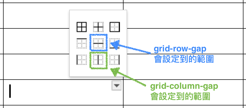
grid-column-gap
grid-row-gap
我們可以在 cell 跟 cell 間,加上一點間隔。
換句話說,我們可以把 ( 不包含外框的 ) grid line 設定成粗一點。
用 word 裡面的表格隔線來舉例,他們各自會影響到的範圍如圖:
預設值: 0
使用方法:
.grid-container {
    grid-column-gap: <line-size>;
    grid-row-gap: <line-size>;
}
( shorthand ) grid-gap
grid-column-gap 跟 grid-row-gap 又可以合併寫成這樣的形式:
.grid-container {
    grid-gap: <grid-column-gap> <grid-row-gap>;
}
使用以上這幾個屬性,就差不多可以 cover 目前 framework 中的 grid system 了,因此這邊寫說是 "基礎屬性"。
但其實還有 grid 更多可以厲害的屬性 ( 姑且稱之為進階屬性 XD ),值得我們好好探索。預計明天會繼續筆記以下幾個項目:
grid item 在 grid cell 中的對齊方式
grid cell 在 grid container 中的對齊方式
3. justify-content
4. align-content
讓 grid track 能自己產生,不用每個都設定
5. grid-auto-columns
6. grid-auto-rows
讓 grid items 換個排列方式
7. grid-auto-flow
可以使用各種排列組合的 shorthand
8. ( shorthand ) grid
其實會分成兩篇,
純粹是我今天寫不完,我對不起我的列祖列宗 Orz
不好意思 請問一下
8. ( shorthand ) grid-gap
格式是不是<'grid-row-gap'> <'grid-column-gap'>才是正確的呢?


 iThome鐵人賽
 看影片追技術