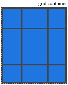
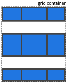
左右對齊方式:用 justify-items 設定 ( 個別 item 的對齊方式,可以用 justify-self 設定 )
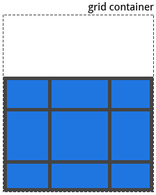
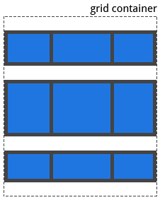
上下對齊方式:用 align-items 設定 ( 個別 item 的對齊方式,可以用 align-self 設定 )
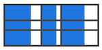
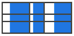
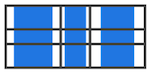
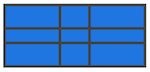
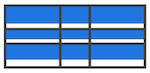
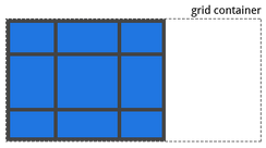
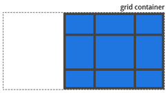
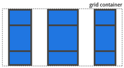
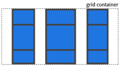
justify-items
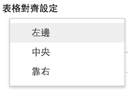
類似表格中的 "對齊設定"
預設值: stretch
可以接受的值: start / end / center / stretch
| start | end | center | stretch |
|---|---|---|---|
 |
 |
 |
 |
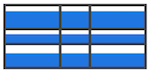
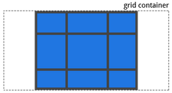
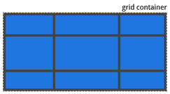
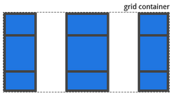
align-items
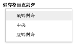
類似表格中的 "垂直對齊設定"
預設值: stretch
可以接受的值: start / end / center / stretch
| start | end | center | stretch |
|---|---|---|---|
 |
 |
 |
 |
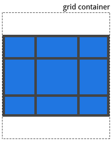
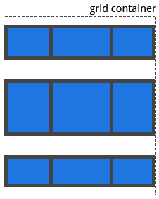
左右對齊方式:用 justify-content 設定
上下對齊方式:用 align-content 設定
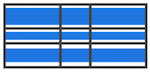
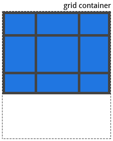
justify-content
預設值: start
可以接受的值: start / end / center / stretch / pace-around / space-between / space-evenly
| start | end | center | stretch |
|---|---|---|---|
 |
 |
 |
 |
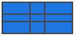
| pace-around | space-between | space-evenly |
|---|---|---|
 |
 |
 |
align-content
預設值: start
可以接受的值: start / end / center / stretch / pace-around / space-between / space-evenly
| start | end | center | stretch | pace-around | space-between | space-evenly |
|---|---|---|---|---|---|---|
 |
 |
 |
 |
 |
 |
 |
grid-auto-columns
grid-auto-rows
使用方式:
.grid-container {
    grid-auto-columns: <track-size>;
    grid-auto-rows: <track-size>;
}
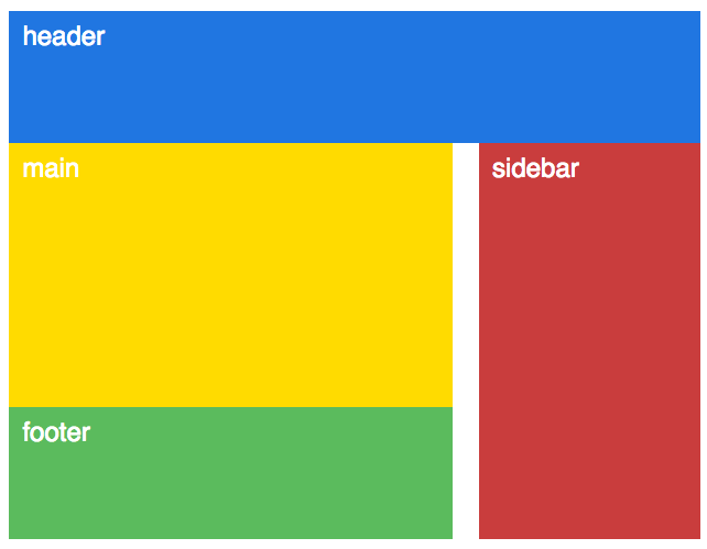
例如:https://jsfiddle.net/lazy_shyu/6syrpxs1/1/
body {
    display: grid;
    grid-template-columns: 2fr 20px 1fr;
    grid-auto-rows: 100px;
}
.header  { grid-area: 1 / 1 / 2 / 4 }
.main    { grid-area: 2 / 1 / 4 / 2 }
.sidebar { grid-area: 2 / 3 / 5 / 4 }
.footer  { grid-area: 4 / 1 / 5 / 2 }
grid-auto-flow
預設值: row
可以接受的值: row / column / row dense / column dense
row 跟 column 如字面上的意思,是排列的方向。
dense 則是稠密的意思 ( by google 翻譯 )。
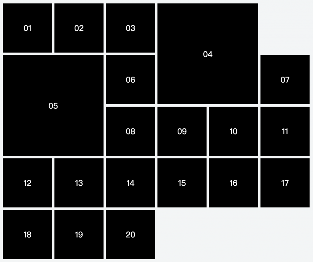
例如一個 cell 有大有小的 grid,本來可能會有空格:https://jsfiddle.net/cdytom74/1/
( 這邊把 04 / 05 的 cell 設成 2x2 的大小 )
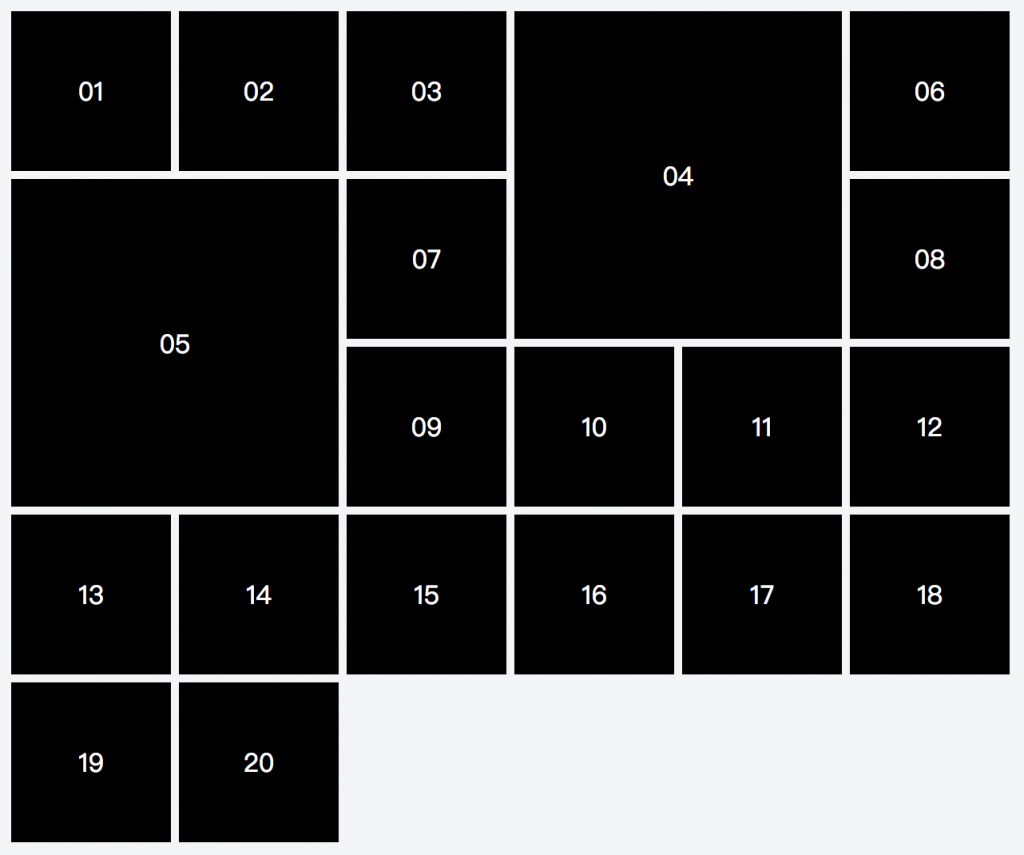
但把 grid-auto-flow 設定成 row dense 後,等於告訴瀏覽器 "發現有空格時,就用排列比較後面的小 cell 填上",所以版面就會變成這樣:
https://jsfiddle.net/cdytom74/2/
MAGIC~!!
但目前設定 dense 後,就是把排序全權交給瀏覽器的自動佈局算法了。或許可以期待 Grid Lv2 之後我們有更多的掌控權 =D
( shorthand ) grid
測試過現在支援度還不完全,但等能用後應該方便很多~
.container {
    /* 把所有的子屬性都設為預設值 */
    grid: none;

    /* 手動設定 欄 / 列 */
    grid: <grid-template>;

    /* 兩個方向都是 auto~ */
    grid: <grid-auto-flow> [<grid-auto-rows> [ / <grid-auto-columns>] ];

    /* 其中一個方向是 auto~
       如果 auto-flow 方向是 row 的話,則把 "auto-flow" 寫在前面;反則寫在 / 後面 */
    grid: <grid-template-rows> / [ auto-flow && dense? ] <grid-auto-columns>?;
    grid: [ auto-flow && dense? ] <grid-auto-rows>? / <grid-template-columns>;

    /* 包含 grid-template-areas、grid-auto-rows、grid-auto-columns 的寫法 */
    grid: [row1-start] "header header header" 1fr  [row1-end] /* 包含 grid line 的名字、area、列高 */
          [row2-start] "footer footer footer" 25px [row2-end] /* 包含 grid line 的名字、area、列高 */
          / auto 50px auto;  /* 各欄的寬度 */
}
以剛剛的例子為例,本來需要寫成:
body {
    display: grid;
    grid-template-columns: repeat(6, 100px);
    grid-auto-rows: 100px;
    grid-gap: 5px 5px;
    grid-auto-flow: row dense;
}
現在則可以改寫成:
body {
    display: grid;
    grid: auto-flow dense 100px / repeat(6, 100px);
    grid-gap: 5px 5px;
}


 iThome鐵人賽
 看影片追技術