上一章節介紹了各種 Utilities ,唯獨垂直置中不介紹,因為在製作、使用垂直置中時要先思考 "支援的瀏覽器",就算現在全部 IE 的使用率低於 2% 的情況下,還是會有很多小兄弟會希望網站優先支援 IE。
本篇會介紹幾種垂直置中手法(不包含舊瀏覽器),每一種手法的寫法都不大一樣,所以使用時要特別注意使用規則。
這篇文章所介紹的垂直置中方式,都不會使用絕對值(px),大多可以運用在各種環境,但實際上還是需要配合CSS的特性去做選用。
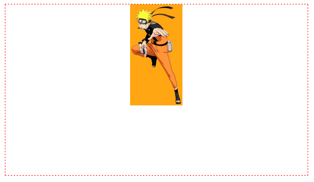
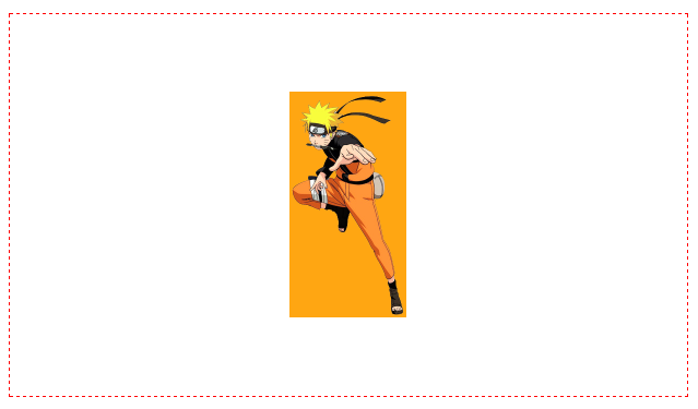
這次用鳴人的圖片來做介紹,這張圖片是用背景的方式載入。
.naruto {
    background-image: url(/images/narutoR.png?1372854973);
    background-color: orange;
    background-repeat: no-repeat;
    width: 107px;
    height: 207px;
    background-size: cover;
    margin: 0 auto;
}
.box-wrap {
    height: 350px;
}
此 table 不是真 table,這是 IE8 以上才支援的 CSS 語法,將 div 的屬性轉成 table,再套用垂直置中的方式來完成。
優點:概念簡單、支援度高(IE8+)
缺點:html 結構較多層、有 table 的特性
完整範例:https://wcc723.github.io/css/2016/12/23/vertical-align/
<style>
.d0116 .table {
    display: table;
    width: 100%;
}
.d0116 .table-cell {
    display: table-cell;
    vertical-align: middle;
}
</style>
<div class="demo d0116">
	<div class="table box-wrap">
		<div class="table-cell">
			<div class="naruto"></div>
		</div>
	</div>
</div>
以前常會用一種方式做垂直置中 top: 50%; margin-top: -(元素高 / 2);,先用 top 往下推 50% 的距離,再利用 margin-top 拉回元素的一半高度,這方式雖然很好用,但是必須用在元素有明確高度上。
而這邊所介紹是相同的道理,但是是用 transform: translateY(-50%) 將元素垂直向上 50% 的距離,這 50% 則是元素的高度,且語法都集中在元素上。
優點:超簡單
缺點:並非所有情境都適用
完整範例:https://wcc723.github.io/css/2016/12/23/vertical-align/
<style>
.vertical-center {
  position: relative;
  top: 50%;
  margin: 0 auto;
  transform: translateY(-50%);
}
</style>
<div class="demo d0116">
	<div class="box-wrap">
		<div class="naruto vertical-center"></div>
	</div>
</div>
Flex 是這幾年我經常使用的語法,這讓 CSS 排版的彈性大幅提升,不過在使用時還是有些瀏覽器的差異,像是舊版的 iOS Safari 就會略有不同,另外在實戰上的注意事項也較多。
優點:很潮
缺點:建議熟悉flex概念
完整範例:https://wcc723.github.io/css/2016/12/23/vertical-align/
<style>
.flex-center {
  display: flex;
	align-items: center;
	justify-content: center;
}
</style>
<div class="demo d0116">
	<div class="box-wrap flex-center">
		<div class="naruto"></div>
	</div>
</div>
這三種是我在實戰上比較常使用的,其中最常用的是 translate ,因為只需要一個 class 就能套用,相容性略高於 flex,相當簡單易用。
完整範例:https://wcc723.github.io/css/2016/12/23/vertical-align/


 看影片追技術