CSS 變數已經出來一陣子了,記得年初的時候支援度還蠻慘烈的,現在則好多了: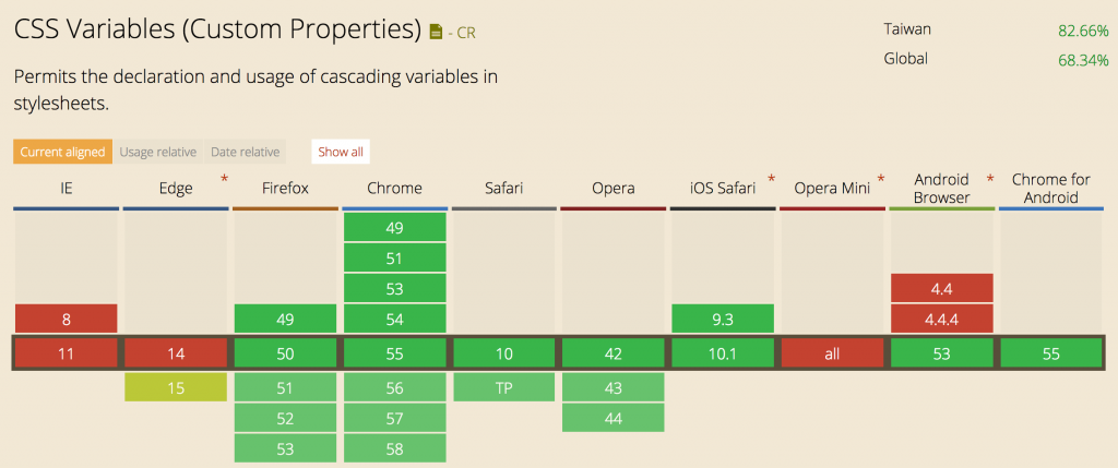
( 來源:http://caniuse.com/#feat=css-variables )
以下主要參考 CSS Custom Properties for Cascading Variables Module Level 1 :: W3C 來筆記。
有幾個主要的特點跟用法有
-- 開頭來命名 / 定義變數 ( 區分大小寫~!! ):root {
--main-color: #06c;
}
#foo h1 {
color: var(--main-color);
}
效果等同於
#foo h1 {
    color: #06c;
}
但這樣寫真的很方便,尤其是在主題色的使用上。
題外話,我一直有錯誤的印象,以為 twitter 的主題是用 CSS variables 寫的,但好像不是 Orz
Rachel Andrew - https://twitter.com/rachelandrew <= 主要是深紫色
Jen Simmons - https://twitter.com/jensimmons <= 主要是深藍色
不過還是很適合拿來寫~!!
另外想到的是,在 OOCSS 的命名架構裡也能用到 ( 樣式統一寫好,在不同主題下定義不同的變數就好 )。
var 的使用方法: var( <custom-property-name> [, <declaration-value> ] )
第二個值是 fallback,如果抓不到第一個變數未定義的話,會設定成第二個值。
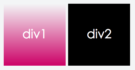
例如:https://jsfiddle.net/lazy_shyu/jroahfvj/2/
:root {
    --main-color: #c06;
    --linear-gradient: linear-gradient(to top, var(--main-color), transparent);
}

div {
    background: var(--div-background-color, #000);
}

.div1 { --div-background-color: var(--linear-gradient); }
.div2 { --div-background-color: var(--undefined-color); }
.div2 沒有定義 --undefined-color => --div-background-color 抓不到
因此 var(--div-background-color, #000) 就會回傳黑色
https://jsfiddle.net/lazy_shyu/jroahfvj/4/
可以接受的值:
:root {
    --text: attr(class);
    --div-size: 100px;
    --main-color: #c06;
    --linear-gradient: linear-gradient(to top, var(--main-color), transparent);
}
目前覺得有點可惜的是
--x: calc(var(--x) * 2) 或 --x: calc(var(--x) + 50px) 這種疊上去的寫法var(...) 的寫法會被轉換成字串1 跟 2 不知道之後有沒有機會支援 XD
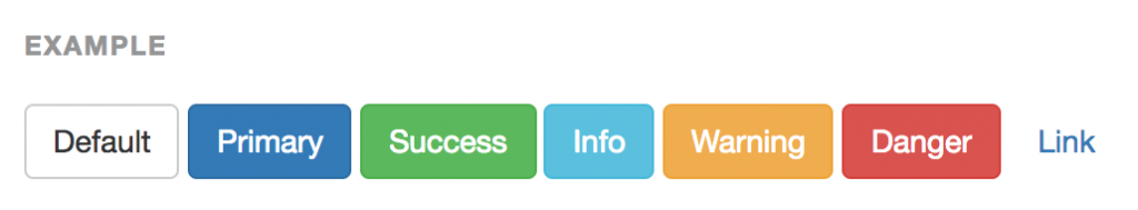
目標:使用 CSS Variables 做出 bootstrap 的按鈕們
加上 html ( https://jsfiddle.net/lazy_shyu/j894xxcw/2/ )
<button class="btn default">Default</button>
<button class="btn primary">Primary</button>
<button class="btn success">Success</button>
<button class="btn info">Info</button>
<button class="btn warning">Warning</button>
<button class="btn danger">Danger</button>
<button class="btn link">Link</button>
還在裸奔中的狀態
預設寫成 default 的樣子 ( https://jsfiddle.net/lazy_shyu/j894xxcw/3/ )
.btn {
    --text-color: #333;
    --theme-color--main: #fff;
    --theme-color--second: #ccc;

    /* ... */
    color: var(--text-color);
    border-color: var(--theme-color--second);
    background: var(--theme-color--main);
    /* ... */
}

.btn:hover {
    --theme-color--main: #e6e6e6;
    --theme-color--second: #adadad;
}
現在有了基本樣式了 ( 第一個是 hover 狀態 )
加上各個主題預設的樣式 ( https://jsfiddle.net/lazy_shyu/j894xxcw/5/ )
.primary { --text-color: #fff;    --theme-color--main: #337ab7;     --theme-color--second: #2e6da4; }
.success { --text-color: #fff;    --theme-color--main: #5cb85c;     --theme-color--second: #4cae4c; }
.info    { --text-color: #fff;    --theme-color--main: #5bc0de;     --theme-color--second: #46b8da; }
.warning { --text-color: #fff;    --theme-color--main: #f0ad4e;     --theme-color--second: #eea236; }
.danger  { --text-color: #fff;    --theme-color--main: #d9534f;     --theme-color--second: #d43f3a; }
.link    { --text-color: #337ab7; --theme-color--main: transparent; --theme-color--second: transparent; }
改用 fallback 的形式處理 default 的顏色 ( https://jsfiddle.net/lazy_shyu/j894xxcw/5/ )
.btn {
    /* ... */
    color: var(--text-color, #333);
    border-color: var(--theme-color--second, #ccc);
    background: var(--theme-color--main, #fff);
    /* ... */
}
加上各主題 hover 的樣式 ( https://jsfiddle.net/lazy_shyu/j894xxcw/6/ )
.primary:hover { --theme-color--main: #286090;     --theme-color--second: #204d74; }
.success:hover { --theme-color--main: #449d44;     --theme-color--second: #4cae4c; }
.info:hover    { --theme-color--main: #31b0d5;     --theme-color--second: #269abc; }
.warning:hover { --theme-color--main: #ec971f;     --theme-color--second: #d58512; }
.danger:hover  { --theme-color--main: #c9302c;     --theme-color--second: #ac2925; }
.link:hover    { --theme-color--main: transparent; --theme-color--second: transparent; }
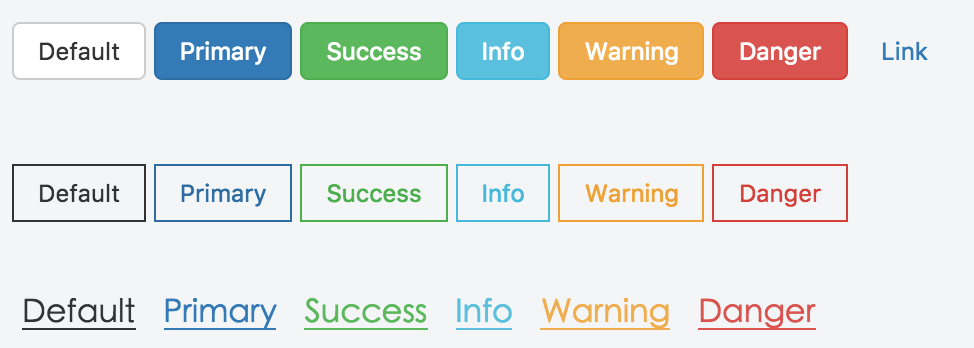
最後幫 .btn.link 加上 hover 的底線樣式 ( https://jsfiddle.net/lazy_shyu/j894xxcw/7/ )
.link:hover {
    /* ... */
    text-decoration: underline;
}
然後就完成了 =D
之後想要套用在其他的 class 上的話,也可以很輕易的完成~
這邊以連結跟幽靈按鈕作為例子:https://jsfiddle.net/lazy_shyu/j894xxcw/9/
第二行:
.btn.btn--ghost+ 各主題的 class
第三行:.text+ 各主題的 class
除了主題顏色系列以外,也可以有字體大小的系列,
例如新增 font-xs / font-sm / font-md / font-lg / font-xl 來控制。
最後,CSS variable 是可以用 js 取得 / 設定的,互動性非常高。
codepen 上就可以找到很多很有感的 demo:
但目前只想到可以用在文章或版型的編輯器裡,之後想到其他應用的話再來試做看看~


 看影片追技術