
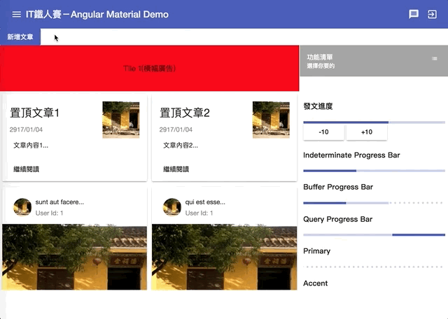
今天是Angular Material部落格篇的最後一天,我們要一口氣介紹三個元件,分別是Chip、Tooltip和Snackbar,其中Chip很適合用來當作類似標籤的功能;而Tooltip和Snackbar則是用在不同的地方,作為提示時使用。
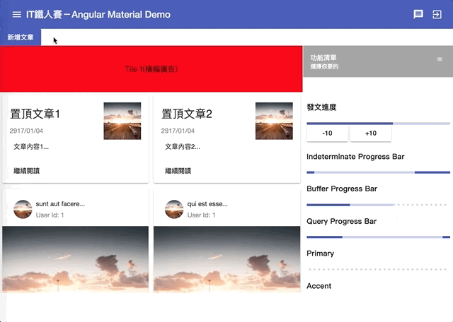
在Material Design的Chips設計指南中,Chip主要用來把複雜的實體分成多個小區塊顯示,像是聯絡人清單等等的資訊,就很適合用Chips存放。
Chip是可以被選擇的,當被選擇時,我們應該要能提供更多關於這個Chip的資訊;當然,既然可選擇,應該也是要能夠提供直覺的刪除Chip的方法。
我們可以在加入MatChipsModule後,使用<mat-chip-list>和<mat-chip>的組合,即可完成一個基本的清單。
這種類型的組合我們已經練習過很多次了,不多說,直接上程式:
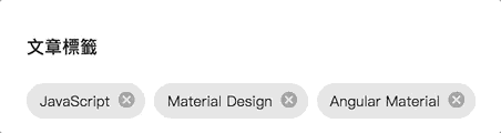
<h4>文章標籤</h4>
<mat-chip-list>
  <mat-chip>JavaScript</mat-chip>
  <mat-chip>Material Design</mat-chip>
  <mat-chip>Angular Material</mat-chip>
</mat-chip-list>
結果如下:
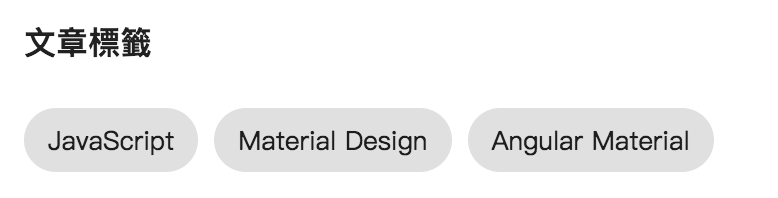
簡單到不行吧!接下來我們再看看還有什麼其他的玩法吧!!
非常容易,只需要加上selected="true"即可
<mat-chip-list>
  <mat-chip selected="true">JavaScript</mat-chip>
  <mat-chip>Material Design</mat-chip>
  <mat-chip>Angular Material</mat-chip>
</mat-chip-list>
結果如下:
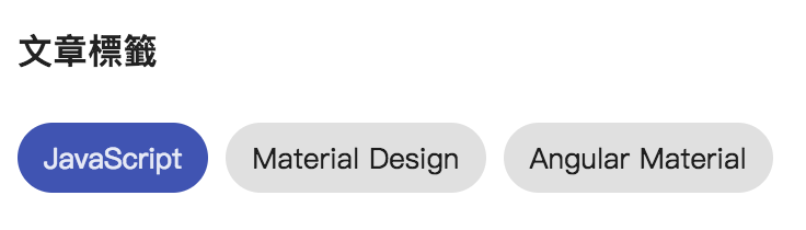
可以看到JavaScript選項因為加上selected="true"之後,變成了被選取的顏色了!當然這個被選取的顏色,也是可以調整的。
<mat-chip-list>
  <mat-chip color="primary" selected="true">JavaScript</mat-chip>
  <mat-chip color="accent" selected="true">Material Design</mat-chip>
  <mat-chip color="warn" selected="true">Angular Material</mat-chip>
</mat-chip-list>
結果如下:
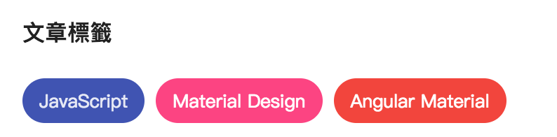
這裡有個比較容易搞混的部分是,設定color並不會改變整個chip的顏色,只會改變被選取時的顏色,目前是沒有辦法再不被選取的狀態下透過color屬性改變顏色的,只能直接調整CSS。
預設的<mat-chip>已經有了基本Material Design風格的樣式,而Angular Material提供了一個<mat-basic-chip>,只提供基本的mat-basic-chip的CSS class,讓我們可以自訂chip樣式:
例如一個CSS如下
.mat-basic-chip {
  background: lime;
  margin: 0 0 0 8px;
  padding: 7px 12px;
  border-radius: 5px;
}
接著畫面上加入<mat-basic-chip>:
<mat-basic-chip>HTML</mat-basic-chip>
成果如下:
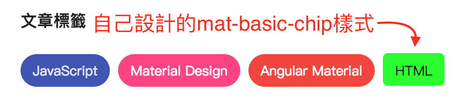
自己使用Chip就可以自己做啦!
Chip是可以被刪除的,我們可以在<mat-chip>裡面加上一個包含matChipRemove的元件,通常是<mat-icon>,之後就可以搭配remove事件,來處理刪除的程式邏輯。
如下:
<mat-chip-list>
  <mat-chip *ngFor="let tag of tags" (remove)="removeTag(tag)">
    {{ tag }}
    <mat-icon matChipRemove>cancel</mat-icon>
  </mat-chip>
</mat-chip-list>
接著在程式加上移除的邏輯:
@Component({
  ...
})
export class AddPostDialogComponent implements OnInit {
  tags = ['JavaScript', 'Material Design', 'Angular Material'];
  removeTag(tagName) {
    this.tags = this.tags.filter(tag => tag !== tagName);
  }
成果如下:
我們也可以為<mat-chip>設定removable屬性,來決定是否允許刪除,例如以下程式代表設定成remove事件不會發生,自然也無法刪除囉
<mat-chip removable="false">
  ...
</mat-chip-list>
<mat-chip-list>和<mat-chip>很棒的一點是,他同時可以跟表單元件一起使用,讓我們能直接輸入文字,並立即轉為Chip,我們直接來看看程式碼:
這次我們反過來,先看TypeScript再來看HTML
TypeScript部分:
import { ENTER, COMMA } from '@angular/cdk/keycodes';
@Component({
  ...
})
export class AddPostDialogComponent implements OnInit {
  tags = ['JavaScript', 'Material Design', 'Angular Material'];
  separatorKeysCodes = [ENTER, COMMA];

  addTag($event: MatChipInputEvent) {
    if (($event.value || '').trim()) {
      const value = $event.value.trim();
      if (this.tags.indexOf(value) === -1) {
        this.tags.push(value);
      }
    }

    $event.input.value = '';
  }
}
上面程式我們宣告了一個separatorKeysCodes變數,來指令當按下哪些鍵時,會傳入新的MatChipInputEvent資料,以這裡的設定來說是ENTER鍵和逗點(,)。這兩個鍵盤keyCode都在@angular/cdk/keycodes先定義好了,節省我們尋找鍵盤keyCode的時間。
另外我們也寫了一個addTag()方法,接收當畫面上輸入資料遇到separatorKeysCodes時,傳入的事件,這個事件有兩個屬性
程式中我們確定輸入的資料若不是空的且沒有重複,就把輸入的內容加入清單中,然後重設輸入的資料。
接著看看HTML中有哪些東西:
<mat-form-field>
  <mat-chip-list #chipList>
    <mat-chip *ngFor="let tag of tags" (remove)="removeTag(tag)">
      {{ tag }}
      <mat-icon matChipRemove>cancel</mat-icon>
    </mat-chip>
  </mat-chip-list>
  <input placeholder="文章標籤"
         [matChipInputFor]="chipList"
         [matChipInputAddOnBlur]="true"
         [matChipInputSeparatorKeyCodes]="separatorKeysCodes"
         (matChipInputTokenEnd)="addTag($event)" />
</mat-form-field>
我們把原來的<mat-chip-list>包裝在<mat-form-field>之中,同時也加上一個<input>,也因此我們可以直接使用placeholder當做整個輸入控制項的標籤,呈現更具有一致性!
在<input>中,關於chip有幾個重要的屬性可以設定
[matChipInputFor]:實際上要放置的<mat-chip-list>
[matChipInputAddOnBlur]:是否要在blur時加入chip[matChipInputSeparatorKeyCodes]:當按下指定的鍵盤按鍵時,視為要新增chip(matChipInputTokenEnd):當真正要加入一個chip時的邏輯程式。最後來看看成果:
看起來就很強大啊!
在Material Design的Tooltips設計指南中,Tooltip主要是用來作為提示訊息使用,會在使用者與某個UI發生互動如滑鼠移過去或focus等行為時顯示;用來給予使用這一些提示文字。
要使用Tooltip,我們需要加入MatTooltipModule,接著就可以直接來使用matTooltip這個directive。
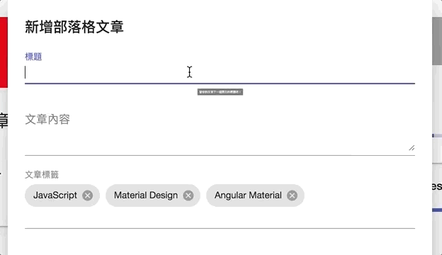
我們可以在任何元件上加入matTooltip這個directive來決定tooltip的文字,如下
<mat-form-field>
  <input matInput placeholder="標題" [(ngModel)]="title" matTooltip="替你的文章下一個漂亮的標題吧!" />
</mat-form-field>
成果如下:
我們可以透過matTooltipPosition屬性來決定tooltip顯示的位置,matTooltipPosition可以設定成如下:
| Position | 顯示位置 |
|---|---|
above |
顯示在目標之上 |
below |
顯示在目標之下 |
left |
顯示在目標左邊 |
right |
顯示在目標右邊 |
before |
LTR模式在左邊,RTL模式在右邊 |
after |
LTR模式在右邊,RTL模式在左邊 |
例如我們改為matTooltipPosition="right",就會改為顯示在目標的右邊
<mat-form-field>
  <input matInput placeholder="標題" [(ngModel)]="title"
         matTooltip="替你的文章下一個漂亮的標題吧!"
         matTooltipPosition="right"/>
</mat-form-field>
成果如下:
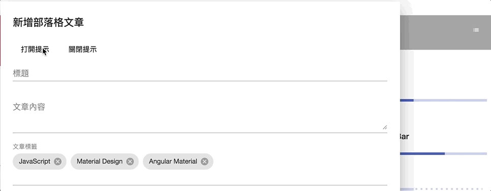
我們可以直接使用matTooltip提供的show()和hide()方法來動態打開或關閉tooltip
以下程式按下"打開"按鈕,會直接顯示tooltip;按下"關閉"按鈕則會關閉tooltip:
<button mat-button (click)="titleTooltip.show()">打開提示</button>
<button mat-button (click)="titleTooltip.hide()">關閉提示</button>
<mat-form-field>
  <input matInput placeholder="標題" [(ngModel)]="title"
         #titleTooltip="matTooltip"
         matTooltip="替你的文章下一個漂亮的標題吧!"
         matTooltipPosition="right"/>
</mat-form-field>
成果如下:
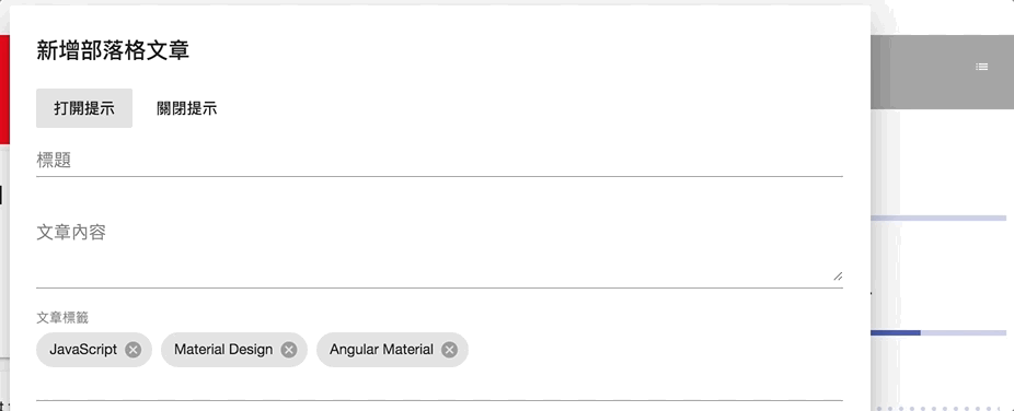
我們可以使用matTooltipShowDelay屬性來決定要延遲多久顯示tooltip,另外也可以使用matTooltipHideDelay來決定延遲多久隱藏tooltip:
<mat-form-field>
  <input matInput placeholder="標題" [(ngModel)]="title"
         #titleTooltip="matTooltip"
         matTooltip="替你的文章下一個漂亮的標題吧!"
         matTooltipPosition="right"
         matTooltipShowDelay="500"
         matTooltipHideDelay="500" />
  </mat-form-field>
結果如下:
當滑鼠移過去時,會延遲500毫秒才顯示tooltip,同樣的當滑鼠離開時,也會延遲500毫秒才關閉tooltip。
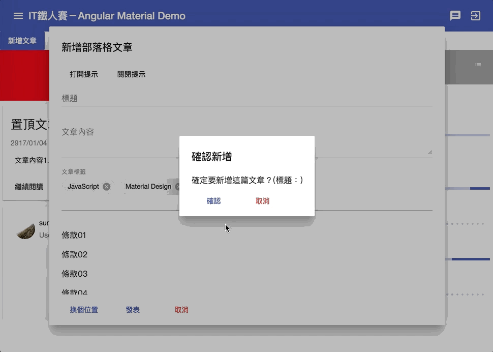
在Material Design的Snackbars & toasts設計指南中,Snackbar是在畫面最下方提供一個文字訊息,讓使用者知道目前系統大致的狀態。這種功能在Android中也叫toast。
SnackBar主要由一個MatSnackBar service來控制顯示,要使用這個service,必須要先加入MatSnackBarModule。
不多說,直接上程式:
@Component({
...
})
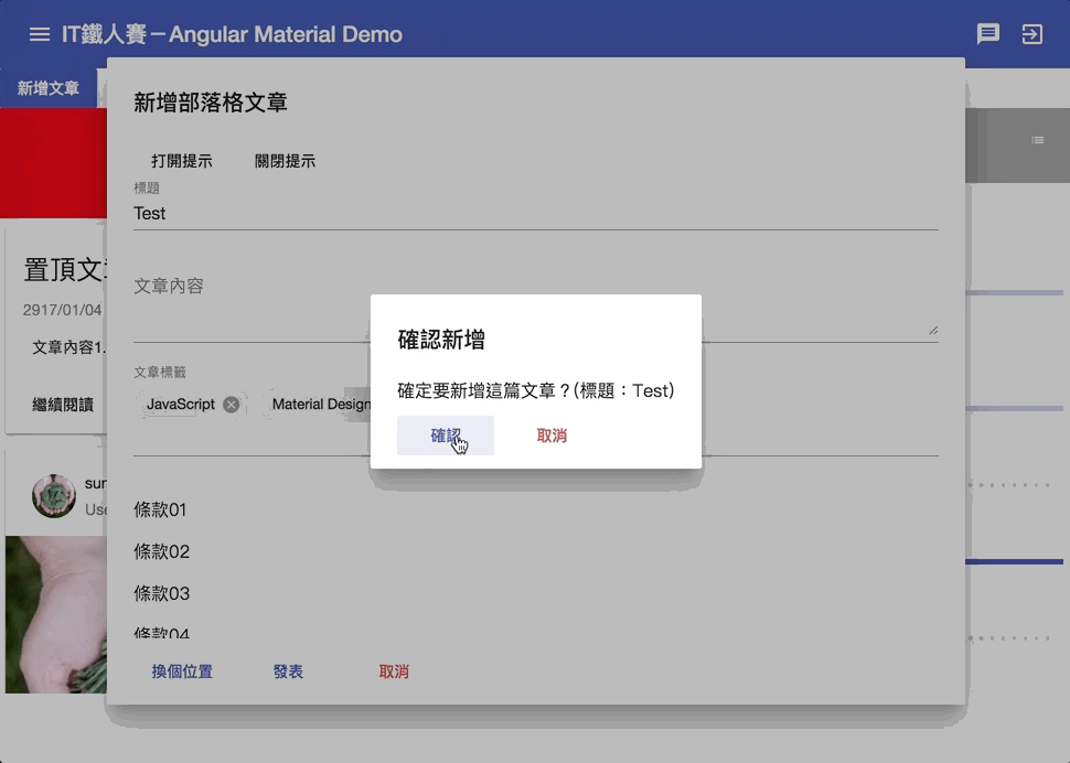
export class AddPostConfirmDialogComponent implements OnInit {
constructor(..., private snackBar: MatSnackBar) {}
confirm() {
...
this.snackBar.open('已新增部落格文章', '我知道了');
}
}
成果如下:
我們只用了MatSnackBar的open()方法,第一個參數代表提示的訊息,第二個參數代表用來關閉訊息的按鈕文字。另外還有第三個參數config?: MatSnackBarConfig,用來做比較細部的微調,稍後我們再來說明。
我們也可以使用MatSnackBar的openFromComponent方法,把一個component當作是SnackBar要顯示的對象,概念上跟昨天介紹過的Dialog非常像,下面程式我們自訂了一個新的Component,HTML內容如下:
<button mat-icon-button (click)="closeSnackBar()">
  <mat-icon align="right">cancel</mat-icon>
</button>
<h4>已新增部落格文章</h4>
<p>溫馨小提示:每30分鐘記得起來運動一下喔!</p>
接著在程式內,使用MatSnackBar的dismiss()方法,將SnackBar關閉
@Component({
   ...
})
export class AfterPostNotifyComponent implements OnInit {
  constructor(private snackBar: MatSnackBar) {}
  closeSnackBar() {
    this.snackBar.dismiss();
  }
}
成果如下:
記得自訂的component要加入entryComponents中。
MatSnackBar的open()或openFromComponent()的最後一個參數都是config: MatSnackBarConfig,我們可以透過這個參數來做一些調整,完成的參數可以上SnackBar的API文件去看,以下列出一些個人覺得重要的參數:
代表多少ms後,會自動關閉SnackBar,如此一來我們就不需要手動去關掉SnackBar了。
在使用自訂component當作SnackBar時非常重要,概念同dialog,我們可以透過注入MAT_SNACK_BAR_DATA來傳入我們要的資訊給自訂的component。
在component中注入的方法:
@Component({
  ...
})
export class AfterPostNotifyComponent implements OnInit {
  get title() {
    return this.snackBarData.title;
  }
  constructor(private snackBar: MatSnackBar, @Inject(MAT_SNACK_BAR_DATA) private snackBarData: any) {}

  ngOnInit() {}

  closeSnackBar() {
    this.snackBar.dismiss();
  }
}
在使用openFromComponent()時只需要加入這個data參數即可:
this.snackBar.openFromComponent(AfterPostNotifyComponent, {
  data: { title: this.title }
});
成果如下:
有了昨天dialog的概念後,這裡應該很容易理解才對吧!
設定SnackBar的水平和垂直的定位方式。
水平定位方式horizontalPosition有幾個選項:
| Position | 顯示位置 |
|---|---|
center |
顯示在螢幕中間 |
left |
顯示在螢幕左邊 |
right |
顯示在螢幕右邊 |
before |
LTR模式在左邊,RTL模式在右邊 |
after |
LTR模式在右邊,RTL模式在左邊 |
垂直定位方式verticalPosition的選項如下:
| Position | 顯示位置 |
|---|---|
top |
顯示在螢幕之上 |
bottom |
顯示在螢幕之下 |
預設會是在中間正下方,如果我們希望改成左下方可以自行設定:
成果如下:
有沒有覺得再調整一下就跟某個社群網站很像啦XD
今天我們介紹了一個可以當作標籤使用的<mat-chip>,這個元件在需要顯示多筆資料時非常好用,也能搭配<mat-form-field>,在表單中能夠有更一致的呈現方式。
另外我們也介紹了兩個用來作為提示用的好功能,分別是tooltip和snackbar。
Tooltip可以當作不同元件的提示訊息,當某個元件可能會有不明確的狀況需要提醒,又不希望提示訊息影響到畫面呈現時,可以使用這種方式來在不破壞畫面的前提給予明確的訊息。
Snackbar則適合當作整個網站程式的狀態提示,不會特別針對某個元件,比起使用alert這種方式,Snackbar則更具有設計質感,也不會破壞畫面的操作,更棒的是我們還能自己設計元件來客製化SnackBar的內容,真的是非常的方便!
部落格篇到這邊告一個段落,不知不覺也用掉了20天,介紹了25個Angular Material的實用功能,明天開始我們將進入收件夾篇,把最後的5個功能介紹完;到時候我們就能大聲的跟人家說我們把Angular Material基本的30種功能 玩弄在鼓掌之間 理解得很不錯啦!
本日的程式碼GitHub:https://github.com/wellwind/it-ironman-demo-angular-material/tree/day-20-chip-tooltip-snackbar
分支:day-20-chip-tooltip-snackbar
剛剛踩雷了,趕快留言給日後的人參考XD
<mat-chip-list>
  <mat-chip *ngFor="let tag of tags" (remove)="removeTag(tag)">
    {{ tag }}
    <mat-icon matChipRemove>cancel</mat-icon>
  </mat-chip>
</mat-chip-list>
(remove)語法已經變成(removed)了
原本還想說哪裡寫錯沒反應
ref: https://github.com/angular/components/issues/11290
感謝~應該先看留言區的XDD


 iThome鐵人賽
 看影片追技術