今天要介紹的會是比較偏重ui 面的使用方式,但目前我們的主畫面如果想要顯示表格又要顯示地圖,那一定會超擠,所以在這邊跟大家介紹一下tabsetPanel 這個元件,他的使用方式很簡單。
tabsetPanel(
   tabPanel("地址表單", tableOutput('addressTable')),
   tabPanel("地址分佈圖", plotOutput("allAddressPlot", height = "800px")),
   tabPanel("K-means結果分佈圖", plotOutput("classifiedAddressPlot", height = "800px"))
)
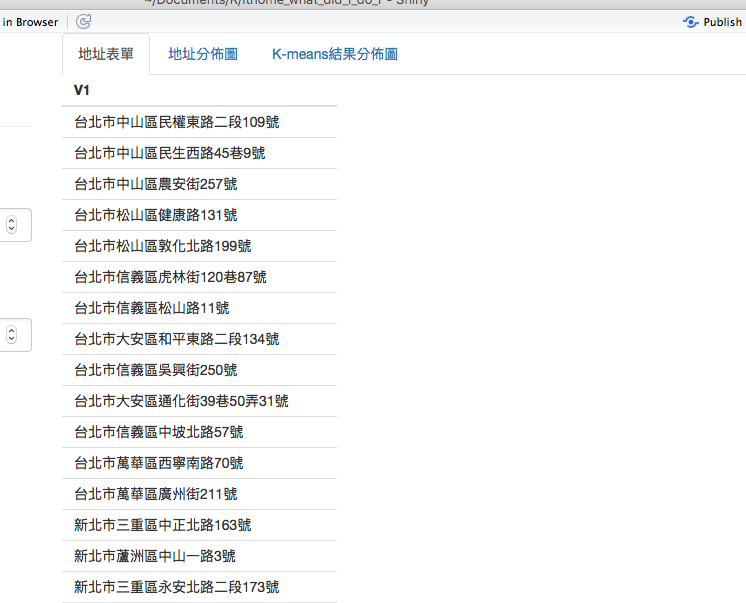
如上,我建構了一個tabsetPanel,使元件含有三個分頁tabPanel,第一個是表格分頁tableOutput,第二和第三個分別是用來畫地圖的panel。
於是我們可以得到這樣的頁面。
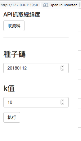
再來,我們知道k-means 需要k值,而每次k-means的結果會不一樣,因此也需要一個種子碼,於是我們在左邊的側邊欄加上這兩個變數的調控區。
column(3,
   h4("API抓取經緯度"),
   actionButton("request", "取資料"),
   hr(),
   numericInput("seed", h3("種子碼"), value = 20180112),
   numericInput("k_value", h3("k值"), value = 10),
   actionButton("do", "執行")
)
得出了這樣的畫面。
以上就是我的ui配置,接著我們來處理server 的邏輯。
現在有了一個新的按鈕事件,我取名叫do,他負責執行k-means 結果,而執行前提是v$addressWithLatLng,也就是已經取得經緯度的結果。
observeEvent(input$do, {
    if (is.null(v$addressWithLatLng)) return()

    set.seed(input$seed)
    kmeans = kmeans(x = v$addressWithLatLng[, c('Lat','Lng')], centers = input$k_value)
    v$addressWithKMeans <- v$addressWithLatLng %>%
        ungroup() %>%
        mutate(category=kmeans$cluster)
})
再看到allAddressPlot 這個分頁,我們需要把地圖畫出來,所以在此處執行ggmap。
output$allAddressPlot <- renderPlot({
    if (is.null(v$addressWithLatLng)) return()
    ggmap(get_googlemap(center=c(121.52311,25.04126), zoom=12, maptype='satellite'), extent='device') +
        geom_point(data=v$addressWithLatLng, aes(x=Lng, y=Lat), colour='red')
})
另一個分頁classifiedAddressPlot 也是跟上面一樣的道理,有一點不同的地方是,他必須要v$addressWithKMeans是有結果才將圖畫出。
output$classifiedAddressPlot <- renderPlot({
    if (is.null(v$addressWithKMeans)) return()
    ggmap(get_googlemap(center=c(121.52311,25.04126), zoom=12, maptype='satellite'), extent='device') +
        geom_point(data=v$addressWithKMeans,
                   size=1.8,
                   aes(x=Lng, y=Lat, colour=factor(category)))
})
好,以上程式碼都完成後,我們來跑跑看。
這是一開始的畫面。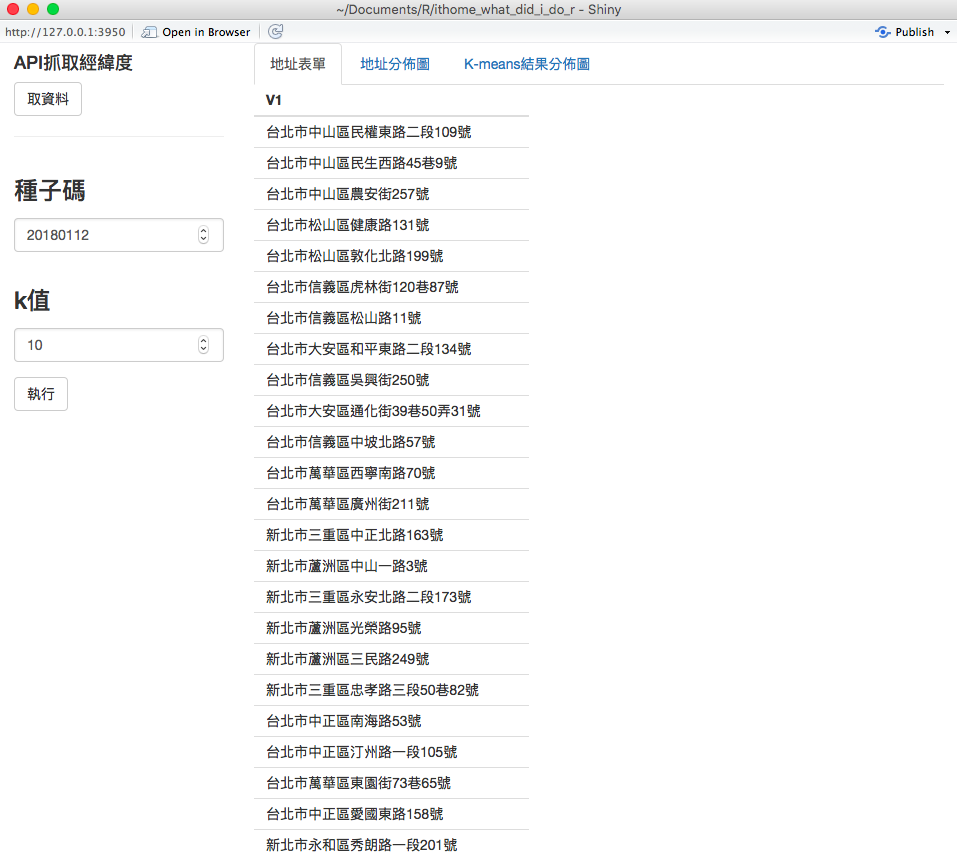
這是取完經緯度座標後的表格畫面。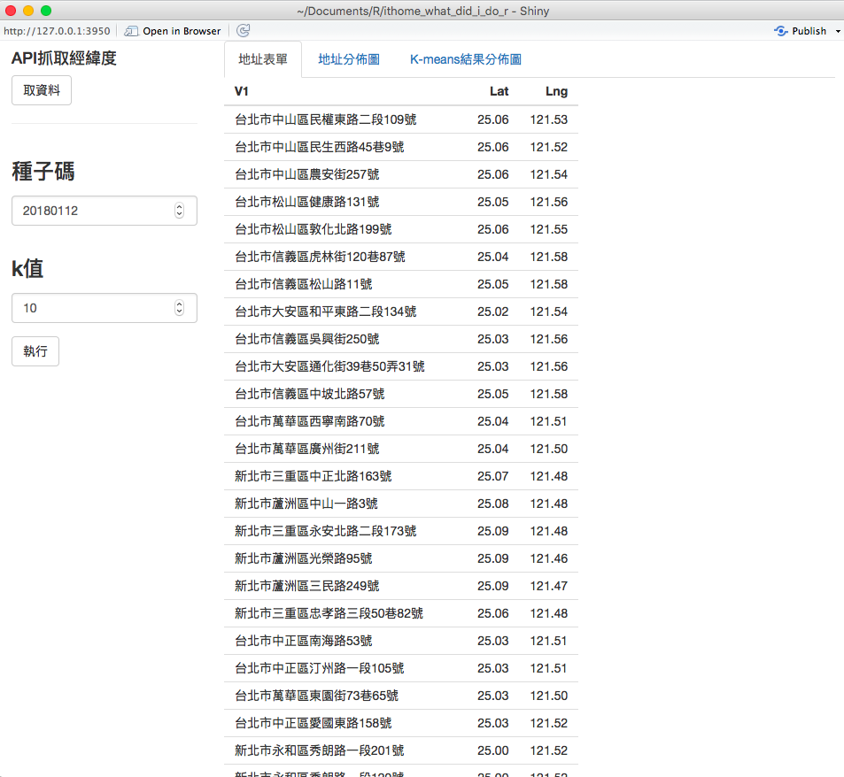
這是取完經緯度座標後,切換到地圖分頁的畫面。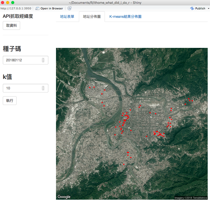
這是執行完種子碼20180112,分成10組後的分類地圖畫面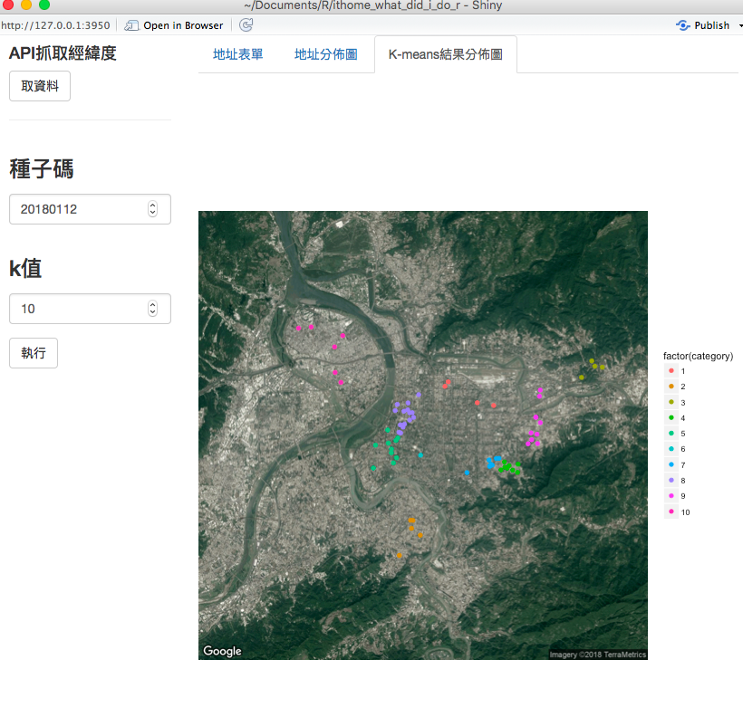
這是執行完種子碼19920113,分成5組後的分類地圖畫面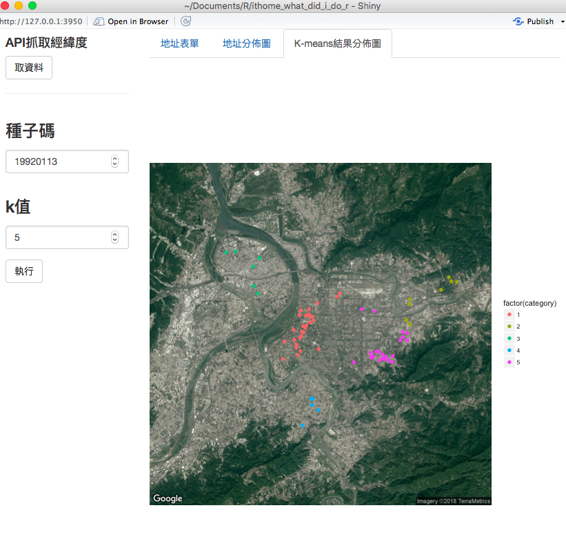
是不是跟之前比起來,用shiny 圖形介面來操作方便許多呢!
ref:
day26原始碼


 iThome鐵人賽