Ref.: Fairness
昨天列出了一些bias,今天則要從資料中認出bias,還有評估bias造成的傷害。
以前我們用過DataFrame.describe去列出feature的一些統計特性:
| -- | longitude | latitude | population | households | median_income |
|---|---|---|---|---|---|
| count | 17000 | 17000 | 17000 | 17000 | 17000 |
| mean | -119.6 | 35.6 | 1429.6 | 501.2 | 3.9 |
| std | 2.0 | 2.1 | 1147.9 | 384.5 | 1.9 |
| min | -124.3 | 32.5 | 3.0 | 1.0 | 0.5 |
| 25% | -121.8 | 33.9 | 790.0 | 282.0 | 2.6 |
| 50% | -118.5 | 34.2 | 1167.0 | 409.0 | 3.5 |
| 75% | -118.0 | 37.7 | 1721.0 | 605.2 | 4.8 |
| max | -114.3 | 42.0 | 35682.0 | 6082.0 | 15.0 |
但如果假設population、households、median_income這三個feature有效的資料只有3000筆,其他14000個都是空值(不見得是0、可能沒有用),這樣這三個feature就不太能被你的model使用。
| -- | longitude | latitude | population | households | median_income |
|---|---|---|---|---|---|
| count | 17000 | 17000 | 3000 | 3000 | 3000 |
| mean | -119.6 | 35.6 | 1429.6 | 501.2 | 3.9 |
| std | 2.0 | 2.1 | 1147.9 | 384.5 | 1.9 |
| min | -124.3 | 32.5 | 3.0 | 1.0 | 0.5 |
| 25% | -121.8 | 33.9 | 790.0 | 282.0 | 2.6 |
| 50% | -118.5 | 34.2 | 1167.0 | 409.0 | 3.5 |
| 75% | -118.0 | 37.7 | 1721.0 | 605.2 | 4.8 |
| max | -114.3 | 42.0 | 35682.0 | 6082.0 | 15.0 |
| 在使用前可能需要先謹慎的檢查這些問題的原因,以確保不會有其他bias產生。 |
今天有了經度緯度,是不是有不在你期待範圍內的經緯度存在?
--|longitude|latitude
1|-121.7|38.0
2|-122.4|37.8
3|-103.5|43.8
4|-118.0|33.7
假設今天要預測的範圍在California裡,仔細一看你可能會發現你資料裡有一個數值不在California的範圍。對,第三筆(-103.5,43.8),在哪?在這:Map
這種數值就該先過濾掉,不該餵進你的model。
今天有了經度緯度,或許我們可以在把資料畫上地圖,看看是不是我們資料的分布跟我們的預期一樣。記得以前在Validation有個例子,我們用的資料set分布不一致。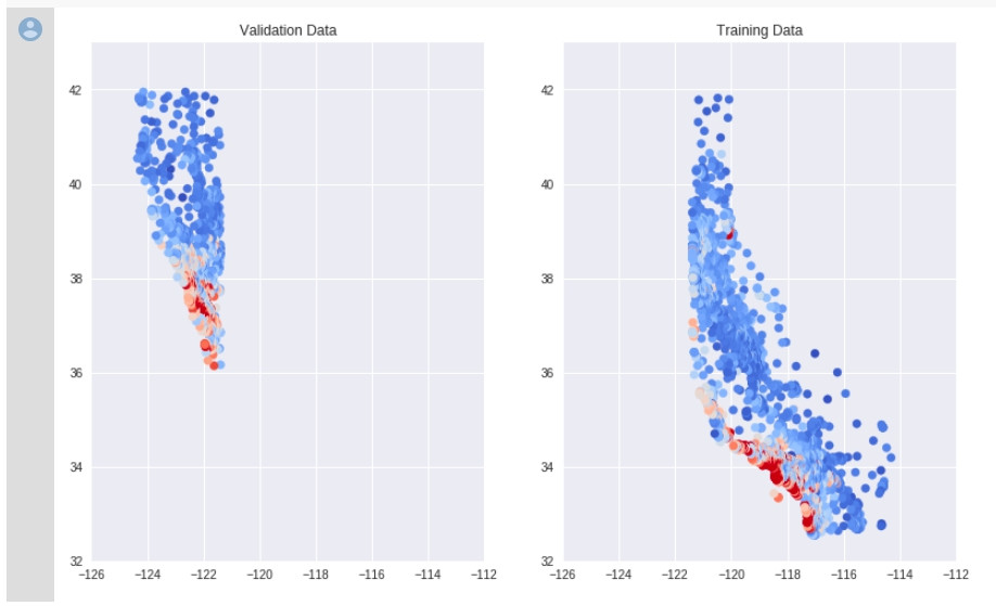
沒有用適當的隨機取樣,讓你的data呈現某種排序,又直接被我們拿去訓練的話,也會有奇怪的bias產生。
有時候,可能資料都正確,表面上看不出任何問題,甚至,train完以後也有相當程度的可靠度,像是下面的confusion matrix: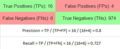
這1000個data是所有腫瘤預測的結果,其中包含500個男性500個女性,Precision 0.8, Recall 0.727,但再仔細細看男女的預測,我們會發現不一樣的結果:
| female | male |
|---|---|
 |
 |
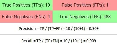
瞧出什麼沒有?對Female的結果而言,預測有腫瘤的結果中,有10個預測正確(Precision 90.9%);同樣的真的有腫瘤的人,有10個預測是正確的(Recall 90.9%)。
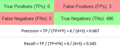
但再看看Male的結果,你得到了什麼?
預測有腫瘤的結果中,9個中有6個預測正確(Precision 66.7%),有33.3%的人實際上沒有腫瘤;同樣的11個真的有腫瘤的人,有6個預測是正確的(Recall 54.5%),有45.5%的人沒被預測出有腫瘤。
這樣更能透過model預測結果理解本質存在的bias,即便整體不容易觀察,細分成更小的Group後會顯而易見。當這些系統要用在實務上時必須更加小心。
是不是看不到code? 點兩下title就可以展開了。不想看的話也可以直接按cell中的執行。
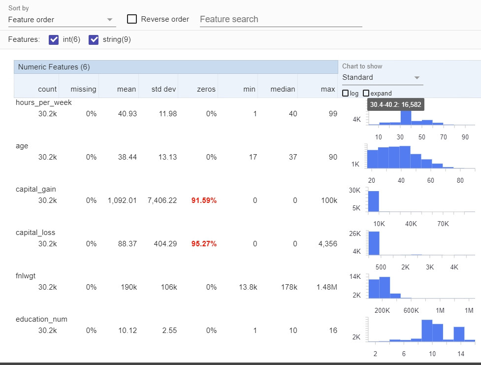
這個練習使用了Facets Overview & Facets Dive,Facets Overview看資料的柱狀圖分布。
#@title Visualize the Data in Facets
fsg = FeatureStatisticsGenerator()
dataframes = [
    {'table': train_df, 'name': 'trainData'}]
censusProto = fsg.ProtoFromDataFrames(dataframes)
protostr = base64.b64encode(censusProto.SerializeToString()).decode("utf-8")

HTML_TEMPLATE = """<link rel="import" href="https://raw.githubusercontent.com/PAIR-code/facets/master/facets-dist/facets-jupyter.html">
        <facets-overview id="elem"></facets-overview>
        <script>
          document.querySelector("#elem").protoInput = "{protostr}";
        </script>"""
html = HTML_TEMPLATE.format(protostr=protostr)
display(HTML(html))
Facets Dive則可以看每個feature與其他feature間的關係:
#@title Set the Number of Data Points to Visualize in Facets Dive

SAMPLE_SIZE = 2500 #@param

train_dive = train_df.sample(SAMPLE_SIZE).to_json(orient='records')

HTML_TEMPLATE = """<link rel="import" href="https://raw.githubusercontent.com/PAIR-code/facets/master/facets-dist/facets-jupyter.html">
        <facets-dive id="elem" height="600"></facets-dive>
        <script>
          var data = {jsonstr};
          document.querySelector("#elem").data = data;
        </script>"""
html = HTML_TEMPLATE.format(jsonstr=train_dive)
display(HTML(html))
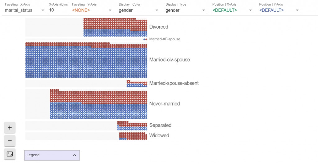
一定要實際操作看看喔!


 iThome鐵人賽