Hi! 大家好,我是Eric,這次要練習R語言中的shiny套件!
shiny是協助我們運用R語言直接作出一個互動式網頁,完成不需要了解網頁語言
緣起:這次我們要使用的資料與之前的shiny文章([R語言]資料視覺化S01─shiny)相同,只是這次要製作的是Dashboard版本
方法:運用[R語言]的[shiny]套件。
目標資料:交通部高速公路局交通資料庫ETC(Electronic Toll Collection )資料─各類車種通行量統計(TDCS_M03A),2016-2019年。
1. 載入套件。
library(ggplot2)
library(ggthemes)
library(shiny)
library(shinydashboard)
2. 載入資料與前置處理。
setwd("C:/Users/User/Desktop/Eric/data")    #設定檔案路徑

#載入資料,這邊我們直接沿用上次([R語言]資料視覺化S01─shiny)的資料
a1<-read.csv("a1.csv")
a2<-read.csv("a2.csv")
b1<-read.csv("b1.csv")
b2<-read.csv("b2.csv")
c1<-read.csv("c1.csv")
c2<-read.csv("c2.csv")
d1<-read.csv("d1.csv")
d2<-read.csv("d2.csv")
3. shiny
ui是shiny中定義使用者看到的網頁樣子,dashboardPage是產生儀錶板頁面:
ui <- dashboardPage(

  #skin設定顏色版顏色;dashboardHeader設定標題與標題寬度;#dashboardSidebar設定頁面側邊攔

  skin = "green",
  dashboardHeader(title = "ETC data of the first and second day of the Chinese New Year",titleWidth = 600),
    dashboardSidebar(),

  #dashboardBody設置頁面主文;
  fluidRow設定輸入物件為浮動佈局,較不會因為每個仁電腦螢幕的尺寸不同,導致物件錯位;box(title,status,solidHeader,collapsible)產生方塊物件的標題、顏色、格式及是否可摺疊;
  selectInput()設定輸入的方式為選擇勾選方式,ID是date、標籤是Date:、可勾選的選項是ETCdata中date欄位的所有資料(不重複計)

    dashboardBody(
      fluidRow(
      box(title = "Select the date", status = "primary",solidHeader = TRUE,collapsible = TRUE,
          selectInput("date", "Date:",choices = unique(ETCdata$date)))
          ),
    mainPanel(    #設定輸出

    #產生tab頁面;產生Plot;產生Summary;產生Table
    #icon為(https://fontawesome.com/icons?from=io)網站中的名稱,可加上小圖示

      tabsetPanel(type = "tabs",
                  tabPanel("Plot", icon("image"),plotOutput("ETCPlot")),
                  tabPanel("Summary", icon("pen-fancy"),verbatimTextOutput("summary")),
                  tabPanel("Table", icon("table"),tableOutput("table"))
       )

    )
  )
)
server是背後的程式碼,負責依照輸入執行程式碼,並將輸出回傳:
註:這邊程式碼我寫的比較冗長,應該會有更好的寫法,還是希望能夠有所幫助,這邊我也把程式碼的格式用的比較易讀一點,所以看起來會更冗長
server <- function(input, output) {

  #ETCPlot為前面ui中的ETCPlot,這邊定義他的功能,用if-eles if判斷日期並使用ggplot2製作線圖(ggplot2至作線圖的解釋請參考我的網站另一篇文章,連結在本文最下面)
  output$ETCPlot <- renderPlot({

     if(input$date=="2016-02-08"){
      ggplot(a1,aes(x=time,y=flow,group = 1))+
      geom_line(linetype = "solid",size=1.5,color="#00CED1")+
      labs(title = paste("Traffic flow in",input$date),x="time",y="flow")+
      theme_stata()+
      theme(axis.title.x = element_text(size = 15, face = "bold", vjust = 0.5, hjust = 0.5))+
      theme(axis.title.y = element_text(size = 15, face = "bold", vjust = 0.5, hjust = 0.5, angle = 360))+
      theme(axis.text.y = element_text(angle = 360))+
      theme(plot.title = element_text(size=15,face = "bold"))
    }else if(input$date=="2017-01-28"){
      ggplot(b1,aes(x=time,y=flow,group = 1))+
      geom_line(linetype = "solid",size=1.5,color="#2E8B57")+
      labs(title = paste("Traffic flow in",input$date),x="time",y="flow")+
      theme_stata()+
      theme(axis.title.x = element_text(size = 15, face = "bold", vjust = 0.5, hjust = 0.5))+
      theme(axis.title.y = element_text(size = 15, face = "bold", vjust = 0.5, hjust = 0.5, angle = 360))+
      theme(axis.text.y = element_text(angle = 360))+
      theme(plot.title = element_text(size=15,face = "bold"))
    }else if(input$date=="2018-02-16"){
      ggplot(c1,aes(x=time,y=flow,group = 1))+
      geom_line(linetype = "solid",size=1.5,color="#FFB90F")+
      labs(title = paste("Traffic flow in",input$date),x="time",y="flow")+
      theme_stata()+
      theme(axis.title.x = element_text(size = 15, face = "bold", vjust = 0.5, hjust = 0.5))+
      theme(axis.title.y = element_text(size = 15, face = "bold", vjust = 0.5, hjust = 0.5, angle = 360))+
      theme(axis.text.y = element_text(angle = 360))+ theme(plot.title = element_text(size=15,face = "bold"))
    }else if(input$date=="2019-02-05"){
      ggplot(d1,aes(x=time,y=flow,group = 1))+
      geom_line(linetype = "solid",size=1.5,color="#EE6363")+
      labs(title = paste("Traffic flow in",input$date),x="time",y="flow")+
      theme_stata()+
      theme(axis.title.x = element_text(size = 15, face = "bold", vjust = 0.5, hjust = 0.5))+
      theme(axis.title.y = element_text(size = 15, face = "bold", vjust = 0.5, hjust = 0.5, angle = 360))+
      theme(axis.text.y = element_text(angle = 360))+ theme(plot.title = element_text(size=15,face = "bold"))
    }else if(input$date=="2016-02-09"){
      ggplot(a2,aes(x=time,y=flow,group = 1))+
      geom_line(linetype = "solid",size=1.5,color="#FF1493")+
      labs(title = paste("Traffic flow in",input$date),x="time",y="flow")+
      theme_stata()+theme(axis.title.x = element_text(size = 15, face = "bold", vjust = 0.5, hjust = 0.5))+
      theme(axis.title.y = element_text(size = 15, face = "bold", vjust = 0.5, hjust = 0.5, angle = 360))+
      theme(axis.text.y = element_text(angle = 360))+
      theme(plot.title = element_text(size=15,face = "bold"))
    }else if(input$date=="2017-01-29"){
      ggplot(b2,aes(x=time,y=flow,group = 1))+
      geom_line(linetype = "solid",size=1.5,color="#008B8B")+
      labs(title = paste("Traffic flow in",input$date),x="time",y="flow")+
      theme_stata()+
      theme(axis.title.x = element_text(size = 15, face = "bold", vjust = 0.5, hjust = 0.5))+
      theme(axis.title.y = element_text(size = 15, face = "bold", vjust = 0.5, hjust = 0.5, angle = 360))+
      theme(axis.text.y = element_text(angle = 360))+
      theme(plot.title = element_text(size=15,face = "bold"))
    }else if(input$date=="2018-02-17"){
      ggplot(c2,aes(x=time,y=flow,group = 1))+
      geom_line(linetype = "solid",size=1.5,color="#90EE90")+
      labs(title = paste("Traffic flow in",input$date),x="time",y="flow")+
      theme_stata()+
      theme(axis.title.x = element_text(size = 15, face = "bold", vjust = 0.5, hjust = 0.5))+
      theme(axis.title.y = element_text(size = 15, face = "bold", vjust = 0.5, hjust = 0.5, angle = 360))+
     theme(axis.text.y = element_text(angle = 360))+ theme(plot.title = element_text(size=15,face = "bold"))
    }else{
      ggplot(d2,aes(x=time,y=flow,group = 1))+
      geom_line(linetype = "solid",size=1.5,color="#008B45")+
      labs(title = paste("Traffic flow in",input$date),x="time",y="flow")+
      theme_stata()+
      theme(axis.title.x = element_text(size = 15, face = "bold", vjust = 0.5, hjust = 0.5))+
      theme(axis.title.y = element_text(size = 15, face = "bold", vjust = 0.5, hjust = 0.5, angle = 360))+
      theme(axis.text.y = element_text(angle = 360))+ theme(plot.title = element_text(size=15,face = "bold"))
    }
  })

  #summary為前面ui中的summary,這邊定義他的功能,用if-eles if判斷日期並使用summary()總結當日交通量
  output$summary<-renderPrint({
    if(input$date=="2016-02-08"){
      summary(a1$flow)
    }else if(input$date=="2017-01-28"){
      summary(b1$flow)
    }else if(input$date=="2018-02-16"){
      summary(c1$flow)
    }else if(input$date=="2019-02-05"){
      summary(d1$flow)
    }else if(input$date=="2016-02-09"){
      summary(a2$flow)
    }else if(input$date=="2017-01-29"){
      summary(b2$flow)
    }else if(input$date=="2018-02-17"){
      summary(c2$flow)
    }else if(input$date=="2019-02-06"){
      summary(d2$flow)
    }
  })

  #table為前面ui中的table,這邊定義他的功能,用if-eles if判斷日期並輸出交通量資料
  output$table <- renderTable({
    if(input$date=="2016-02-08"){
      a1[-1]
    }else if(input$date=="2017-01-28"){
      b1[-1]
    }else if(input$date=="2018-02-16"){
      c1[-1]
    }else if(input$date=="2019-02-05"){
      d1[-1]
    }else if(input$date=="2016-02-09"){
      a2[-1]
    }else if(input$date=="2017-01-29"){
      b2[-1]
    }else if(input$date=="2018-02-17"){
      c2[-1]
    }else if(input$date=="2019-02-06"){
      d2[-1]
    }
  })
}
啟動shiny應用程式
shinyApp(ui, server)
4. 大功告成
首先這是Plot作圖的部分,可由左邊選擇想看的日期,右邊就會自動更新為當日的線圖。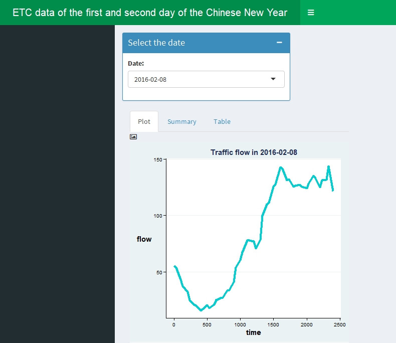
再來是Summary的部分,可由右邊圖表上方3個選項(Plot、Summary及Table)選擇資料呈現方式。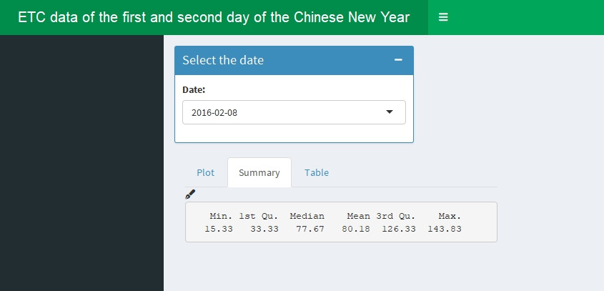
最後是原始資料的呈現,將呈現每日每隔30分鐘的交通量。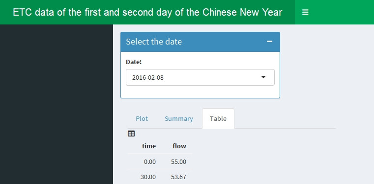
由於這邊只能用靜態的方式呈現,大家可以在自己R語言中互動看看!
5. ggplot2參考資料
[R語言]資料視覺化G01─運用ggplot2完成線圖(line chart)
https://ithelp.ithome.com.tw/articles/10211088
 Eric HSIEH


 iThome鐵人賽