「重新認識 CSS」這個系列名稱的由來就如其名,我想要重新認識它。雖然以前就有學過 CSS,但這次想從 CSS Spec 中學到最原始的定義和內容,更加了解 CSS 的原理,讓我在切版的時候可以更加確定自己在做什麼,我踩到的雷只是因為我不夠了解它才會炸開。
在這 30 天的內容中,會將 Spec 內看到的資料整理成這個系列,也希望正在學 CSS 的各位可以更加了解它。另外我也會同時將文章發至我的 Blog,如果想直接看文內的程式碼 Demo 畫面,可以到我的 Blog 來看。
本文同步發表於 Titangene Blog:重新認識 CSS - Pseudo-class (偽類) (1)
「重新認識 CSS」系列文章發文於:
之前有提到以下這些都是 simple selector:
本篇會介紹 pseudo-class,如果想了解其他 simple selector 可參閱之前介紹的「重新認識 CSS - Simple Selector & Groups of selector」。
pseudo-class 是以 : 為開頭,後面接著 pseudo-class 的名稱,有些會在後面加上括號 (),並在括號之間加上值。例如::nth-child(2)。
注意:
- pseudo-class 和 pseudo-element 不相同
- pseudo-class 是以
:為開頭- pseudo-element 是以
::為開頭,但也可以以:為開頭,因為在舊版的 W3C Spec 中沒有將 pseudo-class 和 pseudo-element 區分成:和::。如果你寫 pseudo-element 是用:,大部份瀏覽器也還是會支援這種語法。
Dynamic pseudo-classes 不會出現在 document source 或 document tree 中。
Dynamic pseudo-classes 又分為:
:link 和 :visited
:hover、:active 和 :focus
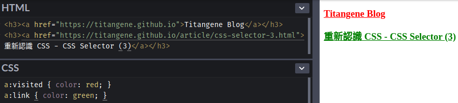
:link 和 :visitedUA (User agent,對 HTML 來說就是瀏覽器) 以不同的方式來顯示連結是否已訪問:
:link:未訪問過的連結:visited:已訪問過的連結不過,過了一段時間之後,UA 可以將已訪問的連結從 :visited 變回 :link 的狀態。
<h3><a href="https://titangene.github.io">Titangene Blog</a></h3>
<h3><a href="https://titangene.github.io/article/css-selector-3.html">重新認識 CSS - CSS Selector (3)</a></h3>
a:visited { color: red; }
a:link { color: green; }
Demo:Codepen 連結
:hover、:active 和 :focus用於 response 使用者的操作:
:hover:
:active:
:active 只適用於主要或主要 actived 的按鈕 (通常為滑鼠左鍵) ...等:focus:當元素有焦點時會應用此 pseudo-class,例如:按鍵盤的 Tab 鍵所選到的元素<h3><a href="https://titangene.github.io">Titangene Blog</a></h3>
<h3><a href="https://titangene.github.io/article/css-selector-3.html">重新認識 CSS - CSS Selector (3)</a></h3>
a { color: black; }
a:hover { color: red; }
a:focus { color: gray; }
a:active { color: purple; }
Demo:Codepen 連結
也可以一次使用多個 dynamic pseudo-class,如下範例:
:focus 和 :hover 的狀態:link 和 :active 的狀態a:focus:hover { color: teal; }
a:link:active { color: fuchsia; }
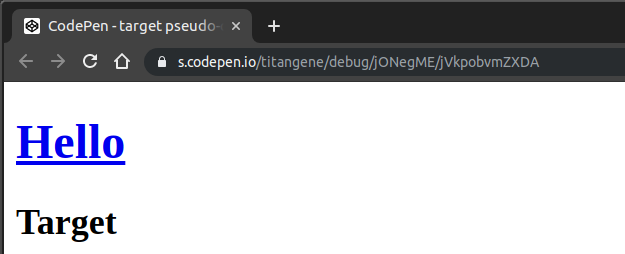
:target有些 URI 的最後會以 # (number sign) 為結尾,後面會接著 anchor identifier (也稱為 fragment identifier),代表該 URI 是指向資源中的某個位置。通常帶有 fragment identifier 的 URL 會 link 到文件中的某些元素,該元素被稱為 target 元素。
例如:在下面的 HTML 文件中有名為 hello 的 anchor (錨點) (也就是 <a href="#hello">Hello</a> 這個連結):
<h1><a href="#hello">Hello</a></h1>
<div id="hello">
  <h2>Target</h2>
</div>
#hello:target { color: red; }
Demo:Codepen 連結
如果此 HTML 的 URL 為:
https://s.codepen.io/titangene/debug/jONegME/vWkRwRNmBvOM
在還沒點擊 #hello 錨點時,畫面如下:
只要點擊 #hello 錨點後,下面的 "Target" 文字就會變成紅色 (也就是會應用 #hello:target 的樣式),畫面如下:
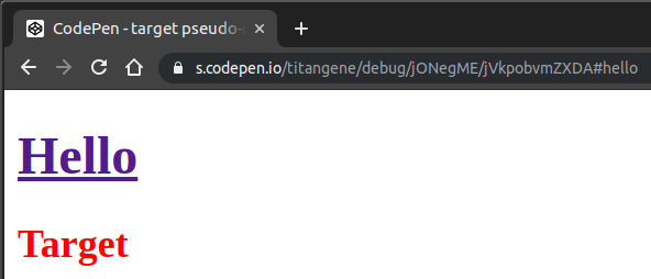
並且 URL 的最後會加上 #hello,而 #hello 就是 fragment identifier。
剛剛點擊的錨點會 link 到 target 元素,而 target 元素就是 <div id="hello">,所以 selector 才會 match 到 #hello:target。
在 MDN 有一個範例也蠻有趣的,可以用 :target pseudo-class 來實作 lightbox:
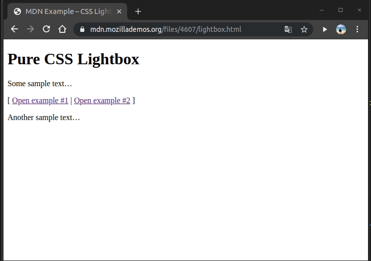
運作原理是用 display: none 和 display: block 來控制 lightbox 是否開啟,觸發的機制就是用剛剛介紹的 :target pseudo-class 來做的。
這個範例很有趣,以前用 JavaScript 才能做到的事情,沒想到也能用純 CSS 來實作出來。
分為:
:enabled:處於啟用狀態的 UI 元素:disabled:處於禁用狀態的 UI 元素:checked:選取 radio 或勾選 checkbox 元素時會應用:enabled & :disabled pseudo-class直接看範例:
<form>
  <label for="enabledField">enabled field:</label>
  <input type="text" id="enabledField" value="Lorem">
  <br><br>
  <label for="disabledField">disabled field:</label>
  <input type="text" id="disabledField" value="Lorem" disabled>
  <br><br>
  <label for="enabledCheckbox">enabled checkbox:</label>
  <input type="checkbox" id="enabledCheckbox">
  <br><br>
  <label for="disabledCheckbox">disabled checkbox:</label>
  <input type="checkbox" id="disabledCheckbox" disabled>
  <br><br>
  <input type="button" value="Submit">
</form>
input:enabled { outline: 3px solid red; }
input:disabled { outline: 3px solid blue; }
Demo:Codepen 連結
只要被加上 disabled 屬性的 input 元素都代表該元素處於禁用狀態,所以這些元素就會套用 input:disabled 此 selector 的樣式。其餘的元素則會套用 input:enabled 此 selector 的樣式。
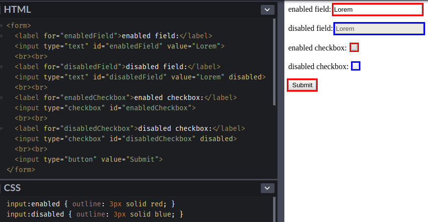
不過要注意的事元素有無啟用,跟一些會影響使用者互動 UI 元素的 CSS 屬性沒關係,這些都不會影響 selector 是否 match 到
:enabled或:disabled。例如:
display和visibility屬性都會讓元素在畫面上消失,但是都不會影響到啟用或禁用的狀態。
display: none不會讓元素出現在 formatting structure 中,很像不在畫面上,會完全消失visibility: hidden生成的 box 是看不見的,完全透明,不會 draw 任何內容,但會影響佈局,也就是會在畫面上佔用空間,但會看不到元素的樣子
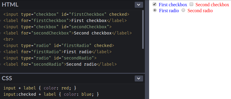
:checked pseudo-class直接看範例:
<input type="checkbox" id="firstCheckbox" checked>
<label for="firstCheckbox">First checkbox</label>
<input type="checkbox" id="secondCheckbox">
<label for="secondCheckbox">Second checkbox</label>
<br>
<input type="radio" id="firstRadio" checked>
<label for="firstRadio">First radio</label>
<input type="radio" id="secondRadio">
<label for="secondRadio">Second radio</label>
input + label { color: red; }
input:checked + label { color: blue; }
Demo:Codepen 連結
今天介紹一些 pseudo-class,接下來幾天會接續介紹其他 selector。
資料來源:
About MDN by Mozilla Contributors is licensed under CC-BY-SA 2.5


 看影片追技術