所有元素都可以設邊框(border)。今天要介紹的border屬性有:
border-style | border-color | border-width | border-radius
border-style 邊框的造型
參數(value):
none 無框線
solid 實線樣式
dotted 圓點樣式
dashed 虛線樣式
double 雙線樣式
ridge 立體樣式(左上光源)
groove 立體樣式(右下光源)
inset 立體樣式(內凹)
outset 立體樣式(外凸)
border-width 邊框的粗細
參數(value)可以用各種單位表示:
h1 {
    border-style: solid;
    border-width: 10px;
}

p {
    border-style: ridge;
    border-width: 1.5rem;
}

border-color 邊框的顏色
參數(value)可以用各種色碼表示:
h1{
    border-style: solid;
    border-width: 10px;
    border-color: hsl(0 ,100%, 100%);
}

p {
    border-style: ridge;
    border-width: 20px;
    border-color: #00ff00;
}

上列的屬性值可以在同一行內聲明,中間用空格區別:
h1{
    border: solid 10px hsl(0 ,100%, 100%);
}

p {
    border: ridge 20px #00ff00;
}
border-radius 邊框的圓角
聲明語法為:border-radius: 四個角;border-radius: 左上角與右下角 右上角與左下角;border-radius: 左上角 右上角 右下角 左下角;
參數(value)可以是單位也可以是數值,為圓角半徑,若以百分比表示,則是以邊框為基準的百分比為圓角半徑。
四個角的圓角半徑為100px。
div {
  width: 300px;
  height: 300px;
  border: 5px solid #000;
  border-radius: 100px;
}

左上角與右下角圓角半徑100px ; 右上角與左下角圓角半徑50px。
div {
  width: 300px;
  height: 300px;
  border: 5px solid #000;
  border-radius: 100px 50px;
}

四個角設不同的圓角半徑。
div {
  width: 300px;
  height: 300px;
  background-color: #ff00ff;
  border-radius: 5rem 50px 30% 50%;
  }

border樣式可以針對上下左右個別聲明。
div {
  border-top: double #000;
  border-right: dotted #000;
  border-bottom: solid #0000ff 20px;
  border-left: solid rgba(234, 234, 123, .5) 10px;

  border-top-left-radius: 30%;
  border-top-right-radius: 30px;
  border-bottom-right-radius: 6em;
  border-bottom-left-radius: 50%;
}

練習看看吧~Try it on codepen.
outline樣式跟border很類似。但它的特性跟border有些許不同。border如果翻譯為邊框 ; 那outline比較像是輪廓。以下為outline的特性:
outline位置在border的外緣,但不佔用元素的任何空間,這個概念在看完box modle的筆記後再回來思考,可能會更清楚。
outline不能夠聲明單邊樣式,它一定是圍繞呈現的。(而border則可以聲明單邊樣式。)
根據CSS規範的描述:
The parts of the outline are not required to be rectangular. To the extent that the outline follows the border edge, it should follow the border-radius curve.
outline的形狀可以不規則,它會順著border邊緣顯示,不一定得是矩形。可是目前大多數的瀏覽器不支援該特性。實際上驗證之下會發現outline並不會去適應border-radius的圓弧:
div {
    width: 300px;
    height: 200px;
    border: 10px solid #000;
    border-radius: 20% 60%;
}
div {
    outline: 10px solid #f00;
}

瀏覽器會針對某些元素被focus時,自動生成outline的樣式。這是為了讓使用者在瀏覽網頁時,能感到更加方便、親切。
比方<input>元素,在被瀏覽器渲染時就會自動生成focus時的outline樣式: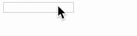
不過現在很多網頁是用box-shadow來做這個效果,因為更能適應border的形狀。
outline-style | outline-width | outline-color | outline-offset
基本上除了outline-offset之外,其他的參數設定跟border是一樣的,就不贅述。
outline-offset設定outline與border邊緣(或元素box邊緣)的空間。
.outline {
    outline: 5px dotted #ff00ff;
    outline-offset: 30px;
}

Try it on codepen.
今天的筆記告一段落,明天見~
*有任何錯誤或描述不夠精準之處,歡迎指教,非常感謝。


 iThome鐵人賽
 看影片追技術