以前在用shiny製作系統的時候,因為系統通常需要應付各種狀況,在視覺化的呈現往往出現不是很固定的狀況,因此就有了需要顏色漸層的時候,我想要的效果是讓大家知道比較的關係,所以不會用不同顏色去代替,而是使用不同的同一顏色(例如:紅色)去實現,我覺得是一種很重要的視覺化手段.
#紅色漸層
mypalette<- colorRampPalette(c("red" , "white"))
mycolors<- mypalette(100)
原本的圖片可能只是長這樣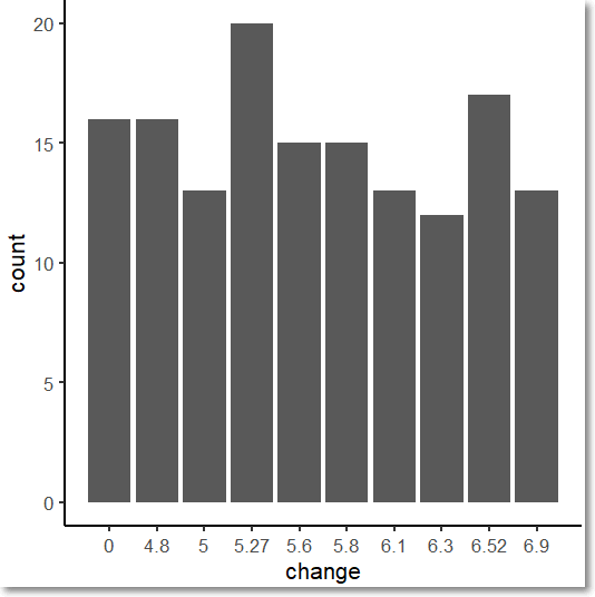
有了漸層之後就可以長這樣了,不過這只是無腦使用漸層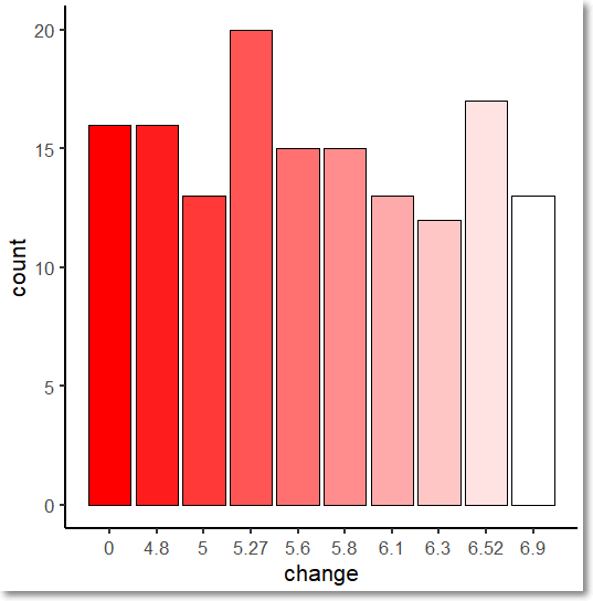
上圖的漸層不是我想要的視覺化目的,我想要的應該是數字越大的顏色越深,大概像這樣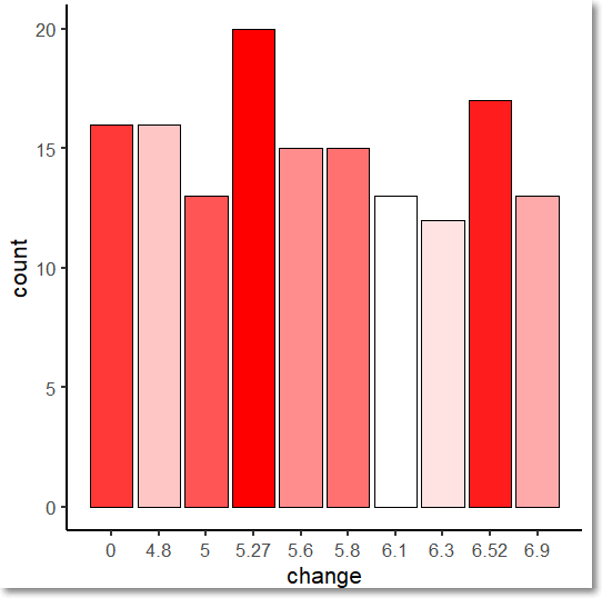
以下是程式碼:
hist_ggplot2 = function(iris , k , l , i ){

  packages = c("ggplot2")
  existing = as.character(installed.packages()[,1])
  for(pkg in packages[!(packages %in% existing)]) install.packages(pkg)
  library(ggplot2)

  target =  iris[,k]
  target_2 =  iris[,l]
  quantile_1 = 0
  for(j  in 1:i)
    quantile_1[j+1] = quantile(target,j*0.1)

  quantile_2 = target

  for(j in 1:i)
    quantile_2 = ifelse(target > quantile_1[j] & target <= quantile_1[j+1] , j %>% as.character() , quantile_2)

  new_data.frame = data.frame(target = target,y = as.factor(target_2),change = as.numeric(quantile_2))


  #紅色漸層
  mypalette<- colorRampPalette(c("white" , "red"))
  mycolors<- mypalette(k)
  order_new_data.frame = order(table(new_data.frame$change))
  mycolors = mycolors[order_new_data.frame]

  ggplot(new_data.frame, aes(x = change)) +
    geom_bar(position = "identity",fill = mycolors ,col = "black" ) +
    theme_classic(base_size = 16)  +
    scale_x_continuous(breaks = c(1:(i+1)) ,labels =quantile_1)

}

hist_ggplot2(iris = iris,k = 1,l = 5 , 10)
使用方法請參閱我之前寫的:https://ithelp.ithome.com.tw/articles/10223845


 iThome鐵人賽