自訂元件系列的文章因為因應需求,需要製造一個可以拖曳按鈕的元件,裡面存放可以被拖曳的按鈕,以及一個可以隨意擺放按鈕的區塊,這個區塊本身可能有兩種模式編輯模式跟顯示模式,在顯示模式下的區塊按扭希望讓它具備功能,
今天就讓我們從這個可以被拖曳的元件開始實作吧
Draggable 使用
自訂一個 DraggableButton 持有自訂的資訊、拖曳的狀態,先產生本來的 btn ,再外包裝 draggable 後回傳
class DraggableButton extends StatefulWidget{
  final index ;
  final DraggableInfo data;
  final Function onDragStarted;
  final double grideSize ;
  final DraggableState draggableState ;

  const DraggableButton({
    Key key,
    @required this.data,
    this.index,
    this.onDragStarted,
    this.grideSize,
    this.draggableState,
  }) : super(key: key);

  @override
  State<StatefulWidget> createState() => DraggableButtonState() ;
}

class DraggableButtonState extends State<DraggableButton>{
  var btnColor = Colors.white ;
  var isEditing = false ;

  @override
  Widget build(BuildContext context) {

    var btn  = RaisedButton(
        child: Text(
            widget.data.text,
            style: TextStyle(
                fontSize: widget.data.textSize
                ),
            ),
        color : btnColor ,
        onPressed: (){ },
    );

    //設定 draggable btn 的大小
    var sizeBtn = SizedBox(
        child: btn,
        width: widget.grideSize*widget.data.width,
        height: widget.grideSize*widget.data.height,
    );


    var draggable = Draggable<DraggableInfo>(
      child: sizeBtn,
      feedback: Opacity( //拖曳時的狀態
        opacity: 0.5,
        child: sizeBtn
      ),
      childWhenDragging:sizeBtn,//當拖曳時本來位置的元件
      data: widget.data,
    );
    return draggable ;

  }
Draggable 使用時需要傳遞資料給 DragTarget ,這裡我們可以使用自訂的資料格式
//之後可能會需要除了按鈕外的元件所以先給定這個屬性
enum DraggableType {
  label,
  button,
  image,
}

class DraggableInfo{

  String id;
  String text;
  String img;

  DraggableType type;
  DraggableInfo(this.id, this.text, this.img, this.type);

  @override //複寫 == 運算式 利用id 來判斷是否是同筆資料
  bool operator == (other) => other is DraggableInfo && id == other.id;
}
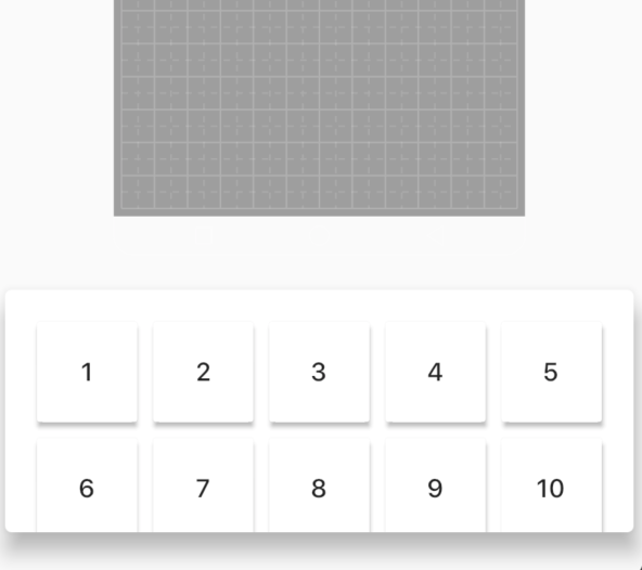
拖曳選單主要是由 GridView 與 btnList 組成
class DraggableButtonMenu extends StatefulWidget {
  final double gridSize ; //傳遞給 btn

  DraggableButtonMenu({
    Key key,
    this.gridSize
  }): super(key: key);

  @override
  _DraggableButtonMenuState createState() => _DraggableButtonMenuState();
}

class _DraggableButtonMenuState extends State<DraggableButtonMenu> {

  List<DraggableButton> draggableList ;
  @override
  void initState() {
    draggableList = new List();

    //建立一個 DraggableButton 的 List
    for (int i = 1 ; i <= 12 ; i++){
      var info = DraggableInfo("$i", "$i","",DraggableType.button);
      var draggable = DraggableButton(
          data: info,
          grideSize: widget.gridSize,
          draggableState: DraggableState.onMenu,
      );
      draggableList.add(draggable);
    }

  }

@override
  Widget build(BuildContext context) {
    return Card(
      elevation:10,
      margin: EdgeInsets.all(10),
      child:  GridView.builder(
        padding: EdgeInsets.all(20),
        itemCount: draggableList.length,
        gridDelegate: SliverGridDelegateWithFixedCrossAxisCount(
          crossAxisCount: 5,
          childAspectRatio: 1,
          crossAxisSpacing: 10,
          mainAxisSpacing: 10,
        ),
        itemBuilder: (_, index) {
          return draggableList[index];
        }
    ),);
  }

}
這樣應該就能順利做出底下的 DraggableItemMenu 了


 看影片追技術