接續昨天,今天加上陰影和動畫效果
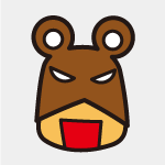
完成畫面:
加上杯蓋陰影
.cup {
    &-lid-top-shadow {
        width: 35px;
        height: 23px;
        border-radius: 100%;
        background-color: $lid-bgc-shadow;
        transform: skew(2deg, -15deg);
        position: absolute;
        top: 109px;
        left: 374px;
    }
    &-lid-middle-shadow {
        width: 186px;
        height: 16px;
        background-color: $lid-middle-bgc-shadow;
        position: absolute;
        left: 187px;
        top: 143px;
        border-radius: 0 20px 20px 0;
    }
    &-lid-bottom-shadow {
        width: 231px;
        height: 29px;
        background-color: $lid-bgc-shadow;
        border-radius: 0 19px 19px 0;
        position: absolute;
        left: 167px;
        top: 172px;
        z-index: 30;
        &::before {
            content: '';
            width: 40px;
            height: 29px;
            background-color: $lid-bgc-shadow;
            border-radius: 0 0 0 12px;
            transform: skew(-24deg);
            position: absolute;
            left: -10px;
            bottom: 0;
        }
    }
}
加上杯身陰影
.cup {
    &-body-shadow {
        width: 248px;
        height: 38px;
        border-radius: 0 45px 45px 0;
        background-color: $cup-bgc-shadow;
        position: absolute;
        left: 176px;
        top: 215px;
        &::after {
            content: '';
            width: 50px;
            height: 38px;
            background-color: $cup-bgc-shadow;
            position: absolute;
            left: -2px;
            right: 0;
            transform: skew(7deg);
        }
    }
    &-body-shadow-bottom {
        width: 184px;
        height: 46px;
        background-color: $cup-bgc-shadow;
        border-radius: 0 45px 45px 27px;
        position: absolute;
        left: 211px;
        top: 457px;
        &::after {
            content: '';
            width: 50px;
            height: 46px;
            border-radius: 0 0 0 20px;
            background-color: $cup-bgc-shadow;
            position: absolute;
            left: -7px;
            top: 0;
            transform: skew(7deg);
        }
    }
}
加上隔熱墊陰影
.cup {
    &-label-red-shadow {
        width: 230px;
        height: 120px;
        background-color: $label-red-bgc-shadow;
        border-radius: 0 111px 183px 33px;
        position: absolute;
        top: 301px;
        left: 191px;
        &::after {
            content: '';
            width: 50px;
            height: 120px;
            background-color: $label-red-bgc-shadow;
            position: absolute;
            left: -6px;
            top: 0;
            transform: skew(7deg);
        }
    }
}
加上動畫效果
// 愛心動畫
@keyframes like-heart {
    0%,
    13%,
    23%,
    100% {
        font-size: 35px;
    }
    1% {
        font-size: 40px;
    }
    17% {
        font-size: 45px;
    }
}
// 表情動畫
@keyframes eyes {
    0%,
    80% {
        transform: scale(1, 1);
    }
    24%,
    60% {
        transform: scale(1.05, 0.3);
    }
}
@keyframes mouth {
    0%,
    80% {
        transform: scale(1, 1);
    }
    15%,
    55% {
        transform: scale(1.1, 0.7);
    }
}
@keyframes blush{
    0%,75%,100%{
        opacity: 0;
    }
    50%{
        opacity: 0.4;
        transform: translate(3px,8px);
    }
}
在對應位置放入動畫控制就完成啦。

 iThome鐵人賽
 看影片追技術