還在和作業奮鬥。
元件的好處是可以直接搬到其他專案上,不用全部重寫。
先開個components資料夾,新增一個box.scss檔案。
然後在all.scss內引入該檔案,就可以開始自訂元件啦。
@import"components/box";
先設定一個基本結構
.box{
    width: 100px;
    height: 100px;
}
然後可以開始增加設定,例如帶入顏色。
官網上的範例是這樣:
.custom-element {
  color: gray("100");
  background-color: theme-color("dark");
}
但實際上可以直接抓變數,這樣寫就讀得到:
.box{
    width: 100px;
    height: 100px;
    background-color: $success;
}
還可以套用函式帶入參數,按照級別增減顏色,正數加深,負數變淺:
.box {
    width: 200px;
    height: 200px;
    background-color: $success;
    &:hover {
        background-color: theme-color-level(success, 5);
    }
}
如果覺得一個一個設定顏色很耗時間,官網也有提供大量產生元件色彩的方法:
@each $color, $value in $theme-colors {
  .alert-#{$color} {
    @include alert-variant(theme-color-level($color, -10), theme-color-level($color, -9), theme-color-level($color, 6));
  }
}
進行簡單的修改
@each $color, $value in $theme-colors {
    .box-#{$color} {
        background-color:$value;
    }
}
在HTML使用時就會出現以下畫面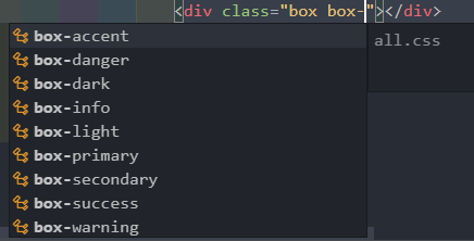
為了配合不同深淺的背景色,還可以對文字深淺進行計算:
@each $color, $value in $theme-colors {
    .box-#{$color} {
        background-color:$value;
        color: color-yiq($value); //加上這行
    }
}
使用時會出現以下畫面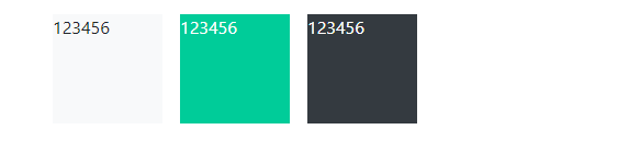
其他邊框文字推移等設定就看自己的需求,還可以配合JS做開合選單之類的效果。


 iThome鐵人賽
 看影片追技術