今天要介紹可以邊玩邊學 CSS,還能事半功倍的產生器系列。相信大家或多或少都有用過,如果有人覺得使用經驗不錯,但是文章沒提起的,也歡迎留言分享喔!

如果只需要簡單的 loading 或 spinner 的畫面,其實使用 CSS3 會比引用圖檔來的好多喔!
LOADING.IO 共有 12 種免費的樣式,並且可以點選上方的色塊切換顏色。
點擊之後就會出現程式碼的對話框,直接複製貼上就好囉!
CSS 的部分
.lds-dual-ring {
  display: inline-block;
  width: 80px;
  height: 80px;
}
.lds-dual-ring:after {
  content: " ";
  display: block;
  width: 64px;
  height: 64px;
  margin: 8px;
  border-radius: 50%;
  border: 6px solid #fdd;
  border-color: #fdd transparent #fdd transparent;
  animation: lds-dual-ring 1.2s linear infinite;
}
@keyframes lds-dual-ring {
  0% {
    transform: rotate(0deg);
  }
  100% {
    transform: rotate(360deg);
  }
}
HTML 的部分
<div class="lds-dual-ring"></div>

如果對動畫相關的 CSS 不是很熟的話,通常都會利用工具來產出相關樣式碼。所以其實目前還蠻多類似的產生器可以使用。
animista 我蠻喜歡的原因是除了畫面很舒服乾淨以外,他有提供三層的分類,讓使用者可以很快找到自己想要的動畫效果。旁邊的細部選項設定也很清楚。
當設定完畢後,可以點選編輯區的右上方的播放測試效果。如果OK的話,就能點選最右邊的按鈕顯示程式碼。
CSS-class 的部分
.slit-in-diagonal-2 {
  -webkit-animation: slit-in-diagonal-2 0.45s ease-out both;
  animation: slit-in-diagonal-2 0.45s ease-out both;
}
CSS-keyframes 的部分
/* ----------------------------------------------
 * Generated by Animista on 2020-9-30 15:39:29
 * Licensed under FreeBSD License.
 * See http://animista.net/license for more info.
 * w: http://animista.net, t: @cssanimista
 * ---------------------------------------------- */

/**
 * ----------------------------------------
 * animation slit-in-diagonal-2
 * ----------------------------------------
 */
@-webkit-keyframes slit-in-diagonal-2 {
  0% {
    -webkit-transform: translateZ(-800px) rotate3d(-1, 1, 0, -90deg);
    transform: translateZ(-800px) rotate3d(-1, 1, 0, -90deg);
    -webkit-animation-timing-function: ease-in;
    animation-timing-function: ease-in;
    opacity: 0;
  }
  54% {
    -webkit-transform: translateZ(-160px) rotate3d(-1, 1, 0, -87deg);
    transform: translateZ(-160px) rotate3d(-1, 1, 0, -87deg);
    -webkit-animation-timing-function: ease-in-out;
    animation-timing-function: ease-in-out;
    opacity: 1;
  }
  100% {
    -webkit-transform: translateZ(0) rotate3d(-1, 1, 0, 0);
    transform: translateZ(0) rotate3d(-1, 1, 0, 0);
    -webkit-animation-timing-function: ease-out;
    animation-timing-function: ease-out;
  }
}
@keyframes slit-in-diagonal-2 {
  0% {
    -webkit-transform: translateZ(-800px) rotate3d(-1, 1, 0, -90deg);
    transform: translateZ(-800px) rotate3d(-1, 1, 0, -90deg);
    -webkit-animation-timing-function: ease-in;
    animation-timing-function: ease-in;
    opacity: 0;
  }
  54% {
    -webkit-transform: translateZ(-160px) rotate3d(-1, 1, 0, -87deg);
    transform: translateZ(-160px) rotate3d(-1, 1, 0, -87deg);
    -webkit-animation-timing-function: ease-in-out;
    animation-timing-function: ease-in-out;
    opacity: 1;
  }
  100% {
    -webkit-transform: translateZ(0) rotate3d(-1, 1, 0, 0);
    transform: translateZ(0) rotate3d(-1, 1, 0, 0);
    -webkit-animation-timing-function: ease-out;
    animation-timing-function: ease-out;
  }
}

在 CSS3 裡,正式推出了一套排版系統grid。如果對這個系統還不是很熟悉的人,可以先使用這種工具協助自己理解每個設定的寫法。
Layoutit! 只要調整左方的設定,就會即時呈現在中間的話畫布中。另外在輸出程式碼的部分,可以在選擇打開一些選項,像是是否兼容 IE11 等。
CSS 的部分
.grid-container {
  display: grid;
  grid-template-columns: repeat(2, 1fr) 2fr;
  grid-template-rows: 1fr 2fr 1fr;
  gap: 10px 20px;
  grid-template-areas:
    ". . ."
    ". . ."
    ". . .";
}

@media all and (-ms-high-contrast: none) {
  .grid-container {
    display: -ms-grid;
    -ms-grid-columns: repeat(2, 1fr) 2fr;
    -ms-grid-rows: 1fr 2fr 1fr;
    gap: 10px 20px;
  }
}
HTML 的部分
<div class="grid-container"></div>

Flex 也是 CSS3 中的一種排版系統。不過在一般情況下,Flex 比較適合使用在 元件或小範圍 的排版上,而 Grid 比較適合大範圍以及需要考慮配置多個欄位的排版。
BUILD WITH FLEXBOX 可以透過 Container 跟 Children 的設定,即時呈現在右方畫布上。而且還提供不同平台-Web 跟 React Native 的選擇。適合跨平台開發的使用者。
不過針對程式碼的部分,目前只有看到 Container 的區塊有顯示。如果有要設定 flex item 的話,還是要自己寫囉。
程式碼如下
/* Default values are skipped */
 {
  display: flex;
  justify-content: space-around;
  align-items: center;
  align-content: space-around;
}

其實這種樣式設定是今天找資料時才意外發現的 XD
如果我們想要在文章的呈現上就像報章雜誌般,有多欄的排版,就能向以下設定一樣就好囉!
當調整完畢後,可以往下滑,程式碼的部分在範例文章的下方。
程式碼如下
 {
  column-count: 2;
  -webkit-column-count: 2;
  -moz-column-count: 2;
  column-gap: 50px;
  -webkit-column-gap: 50px;
  -moz-column-gap: 50px;
  column-rule: 2px solid #e66a1b;
  -webkit-column-rule: 2px solid #e66a1b;
  -moz-column-rule: 2px solid #e66a1b;
}

如果想對圖片套濾鏡和陰影效果,不妨可以試試看這個工具。在左方的設定面版把 filter 相關的選項都呈現上去,像是對比、模糊、明亮度等。右方的圖片能即時查看調整後的效果,相當方便。
程式碼如下
 {
  filter: grayscale(49%) sepia(17%) blur(1px) brightness(84%) hue-rotate(32deg) saturate(
      160%
    )
    opacity(96%) contrast(102%) invert(8%) drop-shadow(-3px 2px 16px #706e7b);
  -webkit-filter: grayscale(49%) sepia(17%) blur(1px) brightness(84%) hue-rotate(
      32deg
    ) saturate(160%) opacity(96%) contrast(102%) invert(8%) drop-shadow(
      -3px 2px 16px #706e7b
    );
  -moz-filter: grayscale(49%) sepia(17%) blur(1px) brightness(84%) hue-rotate(
      32deg
    ) saturate(160%) opacity(96%) contrast(102%) invert(8%) drop-shadow(
      -3px 2px 16px #706e7b
    );
}
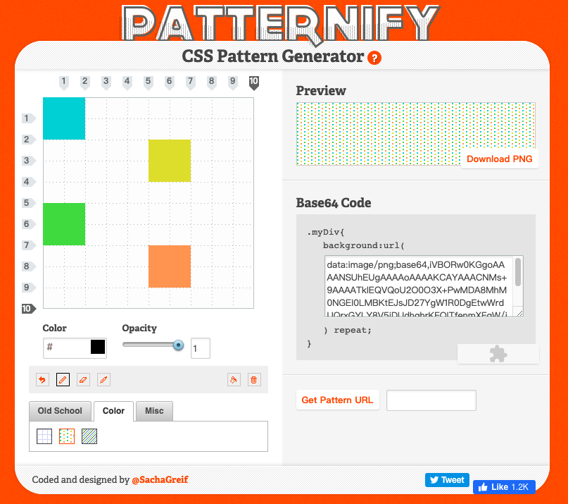
個人覺得蠻有趣的工具。可以編輯色塊,利用 repeat的特性填滿背景。而且轉出來的 base64 字串其實也不長,像這樣 -
data:image/png;base64,iVBORw0KGgoAAAANSUhEUgAAAAoAAAAKCAYAAACNMs+9AAAATklEQVQoU2O0O3X+PwMDA8MhM0NGEI0LMBKtEJsJD27YgW1R0DgEtwWrdUQrxGYLY8V5iDUdhghrKFOITfenmXFgW/jSF+H3DNEKsdkCAO99IAvXcD3VAAAAAElFTkSuQmCC
很適合當小區塊的背景設定。

作者好像是香港人的關係,所以很難得看到有繁中介面的工具。而且其實設定上還蠻完整的,從方向、類型到顏色都有。以後做三角形再也沒有障礙啦!
程式碼如下
 {
  width: 0;
  height: 0;
  border-style: solid;
  border-width: 150px 0 150px 200px;
  border-color: transparent transparent transparent #ff0088;
}

提供多達 27 種的多邊形樣板的設定,另外還可以設定大小與範例圖片。我覺得很厲害的是,中間的編輯區還可以對端點拖拉來調整,不怕做不出視覺上的需求。
程式碼如下
 {
  clip-path: polygon(75% 0%, 100% 50%, 75% 100%, 0% 100%, 25% 50%, 0% 0%);
}

相信很多人都有用過產出box-shadow相關的工具,今天介紹的是看起來畫面還蠻舒服的陰影產生器 - Neumorphism.io
這種視覺風格是近一兩年來逐漸風行的 Soft-UI,以陰影的控制呈現出立體擬態的感覺。
在這個工具裡,可以控制光源的方向,除了基本設定,還有陰影的形狀可以切換。有興趣的可以去玩玩看喔
程式碼如下
 {
  border-radius: 50px;
  background: #8db9d3;
  box-shadow: inset -15px 15px 30px #789db3, inset 15px -15px 30px #a2d5f3;
}


 iThome鐵人賽
 看影片追技術