
Visual examples of those four possibilities. by CSS-TRICKS
在製作表格時,最常遇到的狀況就是需要在各種螢幕上觀看,但有時單純的橫向捲軸,並未能 100% 提供好的使用者體驗。
本篇文章蒐集了幾種 HTML Table RWD 的方法,提供給需要的朋友。
CSS-TRICKS 也提供了四種 RWD Tables 解決方案,可以看看!
在較小的螢幕上,幫表格加入橫向捲軸(overflow-x),是最簡單的處理方式,css 程式碼如下:
table {
    width: 100%;
    display: block;
    overflow-x: auto;
    white-space: nowrap;
}
範例:Bootstrap - Responsive tables
首先需要讓 table 變成 block 區塊元素,再於水平方向的 overflow 讓表格自動判斷是否有超出寬度的內容,如有超出則自動加入水平捲軸(overflow-x: auto)。
white-space: nowrap 這個屬性是讓「文字不會自動斷行」,一定要下才有作用喔!
這樣的方式適合手機版觀看,算是「破壞原本表格排版」的一種。
好處是每個內容都可以清楚對應到標題,缺點是手機版會拉得很長:

Responsive Data Tables by CSS-TRICKS
範例:
<table id="responsive-table">
  <thead>
    <tr>
      <th>First Name</th>
      <th>Last Name</th>
      <th>Job Title</th>
      <th>Joining Date</th>
      <th>Total Experience</th>
      <th>Relevant Experience</th>
      <th>Date of Birth</th>

    </tr>
  </thead>
  <tbody>
    <tr>
      <td>John</td>
      <td>Marks</td>
      <td>Developer</td>
      <td>January 01, 2013</td>
      <td>5</td>
      <td>4</td>
      <td>June 30, 1985</td>
    </tr>
    <tr>
      <td>Tom</td>
      <td>Moody</td>
      <td>Developer</td>
      <td>December 15, 2012</td>
      <td>6</td>
      <td>6</td>
      <td>May 24, 1980</td>
    </tr>
    <tr>
      <td>John</td>
      <td>Marks</td>
      <td>Developer</td>
      <td>January 01, 2013</td>
      <td>5</td>
      <td>4</td>
      <td>June 30, 1985</td>
    </tr>
    <tr>
      <td>Tom</td>
      <td>Moody</td>
      <td>Developer</td>
      <td>December 15, 2012</td>
      <td>6</td>
      <td>6</td>
      <td>May 24, 1980</td>
    </tr>

  </tbody>
</table>
table {
  border-collapse: collapse;
  border: 1px solid #cdcdcd;
  font: normal 12px arial;
  width: 100%;
}
td,
th {
  border: 1px solid #cdcdcd;
  padding: 8px;
}

@media only screen and (max-width: 760px),
  (min-device-width: 768px) and (max-device-width: 1024px) {
  table,
  thead,
  tbody,
  th,
  td,
  tr {
    display: block;
  }

  thead tr {
    position: absolute;
    top: -9999px;
    left: -9999px;
  }

  tr {
    border-bottom: 2px solid #690461;
  }

  td {
    border: none;
    border-bottom: 1px solid #eee;
    position: relative;
    padding-left: 50% !important;
    text-align: left !important;
  }

  td:before {
    position: absolute;
    top: 6px;
    left: 6px;
    width: 45%;
    padding-right: 10px;
    white-space: nowrap;
    font-weight: bold;
  }

  td:nth-of-type(1):before {
    content: "First Name";
    color: #0e9893;
  }
  td:nth-of-type(2):before {
    content: "Last Name";
    color: #0e9893;
  }
  td:nth-of-type(3):before {
    content: "Job Title";
    color: #0e9893;
  }
  td:nth-of-type(4):before {
    content: "Joining Date";
    color: #0e9893;
  }
  td:nth-of-type(5):before {
    content: "Total Experience";
    color: #0e9893;
  }
  td:nth-of-type(6):before {
    content: "Relevant Experience";
    color: #0e9893;
  }
  td:nth-of-type(7):before {
    content: "Date of Birth";
    color: #0e9893;
  }
}
這樣的方式不論手機版或電腦版都適合閱讀,也是「破壞原本表格排版」的一種。
但這樣的方式也有一個缺點:表格內容文字必須限制一行,若有兩行或以上將無法適用於此排版。
↑ 電腦版顯示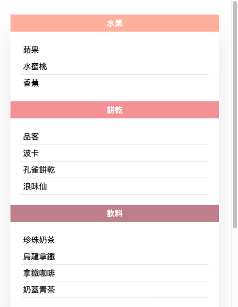
↑ 手機版顯示
筆者的螢幕錄影.gif 一直無法連結到鐵人賽文章,不知道為何上面的可以,只好截兩張圖示意 ( ´;ω;` )
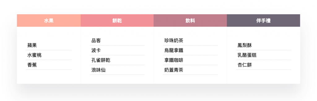
這是筆者目前使用率最高的解決方法,雖然對於內容較多的表格不適用(會需要下太多次 data-title),但以少內容的表格來說很適合手機版閱讀,且內容不限制一行或多行,也可以使用 ol、ul、li 都沒問題。
範例:筆者的 Codepen - Responsive Tables
<div class="table-wrapper">
  <table class="table">
    <thead>
      <tr>
        <th>水果</th>
        <th>餅乾</th>
        <th>飲料</th>
        <th>伴手禮</th>
      </tr>
    </thead>
    <tbody>
      <tr>
        <td data-title="水果">
          <ul>
            <li>蘋果</li>
            <li>水蜜桃</li>
            <li>香蕉</li>
          </ul>
        </td>
        <td data-title="餅乾">
          <ul>
            <li>品客</li>
            <li>波卡</li>
            <li>孔雀餅乾</li>
            <li>浪味仙</li>
          </ul>
        </td>
        <td data-title="飲料">
          <ul>
            <li>珍珠奶茶</li>
            <li>烏龍拿鐵</li>
            <li>拿鐵咖啡</li>
            <li>奶蓋青茶</li>
          </ul>
        </td>
        <td data-title="伴手禮">
          <ul>
            <li>鳳梨酥</li>
            <li>乳酪蛋糕</li>
            <li>杏仁餅</li>
          </ul>
        </td>
      </tr>
    </tbody>
  </table>
</div>
/* ---------------------------- */
/*  Table Styles
------------------------------- */

.table-wrapper {
  margin: 50px;
  box-shadow: 0px 35px 50px rgba(27, 31, 49, 0.1);
}

.table {
  border-collapse: collapse;
  width: 100%;
  background-color: white;
}

.table td,
.table th {
  text-align: center;
  padding: 10px;
}

.table td {
  border-right: 1px solid #f8f8f8;
}

/*  thead th color
------------------------------- */

.table thead th {
  color: #ffffff;
  background: #ffb4a2; /* 指定第一個和預設的標題顏色 */
}

.table thead th:nth-child(2) {
  background: #e5989b; /* 指定第二個標題顏色 */
}

.table thead th:nth-child(3) {
  background: #b5838d; /* 指定第三個標題顏色 */
}

.table thead th:nth-child(4) {
  background: #6d6875; /* 指定第四個標題顏色 */
}

/*  table ul
------------------------------- */

.table ul {
  padding: 20px;
  margin: 0;
  text-align: left;
}
.table ul li {
  border-bottom: 1px solid #e7e7e7;
  padding: 5px;
  position: relative;
  list-style-type: none;
}

/*  Responsive
------------------------------- */

@media (max-width: 767px) {
  .table-wrapper {
    margin: 30px 15px;
  }

  .table thead {
    display: none;
  }

  .table td {
    display: block; /* 一定要下! */
    padding: 0;
  }

  .table td:before {
    content: attr(data-title); /* 顯示 data-title */
    display: inline-block;
    width: 100%;
    font-weight: 500;
    padding: 6px 0;
    color: #ffffff;
    background: #ffb4a2; /* 指定第一個和預設的標題顏色 */
  }

  .table td:nth-child(2):before {
    background: #e5989b; /* 指定第二個標題顏色 */
  }

  .table td:nth-child(3):before {
    background: #b5838d; /* 指定第三個標題顏色 */
  }

  .table td:nth-child(4):before {
    background: #6d6875; /* 指定第四個標題顏色 */
  }
}
換句話說就是使用 div 或其他標籤來達到 table 的排版效果,好處是彈性度較大,CSS-TRICKS 的範例 就是使用 div 來達到各種 RWD 效果。
範例:
以上為筆者收藏的幾種 RWD Table 方法,希望可以幫助到需要的朋友:)


 看影片追技術