簡單架設 x 不失質感

近期為了上架 iOS App ,建置了開發者網站
我的需求是 :
所以我選擇 bootstrap + github pages 方案 :

教程中,除了說明選用的原因與使用方法,還會簡單介紹平時常用的開發工具,以及一些基礎的 Html 與 CSS 語法 ;
目的是讓零基礎的初學者,除了會架設自己的個人網站,對於網頁設計的技術也能有基礎的概念。
平時常用的前端開發工具是 Adobe 的 Brackets

2021 的 9 月 1 日,Adobe 停止支援。(官方推薦 Visual Studio Code)

(不過,此工具是開源專案,有開源社群的維護與更新,應該還可以再使用一段時間。)
官網上已經找不到下載點,必須到 GitHub 頁面的 Releases 下載
其中一個選擇 Brackets 因素,是因為很多的插件可以使用。
通常第一次啟動會點擊右側下方第二個圖示,開啟「擴充功能管理員」:

已安裝插件(參考):
其中兩個最重要的插件 : Custom Work 與 Emmet
Extension : Custom Work
改變工作區的佈局,可以增強分頁的功能與使用。
Extension : Emmet
前端開發的好用工具,在其他的網頁開發工具中,應該都可以找的到這個擴充。(VSCode、Sublime)
工具的使用方法,就是透過語法的縮寫 加上 Tab 按鍵,自動完成 html 的標籤格式 :

Emmet 官方速查表 :


<!DOCTYPE html>
<html lang="en">
<head>
    <meta charset="UTF-8">
    <title>Document</title>
</head>
<body>

</body>
</html>
html 標準樣板

(構成的基本元素是 xml 的標籤,通常情況下會成對存在)
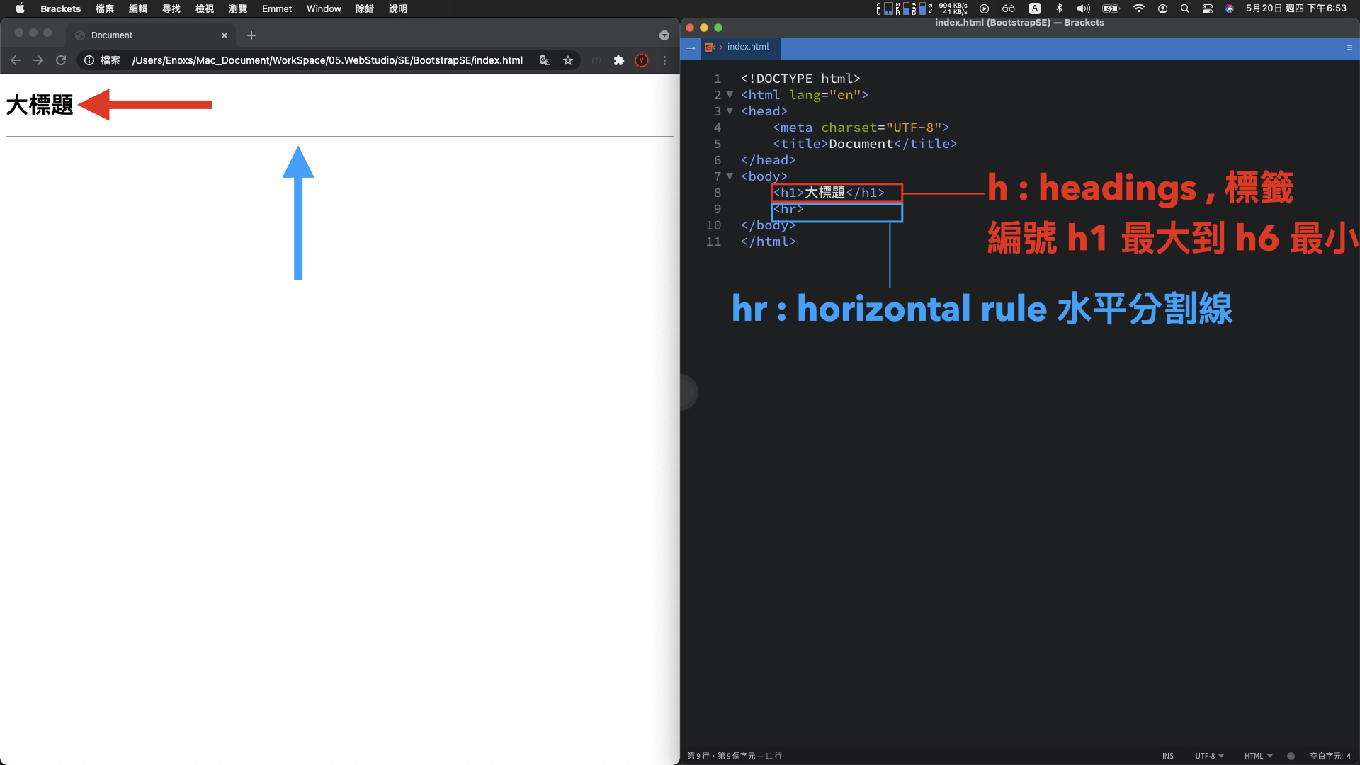
<h1>大標題</h1>
<hr>
h1 標籤 : 大標題文字
hr 標籤 : 水平分割線

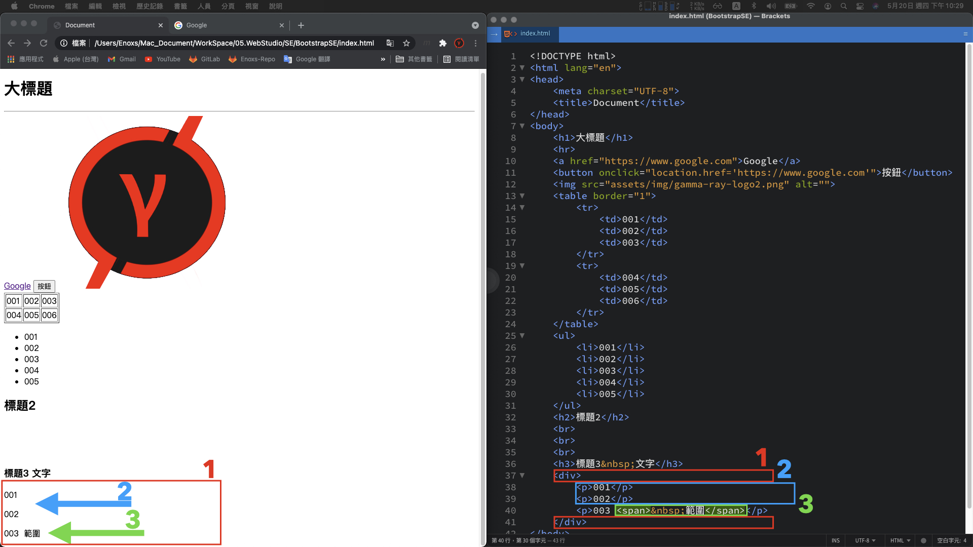
1. a 標籤 : 網址連結
<a href="https://www.google.com">Google</a>
2. button 標籤 : 按鈕元件
<button onclick="location.href='https://www.google.com'">按鈕</button>
基本概念:
網頁畫面中任何可以互動或者動態改變的元素,
背後都有可能是使用 javascript 實作,包含待會介紹的 bootstrap。
3. img 標籤 : 圖片
<img src="assets/img/gamma-ray-logo2.png" alt="">
4. table 標籤 : 2 x 3 的表格
<table border="1">
    <tr>
        <td>001</td>
        <td>002</td>
        <td>003</td>
    </tr>
    <tr>
        <td>004</td>
        <td>005</td>
        <td>006</td>
    </tr>
</table>
5. ul 標籤 : 項目列表
<ul>
    <li>001</li>
    <li>002</li>
    <li>003</li>
    <li>004</li>
	<li>005</li>
</ul>
Bootstrap:
常會被用於向下展開的選單元件
6. br 標籤 與 nbsp 符號 : 換行與空格
<h2>標題2</h2>
---
---
---
<h3>標題3 文字</h3>
用途:
用在調整畫面的佈局,相比調整 css 的樣式,會比較簡單並且直覺。
1. div 標籤 : 區塊容器
<div></div>
用途 :
網頁設計的佈局排版,大部分會透過這個標籤堆疊而來。(加上 css 樣式 )
p 標籤 : 段落容器
<p>001</p>
<p>002</p>
<p>003</p>
用途:
一般的文字呈現,也通常會是使用這個標籤
span 標籤 : 範圍容器
<p>003 <span> 範圍</span></p>
用途:
當想要更細緻的切分區塊時,在標籤內部使用 span 範圍標籤。
有了這三種切分畫面的標籤,就能夠很好的組織畫面結構,並且套用各自的 css 樣式,開發者就可以更精準的描述畫面應該要呈現的樣子。
1. 最簡單方式
在標籤中新增一個 style 屬性,然後添加 css 的語法

<p style="color: white; background-color: black;">001</p>
黑底白字的段落元素:
上述的這種方法,html 的標籤 與 css 的語法 互相交纏在一起。
當 css 語法數量較多或者有大量的 html 標籤套用 style 樣式,程式碼就不容易閱讀。
2. 集中在 style 標籤
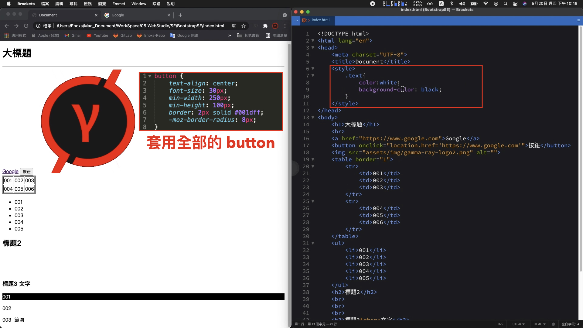
這邊的 style 樣式,可以獨立出來全部集中在 head 內的 style 標籤
<head>
	<style>
		<!-- 區分標籤 : 名稱加上左右大括號 -->
		button{
			text-align: center;
			font-size: 30px;
			min-width: 250px;
			min-height: 100px;
			border: 2px solid #001dff;
			-moz-border-radius: 8px;
		}
		.text {
    		color: white;
    		background-color: black;
		}
	</style>
</head>
<body>
	<p class="text">001</p>
</body>
3. 獨立 css 檔案
關於 html 標籤 與 css 語法的搭配,進階一點可以將兩者分拆成獨立檔案

index.css :
.text {
    color: white;
    background-color: black;
}
使用這種方式,原本 html 的檔案內就不需要使用 style 標籤,只需要透過這個 link 標籤,就可以 將 css 樣式導入。
除了保持 html 檔案內容的純粹性,此方法也是 Bootstrap 前端框架主要的使用方式。
回顧一下,當時對於這個官方網站的需求是 「簡單、不能太難看的網頁設計 」
簡單的作法
最原始的做法,撰寫好一個 html 包含 css 的網頁後,上傳伺服器。
簡單是簡單,只不過如果沒有 UI 設計師的支援光靠工程師自己的美感,就只會跟大學時期繳交的作業差不多。

如此情況,要獨立的完成這項工作,只能選擇現成的模板或者框架。
gitlab pages example
經過一番查找,發現 gitlab pages example 收錄了許多現成、可以快速建置的網頁模板。

搜尋時常看到的關鍵字: hexo、hugo、Jekyll,成品看起來是都不錯

只不過我發現這些模板各自使用 NodeJS、Go、Ruby 程式語言開發,安裝時需要輸入各種指令或者配置各種參數

對我而言,美感是有了但不夠簡單。
Wix 或 WordPress

這種用拖拉方式建立網站的方法,對於已經熟悉程式語言的工程師來說,反而會失去原本對網頁細節調整的優勢。
而且時間上整體的流程,從註冊後各種參數的設置主題、外掛的選擇以及最終外觀細節的調整,我認為並不會比較短。
更何況熟悉網站的操作,本身也是需要一定的學習成本。

因此,純粹的前端框架 Bootstrap 就是一個合乎需求的方案
這個方案的使用方式,就跟原始的做法一樣,撰寫完 html 的網頁後直接丟上伺服器。
而且對於原本就是為了上架 App 而製作的開發者網站,Bootstrap 還多了 RWD 響應式網頁的優勢,完成主體的頁面建置後順便就支援手機畫面的瀏覽。

Bootstrap 官網 : https://getbootstrap.com/

下載解壓縮後,其中最重要的資料夾是 assets/dist/ 資料夾,這裡面是包含 bootstrap 框架所有的 css 與 javascript 程式碼。
複製整個 assets 資料夾到網站的專案路徑,然後刪除用不到的。只留下 bootstrap.bundle.min.js 與 bootstrap.min.css 這兩個檔案。

比對 bootstrap-example 的資料夾以及 Bootstrap 網頁的下載頁面,兩者名稱互相對應

Album 專輯範例
網頁呈現的畫面 與 本地端 Album 資料夾 index 檔案,開啟的畫面一樣。

換句話說,bootstrap-example 資料夾的檔案也是官方網站範例網頁的原始檔。
知道兩者關係後,接下來就是要在範例中找到喜歡的佈局,然後調整成想要的樣子。
例如 Gamma Ray 軟體工作室官方網站的三個頁面
首頁 & Jumbotron

100App+ & Album

Mark Account & Carousel

以 Jumbotron 範例的調整進行說明
比較畫面:

修改的第一步
將 Jumbotron 範例的 index 檔案,複製到專案。
使用瀏覽器開啟,渲染的結果可以發現雖然文字部分還是一樣,但整體的佈局樣式已經跑板。

這是因為導入 css 樣式的 link 標籤,使用的是相對路徑,將路徑中上一層的位置刪除,重新整理就會顯示正常。
- <link href="../assets/dist/css/bootstrap.min.css" rel="stylesheet">
+ <link href="assets/dist/css/bootstrap.min.css" rel="stylesheet">
Jumbotron 範例的 html 文字結構 :
<!doctype html>
<html lang="en">
  <head>
    <!-- something ... -->
    <title>Jumbotron example · Bootstrap v5.0</title>
    <!-- Bootstrap core CSS -->
	<link href="assets/dist/css/bootstrap.min.css" rel="stylesheet">
    <style>
      <!-- something ... -->
    </style>
  </head>
  <body>
<main>
  <div class="container py-4">
    <header class="pb-3 mb-4 border-bottom">
      <!-- something ... -->
    </header>

    <!-- something ... -->

    <footer class="pt-3 mt-4 text-muted border-top">
      © 2021
    </footer>
  </div>
</main>
  </body>
</html>
有了之前的 html 與 css 語法說明,應該能夠理解 head 標籤 style 標籤 與 body 標籤,各自具備什麼功能。
不過 在 body 的內容區塊,之前尚未說明的,還有 main、header、footer 等標籤區塊。
這些並不是 bootstrap 自定義的格式,而是 html5 最新規格的語意標籤
HTML 5 語意標籤 :

<header> : 網頁的標頭,放置網站標題
<nav> : 網頁的選單、導覽。
<main> : 網頁的主要內容。
<aside> : 網頁的側欄、附加內容。
<article> : 一篇文章內容。
<section> : 自訂區塊。
<footer> : 網頁的頁尾,放置聯絡方式、著作權宣告等等。
<mark> : 強調一小塊內容。
<time> : 顯示日期時間。

(參考來源 : https://training.pada-x.com/docs/article.jsp?key=html5-semantic-elements)
對應畫面與程式碼 :

<head>
	<!-- Bootstrap core CSS -->
	<link href="assets/dist/css/bootstrap.min.css" rel="stylesheet">
</head>
<body>
	<main>
	  <div class="container py-4">
	    <header class="pb-3 mb-4 border-bottom">
	      <a href="/" class="d-flex align-items-center text-dark text-decoration-none">
	        <svg xmlns="http://www.w3.org/2000/svg" width="40" height="32" class="me-2" viewBox="0 0 118 94" role="img"><title>Bootstrap</title><path fill-rule="evenodd" clip-rule="evenodd" d="M24.509 0c-6.733 0-11.715 5.893-11.492 12.284.214 6.14-.064 14.092-2.066 20.577C8.943 39.365 5.547 43.485 0 44.014v5.972c5.547.529 8.943 4.649 10.951 11.153 2.002 6.485 2.28 14.437 2.066 20.577C12.794 88.106 17.776 94 24.51 94H93.5c6.733 0 11.714-5.893 11.491-12.284-.214-6.14.064-14.092 2.066-20.577 2.009-6.504 5.396-10.624 10.943-11.153v-5.972c-5.547-.529-8.934-4.649-10.943-11.153-2.002-6.484-2.28-14.437-2.066-20.577C105.214 5.894 100.233 0 93.5 0H24.508zM80 57.863C80 66.663 73.436 72 62.543 72H44a2 2 0 01-2-2V24a2 2 0 012-2h18.437c9.083 0 15.044 4.92 15.044 12.474 0 5.302-4.01 10.049-9.119 10.88v.277C75.317 46.394 80 51.21 80 57.863zM60.521 28.34H49.948v14.934h8.905c6.884 0 10.68-2.772 10.68-7.727 0-4.643-3.264-7.207-9.012-7.207zM49.948 49.2v16.458H60.91c7.167 0 10.964-2.876 10.964-8.281 0-5.406-3.903-8.178-11.425-8.178H49.948z" fill="currentColor"></path></svg>
	        <span class="fs-4">Jumbotron example</span>
	      </a>
	    </header>

	    <div class="p-5 mb-4 bg-light rounded-3">
	      <div class="container-fluid py-5">
	        <h1 class="display-5 fw-bold">Custom jumbotron</h1>
	        <p class="col-md-8 fs-4">Using a series of utilities, you can create this jumbotron, just like the one in previous versions of Bootstrap. Check out the examples below for how you can remix and restyle it to your liking.</p>
	        <button class="btn btn-primary btn-lg" type="button">Example button</button>
	      </div>
	    </div>

	    <div class="row align-items-md-stretch">
	      <div class="col-md-6">
	        <div class="h-100 p-5 text-white bg-dark rounded-3">
	          <h2>Change the background</h2>
	          <p>Swap the background-color utility and add a `.text-*` color utility to mix up the jumbotron look. Then, mix and match with additional component themes and more.</p>
	          <button class="btn btn-outline-light" type="button">Example button</button>
	        </div>
	      </div>
	      <div class="col-md-6">
	        <div class="h-100 p-5 bg-light border rounded-3">
	          <h2>Add borders</h2>
	          <p>Or, keep it light and add a border for some added definition to the boundaries of your content. Be sure to look under the hood at the source HTML here as we've adjusted the alignment and sizing of both column's content for equal-height.</p>
	          <button class="btn btn-outline-secondary" type="button">Example button</button>
	        </div>
	      </div>
	    </div>

	    <footer class="pt-3 mt-4 text-muted border-top">
	      © 2021
	    </footer>
	  </div>
	</main>
</body>
每一標籤中 class 屬性套用 css 的樣式,就是剛才 link 標籤 bootstrap.min.css 檔案中,已經定義好的樣式內容。
標頭部分
我需要的並不是一個純粹的網站標題,而是一個可以切換多國語系的導航選單。
在 Examples 頁面瀏覽,發現 Headers 範例部分由上方數下來第五個導航列看起來符合需求。

開啟原始檔案,有了剛才畫面與程式碼的對照經驗,我們知道要尋找的內容是 header 標籤。
不過這邊 header 標籤不只一個,所以除了用計數的方式尋找,也可以透過畫面的文字定位。

<header class="p-3 mb-3 border-bottom">
    <div class="container">
      <div class="d-flex flex-wrap align-items-center justify-content-center justify-content-lg-start">
        <a href="/" class="d-flex align-items-center mb-2 mb-lg-0 text-dark text-decoration-none">
          <svg class="bi me-2" width="40" height="32" role="img" aria-label="Bootstrap"><use xlink:href="#bootstrap"/></svg>
        </a>

        <ul class="nav col-12 col-lg-auto me-lg-auto mb-2 justify-content-center mb-md-0">
          <li><a href="#" class="nav-link px-2 link-secondary">Overview</a></li>
          <li><a href="#" class="nav-link px-2 link-dark">Inventory</a></li>
          <li><a href="#" class="nav-link px-2 link-dark">Customers</a></li>
          <li><a href="#" class="nav-link px-2 link-dark">Products</a></li>
        </ul>

        <form class="col-12 col-lg-auto mb-3 mb-lg-0 me-lg-3">
          <input type="search" class="form-control" placeholder="Search..." aria-label="Search">
        </form>

        <div class="dropdown text-end">
          <a href="#" class="d-block link-dark text-decoration-none dropdown-toggle" id="dropdownUser1" data-bs-toggle="dropdown" aria-expanded="false">
            <img src="https://github.com/mdo.png" alt="mdo" width="32" height="32" class="rounded-circle">
          </a>
          <ul class="dropdown-menu text-small" aria-labelledby="dropdownUser1">
            <li><a class="dropdown-item" href="#">New project...</a></li>
            <li><a class="dropdown-item" href="#">Settings</a></li>
            <li><a class="dropdown-item" href="#">Profile</a></li>
            <li><hr class="dropdown-divider"></li>
            <li><a class="dropdown-item" href="#">Sign out</a></li>
          </ul>
        </div>
      </div>
    </div>
  </header>
找到目標的程式碼後,複製貼到原本的 header 代碼。
而為了避免導航列的樣式有所遺漏,最好是將 navbar.css 與 link 標籤也一併複製。

<head>
	<!-- Custom styles for this template -->
	<link href="headers.css" rel="stylesheet">
</head>
儲存後,網頁標頭的導航列已經出現。不過仔細查看發現三個問題:

這邊這三個問題的修正方法,也剛好分別代表三種除錯思路。
問題一 : ICON 消失,因為範例中使用的是 svg 向量圖示
原始的程式碼,定義在 main 標籤上方的 svg 標籤裡面
將 svg 標籤刪除後,改使用 img 標籤,套用我們自己的 logo 圖片,然後再順便使用 span 標籤 與 style 屬性,添加標題名稱
 <header class="pb-3 mb-4 border-bottom">
	<a href="/" class="d-flex align-items-center text-dark text-decoration-none">
-		<svg xmlns="http://www.w3.org/2000/svg" width="40" height="32" class="me-2" viewBox="0 0 118 94" role="img"><title>Bootstrap</title><path fill-rule="evenodd" clip-rule="evenodd" d="M24.509 0c-6.733 0-11.715 5.893-11.492 12.284.214 6.14-.064 14.092-2.066 20.577C8.943 39.365 5.547 43.485 0 44.014v5.972c5.547.529 8.943 4.649 10.951 11.153 2.002 6.485 2.28 14.437 2.066 20.577C12.794 88.106 17.776 94 24.51 94H93.5c6.733 0 11.714-5.893 11.491-12.284-.214-6.14.064-14.092 2.066-20.577 2.009-6.504 5.396-10.624 10.943-11.153v-5.972c-5.547-.529-8.934-4.649-10.943-11.153-2.002-6.484-2.28-14.437-2.066-20.577C105.214 5.894 100.233 0 93.5 0H24.508zM80 57.863C80 66.663 73.436 72 62.543 72H44a2 2 0 01-2-2V24a2 2 0 012-2h18.437c9.083 0 15.044 4.92 15.044 12.474 0 5.302-4.01 10.049-9.119 10.88v.277C75.317 46.394 80 51.21 80 57.863zM60.521 28.34H49.948v14.934h8.905c6.884 0 10.68-2.772 10.68-7.727 0-4.643-3.264-7.207-9.012-7.207zM49.948 49.2v16.458H60.91c7.167 0 10.964-2.876 10.964-8.281 0-5.406-3.903-8.178-11.425-8.178H49.948z" fill="currentColor"></path></svg>
-		<span class="fs-4">Jumbotron example</span>
+		<img src="assets/img/gamma-ray-logo2.png" alt="" width="36" height="36" class="me-2" viewBox="0 0 118 94">
+		<span class="fs-4" style="color: red;font-weight: bold;">Gamma Ray Studio</span>
	</a>
 </header>
重新整理後,圖片與標題 就會出現

除錯思路:
檢查原始檔案的頂部,看一下是不是有東西被遺漏,
有缺少的部分找東西替代或者用原始碼補上。
問題二 : 功能列沒有貼合頂部,因為 main 標籤與 header 標籤的位置順序導致
此問題如果只在 header 的範例中,查看原始碼是找不到原因的,因為所有的內容都在 main 標籤裡面。
另外一個更好的方案,觀察同樣有狀態列的 Carousel 範例,他的 header 標籤 是在 main 標籤 的上方。

所以同樣在程式碼中 調整位置,重新整理後位置確實已經貼合在頂部。
 <body>
- <main>
    <header class="p-3 mb-3 border-bottom">
    <div class="container">
      <div class="d-flex flex-wrap align-items-center justify-content-center justify-content-lg-start">
        <a href="/" class="d-flex align-items-center mb-2 mb-lg-0 text-dark text-decoration-none">
          <img src="assets/img/gamma-ray-logo2.png" alt="" width="36" height="36" class="me-2" viewBox="0 0 118 94">
                    <span class="fs-4" style="color: red;font-weight: bold;">Gamma Ray Studio</span>
        </a>

        <ul class="nav col-12 col-lg-auto me-lg-auto mb-2 justify-content-center mb-md-0">
          <li><a href="#" class="nav-link px-2 link-secondary">Overview</a></li>
          <li><a href="#" class="nav-link px-2 link-dark">Inventory</a></li>
          <li><a href="#" class="nav-link px-2 link-dark">Customers</a></li>
          <li><a href="#" class="nav-link px-2 link-dark">Products</a></li>
        </ul>

        <form class="col-12 col-lg-auto mb-3 mb-lg-0 me-lg-3">
          <input type="search" class="form-control" placeholder="Search..." aria-label="Search">
        </form>

        <div class="dropdown text-end">
          <a href="#" class="d-block link-dark text-decoration-none dropdown-toggle" id="dropdownUser1" data-bs-toggle="dropdown" aria-expanded="false">
            <img src="https://github.com/mdo.png" alt="mdo" width="32" height="32" class="rounded-circle">
          </a>
          <ul class="dropdown-menu text-small" aria-labelledby="dropdownUser1">
            <li><a class="dropdown-item" href="#">New project...</a></li>
            <li><a class="dropdown-item" href="#">Settings</a></li>
            <li><a class="dropdown-item" href="#">Profile</a></li>
            <li><hr class="dropdown-divider"></li>
            <li><a class="dropdown-item" href="#">Sign out</a></li>
          </ul>
        </div>
      </div>
    </div>
  </header>
+ <main>
 </main>
 </body
除錯思路:
原始的程式碼,如果看不出問題時,直接去參照已經正確的完整範例,觀察兩者之間 有什麼不一樣
然後調整、測試,你想要的結果,通常都會在這一過程中被嘗試出來。
問題三 : 點擊選單沒有反應,因為 bootstrap 動態網頁的程式碼沒有導入
缺少 header 範例底部的 script 標籤
headers/index.html :
<!-- ... 略 ... -->
	<script src="../assets/dist/js/bootstrap.bundle.min.js"></script>
</body>
</html>
複製到程式碼,相對路徑的部分同樣需要調整。
 <!-- ... 略 ... -->
+    <script src="assets/dist/js/bootstrap.bundle.min.js"></script>
-    <script src="../assets/dist/js/bootstrap.bundle.min.js"></script>
  </body>
 </html>
完成後,重新整理選單展開正常 :

此問題也是之前基本 html 語法 button 標籤提過的動態網頁概念,副檔名為 .js 的檔案就是 bootstrap 的 javascript 腳本。
之所以要放在最後面,是因為希望前面的 html 標籤都加載完成後,才執行元件綁定的動作。
這樣可以避免,因為時間差找不到畫面元素,造成動畫可能失效情況發生。
除錯思路有二 :
1. 除了之前原始檔案頂部的檢查,最好也檢查一下底部有沒有遺漏
2. 如果跟畫面互動有關的問題,大部分都會跟 javascript 的東西有關,可以查看是不是缺少了 script 的標籤或者是 .js 的檔案
以上三個問題的解決方法,也是三種最常見的排查方案 :
之後如果自己在調整網頁問題時,先檢查原始檔案的頭尾然後在比對其他範例,通常大部分的問題都會在這一過程中找到解決的方法。
中間主體

最基本的文字修改,有了之前畫面與程式碼的對應,應該可以知道 :
除了文字的修改,還要再透過三個部分的調整,說明 Bootstrap 的使用方式與基本概念 :
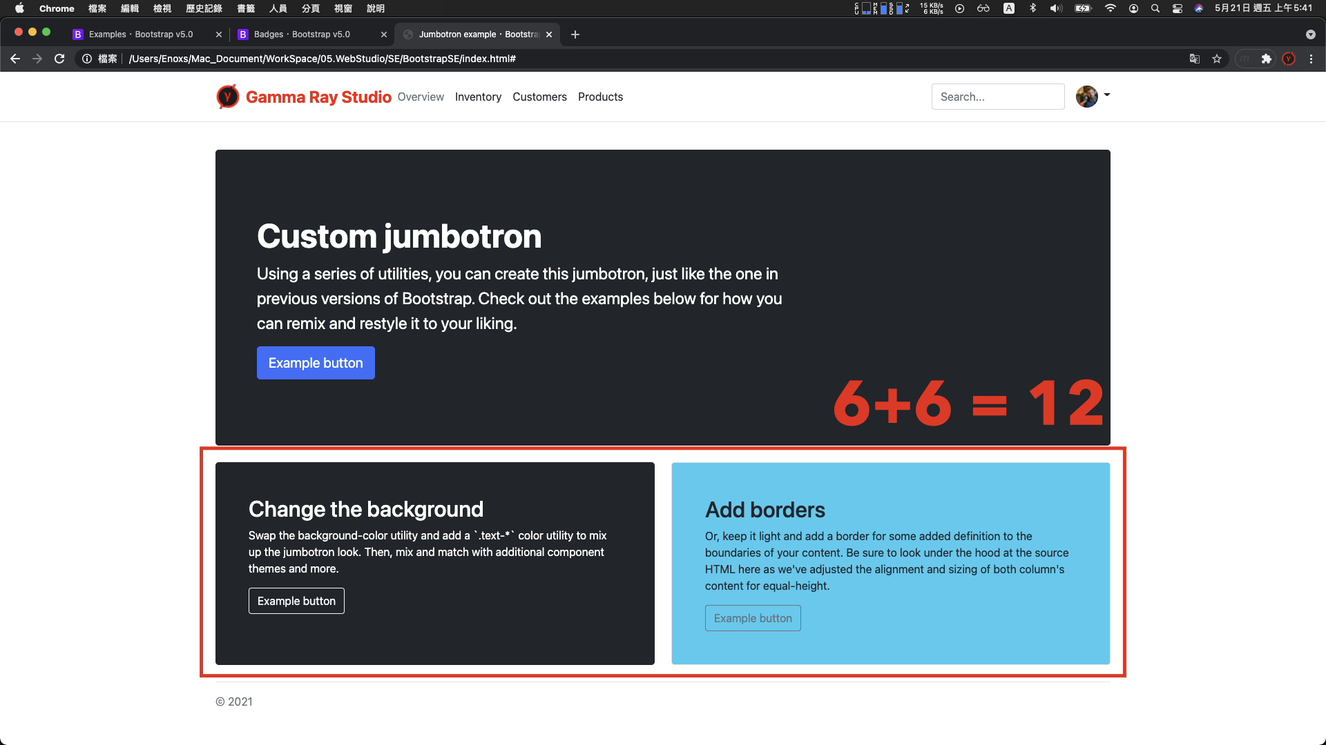
調整一 : 將這三個區塊都變成左下角黑底白字的樣式

最快的方法,查看這一個區塊,了解這個 div 的 class 屬性都是使用了哪些樣式
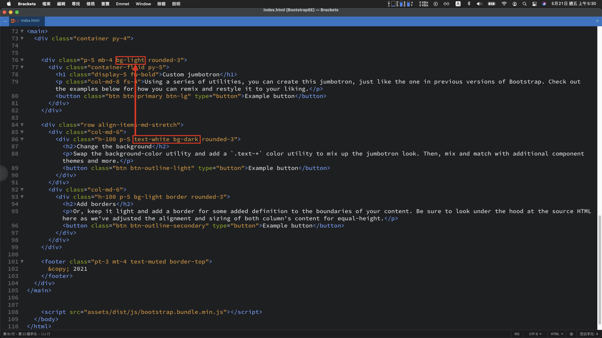
當中 text-white 與 bg-dark,明顯的看得出就是黑底白字樣式。將這兩個名稱複製後,替換第一個 div class 屬性的 bg-light。
重新整理後,黑底白字的樣式已經出現:

另外一種查找方法,可以使用官網中的 Docs 頁籤,搜尋 bg-dark 文字

有更多的樣式可以替換

例如: 使用這個 bg-info、text-dark 右下角的 div 區塊就變成藍底黑字

調整二 : 下方的 div 區塊寬度
當前範例中,觀察單一的 div 區塊的 class 樣式是兩個 col-md-6
<div class="col-md-6">
    <div class="h-100 p-5 text-white bg-dark rounded-3">
      <h2>Change the background</h2>
      <p>Swap the background-color utility and add a `.text-*` color utility to mix up the jumbotron look. Then, mix and match with additional component themes and more.</p>
      <button class="btn btn-outline-light" type="button">Example button</button>
    </div>
  </div>
  <div class="col-md-6">
    <div class="h-100 p-5 bg-light border rounded-3">
      <h2>Add borders</h2>
      <p>Or, keep it light and add a border for some added definition to the boundaries of your content. Be sure to look under the hood at the source HTML here as we've adjusted the alignment and sizing of both column's content for equal-height.</p>
      <button class="btn btn-outline-secondary" type="button">Example button</button>
    </div>
  </div>
</div>
數字是 6 + 6 = 12
複製一個 div,然後將 class 屬性中的 col-md-6 全部改成 col-md-4,呈現的結果維持同一行

數字是 4 + 4 + 4 也等於 12
這個是 Bootstrap 中 構建 RWD 排版,重要的網格系統 (Grid System)
官網文件(Docs) > Layout > Grid 可以看到相關資訊。

(更多詳細資料 -> Google 搜尋 : Bootstrap 網格系統)
網格系統簡單來說是一種排版工具 :
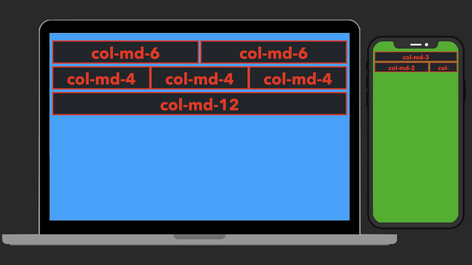
當移動設備要訪問這個網站時,就能夠瀏覽到合適的佈局。
這邊如果想要查看不同裝置的呈現效果:

調整三 : div 區塊中的元件
官網文件 > Components > 各種元件的樣式
查看 Button 元件,除了能夠調整背景與文字顏色,還可以替換成僅有外框線的按鈕。

程式碼差異的部分,就是在 class 屬性的樣式。
所以如果要將按鈕的尺寸加大,只要將 btn-lg 的樣式,貼到 button 的 class 屬性。
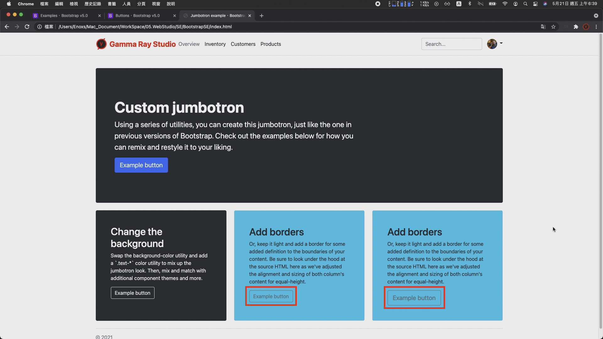
重新整理,就可以發現按鈕的大小,已經比之前的格式又大了一些。
底部文字
經過前面兩個部分的示範調整,應該已經知道如何透過 Examples 頁面的範例與 Docs 頁面的文件組合使用,完成網頁建置的動作。
最後,調整的下方底部的這一大段資訊就是這兩者的綜合運用。
使用的範例是Blog 底部的文字 :

具體的流程 :
如此,整體的畫面佈局就已經成形 :

當然距離最終的成品,還需要許多的試錯與調整。不過有了上面三個部份的示範,應該已經克服最初的困難不在毫無頭緒。
剩下的部分隨著參照與調整的數量增加,自然而然就會知道使用哪些樣式可以達成什麼樣的效果,
而這一試錯的過程,我認為也是網頁設計初期學習的絕佳方案。
GitHub 網頁代管服務,僅能存放靜態網頁
我認為它具有三大優點 : 簡單、免費、穩定
簡單部分:
只要註冊了 GitHub 帳號並且創建特定名稱的專案,就可以立即使用。
剩下的操作的方法,跟一般的 git 操作一樣。
免費的部分
GitHub Pages 的使用限制 :
對於僅僅是要架設個人網站或者部落格,呈現相關資訊的需求相當夠用。
穩定的部分
GitHub 是世界上最大的代碼託管平台(開源社群)
並且於 2018 年 被微軟收購,加上大公司的支持,伺服器的穩定性更可以讓人放心一些。
除了這三個好處以外,如果你剛好也是名軟體工程師,我認為還有另外一個好處 :
順便證明你會使用 git 版本控制以及理解版本控制的重要性。
這個好處對於剛入行的工程師比較重要,因為我認為在沒有足夠多的作品以及足夠多的技能,可以證明自己的強悍程度時,
一個用 github pages 展示的作品集,可以說明很多事情。
對於履歷內容的呈現或者面試時雙方交流的內容,都能夠起到一個不錯的加分效果。

https://rhzenoxs.github.io/Tunffli-View/
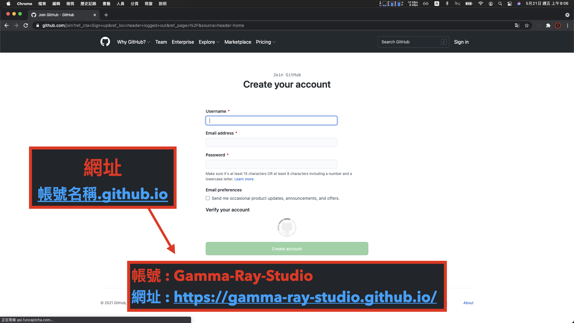
注意網站的網址會是帳號名稱後方加上 .github.io,雖然還是可以使用 DNS 變更網域,但相對麻煩。
所以在創建帳號時就要想好網址要呈現的樣子。
像我這個 Gamma Ray 的官方網站,帳號的名稱就是 Gamma-Ray-Studio
所以他的網址就會變成 gamma-ray-studio.github.io
註冊完成後,下一步創建一個帳號名稱加上 .github.io 的專案
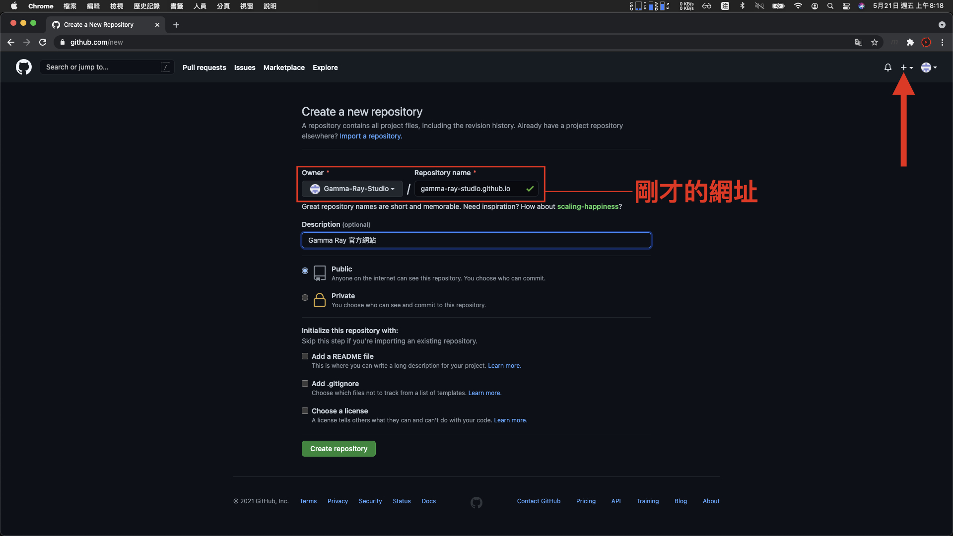
(以我這個 gamma-ray-studio 的帳號來說,也就是剛才的網址作為專案名稱。)
一般 git 專案提交與推送的方法
如果不太熟悉如何使用 git 工具可以參照下列的這幾個 git 筆記的影片,有更深入說明 :
這邊直接以 Sourcetree 工具進行示範
點擊 New > Clone from URL > 填入 git 網址 > 選擇本地端的路徑 > clone

克隆完成後,是一個空的專案,這時候就可以將之前已經完成的網頁檔案,放入到專案內,然後提交、推送

完成後重新整理,可以看見專案的內容已經更新

稍微等待一下,訪問 github pages 網址,就可以看見個人網站已經完成架設。

 Enoxs
Enoxs

 看影片追技術