“Responsive web design (RWD) is a design and technical approach that aims to adapt the layout and interaction of a site or app to work optimally across a wide range of device resolutions, screen densities and interaction modes with the same underlying codebase.“ from RWD Basics - jQuery Mobile Demos
Basing on the previous Web layout practice, we’ll have to add a new element--<meta name="viewpoint" content="width=device-width, initial-scale=1, maximum-scale=1" />--to the basic web layout.
@media query will detect mobile device so that the content adapts to its width automatically.@media screen and (max-width:600px){
.content{width:100%;}
}
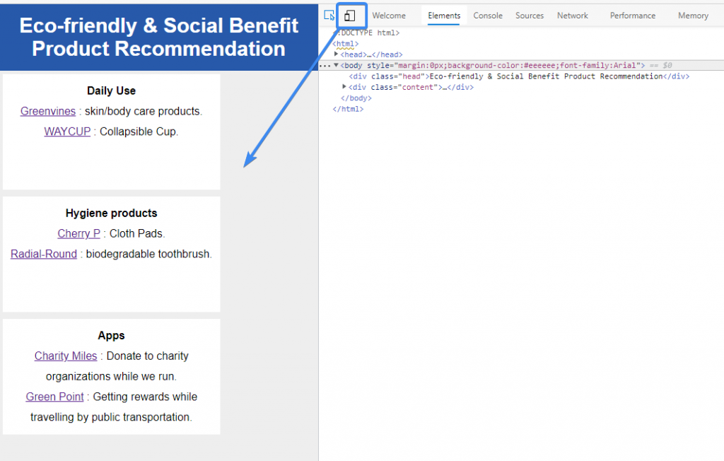
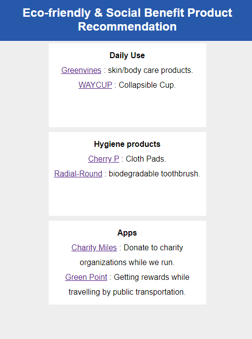
(also the final look of today’s practice)
text-align:center..head{font-size:24px;}.@media screen and (max-width:600px) {
.head{font-size:24px;}
.content{width:100%;text-align:center;}
}

If you guys find this article helpful, please kindly do the writer a favor — LIKE this article.
Feel free to comment and share your ideas below to learn together!

 看影片追技術