Q: 請問icon要怎麼出圖好呢?
A: 一定要用圖片嗎?
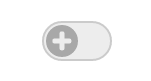
本篇要實作的是「加到最愛」的按鈕,結合之前所述的偽元素,以不使用圖片的方式做出圖案,讓按鈕可以有更多變化。
<script>
  function toggle() {
    document.getElementById('container').classList.toggle('is-active')
  }
</script>

<style>
  .container {
    box-sizing: border-box;
    width: 70px;
    height: 40px;
    padding: 2px;
    border-radius: 20px;
    background-color: #eee;
    border: 2px solid #ccc;
  }
  .circle {
    position: relative;
    width: 32px;
    height: 32px;
    background-color: #aaa;
    border-radius: 50%;
    margin-left: 0;
    cursor: pointer;
  }
  .container,
  .circle  {
    transition: .3s;
  }
  .is-active.container {
    background-color: LavenderBlush;
    border-color: Crimson;
  }
  .is-active .circle {
    background-color: Crimson;
    margin-left: calc(100% - 32px);
  }
</style>

<div id="container" class="container">
  <div class="circle" onclick="toggle()"></div>
</div>

再來要使用偽元素::before及::after做出「+」,以position: absolute將元素定位在.circle左方及上方各為50%的位置,然後以transform: translate(-50%, -50%)將元素回推自己的X及Y各一半,最後再給::before及::after寬高就可以囉,這時候不論寬高如何調整,都會在.circle的正中央。
<style>
  .circle::before,
  .circle::after {
    content: '';
    position: absolute;
    left: 50%;
    top: 50%;
    background-color: #eee;
    transform: translate(-50%, -50%);
    border-radius: 2px;
  }
  .circle::before {
    height: 60%;
    width: 5px;
  }
  .circle::after {
    width: 60%;
    height: 5px;
  }
</style>
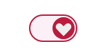
將::before及::after都做成拱形的樣子,並將兩個重疊就會是愛心。先移除原本位移的transform,並讓 top及 left 的位置修改為24%。最後對 .circle 進行旋轉就可以讓愛心變成正的了!
<style>
  .is-active .circle::before,
  .is-active .circle::after {
    transform: none;
    top: 24%;
    left: 24%;
  }
  .is-active .circle::before {
    width: 32%;
    border-radius: 0 0 20px 20px;
  }
  .is-active .circle::after {
    height: 32%;
    border-radius: 0 20px 20px 0;
  }
  .is-active .circle {
    transform: rotate(-135deg);
  }
</style>
再來為了icon也有漸變的效果,所以需要在::before及::after也都加上屬性transition。
<style>
  .circle::before,
  .circle::after {
    transition: .3s;
  }
</style>

如果可以用css就做出icon取代圖片,還可以讓畫面變化時有轉場的效果,這樣不美嗎?
如果有寫錯的地方,歡迎點評! 會及時改進~
如果有更好的寫法,歡迎指教! 希望各位不吝賜教~
如果想看更多效果,歡迎敲碗! 提供示意圖小編寫寫看~
如果內容疑似侵權,拜託告知! 內容皆為小編理解後原創~
如果對你有點幫助,拿去用吧!


 iThome鐵人賽
 看影片追技術