iT邦幫忙

2021 iThome 鐵人賽

DAY 14
0
AI & Data

30Day 從一介凡人羽化成資料科學初學者系列 第 14

Day14-seaborn(2)直方圖histplot、散佈圖jointplot

  • 分享至 

  • xImage
  •  

直方圖
直方圖與上一篇所介紹長條圖差別在哪裡呢?
直方圖通常用來觀察連續性資料對於相同屬性值的呈現結果
直方圖的x軸為連續性資料,例:年齡、年份等
而長條圖的x軸為類別型的資料,例:XX的有無、屬於什麼類別
一樣使用Titanic資料集做示範
使用seaborn的histplot繪製長條圖
可傳x與y參數,如果不傳y參數,那y軸就是數量
Age欄位為乘客的年齡
https://ithelp.ithome.com.tw/upload/images/20210829/20140416rf2acaJju4.png

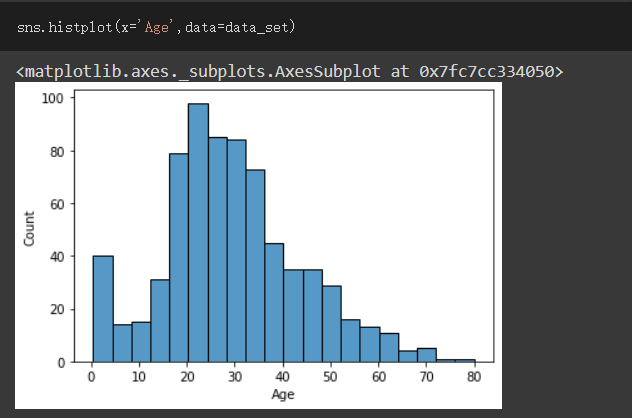
Survived為乘客有無生存,放入參數hue做分類來觀察
https://ithelp.ithome.com.tw/upload/images/20210829/20140416lU1GONIxU5.png

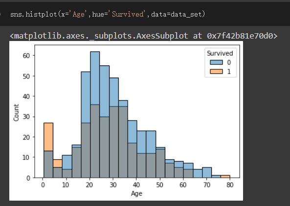
使用seaborn的jointplot繪製散佈圖
通常用來觀察兩資料之間的關係及分布情形
這邊我會用鳶尾花資料集做示範
先載入資料
資料集介紹:
SepalLengthCm(萼片長度)、SepalWidthCm(萼片寬度)、PetalLengthCm(花瓣長度)
PetalWidthCm(花瓣寬度)、Species(屬於哪一種花)
https://ithelp.ithome.com.tw/upload/images/20210829/20140416G1qnOPNcxI.png
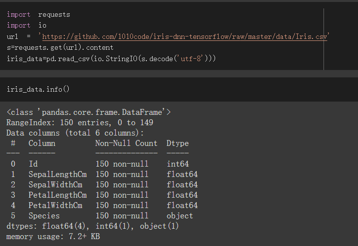
x參數填入SepalLengthCm,y參數填入SepalWidthCm,之後hue用Species分類
https://ithelp.ithome.com.tw/upload/images/20210829/20140416mEtGUBrsxD.png

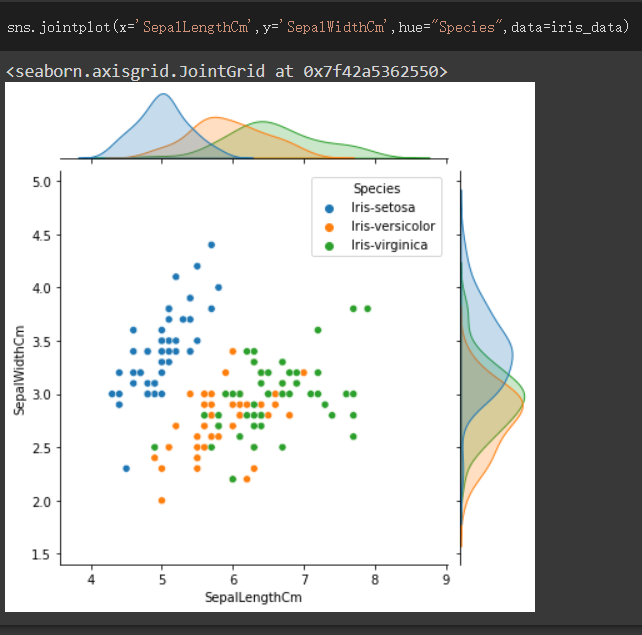
送上colab連結,可自行在上面多做點練習更加熟悉seaborn
https://colab.research.google.com/drive/1fT9qs1doFqEPEJYne8aLMK74xl7U8n56?usp=sharing


上一篇
Day13-seaborn(1)長條圖barplot、countplot
下一篇
Day15-seaborn(3)盒鬚圖boxplot、熱力圖heatmap
系列文
30Day 從一介凡人羽化成資料科學初學者30
圖片
  直播研討會
圖片
{{ item.channelVendor }} {{ item.webinarstarted }} |
{{ formatDate(item.duration) }}
直播中

尚未有邦友留言

立即登入留言