以下內容皆參考 Backtrader 官網
有了策略可以讓我們進行評估,有了歷史資料可以進行回測,加上 Backtrader 有 trade_notify, order_notify,我們可以看到每筆交易的價格,如果要進行策略優化,也有 stop 這個事件,可以在執行完策回測後進行回報成果,基本上這樣就結束了...嗎?如果只是程式在跑,的確是結束了,不過人是視覺的動物,所以補上繪圖這一塊才算是完整。
在之前就有大概介紹過如何進行繪圖,今天再說明仔細一點,Backtrader 的繪圖指令很簡單,只有一行:
cerebro.plot()
它就會自動繪出以下的資料:
datafeed 的部份,不管是使用 adddata, resampledata, replaydata 都會新增一筆資料,也會在繪圖的時候一併顯示。
指標的話,就是在 init 的地方,我們可以新增指標,不管有沒有指定變數,只要我們有初始化,那就會顯示
def __init__(self):
    self.sma_short = btind.SimpleMovingAverage(period = 5)
    self.sma_long = btind.SimpleMovingAverage(period = 30)
    # 或者不指定變數
    # btind.SimpleMovingAverage(period = 5)
    # btind.SimpleMovingAverage(period = 30)
如果還有記得第一天,我們在初始化 cerebro 的時候是這樣子的
cerebro = bt.Cerebro(stdstats=False)

# 也可以在執行的時候指定
# cerebro.run(stdstats=False)
stdstats 指的就是上面 3 個基本的 observers,所以第一天畫出來的圖,並沒有 observers 的資訊。
我們以一段簡單的策略來示範:
import backtrader as bt
import backtrader.indicators as btind
import backtrader.feeds as btfeeds
class St(bt.Strategy):
    def __init__(self):
        self.sma_short = btind.SimpleMovingAverage(period = 5)
        self.sma_long = btind.SimpleMovingAverage(period = 30)

data = btfeeds.PandasData(dataname=df, timeframe=bt.TimeFrame.Minutes)

cerebro = bt.Cerebro(stdstats=True)

cerebro.resampledata(data, timeframe=bt.TimeFrame.Days)

cerebro.addstrategy(St)
cerebro.run()
cerebro.plot()
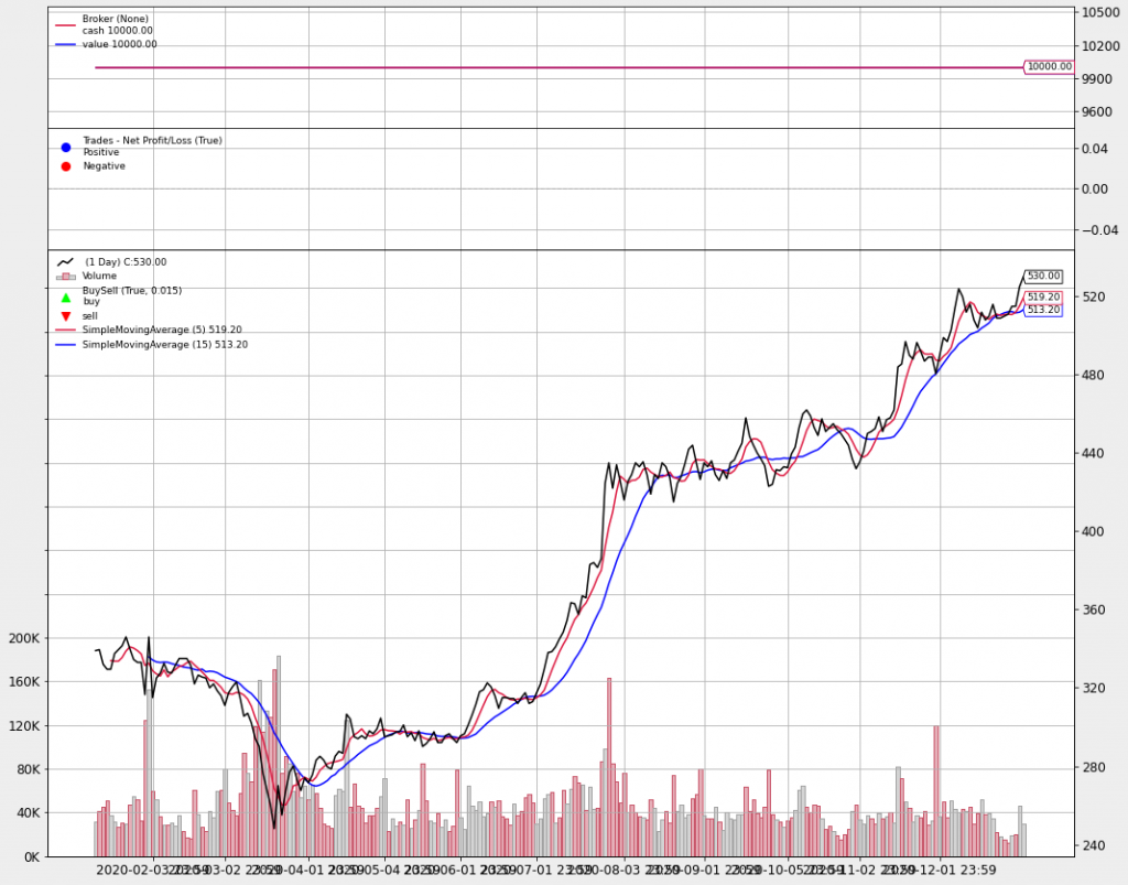
上面的2個圖就是,現金/收益, 買進/賣出,下面最主要的圖就是 datafeed/指標,之前說過指標也是以 line 的型式在儲存資料,所以可以在這上面畫出一條線來,要加畫線的話,可以在 init 增加我們的指標,而且不一定要指定變數。像是這樣
在繪制 indicators 和 observers 的時候,有一些選項可以進行細部設定選項如下所例:
設定的方法有 2 種:
# 在初始化 indicators 時指定 kwargs
btind.SimpleMovingAverage(period = 5, plot = False)

# 在初始化後,依照指定的變數設定
sma = btind.SimpleMovingAverage(period = 5)
sma.plotinfo.plot = False
def plot(self, plotter=None, numfigs=1, iplot=True, **kwargs):
class PlotScheme(object):
    def __init__(self):
        # to have a tight packing on the chart wether only the x axis or also
        # the y axis have (see matplotlib)
        self.ytight = False

        # y-margin (top/bottom) for the subcharts. This will not overrule the
        # option plotinfo.plotymargin
        self.yadjust = 0.0
        # Each new line is in z-order below the previous one. change it False
        # to have lines paint above the previous line
        self.zdown = True
        # Rotation of the date labes on the x axis
        self.tickrotation = 15

        # How many "subparts" takes a major chart (datas) in the overall chart
        # This is proportional to the total number of subcharts
        self.rowsmajor = 5

        # How many "subparts" takes a minor chart (indicators/observers) in the
        # overall chart. This is proportional to the total number of subcharts
        # Together with rowsmajor, this defines a proportion ratio betwen data
        # charts and indicators/observers charts
        self.rowsminor = 1

        # Distance in between subcharts
        self.plotdist = 0.0

        # Have a grid in the background of all charts
        self.grid = True

        # Default plotstyle for the OHLC bars which (line -> line on close)
        # Other options: 'bar' and 'candle'
        self.style = 'line'

        # Default color for the 'line on close' plot
        self.loc = 'black'
        # Default color for a bullish bar/candle (0.75 -> intensity of gray)
        self.barup = '0.75'
        # Default color for a bearish bar/candle
        self.bardown = 'red'
        # Level of transparency to apply to bars/cancles (NOT USED)
        self.bartrans = 1.0

        # Wether the candlesticks have to be filled or be transparent
        self.barupfill = True
        self.bardownfill = True

        # Wether the candlesticks have to be filled or be transparent
        self.fillalpha = 0.20

        # Wether to plot volume or not. Note: if the data in question has no
        # volume values, volume plotting will be skipped even if this is True
        self.volume = True

        # Wether to overlay the volume on the data or use a separate subchart
        self.voloverlay = True
        # Scaling of the volume to the data when plotting as overlay
        self.volscaling = 0.33
        # Pushing overlay volume up for better visibiliy. Experimentation
        # needed if the volume and data overlap too much
        self.volpushup = 0.00

        # Default colour for the volume of a bullish day
        self.volup = '#aaaaaa'  # 0.66 of gray
        # Default colour for the volume of a bearish day
        self.voldown = '#cc6073'  # (204, 96, 115)
        # Transparency to apply to the volume when overlaying
        self.voltrans = 0.50

        # Transparency for text labels (NOT USED CURRENTLY)
        self.subtxttrans = 0.66
        # Default font text size for labels on the chart
        self.subtxtsize = 9

        # Transparency for the legend (NOT USED CURRENTLY)
        self.legendtrans = 0.25
        # Wether indicators have a leged displaey in their charts
        self.legendind = True
        # Location of the legend for indicators (see matplotlib)
        self.legendindloc = 'upper left'

        # Plot the last value of a line after the Object name
        self.linevalues = True

        # Plot a tag at the end of each line with the last value
        self.valuetags = True

        # Default color for horizontal lines (see plotinfo.plothlines)
        self.hlinescolor = '0.66'  # shade of gray
        # Default style for horizontal lines
        self.hlinesstyle = '--'
        # Default width for horizontal lines
        self.hlineswidth = 1.0

        # Default color scheme: Tableau 10
        self.lcolors = tableau10

        # strftime Format string for the display of ticks on the x axis
        self.fmt_x_ticks = None

        # strftime Format string for the display of data points values
        self.fmt_x_data = None
另外,繪圖的設定選項還有在 indicators|observers 裡設定,不過這裡要知道怎麼自訂義 indicators|observers,因為我還沒有分享到這,所以暫時就不分享這部份,之後如果有時間,再來補充


 iThome鐵人賽