本篇大綱:合併圖表繪製關鍵、圖表畫面與互動效果、本次使用資料、圖表繪製
今天的一天一圖表,我們要來看怎麼把兩張圖表合併啦!一般來說,我們最常看到的合併圖表就是 長條圖+折線圖 這類圖表,這種合併圖表多了右邊的Y軸,能表達的資訊稍微多了一些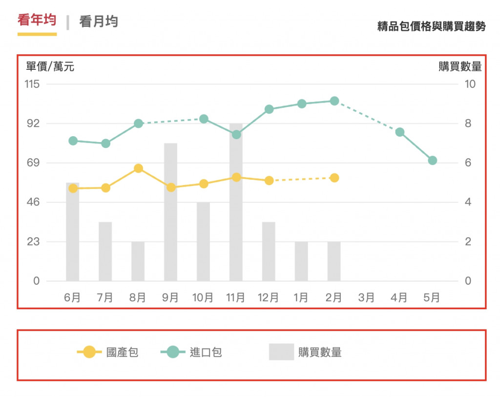
雖然合併圖表看似很簡單,只是長條圖跟折線圖畫在一起,但由於D3在繪製長條圖跟折線圖時使用的比例尺不同,因此也會稍微有點難度。我們有兩種做法
我自己是建議直接設定兩種比例尺,這樣直接用 scaleBand 旗下的 bandwidth 就能設定長條圖的寬度,會方便很多
這次要做的圖表包含以下功能

由於這次要把部分折線圖設計成虛線線段代表缺少這部分的資料,比較難找到符合這種條件的開放資料,因此我們這次就先用自己定義的資料。資料結構長這樣
{
    "code": 200,
    "msg": "success",
    "list": [{
            "date": "110-5",
            "domesticBagPrice": 0.0000,
            "dealCount": 0,
            "foreignBagPrice": 70.4700
        },
        {
            "date": "110-4",
            "domesticBagPrice": 0.0000,
            "dealCount": 0,
            "foreignBagPrice": 87.0078
        },
        {
            "date": "110-3",
            "domesticBagPrice": 0.0000,
            "dealCount": 0,
            "foreignBagPrice": 0
        },
        {
            "date": "110-2",
            "domesticBagPrice": 60.3050,
            "dealCount": 2,
            "foreignBagPrice": 105.2008
        },
        {
            "date": "110-1",
            "domesticBagPrice": 0,
            "dealCount": 2,
            "foreignBagPrice": 103.5544
        },
        {
            "date": "109-12",
            "domesticBagPrice": 58.7133,
            "dealCount": 3,
            "foreignBagPrice": 100.3663
        },
        {
            "date": "109-11",
            "domesticBagPrice": 60.6288,
            "dealCount": 8,
            "foreignBagPrice": 85.5546
        },
        {
            "date": "109-10",
            "domesticBagPrice": 56.8400,
            "dealCount": 4,
            "foreignBagPrice": 94.7130
        },
        {
            "date": "109-9",
            "domesticBagPrice": 54.7029,
            "dealCount": 7,
            "foreignBagPrice": 0
        },
        {
            "date": "109-8",
            "domesticBagPrice": 65.8500,
            "dealCount": 2,
            "foreignBagPrice": 92.0291
        },
        {
            "date": "109-7",
            "domesticBagPrice": 54.4367,
            "dealCount": 3,
            "foreignBagPrice": 80.3800
        },
        {
            "date": "109-6",
            "domesticBagPrice": 54.1520,
            "dealCount": 5,
            "foreignBagPrice": 81.9309
        }
    ]
}
那我們就直接來繪製圖表啦!這次的圖表算是這一整篇D3鐵人賽系列的集大成圖表,如果再拆成片段的講解反而較難看懂,所以就直接上完整的程式碼吧~重要的細節我會寫在註解內
// css
html {
  font-size: 13px;
}

#wrapper {
  position: relative;
  width: 100%;
  height: 100%;
  min-width: 300px;
  max-width: 980px;
  min-height: 300px;
}

.chartContainer {
  margin: auto;
  width: 80%;
  min-width: 300px;
  height: 500px;
}

.chartTitle {
    font-size: 1.5rem;
    font-weight: bold;
    color: #333333;
}

.infoWrap {
    display: flex;
    justify-content: space-between;
}

.bagsInfo {
    align-self: center;
    font-size: 13px;
    line-height: 1.6;
    color: #333333;
}

.switchBtnWrap {
  display: flex;
  margin-bottom: 10px;
  align-items: center;
}

.switchBtn {
  box-sizing: border-box;
  font-size: 1.2rem;
  color: #666666;
  cursor: pointer;
  padding-top: 4px;
  padding-bottom: 4px;
}

.switchBtn:hover,
.active {
  color: #d02b41;
  font-weight: bold;
  border-bottom: 4px solid #ffcc33;
}

.greyLine {
  margin-right: 10px;
  margin-left: 10px;
  color: #cccccc;
}

svg {
  width: 100%;
}

svg text {
  font-size: 1rem;
  color: #777777;
}

.graph-info text {
  font-size: 0.8rem;
}

.y1Axis .tick line {
  stroke: #e8e8e8;
}

/* 監聽方塊透明 */
.listening-rect {
  fill: transparent;
}
// html
<div id="wrapper">
    <div class="chartContainer"></div>
</div>
// js
// 加圖表標題資訊
const chartInfo = `<div class="chartTitle"包包購買趨勢</div>
<div class="infoWrap">
    <div class="switchBtnWrap">
        <div class="switchBtn yearEverage active">看年均</div>
        <div class="greyLine">|</div>
        <div class="switchBtn monthEverage ">看月均</div>
    </div>
    <div class="bagsInfo">精品包價格與購買趨勢</div>
</div>`;

const chartContainer = document.querySelector(".chartContainer");
chartContainer.innerHTML = chartInfo;

// 繪製D3圖表,Select 選定元素
const container = d3.select(".chartContainer");

// 定義資料
let data = [],
data2 = [],
dataURL = "./data/data.json";

// 切換年均月均Data
const yearEverage = document.querySelector(".yearEverage");
const monthEverage = document.querySelector(".monthEverage");

yearEverage.addEventListener("click", function (e) {
monthEverage.classList.remove("active");
this.classList.add("active");
dataURL = "./data/data.json";
getData();
});

monthEverage.addEventListener("click", function (e) {
yearEverage.classList.remove("active");
this.classList.add("active");
dataURL = "./data/data2.json";
getData();
});

// 非同步取資料
async function getData() {
dataGet = await d3.json(dataURL);
data = dataGet.list.reverse();

renderChart();
}

// 畫圖表
function renderChart() {
// 調整畫面大小
let svgwidth = parseInt(d3.select(".chartContainer").style("width")),
    svgheight = svgwidth * 0.6,
    marginLeft = (svgwidth / 100) * 6, //25
    marginBottom = (svgwidth / 100) * 6, //30
    chartWidth = svgwidth - marginLeft * 2,
    chartHeight = svgheight - marginBottom;

// 限定margin
marginBottom = marginBottom < 28 ? 28 : marginBottom;
marginLeft = marginLeft < 28 ? 28 : marginLeft;

// 限定寬高不可以小於200
chartWidth = svgwidth < 200 ? 200 : chartWidth;
chartHeight = svgheight < 300 ? 300 : chartHeight;

// 先刪除原本的svg.charts,再重新渲染計算過寬度的svg
d3.select(".charts").remove();

// 繪製畫布
const svg = container
    .append("svg")
    .attr("width", chartWidth)
    .attr("height", chartHeight)
    .attr("class", "charts");

// X軸是年份(Date)、Y1是單價(domesticBagPrice)
//Y2是賣出數量(dealCount),Y3是國外包包價格(foreignBagPrice)
const xData = data.map((i) => parseInt(i.date.slice(4))),
    y1Data = data.map((i) => i.domesticBagPrice),
    y2Data = data.map((i) => i.dealCount),
    y3Data = data.map((i) => i.foreignBagPrice);

//數值取出後,轉換成X軸的scale
let xScale = d3
    .scaleBand()
    .domain(xData)
    .range([marginLeft, chartWidth + marginLeft])
    .padding(0.6);

// 設定X軸線與tick
let xAxis = d3
    .axisBottom(xScale)
    .tickSizeOuter(0)
    .tickSizeInner(0)
    .tickPadding(10)
    .tickFormat(function (d) {
    return d;
    });

// 手機板時減少X軸的tick
let xMobileTicks = [];
xData.forEach((item, index) => {
    if (index % 2 == 0) {
    xMobileTicks.push(item);
    }
});

let xAxisWeb;
// 手機板跟電腦版的tick數量改動
if (svgwidth < 400) {
    xAxisWeb = xAxis
    .tickFormat(function (d) {
        return `${d}月`;
    })
    .tickValues(xMobileTicks);
} else {
    xAxisWeb = xAxis.tickFormat(function (d) {
    return `${d}月`;
    });
}

// 呼叫繪製X軸線
const xAxisLine = svg
    .append("g")
    .attr("class", "xAxis")
    //讓X軸到下方
    .style("transform", `translate(0px,${chartHeight - marginBottom}px)`)
    .call(xAxis);

// 改變X軸顏色與粗細
xAxisLine
    .select(".domain")
    .attr("stroke", "#e8e8e8")
    .attr("stroke-width", "1")
    .attr("opacity", "1");

// 調整X軸標籤位置
xAxisLine
    .selectAll("text")
    .attr("y", 15)
    .attr("x", 0)
    .style("color", "#777777");

// Y1軸(單價)
// 平均分配Y1的軸數 (六個軸)
// 抓Y1,Y3的最大值
let maxYData = y1Data.concat(y3Data);
let maxY1Data = parseInt(Math.max.apply(null, maxYData)) + 10;
let minY1Data = Math.min.apply(null, maxYData);

let y1Summary = maxY1Data + minY1Data,
    y1EventNumber = y1Summary / 5,
    Y1EventArray = [];
let arrayBase = 0;

for (let i = 1; i < 6; i++) {
    arrayBase = arrayBase + y1EventNumber;
    Y1EventArray.push(minY1Data);
    Y1EventArray.push(parseInt(arrayBase));
}

// 把平均後的數字吐回給Y domain
let y1Scale = d3
    .scalePoint()
    .domain(Y1EventArray)
    .range([chartHeight, marginBottom * 2]);

// Y1軸線刻度
let y1Axis = d3
    .axisLeft(y1Scale)
    .tickSizeOuter(0)
    .tickSizeInner(-chartWidth) //軸線向內(右)延伸,比照繪圖區高度
    .tickPadding(8)
    .ticks(6);

const y1AxisLine = svg
    .append("g")
    .attr("class", "y1Axis")
    .style("transform", `translate(${marginLeft}px, -${marginBottom}px)`)
    .call(y1Axis);

// 加上Y1標籤
const y1AxisLabel = y1AxisLine
    .append("text")
    .attr("class", "y1axis-label")
    .text("單價/萬元")
    .attr("x", marginLeft)
    .attr("y", marginBottom * 1.5)
    .style("fill", "#333333")
    .style("font-size", "1rem");

// 改變Y1軸成透明
y1AxisLine.select(".domain").attr("opacity", "0");

// Y2軸
let y2Scale = d3
    .scaleLinear()
    .domain([0, 10])
    .range([chartHeight, marginBottom * 2]);

let y2Axis = d3
    .axisRight(y2Scale)
    .tickSizeInner(0)
    .tickSizeOuter(0)
    .ticks(5)
    .tickPadding(8);

const y2AxisLine = svg
    .append("g")
    .attr("class", "y2Axis")
    .style(
    "transform",
    `translate(${svgwidth - marginLeft}px, -${marginBottom}px)`
    )
    .call(y2Axis);

// 加上Y2標籤
const y2AxisLabel = y2AxisLine
    .append("text")
    .attr("class", "y2axis-label")
    .text("購買數量")
    .attr("x", -(marginLeft * 0.7))
    .attr("y", marginBottom * 1.5)
    .style("fill", "#333333")
    .style("font-size", "1rem");

// 改變Y2軸成透明
y2AxisLine.select(".domain").attr("opacity", "0");

// 畫折線圖跟長條圖
// 這邊先設定方法,讓折線圖跟長條圖的XY軸能產出正確的座標
const xAccessor = (d) => parseInt(d.date.slice(4));
const y1Accessor = (d) => d.domesticBagPrice;
const y2Accessor = (d) => d.dealCount;
const y3Accessor = (d) => d.foreignBagPrice;

// 先畫長條圖,折線圖才不會被蓋住
const barChart = svg
    .append("g")
    .selectAll("rect")
    .data(data)
    .join("rect")
    .attr("x", (d, i) => {
    return xScale(xAccessor(d));
    })
    .attr("y", (d, i) => {
    return y2Scale(y2Accessor(d)) - marginBottom;
    })
    .attr("width", xScale.bandwidth())
    .attr("height", (d) => y2Scale(0) - y2Scale(y2Accessor(d)))
    .attr("fill", "#e0e0e0");

// 畫折線圖
// 處理Y1,Y3折線圖ScaleLinear
let y1LineScale = d3
    .scaleLinear()
    .domain([d3.min(Y1EventArray), d3.max(Y1EventArray)])
    .range([chartHeight, marginBottom * 2]);

// 繪製Y軸第一條折線圖
const lineChart = d3
    .line()
    .x((d) => xScale(xAccessor(d)) + marginLeft / 4)
    .y((d) => {
    return y1LineScale(y1Accessor(d)) - marginBottom;
    })
    .defined((d) => d.domesticBagPrice > 0)
    .curve(d3.curveLinear); //決定曲線線條

// 有資料的線
const line = svg
    .append("g")
    .append("path")
    .attr("d", lineChart(data))
    .attr("fill", "none")
    .attr("stroke", "#FFCC33")
    .attr("stroke-width", 2);

let filteredData = data.filter(lineChart.defined());

// 覆蓋的dashed
svg
    .append("g")
    .append("path")
    .attr("d", lineChart(filteredData))
    .attr("fill", "none")
    .attr("stroke", "#FFCC33")
    .attr("stroke-width", 2)
    .style("stroke-dasharray", "4,4");

// 折線圖圓點點
svg
    .selectAll(".dot")
    .data(filteredData)
    .enter()
    .append("g")
    .classed("dot1", true)
    .append("circle")
    .attr("cx", (d) => xScale(xAccessor(d)) + marginLeft / 4)
    .attr("cy", (d) => y1LineScale(y1Accessor(d)) - marginBottom)
    .attr("r", 5)
    .attr("fill", "#FFCC33")
    .attr("stroke", "#FFCC33");

// 繪製Y軸第二條折線圖 foreignBagPrice
const lineChart2 = d3
    .line()
    .x((d) => xScale(xAccessor(d)) + marginLeft / 4)
    .y((d) => {
    // console.log(y1LineScale(y1Accessor(d)))
    return y1LineScale(y3Accessor(d)) - marginBottom;
    })
    .defined((d) => d.foreignBagPrice > 0)
    .curve(d3.curveLinear); //決定曲線線條

// 第二條折線圖
const line2 = svg
    .append("g")
    .append("path")
    .attr("d", lineChart2(data))
    .attr("fill", "none")
    .attr("stroke", "#78c9b7")
    .attr("stroke-width", 2);

let filteredData2 = data.filter(lineChart2.defined());

// 第二條覆蓋的dashed
svg
    .append("g")
    .append("path")
    .attr("d", lineChart2(filteredData2))
    .attr("fill", "none")
    .attr("stroke", "#78c9b7")
    .attr("stroke-width", 2)
    .style("stroke-dasharray", "4,4");

// 第二條折線圖圓點
const dots2 = svg
    .selectAll(".dot2")
    .data(filteredData2)
    .enter()
    .append("g")
    .classed("dot2", true)
    .append("circle")
    .attr("cx", (d) => xScale(xAccessor(d)) + marginLeft / 4)
    .attr("cy", (d) => y1LineScale(y3Accessor(d)) - marginBottom)
    .attr("r", 5)
    .attr("fill", "#78c9b7")
    .attr("stroke", "#78c9b7");

// 滑鼠事件
let tooltip = d3
    .select(".chartContainer")
    .append("div")
    .text("text!!")
    .style("position", "absolute")
    .style("opacity", 0)
    .attr("class", "tooltip")
    .style("background-color", "white")
    .style("border", "solid")
    .style("border-width", "1px")
    .style("border-color", "grey")
    .style("padding", "5px");

dots2
    .on("mouseover", function () {
    const mousePosition = d3.pointer(event, this);
    const hoveredDate = y1LineScale.invert(mousePosition[1]);
    // 圓點放大變色
    d3.select(this)
        .attr("cursor", "pointer")
        .attr("r", 7)
        .style("fill", "white")
        .style("stroke-width", 5);

    // tooltip
    tooltip
        .html(
        `單價<br><span style="color:#d02b41">${parseInt(
            hoveredDate
        )}</span> 萬元`
        )
        .style("opacity", 1)
        .style('position', 'absolute')
        .style("left", `${mousePosition[0]}px`)
        .style("top", `${mousePosition[1]}px`);

    })
    .on("mouseleave", function () {
    d3.select(this)
        .attr("r", 5)
        .style("fill", "#78c9b7")
        .style("stroke-width", 1);
    tooltip.style("opacity", 0);
    });

// 最後再渲染圖表標籤
renderChartLabel();
}

// 畫資料標籤
function renderChartLabel() {
// 刪掉原本元素,切換時需重新渲染
d3.select(".graph-info").remove();

// 定義 margin
let svgwidth = parseInt(d3.select(".chartContainer").style("width")),
    marginX = svgwidth / 10 + 20,
    marginY = 15;

// 資料標籤
const graphInfo = d3
    .select(".chartContainer")
    .append("svg")
    .attr("class", "graph-info")
    .attr("height", "60px")
    .style("padding-top", "10px");

// 黃色折線-國內包包
graphInfo
    .append("line")
    .style("stroke", "#FFCC33")
    .style("stroke-width", 3)
    .attr("x1", 70)
    .attr("y1", marginY)
    .attr("x2", 100)
    .attr("y2", marginY);

graphInfo
    .append("circle")
    .attr("cx", 85)
    .attr("cy", marginY)
    .attr("r", 7)
    .style("stroke", "#FFCC33")
    .style("fill", "#FFCC33");

graphInfo
    .append("text")
    .attr("x", 105)
    .attr("y", 20)
    .text("國產包")
    .style("font-size", "1rem")
    .style("fill", "#777777");

// 藍色折線-國外包包
graphInfo
    .append("line")
    .style("stroke", "#78c9b7")
    .style("stroke-width", 3)
    .attr("x1", 170)
    .attr("y1", marginY)
    .attr("x2", 200)
    .attr("y2", 15);

graphInfo
    .append("circle")
    .attr("cx", 185)
    .attr("cy", marginY)
    .attr("r", 7)
    .style("stroke", "#78c9b7")
    .style("fill", "#78c9b7");

graphInfo
    .append("text")
    .attr("x", 205)
    .attr("y", 20)
    .text("進口包")
    .style("font-size", "1rem")
    .style("fill", "#777777");

// 直條圖
graphInfo
    .append("rect")
    .attr("x", 300)
    .attr("y", 5)
    .attr("width", 30)
    .attr("height", 20)
    .attr("fill", "#e0e0e0");

graphInfo
    .append("text")
    .attr("x", 335)
    .attr("y", 20)
    .text("購買數量")
    .style("font-size", "1rem")
    .style("fill", "#777777");
}

getData();
// RWD
d3.select(window).on("resize", renderChart);
這樣就完成啦!想不到寫著寫著也到第29天了,明天就是最後一天要完賽了,感謝老天爺!
最後附上本章的程式碼:想看完整程式碼的請上 Github,想直接操作圖表的則去 Github Page 吧!請自行取用~