本篇大綱:繪製氣泡圖的關鍵、資料下載、範例圖表的畫面與互動效果、繪製圖表
今天的一天一圖表,我們要來畫氣泡圖!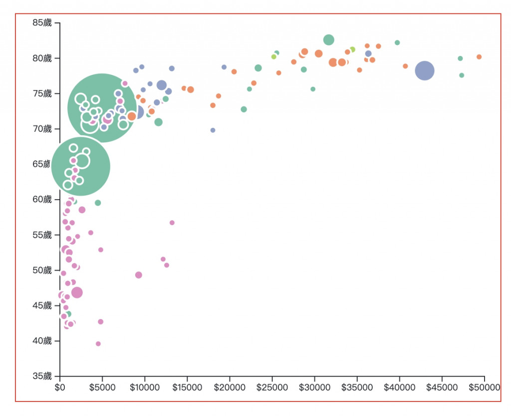
氣泡圖其實是散點圖的延伸,差別在於 氣泡圖多了一道步驟要設定氣泡的大小,因此我們要特別設定圓點大小要看哪項資料去設定,並 多建立一個比例尺 去設定這項資料的範圍。
我們這次要使用的資料是這一份,這份資料比較了不同國家的平均壽命、人口數量與GDP,並且也把不同國家分別隸屬五大洲的哪一洲分別歸類,資料結構長這樣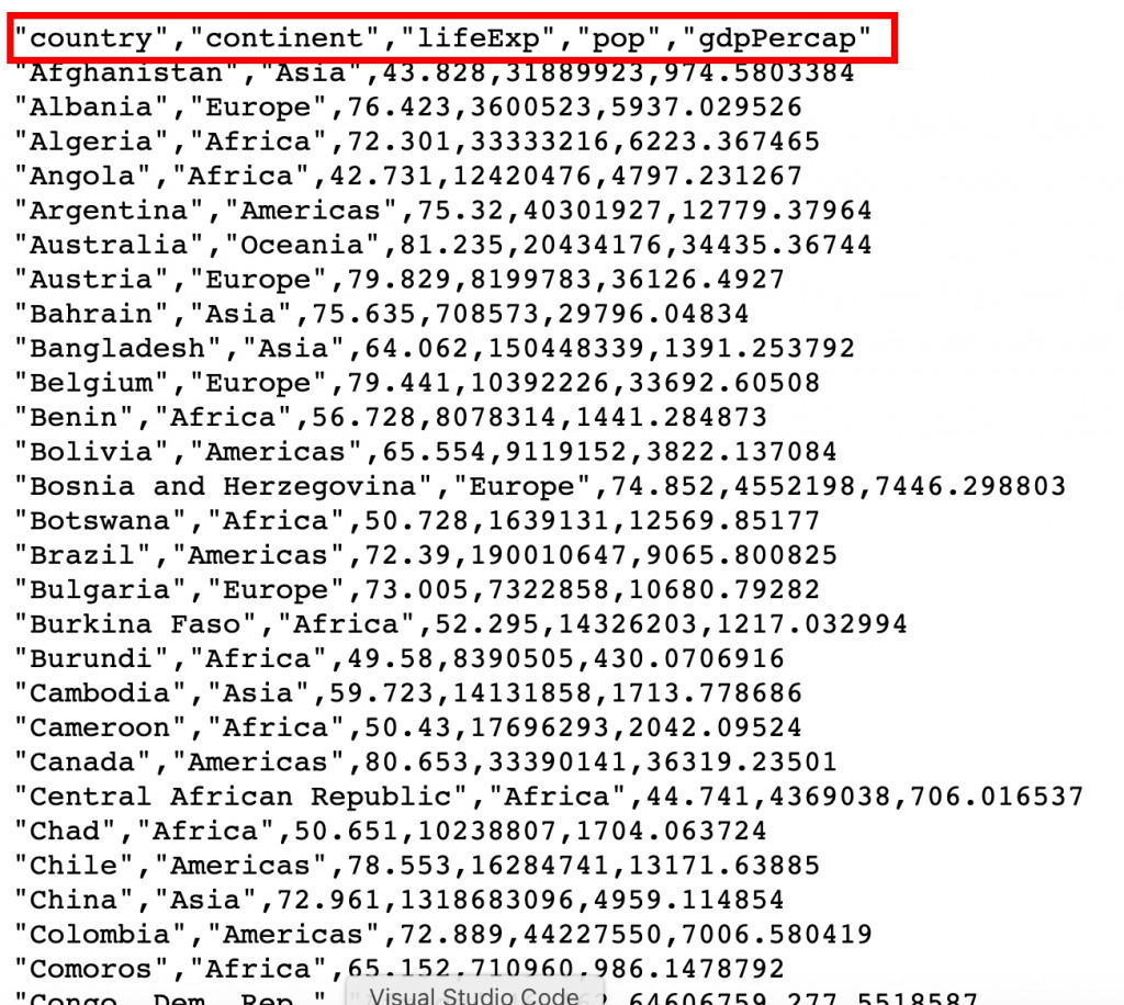
秉持我們一貫的作風,圖表當然不只有畫面啦!這次我們簡單加上一個tooltip,滑鼠滑過氣泡時會顯示該氣泡代表哪一國,具體畫面如下:
現在我們趕快開始吧~首先,一樣先取資料並建立svg
// css
.bubbleChart{
	margin: auto;
	width: 80%;
	min-width: 300px;
	position: relative;
}
// html
<h4 class="text-center mt-4">比較不同國家的平均壽命、人口數量與GDP</h4>
<div class="bubbleChart""></div>
// js
// 先取資料
let data = []
async function getData(){
  let dataGet;

  const url = 'https://raw.githubusercontent.com/holtzy/data_to_viz/master/Example_dataset/4_ThreeNum.csv'

  dataGet = await d3.csv(`${url}`);
  data = dataGet
  bubbleChart()
}
getData()

// 建立氣泡圖
function bubbleChart(){
  // RWD 清除原本的圖型
  d3.select(".bubbleChart").select('svg').remove()

  // 設定svg與邊界
  const margin = {top: 10, right: 20, bottom: 30, left: 50},
      svgWidth = parseInt(d3.select('.bubbleChart').style('width')),
      svgHeight = svgWidth*0.8
      width = svgWidth - margin.left - margin.right,
      height = svgHeight - margin.top - margin.bottom;

  // 建立svg
  const svg = d3.select(".bubbleChart")
      .append("svg")
      .attr("width", svgWidth)
      .attr("height", svgHeight)
      .append("g")
      .attr("transform", `translate(${margin.left},${margin.top})`);

// 接下來的程式碼放這邊...
// 接下來的程式碼放這邊...
// 接下來的程式碼放這邊...

}

// RWD
d3.select(window).on("resize", bubbleChart);
接下來,我們把XY軸需要的資料整理出來,並建立XY軸跟比例尺
// 整理XY軸資料
const xData = data.map((i) => parseInt(i.gdpPercap))
const yData = data.map((i) => i.lifeExp)

// 建立X比例尺與軸線
const x = d3.scaleLinear()
  .domain([0, d3.max(xData)])
  .range([ 0, width ])
  .nice()

const xAxis = d3.axisBottom(x)
                .tickFormat(d=> '$'+ d)

svg.append("g")
  .attr("transform", `translate(0, ${height})`)
  .call(xAxis);

// 建立Y比例尺與軸線
const y = d3.scaleLinear()
  .domain(d3.extent(yData))
  .range([height, 0])
  .nice()

const yAxis = d3.axisLeft(y)
                .tickFormat(d => d+'歲')

svg.append("g")
  .call(yAxis);
下一步是關鍵,我們要把用來設定氣泡大小的資料整理出來,並建立它的比例尺
// 整理人口數量資料,用來設定氣泡大小
const zData = data.map((i) => i.pop)

// 按照人口去設定氣泡大小的比例尺
const z = d3.scaleLinear()
  .domain([d3.min(zData), 1310000000])
  .range([4, 40]);
接著設定氣泡的顏色,我們這邊用不同州來設定氣泡顏色~
// 設定氣泡顏色,根據不同洲來設定
const myColor = d3.scaleOrdinal()
    .domain(["Asia", "Europe", "Americas", "Africa", "Oceania"])
    .range(d3.schemeSet2);
這樣就可以來綁定點點啦
// 綁定氣泡
const bubble = svg.append('g')
  .selectAll("dot")
  .data(data)
  .join("circle")
    .attr("class", "bubbles")
    .attr("cx", d => x(d.gdpPercap))
    .attr("cy", d => y(d.lifeExp))
    .attr("r", d => z(d.pop))
    .style("fill", d => myColor(d.continent))
噹噹噹~基本的氣泡圖完成啦!
接下來簡單綁上 tooltips 並設定mouse event
// 建立標籤tooltips
const tooltip = d3.select(".bubbleChart")
  .append("div")
    .style("opacity", 0)
    .attr("class", "tooltip")
    .style("background-color", "black")
    .style("border-radius", "5px")
    .style("padding", "10px")
    .style("color", "white")

// 設定顯示、移動、隱藏tooltips的滑鼠事件方法
const showTooltip = function(event, d) {
  console.log(event)
  // 漸漸出現
  tooltip
    .transition()
    .duration(200)

  // 設定樣式與呈現文字
  tooltip
    .style("opacity", 1)
    .html("Country: " + d.country)
    .style("left", (event.x)/2 + "px")
    .style("top", (event.y)/2+30 + "px")
}
const moveTooltip = function(event, d) {
  tooltip
    .style("opacity", 1)
    .style("left", (event.x)/2 + "px")
    .style("top", (event.y)/2+30 + "px")
}
const hideTooltip = function(event, d) {
  tooltip
    .transition()
    .duration(200)
    .style("opacity", 0)
}

// 綁定滑鼠事件
bubble.on("mouseover", showTooltip )
      .on("mousemove", moveTooltip )
      .on("mouseleave", hideTooltip )
完成!
最後附上本章的程式碼:想看完整程式碼的請上 Github,想直接操作圖表的則去 Github Page 吧!請自行取用~