您好,歡迎光臨CSS甜點烘焙店
今天上架的是芒果瑞士捲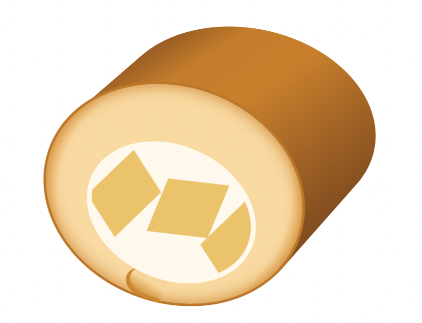
瑞士捲主要分成3個部份,蛋糕體、蛋糕表皮,以及芒果鮮奶油內餡
Html結構如下:
.rollCake
	.crust
	.cake
	.cream
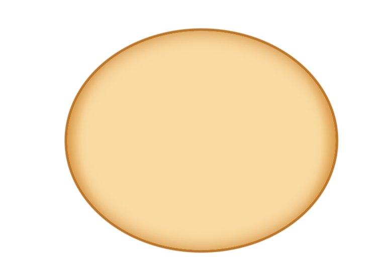
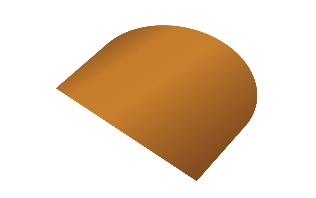
畫一長方形,並給border-radius: 50%,線性漸層上色及box-shadow做外面的蛋糕皮
background: radial-gradient(circle, rgba(255,216,154,1) 69%, rgba(238,150,8,1) 86%)
box-shadow: 0 0 0 0.1rem #c77300, inset 0 0 0.6rem 0 #d57b00
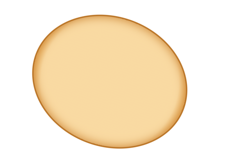
接下來加上傾斜角度,完成品會更自然一些
transform: translate(-50%, -50%) rotate(20deg)
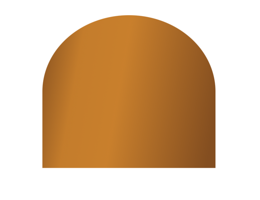
畫一接近正方形的長方形,並給線性漸層,加上border-radius只做上邊2角的弧度
border-radius: 50% 50% 0 0
background: linear-gradient(280deg, rgba(141,75,16,1) 5%, rgba(213,123,0,1) 55%, rgba(208,120,1,1) 78%, rgba(143,77,15,1) 100%)
小提醒 border-radius:50% 50% 0 0(左上 右上 右下 左下)
加入透視及旋轉,這裡的定位需要花點功夫來對齊
transform: perspective(40em) rotateX(40deg) rotate(38deg)
與蛋糕體合併後的樣子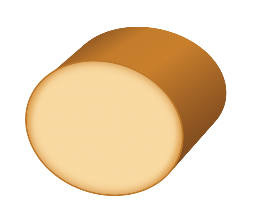
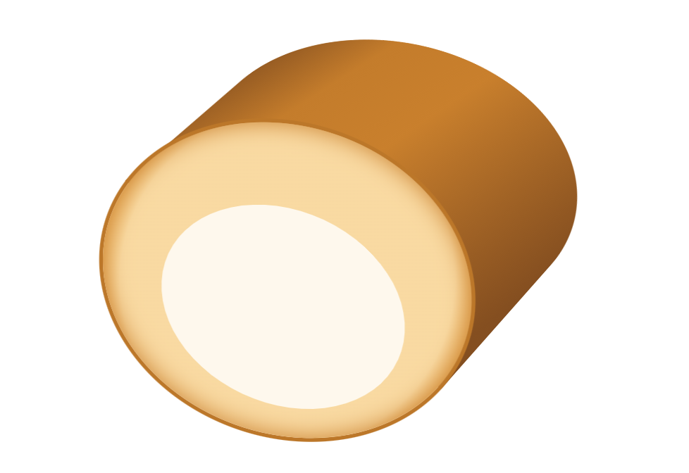
畫一橢圓,並加入旋轉及同色邊線,讓待會的芒果不會太靠近邊緣
transform: rotate(25deg)
border: 0.2rem solid #fff8ec
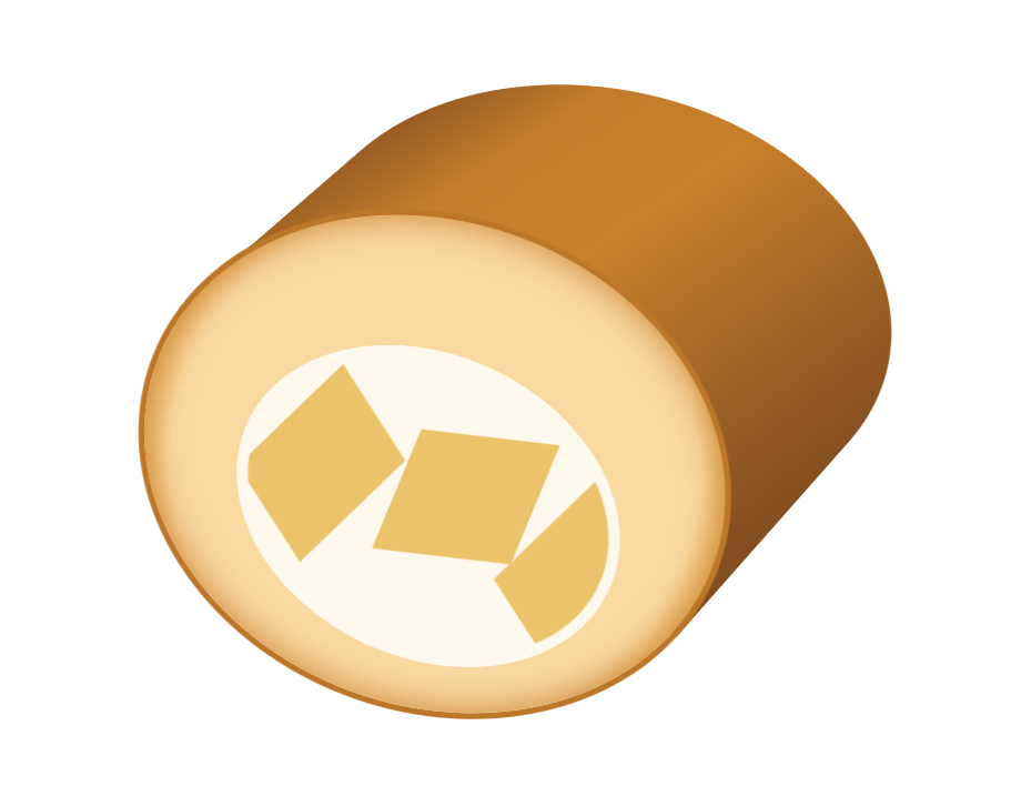
在&::before及&::after畫上芒果
&::before
	content: ''
	position: absolute
	top: 1rem
	left: 0.2rem
	width: 2rem
	height: 2.8rem
	background: #f3c15a
	transform: rotate3d(1, 1, 1, 45deg)
	box-shadow: 4.6rem -3rem 0 0 #f3c15a
&::after
	content: ''
	position: absolute
	top: 0.4rem
	left: 2.4rem
	width: 2.4rem
	height: 3rem
	background: #f3c15a
	transform: rotate3d(0.4, -0.2, 0.1, -50deg)
回到.cake架構,在&::before的地方加上尾段的修飾,看起來更有蛋糕捲的樣子
做一長方形,並同樣的border-radius只做2角的弧度,再利用box-shadow做出邊線
border-radius: 50% 0 0 50%
background: linear-gradient(14deg, rgba(213,133,4,1) 0%, rgba(254,212,146,1) 49%)
box-shadow: -0.1rem 0.1rem 0 0.04rem #d58504

希望今天的芒果瑞士捲您還滿意,請慢用~
如有任何問題,歡迎下方留言討論


 看影片追技術