接下來就是針對介面拉出對應的元件位置,就像七巧板一樣,而 ConstrainLayout 可以幫助我們更容易調整元件的位置,以及更扁平化的方式作出複雜的結構,這篇會簡單的介紹 ConstrainLayout 有哪些功能可以使用,以下如有解釋不清或是描述錯誤的地方還請大家多多指教:
就像開頭說的我們跟著 UI 設計出來的介面依樣畫葫蘆,將元件放在對應的位置上,ConstrainLayout 就像七巧板外框的進階版,讓不同形狀的版子更有彈性的擺放,那我們就來看看幾個功能吧!
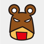
針對畫面調整相對位置,如以下的按鈕要在文字的下面: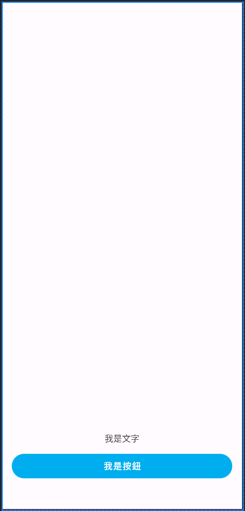
文字對按鈕往上 16dp,各自對邊邊 16dp,按鈕對下 50dp,我們可以寫成這樣:
<androidx.constraintlayout.widget.ConstraintLayout xmlns:android="http://schemas.android.com/apk/res/android"
    xmlns:app="http://schemas.android.com/apk/res-auto"
    android:layout_width="match_parent"
    android:layout_height="match_parent"
    xmlns:tools="http://schemas.android.com/tools">

    <TextView
        android:id="@+id/isText"
        android:layout_width="wrap_content"
        android:layout_height="wrap_content"
        android:layout_marginStart="16dp"
        android:layout_marginEnd="16dp"
        android:layout_marginBottom="16dp"
        app:layout_constraintBottom_toTopOf="@+id/isButton"
        app:layout_constraintEnd_toEndOf="parent"
        app:layout_constraintStart_toStartOf="parent"
        tools:text="我是文字" />

    <com.google.android.material.button.MaterialButton
        android:id="@+id/isButton"
        android:layout_width="0dp"
        android:layout_height="40dp"
        android:layout_marginStart="16dp"
        android:layout_marginEnd="16dp"
        android:layout_marginBottom="50dp"
        app:layout_constraintBottom_toBottomOf="parent"
        app:layout_constraintEnd_toEndOf="parent"
        app:layout_constraintStart_toStartOf="parent"
        tools:text="我是按鈕" />
</androidx.constraintlayout.widget.ConstraintLayout>
layout_constraintBottom_toTopOf 表示說我這個元件的底部要對上 XXid 的頂部,如果是對 constraintLayout 本身則是帶入 parent
layout_marginStart 表示說我這個元件的左邊要與連結的那邊間隔 XXdp,至於這邊也可以寫成 layout_marginLeft ,如果手機 app 是支援 rtl 語系區域,那就必須使用 start,而 right 必須寫成 end
物件可調整與另一個物件比例位置,使用 Bias 調整位置的前提之下是物件兩邊都需要 constraint,像是橫向調整則左右兩邊要有 constriant 的對像;直向則是上下要有對象,如以下文字想在 layout 左邊 20% 的位置: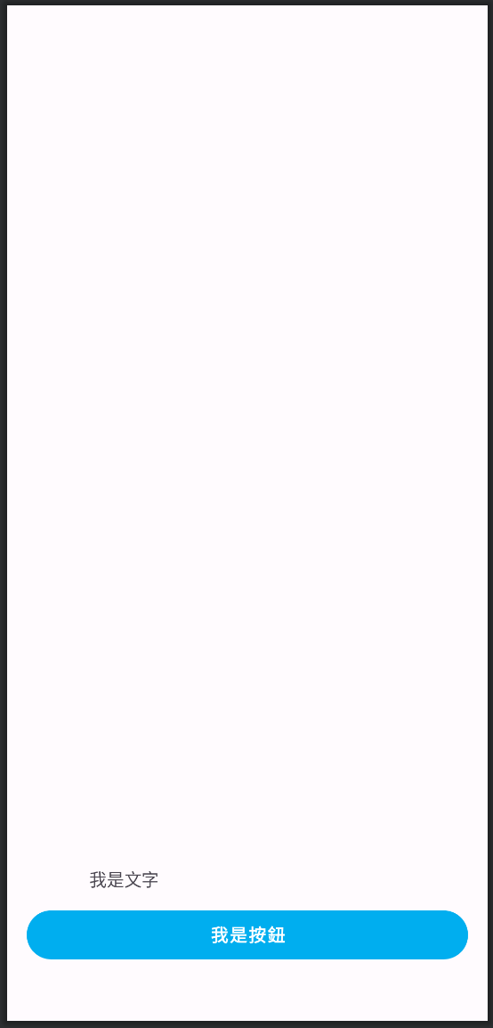
...
	<TextView
        android:id="@+id/isText"
        android:layout_width="wrap_content"
        android:layout_height="wrap_content"
        android:layout_marginBottom="16dp"
        app:layout_constraintBottom_toTopOf="@+id/isButton"
        app:layout_constraintEnd_toEndOf="parent"
        app:layout_constraintHorizontal_bias="0.2"
        app:layout_constraintStart_toStartOf="parent"
        tools:text="我是文字" />
...
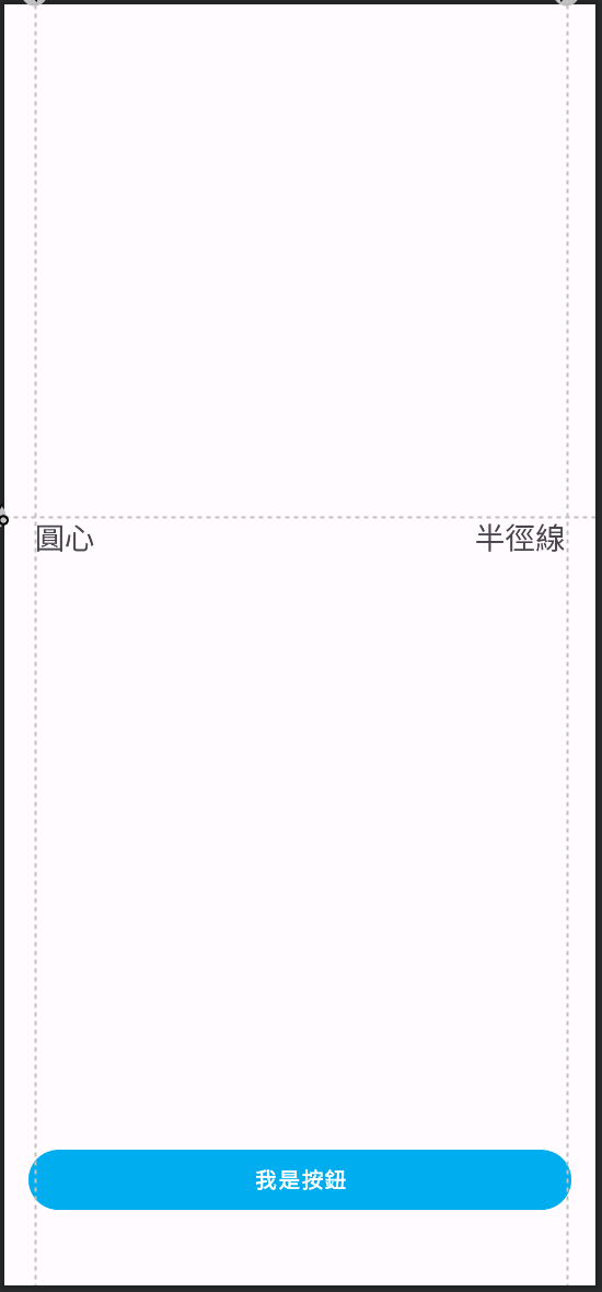
layout_constraintHorizontal_bias 橫向的比例分配,由左到右從 0 到 1layout_constraintVertical_bias 直向的比例,由上往下從 0 到 1以另一物件為中心設置半徑多少的距離,擺放想要的相對角度,如以下文字 半徑線 想在文字 圓心 半徑斜角 30 度的位置:
...
	<TextView
        android:id="@+id/isRadius"
        android:layout_width="wrap_content"
        android:layout_height="wrap_content"
        android:textSize="20sp"
        app:layout_constraintBottom_toTopOf="@+id/isCenter"
        app:layout_constraintCircle="@id/isCenter"
        app:layout_constraintCircleAngle="30"
        app:layout_constraintCircleRadius="100dp"
        app:layout_constraintEnd_toEndOf="parent"
        app:layout_constraintTop_toTopOf="parent"
        tools:text="半徑線" />

    <TextView
        android:id="@+id/isCenter"
        android:layout_width="wrap_content"
        android:layout_height="wrap_content"
        android:textSize="20sp"
        app:layout_constraintBottom_toTopOf="@+id/isButton"
        app:layout_constraintEnd_toEndOf="parent"
        app:layout_constraintStart_toStartOf="parent"
        app:layout_constraintTop_toTopOf="parent"
        tools:text="圓心" />
...
layout_constraintCircle 要以哪個 id 的元件為中心layout_constraintCircleAngle 由上方為基準往幾度的位置layout_constraintCircleRadiu 以圓心那個物件的中心點半徑多少 dp可以針對物件鎖定特定比例的長寬,我比較常使用到的情境是圖片的比例,如以下範例: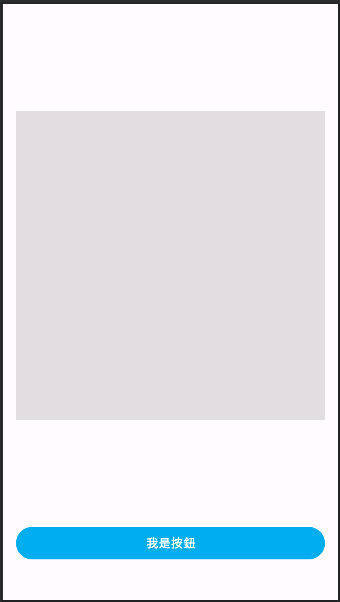
...
	<ImageView
        android:layout_width="0dp"
        android:layout_height="0dp"
        android:layout_marginStart="16dp"
        android:layout_marginEnd="16dp"
        android:background="@color/black_1e"
        app:layout_constraintBottom_toTopOf="@+id/isButton"
        app:layout_constraintDimensionRatio="1:1"
        app:layout_constraintEnd_toEndOf="parent"
        app:layout_constraintStart_toStartOf="parent"
        app:layout_constraintTop_toTopOf="parent" />

    <com.google.android.material.button.MaterialButton
        android:id="@+id/isButton"
        android:layout_width="0dp"
        android:layout_height="40dp"
        android:layout_marginStart="16dp"
        android:layout_marginEnd="16dp"
        android:layout_marginBottom="50dp"
        app:layout_constraintBottom_toBottomOf="parent"
        app:layout_constraintEnd_toEndOf="parent"
        app:layout_constraintStart_toStartOf="parent"
        tools:text="我是按鈕" />
...
layout_constraintDimensionRatio 圖片鎖定在 1:1 的大小,可以隨設計圖給的設定去調app:srcCompat 去設定,因為低版本的手機不支援 vector drawable,而 srcCompat 有上下相容可以設定物件是否顯示,在某些情境下元件不想一開始就是可見的狀態,這時候就可以透過需求來設定 Gone 或是 Invisible。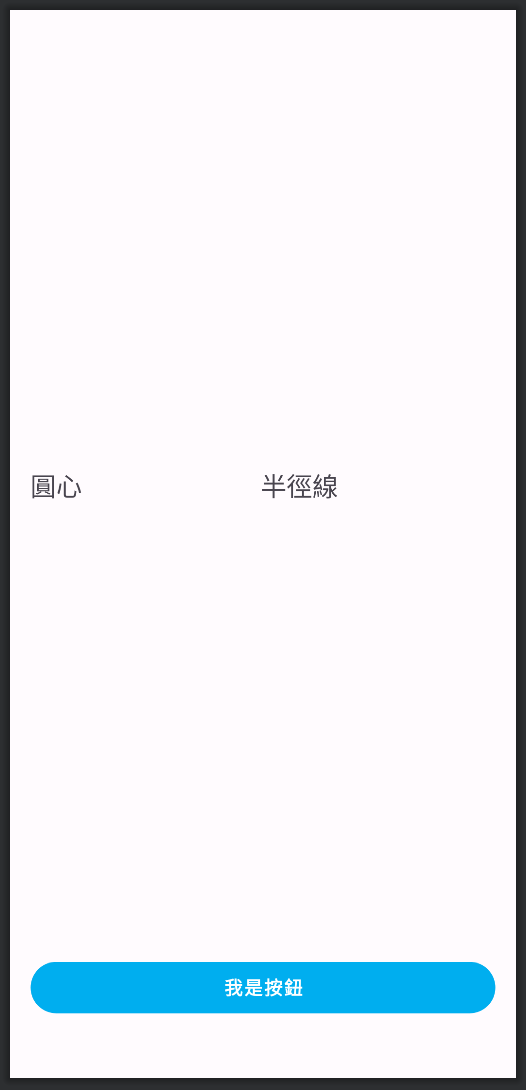
會是整個物件消失,包含物件所佔的面積,所以有跟他有連接的對象就會往前推,如以下的狀況:
...
	<TextView
        android:id="@+id/isRadius"
        android:layout_width="wrap_content"
        android:layout_height="wrap_content"
        android:textSize="20sp"
        app:layout_constraintBottom_toBottomOf="@+id/isCenter"
        app:layout_constraintEnd_toEndOf="parent"
        app:layout_constraintStart_toEndOf="@+id/isCenter"
        app:layout_constraintTop_toTopOf="@+id/isCenter"
        tools:text="半徑線" />

    <TextView
        android:id="@+id/isCenter"
        android:layout_width="wrap_content"
        android:layout_height="wrap_content"
        android:textSize="20sp"
		android:visibility="gone"
        android:layout_marginStart="16dp"
        app:layout_constraintBottom_toTopOf="@+id/isButton"
        app:layout_constraintStart_toStartOf="parent"
        app:layout_constraintTop_toTopOf="parent"
        tools:text="圓心" />
...
半徑線文字因為沒有特別設定又加上他的寬度是按照文字長度,所以預設位置會是中間,在與圓心文字沒有設定 margin 的情況下,將圓心設成 Gone 會變成以下樣子,整個字包含設定的 margin 16dp 都會不見。
有時候我們會想要在某些物件顯示的時候 margin 跟物件隱藏時的 margin 不同,這時候可以在
半徑線這個文字上加layout_goneMarginStart="xxdp",就可以在start位置的物件 gone 的時候 margin xxdp
物件會隱形但所佔面積不變,所以原本的位置並不會因此改變。
...
	<TextView
        android:id="@+id/isRadius"
        android:layout_width="wrap_content"
        android:layout_height="wrap_content"
        android:textSize="20sp"
        app:layout_constraintBottom_toBottomOf="@+id/isCenter"
        app:layout_constraintEnd_toEndOf="parent"
        app:layout_constraintStart_toEndOf="@+id/isCenter"
        app:layout_constraintTop_toTopOf="@+id/isCenter"
        tools:text="半徑線" />

    <TextView
        android:id="@+id/isCenter"
        android:layout_width="wrap_content"
        android:layout_height="wrap_content"
        android:layout_marginStart="16dp"
        android:textSize="20sp"
        android:visibility="invisible"
        app:layout_constraintBottom_toTopOf="@+id/isButton"
        app:layout_constraintStart_toStartOf="parent"
        app:layout_constraintTop_toTopOf="parent"
        tools:text="圓心" />
...
圓心的字在設成 invisible 之後位置依然跟有顯示時一樣,半徑線也不會改變它原有的位置。
如果想在 preview 的時候看到完整顯示的狀態可以加上
tools: visibility ="visible"
以下介紹幾個我有使用過的 helper,用來處理一些特殊情況。
當你需要所有物件都向左偏移一樣的距離,又不想要每增加一個物件就要再寫一次,或是這次設計改了新的距離,所有物件都要改,但建議是有比較多重複性物件在使用,或是真的有需求性的設計,不然只要改動 guideline 依附在下面的物件也會更動。
Guideline 不是一個 view,所以我們只能在 preview 時看到,依樣有分成縱向跟橫向,有三種設定距離的方式:
layout_constraintGuide_begin
layout_constraintGuide_end
layout_constraintGuide_percent
...
	<androidx.constraintlayout.widget.Guideline
        android:id="@+id/startGuideline"
        android:layout_width="wrap_content"
        android:layout_height="wrap_content"
        android:orientation="vertical"
        app:layout_constraintGuide_begin="20dp" />

    <androidx.constraintlayout.widget.Guideline
        android:id="@+id/endGuideline"
        android:layout_width="wrap_content"
        android:layout_height="wrap_content"
        android:orientation="vertical"
        app:layout_constraintGuide_end="20dp" />

    <androidx.constraintlayout.widget.Guideline
        android:id="@+id/horizontalGuideline"
        android:layout_width="wrap_content"
        android:layout_height="wrap_content"
        android:orientation="horizontal"
        app:layout_constraintGuide_percent="0.4" />

    <TextView
        android:id="@+id/isRadius"
        android:layout_width="wrap_content"
        android:layout_height="wrap_content"
        android:textSize="20sp"
        app:layout_constraintEnd_toEndOf="@id/endGuideline"
        app:layout_constraintTop_toTopOf="@+id/horizontalGuideline"
        tools:text="半徑線" />

    <TextView
        android:id="@+id/isCenter"
        android:layout_width="wrap_content"
        android:layout_height="wrap_content"
        android:textSize="20sp"
        app:layout_constraintStart_toStartOf="@id/startGuideline"
        app:layout_constraintTop_toTopOf="@id/horizontalGuideline"
        tools:text="圓心" />
...
半徑線要以 endGuideline 為基準,所以要 end(right) constraint endGuideline;圓心 要以 startGuideline 為基準,所以 start(left) constraint startGuideline,percent 由上往下從 0 到 1。
就像一個屏障一樣,物件會和對邊最長物件保持相同距離,這是什麼意思呢?來看範例吧:
今天設計出了一個任務卡的圖,未完成之前顯示分數的 TextView,跟完成後會顯示完成的圖,任務描述顯示的寬度間 5dp。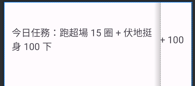
與顯示分數的文字保持 5dp
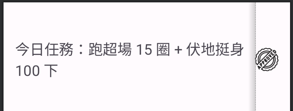
與完成的徽章也保持 5dp
因為文字和圖的寬度不一樣,狀態不一樣的情況下,其中一個物件會消失,所以文字的右邊不能 constriant 在任一個物件,不然會變成以下狀況: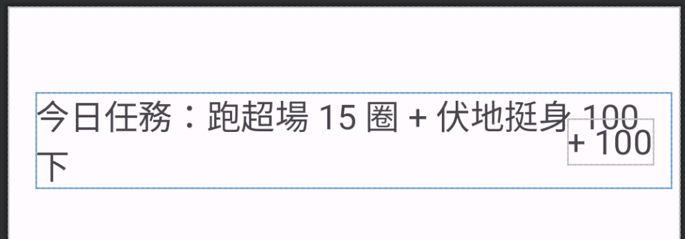
constraint 的那方消失 margin 也不一樣
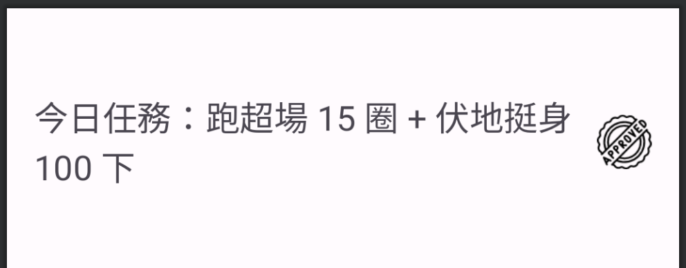
只有 constraint 的那個物件顯示時會正常
...
	<androidx.constraintlayout.widget.Barrier
        android:id="@+id/barrier"
        android:layout_width="wrap_content"
        android:layout_height="wrap_content"
        app:constraint_referenced_ids="missionCollect, missionScore"
        app:barrierDirection="left" />

    <TextView
        android:id="@+id/missionTitle"
        android:layout_width="0dp"
        android:layout_height="wrap_content"
        android:layout_marginTop="50dp"
        android:layout_marginStart="16dp"
        android:layout_marginEnd="5dp"
        android:textSize="20sp"
        app:layout_constraintTop_toTopOf="parent"
        app:layout_constraintStart_toStartOf="parent"
        app:layout_constraintEnd_toEndOf="@+id/barrier"
        tools:text="今日任務:跑超場 15 圈 + 伏地挺身 100 下" />

    <ImageView
        android:id="@+id/missionCollect"
        android:layout_width="wrap_content"
        android:layout_height="wrap_content"
        android:layout_marginEnd="16dp"
        app:layout_constraintBottom_toBottomOf="@+id/missionTitle"
        app:layout_constraintEnd_toEndOf="parent"
        app:layout_constraintTop_toTopOf="@+id/missionTitle"
        app:srcCompat="@drawable/stamp" />

    <TextView
        android:id="@+id/missionScore"
        android:layout_width="wrap_content"
        android:layout_height="wrap_content"
        android:layout_marginEnd="16dp"
        android:textSize="20sp"
        android:visibility="gone"
        app:layout_constraintBottom_toBottomOf="@+id/missionTitle"
        app:layout_constraintEnd_toEndOf="parent"
        app:layout_constraintTop_toTopOf="@+id/missionTitle"
        tools:text="+ 100" />
...
跟 Guideline 一樣 Barrier 不是一個 view,所以只有在 preview 可以看到,維持的那邊要 constraint Barrier,顯示會改變的那方要加在 constraint_referenced_ids 參數中。
當你有很多元件需要在某個情境下將 visibility 設成 Gone 或 Invisible,難道要一個一個元件寫嗎 ! 這時候我們就可以使用 Group,這樣只需要針對 Group 設定就行了,來看看以下範例:
...
    <TextView
        android:id="@+id/isRadius"
        android:layout_width="wrap_content"
        android:layout_height="wrap_content"
        android:textSize="20sp"
        app:layout_constraintBottom_toBottomOf="@+id/isCenter"
        app:layout_constraintEnd_toEndOf="parent"
        app:layout_constraintStart_toEndOf="@+id/isCenter"
        app:layout_constraintTop_toTopOf="@+id/isCenter"
        tools:text="半徑線" />

    <TextView
        android:id="@+id/isCenter"
        android:layout_width="wrap_content"
        android:layout_height="wrap_content"
        android:layout_marginStart="16dp"
        android:textSize="20sp"
        app:layout_constraintBottom_toTopOf="@+id/isButton"
        app:layout_constraintStart_toStartOf="parent"
        app:layout_constraintTop_toTopOf="parent"
        tools:text="圓心" />

    <androidx.constraintlayout.widget.Group
        android:id="@+id/group"
        android:layout_width="wrap_content"
        android:layout_height="wrap_content"
        app:constraint_referenced_ids="isCenter,isRadius" />
...
只要在 constraint_referenced_ids 寫上要一起群組的原件 id 就可以針對 Group 操作了,像是以下範例:
// binding 的部分後續篇章會介紹到
binding.group.isVisible = number == 2
接下來就要針對設計好的介面去排畫面,在上一篇建立 Fragment 時就有一起將 layout 的 XML 檔一起建立了,依序將畫面的元件排好,以主頁為範例: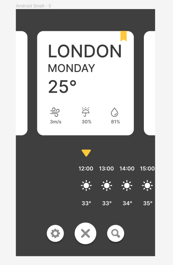
dependencies {
    ...
    implementation 'androidx.constraintlayout:constraintlayout:2.1.4'
    ...
}
<androidx.constraintlayout.widget.ConstraintLayout
        xmlns:android="http://schemas.android.com/apk/res/android"
        xmlns:app="http://schemas.android.com/apk/res-auto"
        xmlns:tools="http://schemas.android.com/tools"
        android:layout_width="match_parent"
        android:layout_height="match_parent"
        android:background="@color/dark_gray"
        tools:context=".HomeFragment">

    <androidx.recyclerview.widget.RecyclerView
            android:id="@+id/cityList"
            android:layout_width="match_parent"
            android:layout_height="0dp"
            app:layout_constraintTop_toTopOf="parent"
            app:layout_constraintStart_toStartOf="parent"
            app:layout_constraintEnd_toEndOf="parent"
            app:layout_constraintBottom_toTopOf="@+id/arrowSign" />

    <androidx.recyclerview.widget.RecyclerView
            android:id="@+id/cityTemList"
            android:layout_width="match_parent"
            android:layout_height="0dp"
            android:layout_marginBottom="24dp"
            app:layout_constraintStart_toStartOf="parent"
            app:layout_constraintEnd_toEndOf="parent"
            app:layout_constraintBottom_toTopOf="@+id/addButton" />

    <ImageView
            android:id="@+id/arrowSign"
            android:layout_width="24dp"
            android:layout_height="24dp"
            android:layout_marginBottom="20dp"
            android:src="@drawable/play"
            android:rotation="90"
            app:layout_constraintEnd_toEndOf="parent"
            app:layout_constraintStart_toStartOf="parent"
            app:layout_constraintBottom_toTopOf="@+id/cityTemList" />

    <com.google.android.material.floatingactionbutton.FloatingActionButton
            android:id="@+id/addButton"
            android:layout_width="wrap_content"
            android:layout_height="wrap_content"
            android:layout_marginBottom="36dp"
            android:text="@string/app_name"
            app:backgroundTint="@color/white"
            app:fabSize="normal"
            app:srcCompat="@drawable/plus"
            app:tint="@null"
            app:layout_constraintStart_toStartOf="parent"
            app:layout_constraintEnd_toEndOf="parent"
            app:layout_constraintBottom_toBottomOf="parent" />

    <com.google.android.material.floatingactionbutton.FloatingActionButton
            android:id="@+id/settingButton"
            android:layout_width="wrap_content"
            android:layout_height="wrap_content"
            android:layout_marginEnd="28dp"
            android:text="@string/app_name"
            app:backgroundTint="@color/white"
            app:fabSize="mini"
            app:srcCompat="@drawable/settings"
            app:tint="@null"
            app:layout_constraintBottom_toBottomOf="@+id/addButton"
            app:layout_constraintEnd_toStartOf="@+id/addButton"
            app:layout_constraintTop_toTopOf="@+id/addButton" />

    <com.google.android.material.floatingactionbutton.FloatingActionButton
            android:id="@+id/searchButton"
            android:layout_width="wrap_content"
            android:layout_height="wrap_content"
            android:layout_marginStart="28dp"
            android:text="@string/app_name"
            app:backgroundTint="@color/white"
            app:fabSize="mini"
            app:srcCompat="@drawable/magnifying_glass"
            app:tint="@null"
            app:layout_constraintBottom_toBottomOf="@+id/addButton"
            app:layout_constraintStart_toEndOf="@+id/addButton"
            app:layout_constraintTop_toTopOf="@+id/addButton" />
</androidx.constraintlayout.widget.ConstraintLayout>

 iThome鐵人賽
 看影片追技術