在進入實作之前,官方有提到一些建議:如果 FAB 放在 CoordinatorLayout 佈局中,可以免費獲得某些行為設置。它會自動移動,以便任何顯示的 Snackbars 都不會覆蓋它,並且在被 AppBarLayout 或 BottomSheetBehavior 覆蓋時會自動隱藏。如果有上述情況的話,建議先將佈局改變,在下面實作上我就不會特別去應用了
FAB 有 hide()、show() 方法,會透過動畫呈現 FAB的出現與消失,show () 動畫使元件增長並將其淡入,hide() 動畫則縮小元件並將其淡出。所以在設計畫面與 FAB 互動時,只要直接使用這兩個方法即可
// To show:
fab.show()
// To hide:
fab.hide()
使用 extend、shrink 方法,可在 extended FAB 上,收縮 Text Label。讓 extended FAB 變為 Regular FAB。設計上,如果只設置 text label 而沒有 icon,此功能不會觸發
// To extend:
extendedFab.extend()
// To shrink:
extendedFab.shrink()
以上這些都可以透過
app:fabSize來快速設定
<com.google.android.material.floatingactionbutton.FloatingActionButton
        ...
        app:fabSize="normal"
        ...
 />
app:fabCustomSize來客製化 size ,而已經設置app:fabSize,將會被覆蓋掉。如果客製化的 size 被 clearCustomSize清除掉,復原回 setSize() 或是app:fabSize 設置的大小實作上就分為這三個種類

預設上就是 Regular
<com.google.android.material.floatingactionbutton.FloatingActionButton
        android:id="@+id/regular_fab"
        android:layout_width="wrap_content"
        android:layout_height="wrap_content"
        android:layout_margin="10dp"
        app:layout_constraintBottom_toBottomOf="parent"
        app:layout_constraintEnd_toEndOf="parent"
        app:srcCompat="@drawable/ic_baseline_add_24"
        />
只要透過 app:fabSize 就能更改 size
<com.google.android.material.floatingactionbutton.FloatingActionButton
      ...
      app:fabSize="mini"/>
設置與組成上都與 Regular 相同,所以下方屬性也一並講解
若想透過 app:backgroundTint 改變 FAB button 的顏色時,要注意,改變過程中會發現,沒有填滿整個 FAB ,這是因為有 Stroke 的存在,如果不想要的話可以透過 app:borderWidth 設為 0dp


Extended FABs 是 MaterialButton 的子類,與 Regular 不同,所以在一些屬性的設置上,有所不同。例如,設置 icon 在 Regular 是用 app:srcCompat 而在 Extended 是用 app:icon,其他屬性在下面會陸續介紹到
<com.google.android.material.floatingactionbutton.ExtendedFloatingActionButton
    android:id="@+id/extended_fab"
    android:layout_width="wrap_content"
    android:layout_height="wrap_content"
    android:layout_margin="16dp"
    android:text="@string/extended_fab_label"
    app:icon="@drawable/ic_plus_24px"/>
與 Regular 相比,多了 Stroke 可以設置
app:strokeWidth
app:strokeColor

icon 方面還能自行設置大小與間距


這部分在實作方面官方並沒有提到,所以我自己做了一個希望能幫到大家,整體的實作是參考這個網址,我會分成幾個部分陸續帶大家完成
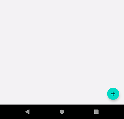
就先從元件設置開始,方位的話大都是放在右下方,而每個子 FAB 要相連再一起,最後與主 FAB 串連起來。然後把所有子 FAB 都先隱藏起來,在點擊主 FAB 後才彈出顯示
  <!-- Expandable FABs  -->
    <com.google.android.material.floatingactionbutton.FloatingActionButton
        android:id="@+id/expandable_fab"
        android:layout_width="wrap_content"
        android:layout_height="wrap_content"
        android:layout_marginEnd="24dp"
        android:layout_marginBottom="224dp"
        app:layout_constraintBottom_toBottomOf="parent"
        app:layout_constraintEnd_toEndOf="parent"
        app:srcCompat="@drawable/ic_baseline_add_24" />

    <com.google.android.material.floatingactionbutton.FloatingActionButton
        android:id="@+id/share_expand_fab"
        android:layout_width="wrap_content"
        android:layout_height="wrap_content"
        android:layout_marginBottom="16dp"
        android:visibility="gone"
        app:layout_constraintBottom_toTopOf="@+id/expandable_fab"
        app:layout_constraintEnd_toEndOf="@+id/expandable_fab"
        app:srcCompat="@drawable/ic_baseline_share_24" />

    <com.google.android.material.floatingactionbutton.FloatingActionButton
        android:id="@+id/search_expand_fab"
        android:layout_width="wrap_content"
        android:layout_height="wrap_content"
        android:layout_marginBottom="16dp"
        android:visibility="invisible"
        app:layout_constraintBottom_toTopOf="@+id/share_expand_fab"
        app:layout_constraintEnd_toEndOf="@+id/share_expand_fab"
        app:srcCompat="@drawable/ic_baseline_search_24" />
再來就是動畫,如果對設計動畫不熟的朋友,可以先看一下文檔。我們會需要四個動畫檔,分別是:主FAB的轉入與轉出、子FAB的跳出與收回
由於我們想要主FAB 有旋轉傾斜的效果,將 Degrees 從 0 到 45
<set xmlns:android="http://schemas.android.com/apk/res/android"
    android:fillAfter="true">
<!-- 讓元件旋轉的動畫效果 -->
    <rotate
        android:fromDegrees="0"
        android:pivotX="50%"
        android:pivotY="50%"
        android:toDegrees="45"
        android:duration="300"/>
</set>
那關閉就是 open 的相反,將 Degrees 從 45 到 0 旋轉回來
<set xmlns:android="http://schemas.android.com/apk/res/android"
    android:fillAfter="true">
    <rotate
        android:fromDegrees="45"
        android:pivotX="50%"
        android:pivotY="50%"
        android:toDegrees="0"
        android:duration="300"/>

</set>
要讓子FAB 彈出,由於在 layout 預設狀態下,子 FAB 是位在主 FAB 上方的,為了在動畫上看起來是從底部彈出,所以在 設置 fromYDelta、toYDelta,讓元件 from 它本身相對位置的下方,to 回到原本的位置,再透過 縮小 子FAB 讓用戶能迅速辨識
<set xmlns:android="http://schemas.android.com/apk/res/android"
    android:fillAfter="true">
<!-- 移動動畫效果 -->
    <translate
        android:duration="500"
        android:fromYDelta="300%"
        android:toYDelta="0%" />
<!-- 縮放的動畫效果 -->
    <scale
        android:pivotY="50%"
        android:pivotX="50%"
        android:toXScale="0.9"
        android:toYScale="0.9"/>
<!-- 透明度變化的動畫效果(淡入淡出) -->
    <alpha
        android:fromAlpha="0"
        android:toAlpha="1"
        android:duration="800"/>

</set>
與 from 做出相反的設置,將子 FAB 收起,而這邊在 淡出的速度要快一點,否則會讓用戶看到 translate 回到主 FAB 下方的樣子,避免讓用戶誤會
<set xmlns:android="http://schemas.android.com/apk/res/android"

    android:fillAfter="true">
    <translate
        android:duration="300"
        android:fromYDelta="0%"
        android:toYDelta="300%" />

    <scale
        android:pivotY="50%"
        android:pivotX="50%"
        android:fromYScale="0.9"
        android:fromXScale="0.9"
        android:toXScale="0.9"
        android:toYScale="0.9"/>

    <alpha
        android:fromAlpha="1"
        android:toAlpha="0"
        android:duration="300"/>

</set>
那上方的 layout 與 animation 都設置完後,就開始實際運用了。首先先盡力三個方法,分別為 setAnimation、setVisibility、setButtonClickable,然後透過一個作為 FAB 開關依據的布林值,來控制動畫執行的過程
在設置這些方法之前,我們先將動畫資源檔初始化
private val fromBottom :Animation by lazy { AnimationUtils.loadAnimation(requireContext(), R.anim.from_bottom_animation) }
private val toBottom :Animation by lazy { AnimationUtils.loadAnimation(requireContext(), R.anim.to_bottom_animation) }
private val rotateClose :Animation by lazy { AnimationUtils.loadAnimation(requireContext(), R.anim.rotate_close_animation) }
private val rotateOpen :Animation by lazy { AnimationUtils.loadAnimation(requireContext(), R.anim.rotate_open_animation) }
private fun setAnimation(isExpanded: Boolean) {
        if (isExpanded){
            binding.searchExpandFab.startAnimation(fromBottom)
            binding.shareExpandFab.startAnimation(fromBottom)
            binding.expandableFab.startAnimation(rotateOpen)
        }else{
            binding.searchExpandFab.startAnimation(toBottom)
            binding.shareExpandFab.startAnimation(toBottom)
            binding.expandableFab.startAnimation(rotateClose)
        }
    }
private fun setVisibility(isExpanded: Boolean) {
        if (isExpanded){
            binding.searchExpandFab.visibility = VISIBLE
            binding.shareExpandFab.visibility = VISIBLE
        }else{
            binding.searchExpandFab.visibility = INVISIBLE
            binding.shareExpandFab.visibility = INVISIBLE
        }
    }
private fun setButtonClickable(isExpanded: Boolean) {
        if (isExpanded){
            binding.searchExpandFab.isClickable= true
            binding.shareExpandFab.isClickable = true
        }else{
            binding.searchExpandFab.isClickable = false
            binding.shareExpandFab.isClickable = false
        }
    }
都設置完後,到主 FAB 去設置點擊邏輯就大功告成了。透過 isFabExpanded 布林值的變化,去啟動各種功能。當然這邊可以在包得更好,例如包成類似 hide or show 等方式,在可讀性在會更好,但礙於時間關係,小弟弟我呢就留給大家發揮了
private var isFabExpanded = false

binding.expandableFab.setOnClickListener {
            isFabExpanded = !isFabExpanded
            setVisibility(isFabExpanded)
            setAnimation(isFabExpanded)
            setButtonClickable(isFabExpanded)
        }
風格檔上,依據在使用 exapnded FABs 時,是否有添加 icon,若有記得去改成適用 Icon 的 style,讓 Material Design 幫助我們設置適當的 icon padding

又來到愉快的自定義 style 環節 (自虐環節),這邊一樣給大家看我魔改的成品
FAB 的顏色都是隨著主題的相對色,也就是 colorSecondary、colorOnSecondary,就會是我下手的目標
<style name="Widget.App.ExtendedFloatingActionButton"parent="Widget.MaterialComponents.ExtendedFloatingActionButton.Icon">
    <item name="materialThemeOverlay">@style/ThemeOverlay.App.FloatingActionButton</item>
    <item name="shapeAppearanceOverlay">@style/ShapeAppearance.App.SmallComponent</item>
</style>

<style name="Widget.App.FloatingActionButton" parent="Widget.MaterialComponents.FloatingActionButton">
    <item name="materialThemeOverlay">@style/ThemeOverlay.App.FloatingActionButton</item>
    <item name="shapeAppearanceOverlay">@style/ShapeAppearance.App.SmallComponent</item>
</style>

<style name="ThemeOverlay.App.FloatingActionButton" parent="">
    <item name="colorSecondary">@color/lightGrey</item>
    <item name="colorOnSecondary">@color/white</item>
</style>

<style name="ShapeAppearance.App.SmallComponent" parent="ShapeAppearance.MaterialComponents.SmallComponent">
    <item name="cornerFamily">cut</item>
    <item name="cornerSize">4dp</item>
</style>

FAB 設置上 Material Design 都幫我們設計好了,細節部分也支援很多屬性可以調整,不一定要用 style 才能改動。重點反而是在於動畫呈現那一個部分,因為這是與一般 Button 最大的差別之處,甚至要去做出在一些符合使用者情境設計的功能,例如我們剛剛實作的 Speed dial,還有配合畫面跳轉做的 transitions 動畫。如何才能實作出配合當前畫面上下文的設計實作,才是 FABs 真正困難也最有價值的地方
若對實作還是有點不懂的,這邊提供我的 Github 方便大家參考


 看影片追技術