先就簡單地做一下基本的架構,需要BottomNavigationView 跟 menu
我們可以透過 menu 來設定想要的 BottomNavigation item 。例如 item 的 text label、icon、color
而要注意的是,如果 menu item 超過五個的話就會失效
<androidx.constraintlayout.widget.ConstraintLayout xmlns:android="http://schemas.android.com/apk/res/android"
    xmlns:app="http://schemas.android.com/apk/res-auto"
    android:layout_width="match_parent"
    android:layout_height="match_parent">

    <com.google.android.material.bottomnavigation.BottomNavigationView
        android:id="@+id/bottom_navigation"
        android:layout_width="match_parent"
        android:layout_height="wrap_content"
        app:layout_constraintBottom_toBottomOf="parent"
        app:menu="@menu/bottom_navigation_menu" />

</androidx.constraintlayout.widget.ConstraintLayout>
<menu xmlns:android="http://schemas.android.com/apk/res/android"
    xmlns:app="http://schemas.android.com/apk/res-auto">
    <item
        android:id="@+id/home_item"
        android:icon="@drawable/ic_baseline_home_24"
        android:title="Home"/>
    <item
        android:id="@+id/search_item"
        android:icon="@drawable/ic_baseline_search_24"
        android:title="Search"/>
    <item
        android:id="@+id/setting_item"
        android:icon="@drawable/ic_baseline_settings_24"
        android:title="Setting"/>
</menu>

呼叫 setOnItemSelectedListener 當中可以拿到 menuItem ,就可以用來設定跳轉的邏輯
binding.bottomNavigation.setOnItemSelectedListener { menuItem->
            when(item.itemId){
                R.id.home_item->{
                    // navigate to home
                    true
                }
                R.id.search_item->{
                    // navigate to search
                    true
                }
                R.id.setting_item->{
                    // navigate to setting
                    true
                }
                else -> false
            }
        }
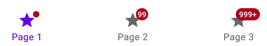
如果場景需要 badge,可以透過 getOnCreateBadge 來生成設定
拿到 badge 之後,就可呼叫屬性 number 去設定提醒的數量
val homeBadge = binding.bottomNavigation.getOrCreateBadge(R.id.home_item)
homeBadge.number = 99
val searchBadge = binding.bottomNavigation.getOrCreateBadge(R.id.search_item)
searchBadge.number = 88
val settingBadge = binding.bottomNavigation.getOrCreateBadge(R.id.setting_item)
settingBadge.number = 77

如果情境上需要暫時隱藏 badge ( 例如,直到收到下一個通知 ),可動態控制 badge 的可見性
val homeBadgeDrawable = binding.bottomNavigation.getBadge(R.id.home_item)
        if (homeBadgeDrawable != null) {
            homeBadgeDrawable.isVisible = false
            homeBadgeDrawable.clearNumber()
        }

如果不再需要 badge 出現,可直接移除,使用 removeBadge(menuItemId)
bottomNavigation.removeBadge(menuItemId)
Navigation items:


app:labelVisibilityMode="labeled" 是用來設置 navigation item 的 text label 顯示模式,該屬性對應的值有
1. auto (Default) : 當 item 小於或等於三個時顯示文字,item 大於三個則默認不顯示,選取才會顯示
2. labeled : 始终顯示
3. selected : 選取時顯示
4. unlabeled : 完全不顯示文字,即便選取或不選取


由於 bottom navigation 有依照各種元件給予對應的屬性能調整,在自定義 style 上,簡單改變一下顏色
<style name="Widget.App.BottomNavigationView" parent="Widget.MaterialComponents.BottomNavigationView.Colored">
        <item name="materialThemeOverlay">@style/ThemeOverlay.App.BottomNavigationView</item>
</style>

<style name="ThemeOverlay.App.BottomNavigationView" parent="">
        <item name="colorPrimary">@android:color/holo_blue_dark</item>
        <item name="colorOnPrimary">@color/white</item>
</style>

Bottom Navigation 雖然看起來蠻複雜的,有許多元件與互動邏輯,但這些 Material Design 都幫我們包好了,只要在 BottomNavigationView 元件中注入 menu,再透過許多對應元件的屬性做細部的調整,就能做出我們想要的外觀設計
但在實現 Navigation 導航功能上,是要我們自己實作,官方文檔寫得很清楚,有興趣的可以看看。還有在我 Demo 元件範例的 Project 也是透過 Navigation 來實現畫面跳轉,相關內容也能在我的 Github 上面看到


 看影片追技術