接續昨天
https://www.youtube.com/watch?v=V_G1WzPjb4o&list=PL5e68lK9hEzd-ZM4Km6xUia-mxQp52G6U&index=27
HTML
<!DOCTYPE html>
<html lang="en">
<head>
	<meta charset="utf-8">
	<title>測試</title>
	<link href="C1.css" rel="stylesheet">
</head>
<body>
	<div class="container">
		<div class="card">
			<div class="percent" style="--clr:#18FFF2; --num:85">
				<div class="dot" style="color: #FFFFFF;">XXX</div>
				<svg>
					<circle cx="70" cy="70" r="70"></circle>
					<circle cx="70" cy="70" r="70"></circle>
				</svg>
				<div class="np">
					<h2>85 <span>%</span></h2>
					<p>進度1</p>
				</div>
			</div>
		</div>
	</div>

</body>
</html>
CSS
@import url('https://fonts.googleapis.com/css?family=Roboto:300,400,500,700,900&display=swap');

*{
	margin: 0;
	padding: 0;
	box-sizing: border-box;
}

body{
	display: flex;
	justify-content: center;
	align-items: center;
	min-height: 100vh;
	background: #171819;
}

.container{
	position: relative;
	display: flex;
	justify-content: center;
	align-items: center;
	flex-wrap: wrap;
	gap: 40px;
}

.container .card{
	position: relative;
	width: 220px;
	height: 250px;
	background: #252627;
	display: flex;
	justify-content: center;
	align-items: center;
}

.container .card .percent{
	position: relative;
	width: 150px;
	height: 150px;
}
.container .card .percent svg{
	position: relative;
	width: 150px;
	height: 150px;
	transform: rotate(270deg);/*圓形進度條的缺口角度*/
	/*background: #54D5F3;  /*測試用的底色*/
}

.container .card .percent svg circle{
	width: 100%;
	height: 100%;
	fill: transparent;
	stroke-width: 2;
	stroke: #1D1D1F;
	transform: translate(5px, 5px);
}

.container .card .percent svg circle:nth-child(2){  /*circle標籤 有2個,所以填2的樣子*/
	stroke: var(--clr);
	stroke-dasharray: 440;
	stroke-dashoffset: calc(440 - (440* var(--num)) /100); /*讓"亮色圈圈" 只出現一些部分*/
	opacity: 0;
	animation: FN 1s linear forwards;
	animation-delay: 2s;
}

@Keyframes FN{
	0%{
		opacity: 0;
	}
	100%{
		opacity: 1;
	}
}

.dot{
	position: absolute;
	inset: 5px;
	z-index: 10;
	transform: rotate(calc(3.6deg * var(--num))); /*360度/100等分 = 3.6  (進度條沒有小數點)*/
	animation: Adot 2s linear forwards;
}

@Keyframes Adot{
	0%{
		transform: rotate(0deg);
	}
	100%{
		transform: rotate(calc(3.6deg *var(--num)));
	}
}

.dot::before{
	content: '';
	position: absolute;
	top: -5px;
	left: 50%;
	transform: translateX(-50%);
	width: 10px;
	height: 10px;
	border-radius: 50%;
	background: var(--clr);

	box-shadow: 0 0 10px var(--clr),
				0 0 30px var(--clr);
}

.np{
	position: absolute;
	inset: 0;
	display: flex;
	justify-content: center;
	align-items: center;
	flex-direction: column;
	opacity: 0;
	animation: FN 1s linear forwards;
	animation-delay: 2s;
}

.np h2{
	display: flex;
	justify-content: center;
	align-items: center;
	color: #FFFFFF;
	font-weight: 700;
	font-size: 2.5em;
}
.np h2 span{
	font-weight: 300;
	font-size: 0.5em;
	color: #FFFFFF;
}

.np p{
	font-weight: 300;
	font-size: 0.75em;
	letter-spacing: 2px;
	margin-top: 10px;
	text-transform: uppercase;
	color: #A0A0A0;
}
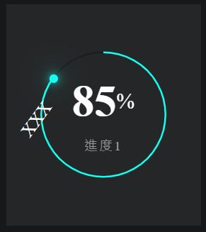
成果 (動畫中途+結束)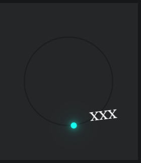
今天先這樣,明天找別的


 看影片追技術