最經典的 Input 系列元件還是不免俗地要復刻看看啦 ?
今天以「透過原生 HTMLInputElement 來還原 MUI input 系列元件的外觀」為主,行為比較複雜的元件(如 MUI Autocomplete)要靠原生 HTMLElement 來重現實在還是有些麻煩。第三方 component lib 是真的可以節省時間~~,鐵人賽第 25 天,終於屈打成招~~。
全部的樣式都靠原生選取器解決,唯獨調整 autofill 的外觀比較不直覺(今天的內容沒有實作到,但處理方式可參考個人過去的筆記:如何設定 input autofill 樣式)。
而 props.error 與 props.helperText 搭配則是實現「當使用者輸入的內容不符合預期時,顯示提示訊息」。內容驗證的邏輯可參考以下:
/* States */
const [textInput, setTextInput] = useState<string>('');
const validAccount = useMemo(
() => (!textInput ? true : textInput.length > 5 && textInput.length < 17),
[textInput]
);
const hint = useMemo(
() => (validAccount ? '' : 'not valid account'),
[validAccount]
);
/* Functions */
const handleInputChange = (e: React.ChangeEvent): void => {
const input = e.target as HTMLInputElement;
setTextInput(input.value);
};
/* Main */
return (
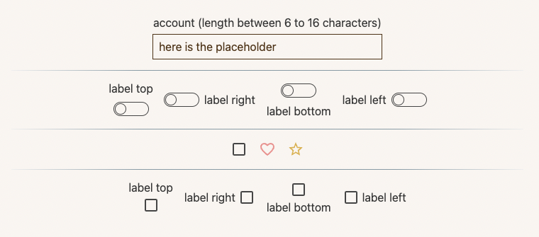
<InputText
labelText="account (length between 6 to 16 characters)"
placeholder="here is the placeholder"
value={textInput}
error={!validAccount}
helperText={hint}
onChange={handleInputChange}
/>
);
白話文:當使用者輸入的內容少於 6 或多於 16 個字時,判定該輸入內容不符合預期,需提供 InputText props.helperText 提示內容 hint。
透過 HTMLLabelElement 包覆整個元件,確保使用者點擊 label 時也會連帶更新 input:checkbox 的值。
畫面上看到的按鈕軌道與按鈕都是透過 trackStyle 做出來的。::before 負責軌道,::after 則是按鈕本體;解說可參考以下內容:
const trackStyle = useMemo(
  () =>
    css({
      // 設定容器尺寸,並透過 position: relative 讓 .trackStyle 綁定的 HTMLSpanElement 成為軌道與按鈕的定位元件
      width: '48px',
      height: '24px',
      position: 'relative',
      '&::before': {
        content: '""',
        // 設定軌道尺寸
        width: '48px',
        height: '18px',
        position: 'absolute',
        top: '50%',
        left: '50%',
        backgroundColor: 'transparent',
        // 透過 border 搭配 borderRadius 畫出軌道的曲線外框
        border: `1px solid ${checked ? '#5c7f67' : '#333'}`,
        borderRadius: '16px',
        // 結合 top/left 50% 讓軌道可以在容器裡水平+垂直置中
        transform: 'translate(-50%, -50%)',
      },
      '&&::after': {
        content: '""',
        boxSizing: 'border-box',
        // 設定按鈕尺寸
        width: '16px',
        height: '16px',
        position: 'absolute',
        top: '50%',
        left: '9px',
        backgroundColor: checked ? '#5c7f67' : 'transparent',
        border: `1px solid ${checked ? '#5c7f67' : '#333'}`,
        borderRadius: '16px',
        // 透過 props.checked 來調整按鈕的左右位置,在使用者選取(checked)時,透過 translateX(135%) 把按鈕往右邊推移
        transform: checked ? 'translate(135%, -50%)' : 'translate(-50%, -50%)',
        transition: 'all .2s ease',
      },
    }),
  [checked]
);
另外,當使用者有傳入 props.children 時,可搭配 props.labelPosition 來調整「標籤應該在 Switch 元件的哪一個方位」。使用 flex-direction 來處理即可。
觀摩了 MUI Checkbox 發現透過 icon 來處理 checkbox 的樣式簡直不能再更方便,邏輯也簡單;實作時也只要加上 props.icon 與 props.checkedIcon 就可支援各種奇形怪狀的 checkbox 造型,賺爛。
其實 MUI 也有提供 InputBase 此類完全沒有樣式設定的 headless-component 供開發使用,如果是卡在「覺得樣式客製很麻煩」這點上,可考慮改用此類空樣式元件來進行開發。
但身為一個工程師,早晚還是會想試圖自幹一套東西出來用,所以今年的鐵人賽我在這裡 ?


 看影片追技術