您好,歡迎光臨CSS甜點烘焙店
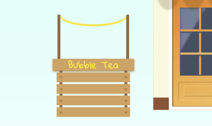
今天繼續完成飲料攤的旗幟
續上一集的架構
.beverageStore
	//略
	.flag
		.arrow
我們要利用border的4邊特性,來製作三角旗,這裡直接有動態演示,淺顯易懂
CSS Triangle
畫一長方形,並給上平下圓的弧度
border-radius: 0 0 50% 50%
再給box-shadow畫出彩帶的感覺
box-shadow: 0 0.1rem 0 0 #fee401
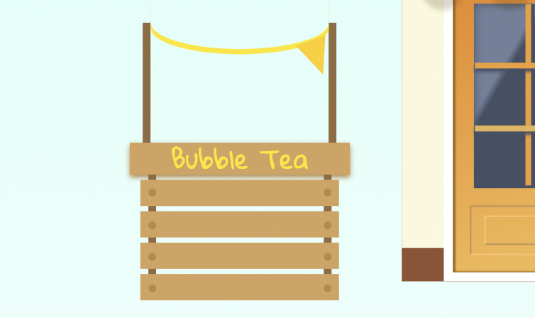
接下來在&::before畫一小長方形,跟著CSS Triangle畫出border-top的三角形,並依彩帶的弧度給旋轉角度
border-style: solid
border-width: 0.7rem 0.3rem
border-color: #fdce08 transparent transparent transparent//上 右 下 左
transform: rotate(-20deg)
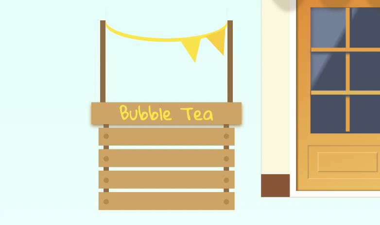
同樣在&::after複製一份三角形,並給旋轉角度
transform: rotate(-10deg)
同上一步驟,繼續畫出其它三角形
border-style: solid
border-width: 0.7rem 0.3rem
border-color: #fdce08 transparent transparent transparent
transform: rotate(32deg)
&::before
border-style: solid
border-width: 0.7rem 0.3rem
border-color: #fce405 transparent transparent transparent
transform: rotate(-20deg)
&::after
border-style: solid
border-width: 0.7rem 0.3rem
border-color: #fce405 transparent transparent transparent
transform: rotate(-30deg)
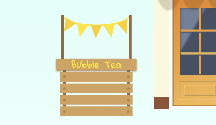
旗幟就完成囉!
截取之前畫過的珍珠鮮奶茶來擺設
【珍珠鮮奶茶】不可不知的perspective透視技巧,畫完好想喝一口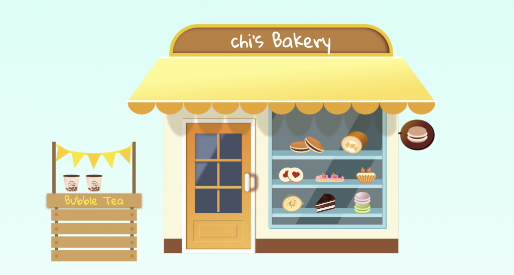
希望今天的珍珠奶茶攤您還滿意,請慢用~
如有任何問題,歡迎下方留言討論


 iThome鐵人賽
 看影片追技術